Responsive Mastery
Unleashing the Power of CSS Media Queries
You've built websites, you know your way around CSS, but when it comes to creating truly responsive designs, things get a bit... messy.
269 pages13 chaptersDec 25, 2024Web Development
About this book
Media queries seem like a maze of breakpoints and nested rules that never quite work as expected. Sound familiar? Responsive Mastery: Unleashing the Power of CSS Media Queries is your guide to conquering the art of adaptive web design. This book takes you beyond the basics, diving deep into the intricacies of media queries to help you create websites that look stunning and function flawlessly on any device. From crafting pixel-perfect layouts to optimizing performance across breakpoints, you'll learn how to harness the full potential of CSS media queries. Discover how to create fluid designs that adapt not just to screen sizes, but to user preferences and device capabilities. By the end of this book, you'll have the skills to build websites that don't just respond to different devices – they anticipate and enhance the user's experience on each one. Get ready to elevate your CSS skills and become the go-to expert for responsive web design in your team.
Table of contents
- IntroductionWhy Responsive Design Matters, The Role of Media Queries in Modern Web Development, What to Expect from This BookRead below
- Chapter 1: CSS Media Queries FundamentalsWhat Are Media Queries?, Syntax and Structure, Media Types Explained, Common Media Features
- Chapter 2: Understanding Viewport DimensionsThe Viewport Concept, Device Pixels vs CSS Pixels, The Meta Viewport Tag, Responsive Units (em, rem, vw, vh)
- Chapter 3: Adopting a Mobile-First ApproachThe Mobile-First Philosophy, Progressive Enhancement vs Graceful Degradation, Writing Base Styles, Choosing Breakpoints Wisely
- Chapter 4: Advanced Media Query TechniquesUsing Logical Operators, Range Contexts, Feature Queries with @supports, Nested Media Queries
- Chapter 5: Beyond Screen Size: Other Media FeaturesOrientation: Portrait vs Landscape, Resolution and Pixel Density, Hover and Pointer Media Features, Accessibility: prefers-reduced-motion
- Chapter 6: Responsive Layout TechniquesFluid Grids and Flexible Images, Flexbox with Media Queries, CSS Grid with Media Queries, Introduction to Container Queries
- Chapter 7: Responsive TypographyFluid Font Sizing, Controlling Line Length, Maintaining Vertical Rhythm, Font Loading Strategies
- Chapter 8: Responsive Images and MediaResponsive Images Techniques, The Picture Element, Using srcset and sizes Attributes, Responsive Video Embedding
- Chapter 9: Performance Optimization for Responsive DesignMinimizing HTTP Requests, CSS Optimization Techniques, Implementing Lazy Loading, Critical CSS and Async Loading
- Chapter 10: Testing and Debugging Responsive DesignsUsing Browser Developer Tools, Testing on Real Devices, Automated Responsive Testing, Common Responsive Design Issues and Solutions
- Chapter 11: CSS Frameworks and Media QueriesBootstrap's Approach to Media Queries, Tailwind CSS and Responsive Design, Foundation's Media Query Usage, Building a Custom Responsive Framework
- Chapter 12: Future Trends in Responsive DesignThe Future of Container Queries, Variable Fonts in Responsive Design, CSS Houdini and Responsive Possibilities, AI-Driven Responsive Design
- Chapter 13: Real-World Case StudiesResponsive E-commerce Site, News Portal with Complex Layout, Responsive Web Application, Artist Portfolio with Rich Media
- Conclusion
- Glossary
- Further Reading
Introduction
Welcome to "Responsive Mastery: Unleashing the Power of CSS Media Queries." As you embark on this journey to enhance your web development skills, you're taking a crucial step towards creating websites that not only look great but also provide an optimal user experience across all devices. In today's digital landscape, where users access the web through a myriad of devices with varying screen sizes and capabilities, responsive design isn't just a nice-to-have feature—it's an absolute necessity.
This book is designed to take your intermediate CSS knowledge and elevate it to new heights, specifically in the realm of responsive design through the mastery of CSS media queries. Whether you're looking to refine your existing skills or dive deep into the intricacies of adaptive layouts, you'll find the knowledge and practical techniques you need to create truly responsive websites that stand out in today's competitive web environment.
Throughout this book, you'll discover how media queries serve as the cornerstone of responsive web design, allowing you to craft layouts that seamlessly adapt to different screen sizes, orientations, and even user preferences. You'll learn how to approach responsive design with a mobile-first mindset, ensuring that your websites are not only functional but also optimized for performance across all devices.
As we progress, you'll gain insights into advanced techniques that go beyond basic screen size adjustments. You'll explore how to use media queries in conjunction with modern CSS layout techniques like Flexbox and Grid, and how to optimize your designs for various device capabilities and user settings. By the end of this journey, you'll have the skills and confidence to tackle complex responsive design challenges and create websites that truly respond to the needs of your users.
So, let's dive in and start mastering the art of responsive web design with CSS media queries. Your path to creating fluid, adaptable, and user-centric websites begins here.
Why Responsive Design Matters
In the ever-evolving landscape of web development, responsive design has transitioned from a novel concept to an indispensable practice. The proliferation of devices with diverse screen sizes and resolutions has fundamentally changed how users interact with the web. From smartphones and tablets to desktops and even smart TVs, the variety of devices used to access websites is staggering. This diversity presents both a challenge and an opportunity for web developers like yourself.
Responsive design matters because it directly impacts user experience, which is at the heart of successful web development. A website that adapts seamlessly to different screen sizes ensures that content is accessible and easy to navigate, regardless of the device being used. This adaptability is not just about aesthetics; it's about functionality and usability. When a site is responsive, users don't have to zoom, pan, or scroll unnecessarily to view content or interact with the site's features. This ease of use translates into longer visit durations, lower bounce rates, and higher conversion rates—metrics that are crucial for the success of any website[1].
Moreover, responsive design is increasingly important for search engine optimization (SEO). Search engines like Google prioritize mobile-friendly websites in their rankings, recognizing the growing trend of mobile internet usage. By implementing responsive design, you're not only catering to user needs but also aligning with search engine preferences, potentially boosting your site's visibility and reach[2].
From a development perspective, responsive design offers significant advantages in terms of maintenance and efficiency. Instead of creating and maintaining separate versions of a website for different devices, a responsive approach allows you to manage a single codebase that adapts to various screen sizes. This not only streamlines the development process but also ensures consistency across different versions of the site, reducing the likelihood of errors and discrepancies.
The importance of responsive design extends beyond mere convenience; it's about inclusivity and accessibility. In many parts of the world, mobile devices are the primary—and sometimes only—means of accessing the internet. By creating responsive websites, you're ensuring that your content is accessible to a global audience, regardless of their device or internet connectivity. This inclusivity is not just good practice; it's increasingly becoming a legal requirement in many jurisdictions, with accessibility guidelines mandating that web content be accessible on various devices[3].
Furthermore, responsive design is crucial for future-proofing your websites. As new devices with different screen sizes and capabilities continue to emerge, a well-implemented responsive design ensures that your website remains functional and visually appealing without requiring constant redesigns. This adaptability is particularly important in the age of wearable technology, foldable devices, and other innovations that challenge traditional notions of screen size and interaction.
The business case for responsive design is compelling. Companies that invest in responsive websites often see improved customer satisfaction, increased engagement, and higher conversion rates. In e-commerce, for instance, a responsive design can significantly reduce cart abandonment rates on mobile devices, directly impacting sales and revenue[4]. For content-heavy sites, responsive design ensures that articles, videos, and interactive elements are easily consumable across devices, leading to increased time on site and improved ad revenue.
As a web developer, mastering responsive design techniques, particularly through the effective use of CSS media queries, positions you as a valuable asset in the industry. It demonstrates your ability to create modern, user-centric websites that meet the demands of today's diverse digital ecosystem. This skill set is highly sought after by employers and clients alike, opening up opportunities for career advancement and more challenging, rewarding projects.
In conclusion, responsive design matters because it sits at the intersection of user experience, technical efficiency, and business success. It's not just about making websites look good on different devices; it's about creating inclusive, accessible, and future-proof digital experiences. As you delve deeper into the world of CSS media queries and responsive techniques, remember that you're not just learning a set of technical skills—you're equipping yourself to create web experiences that truly serve and delight users across the full spectrum of devices and contexts.
The Role of Media Queries in Modern Web Development
In the realm of modern web development, CSS media queries play a pivotal role in creating responsive and adaptive designs. They serve as the technological backbone that enables websites to adjust their layout, styling, and functionality based on the characteristics of the device or browser being used to view them. Media queries are not just a tool; they're a fundamental concept that has revolutionized how we approach web design and development in an era of diverse digital devices.
At their core, media queries allow you to apply CSS styles conditionally based on various factors such as screen width, height, orientation, resolution, and even user preferences. This capability is what makes it possible to create a single website that can adapt its appearance and behavior across a wide range of devices, from small smartphone screens to large desktop monitors and everything in between. The power of media queries lies in their ability to create breakpoints in your design, points at which the layout and styling of your website can shift to better accommodate the viewing environment[5].
One of the most significant roles of media queries in modern web development is enabling the mobile-first approach. This methodology, which has become increasingly popular and important, involves designing for mobile devices first and then progressively enhancing the design for larger screens. Media queries are essential in this process, allowing developers to start with a base set of styles for the smallest screens and then use queries to add or modify styles as the screen size increases. This approach not only ensures a good experience on mobile devices but often leads to cleaner, more efficient code overall.
Media queries also play a crucial role in performance optimization. By allowing you to serve different CSS based on the device characteristics, you can ensure that users only download the styles they need. For instance, you can use media queries to serve higher-resolution images only to devices with high-density displays, or to disable certain animations on devices that might struggle with performance. This targeted approach to styling can significantly improve load times and overall site performance, which is crucial for user experience and search engine rankings[6].
Beyond just adapting to different screen sizes, media queries enable developers to create more accessible and user-friendly designs. For example, media queries can be used to implement larger text sizes or higher contrast ratios for users who have set their device preferences to these settings. The `prefers-reduced-motion` media query allows websites to respect a user's desire for reduced animation, which is particularly important for users who experience motion sickness or other vestibular disorders. These accessibility-focused applications of media queries demonstrate how they contribute to creating more inclusive web experiences.
In the context of modern CSS layouts, media queries work hand in hand with flexible layout systems like Flexbox and CSS Grid. While these layout methods provide powerful tools for creating flexible designs, media queries allow you to fine-tune how these layouts behave at different screen sizes. For instance, you might use a media query to change a flex container from a row to a column layout on smaller screens, or to adjust the number of columns in a CSS Grid layout based on the available space. This combination of flexible layouts and targeted media queries allows for incredibly sophisticated and adaptable designs.
Media queries also play a significant role in the implementation of responsive images, a crucial aspect of modern web development. By using media queries in conjunction with the `srcset` and `sizes` attributes of the `` tag, or within `
In the realm of progressive enhancement, media queries allow developers to provide advanced features or styles to browsers and devices that support them, while ensuring a basic level of functionality for older or less capable devices. This approach is particularly valuable in creating websites that are both forward-looking and backwards-compatible, ensuring a wide reach while still taking advantage of modern web capabilities.
As web technologies continue to evolve, the role of media queries is expanding. The introduction of container queries, for instance, builds upon the concept of media queries but allows for even more granular control over layout and styling based on the size of a container element rather than just the viewport. While not yet fully implemented across all browsers, container queries represent the next evolution in responsive design, and understanding media queries provides a solid foundation for working with these new technologies as they become available.
Media queries also play a crucial role in creating cohesive experiences across different devices within a single ecosystem. For example, when developing for platforms like Progressive Web Apps (PWAs) or when creating websites that need to function seamlessly across desktop and mobile versions, media queries allow for a unified codebase that can adapt to different contexts. This adaptability is crucial for maintaining consistency in branding and user experience across various touchpoints.
In conclusion, the role of media queries in modern web development is multifaceted and essential. They are the key to creating truly responsive designs, enabling performance optimizations, enhancing accessibility, and providing the flexibility needed to address the diverse landscape of web-enabled devices. As you delve deeper into the world of CSS and responsive design, you'll find that mastering media queries opens up a world of possibilities, allowing you to create web experiences that are not only visually appealing but also highly functional and user-centric across all devices and contexts.
What to Expect from This Book
"Responsive Mastery: Unleashing the Power of CSS Media Queries" is designed to be your comprehensive guide to mastering the art and science of responsive web design. As you progress through this book, you'll embark on a journey that will transform your understanding of CSS media queries and equip you with the skills to create truly adaptive and user-centric websites. This book is structured to provide a logical progression from fundamental concepts to advanced techniques, ensuring that you build a solid foundation before tackling more complex topics.
In the early chapters, you'll dive deep into the fundamentals of CSS media queries. You'll learn about the syntax and structure of media queries, understanding how they work and why they're so powerful in responsive design. This section will cover the various media types and features you can target, providing you with a comprehensive understanding of the building blocks of responsive design. You'll explore common use cases and best practices, setting the stage for more advanced applications later in the book.
As you progress, you'll delve into the crucial concept of viewport dimensions and how they relate to responsive design. This section will demystify the sometimes confusing world of device pixels, CSS pixels, and viewport units. You'll learn how to effectively use the meta viewport tag and responsive units like em, rem, vw, and vh to create layouts that adapt seamlessly to different screen sizes and resolutions. This knowledge is fundamental to creating designs that look great and function well across a wide range of devices.
One of the key themes throughout the book is the mobile-first approach to responsive design. You'll learn why this methodology has become industry standard and how to implement it effectively in your projects. This section will cover techniques for progressive enhancement, writing base styles, and choosing appropriate breakpoints. By adopting a mobile-first mindset, you'll create more efficient, maintainable, and future-proof code.
As you become more comfortable with the basics, the book will introduce you to advanced media query techniques. You'll explore logical operators, range contexts, and nested media queries, learning how to create complex conditions that allow for highly specific and targeted styling. This section will also cover feature queries with @supports, enabling you to progressively enhance your designs based on browser support for specific CSS features.
Beyond screen size, you'll discover how media queries can target other aspects of the user's device and preferences. You'll learn about orientation-based styling, adapting designs for different pixel densities, and using hover and pointer media features to optimize for touch and non-touch devices. Importantly, you'll also explore accessibility-focused media features like prefers-reduced-motion, ensuring your designs are inclusive and user-friendly.
A significant portion of the book is dedicated to responsive layout techniques. You'll learn how to create fluid grids and flexible images, and how to combine media queries with modern layout tools like Flexbox and CSS Grid. This section will provide you with the skills to create complex, adaptive layouts that work across a wide range of devices and screen sizes. You'll also get an introduction to the emerging concept of container queries, preparing you for the future of responsive design.
Typography plays a crucial role in responsive design, and this book dedicates a full chapter to the subject. You'll learn techniques for fluid font sizing, controlling line length, and maintaining vertical rhythm across different device sizes. This section will also cover font loading strategies to ensure your typography looks great without compromising on performance.
Responsive images and media are often challenging aspects of responsive design, and this book provides comprehensive coverage of these topics. You'll learn about various responsive image techniques, including the use of the picture element and srcset and sizes attributes. You'll also explore strategies for responsive video embedding, ensuring that all media in your designs adapts appropriately to different screen sizes and device capabilities.
Performance is a critical consideration in responsive design, and this book dedicates a full chapter to optimization techniques. You'll learn strategies for minimizing HTTP requests, optimizing CSS, implementing lazy loading, and working with critical CSS. These techniques will help you create responsive designs that not only look great but also load quickly and perform well across all devices.
Testing and debugging responsive designs can be complex, and this book provides you with the tools and techniques to tackle these challenges effectively. You'll learn how to use browser developer tools, conduct testing on real devices, and even implement automated responsive testing. This section also covers common responsive design issues and their solutions, preparing you to troubleshoot and refine your designs efficiently.
To provide context for how media queries are used in popular frameworks, the book includes a chapter on CSS frameworks and their approach to responsive design. You'll explore how frameworks like Bootstrap, Tailwind CSS, and Foundation implement media queries, and learn how to build your own custom responsive framework. This knowledge will help you work more effectively with existing frameworks and give you the skills to create custom solutions when needed.
Looking to the future, the book concludes with an exploration of emerging trends in responsive design. You'll get insights into the future of container queries, the use of variable fonts in responsive design, the possibilities offered by CSS Houdini, and even the potential impact of AI on responsive design. This forward-looking perspective will help you stay ahead of the curve in the rapidly evolving field of web development.
Throughout the book, you'll find practical examples, code snippets, and real-world case studies that illustrate the concepts being discussed. These hands-on elements are designed to bridge the gap between theory and practice, allowing you to apply what you've learned to real-world scenarios. By the end of the book, you'll have not only a deep understanding of CSS media queries and responsive design principles but also the practical skills to implement complex, adaptive layouts in your own projects.
In essence, "Responsive Mastery" is more than just a book about CSS media queries—it's a comprehensive guide to creating websites that provide an optimal user experience across the full spectrum of devices and contexts. Whether you're looking to refine your existing skills or dive deep into the world of responsive design, this book will equip you with the knowledge and techniques to create truly adaptive, user-centric web experiences.
Notes
Introduction
- 1. Google Developers, Responsive Web Design Basics, Web Fundamentals, 2020
- 2. Moz, Mobile SEO: Responsive Design vs. Separate URLs vs. Dynamic Serving, The Moz Blog, 2021
- 3. W3C Web Accessibility Initiative, Mobile Accessibility at W3C, 2021
- 4. Baymard Institute, Mobile E-Commerce Usability: Exploring the Mobile Shopping Experience, 2021
- 5. MDN Web Docs, Using media queries, Mozilla Developer Network, 2021
- 6. Google Developers, Optimize CSS Background Images with Media Queries, Web Fundamentals, 2021
- 7. Responsive Images Community Group, Responsive Images Specification, 2021
This is the end of the free sample. The full book has 13 chapters.
Want this book written for you?
Tell us your goals and background, and get your own version of this book, tailored by AI to you.


Benefits of AI-tailored books
- Read one book, not ten:
- all the Web Development knowledge you need, gathered into a single book.
- Save days of learning:
- tell us your goals, choose your topics, and the whole book is built around them.
- Learn effortlessly:
- Web Development book written for your specific background and expertise.
- Understand at a glance:
- includes charts, tables, timelines, checklists, decision trees, and more.
- Stay current:
- written the day you order it, not years ago.
- Trust what you read:
- every book is checked for accuracy, with real research when your subject needs it.
Create your unique book in 3 steps
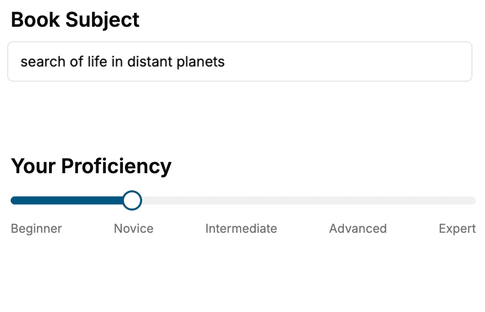
- 1. Select your focus
Select the focus of your Web Development book and share your background
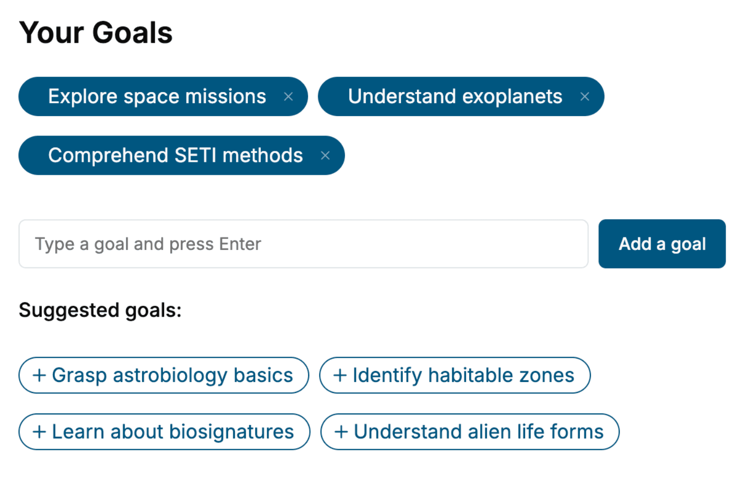
- 2. Personalize your book
Specify your goals and choose sub-topics to include
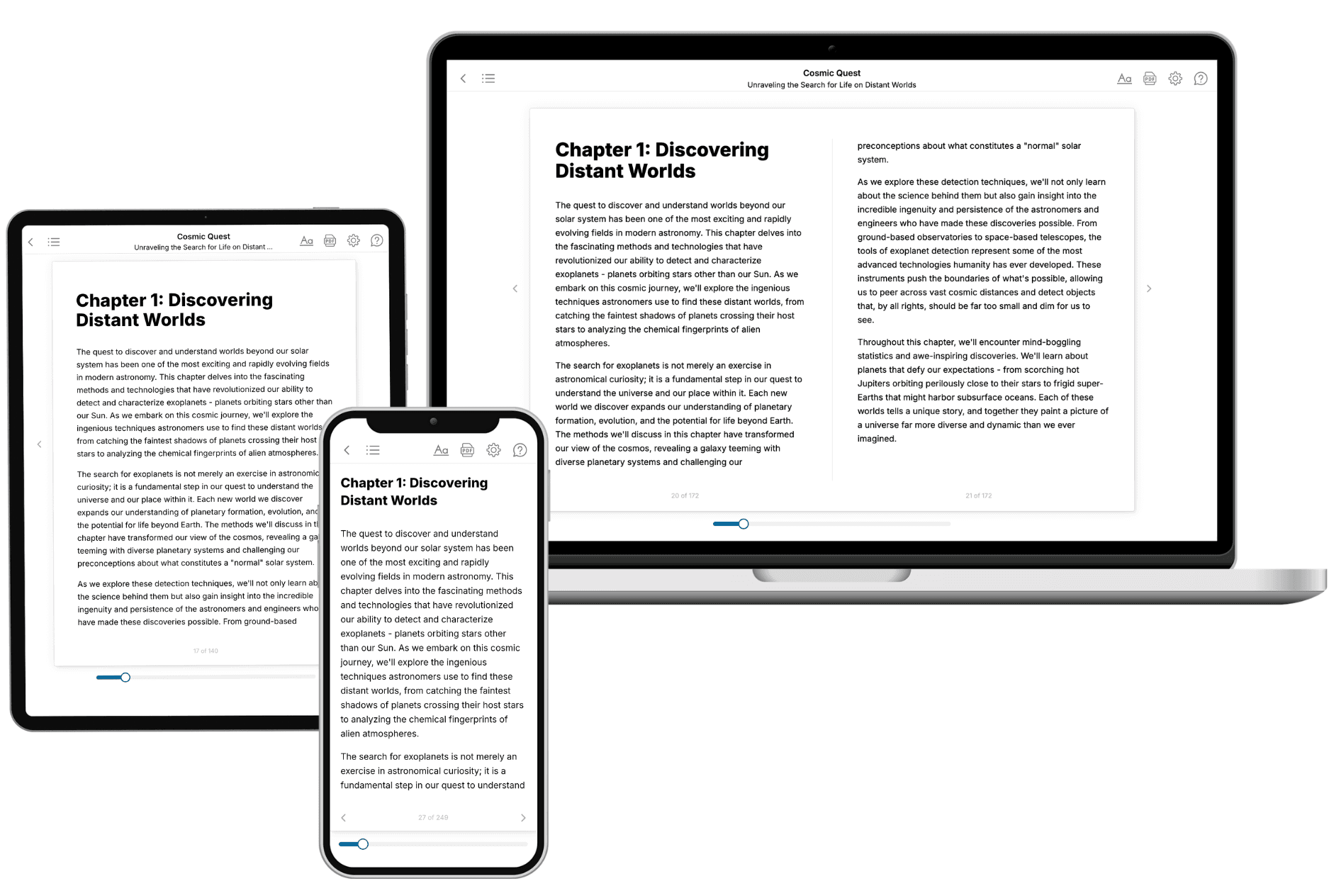
- 3. Get your tailored book
Your book is ready in 10 minutes. Read it online, download as EPUB or PDF, or send to Kindle.
Frequently asked questions
- What is TailoredRead?
TailoredRead creates complete, full-length nonfiction ebooks, written specifically for you. Tell us what you want to learn and why, and TailoredRead writes you a complete ebook on it, with charts, tables, and diagrams throughout. Read it online, on Kindle, or on any e-reader, or download it as a PDF or EPUB. Every book is written fresh the day you order it.
- How is the book tailored to me?
Before anything is written, you answer a few short questions about your goals, your background, and the topics you care about. Your book is then planned around your answers: written at your level, focused on your goals, and covering the topics you chose, instead of the one-size-fits-all book a store sells everyone.
- Will it read like generic AI content?
No. Your book isn't a chat transcript: it's planned chapter by chapter before a single word is written, told in a clear book voice, and explains ideas visually with charts, tables, and diagrams. After writing, every book goes through an editorial pass that polishes chapters so the book reads consistent from start to finish. Judge for yourself: browse thousands of sample books on our Explore Books page.
- How accurate is the content?
Our AI first checks whether your subject needs live research. Niche and fast-moving subjects are researched before writing, and the book plan and chapters are grounded in what it finds. After writing, every book goes through a quality pass that checks its facts and consistency, and researched books list their sources in a Notes section at the back.
- How long is the book?
You choose the length: Comprehensive (250-300 pages), Detailed (150-200 pages), Essential (70-100 pages), or Short (30-50 pages).
- Does the book include visuals?
Yes. Every book includes visual elements such as timelines, checklists, step-by-step guides, decision trees, comparison tables, and matrices, and many include bar charts. A typical book includes dozens of these visual elements.
- Can I read it on Kindle? What formats can I download?
Yes. Every book can be read in our online reader or downloaded as a PDF or EPUB. The EPUB can be opened with Kindle, Apple Books, Kobo, and any e-reader. The Commercial and Author licenses also include an editable Word (DOCX) and Markdown download.
- How much does it cost?
About the price of a regular ebook. The exact price depends on your book's length and complexity, from $2 for the shortest books to $35 for the most comprehensive, and it's shown when you review your book, before you commit to anything. Each book is a one-time purchase, yours to keep, no subscription. Licenses that let you share, teach, or publish your book range from $35.99 to $49.99.
- Can I preview the book before purchasing?
Before you pay, you'll see what your book will cover: the title, a detailed description, the estimated length, and the complete chapter-by-chapter table of contents, so you know what you're getting before you decide. The full text itself is written after you purchase.
- How long does it take to create a book?
About 10 minutes. You can start reading the opening chapters while the rest is still being written.