Analogous Colors in Photography
Master Harmonious Composition Through Color Theory and Framing Techniques
Imagine capturing photographs where every color works in perfect harmony, drawing viewers deeper into your visual story without distraction.
222 pages10 chaptersAug 17, 2026Photography
About this book
This book teaches you how analogous colors—hues that sit naturally beside each other on the color wheel—create this magnetic visual cohesion. You'll discover how to recognize analogous color opportunities in your environment, frame them intentionally, and use composition techniques to amplify their emotional power. Whether you're photographing landscapes, portraits, or still life, you'll learn the practical methods professionals use to plan shoots around color harmony, adjust your camera settings for optimal color capture, and refine your images in post-processing. This guide bridges color theory and real-world application, showing you exactly how to move beyond random color combinations to create photographs that feel intentional, sophisticated, and emotionally resonant. By the end, you'll have a systematic approach to seeing and capturing analogous color schemes that transforms your photography from good to gallery-worthy.
Table of contents
- IntroductionWhy Color Matters in Photography, What You'll Learn in This Book, How to Use This GuideRead below
- Chapter 1: The Color Wheel and Color RelationshipsUnderstanding the Color Wheel, Primary, Secondary, and Tertiary Colors, Exploring Color Relationships and Harmony, Hue, Saturation, and Value in Photography
- Chapter 2: What Are Analogous Colors?Definition and Characteristics of Analogous Colors, Identifying Analogous Color Schemes, Analogous Colors vs. Other Color Schemes
- Chapter 3: The Emotional Power of Analogous ColorsThe Psychology of Color Harmony, Emotional Responses to Different Analogous Schemes, Storytelling Through Analogous Color Palettes, Creating Mood and Atmosphere
- Chapter 4: Composition and Framing with Analogous ColorsFraming Techniques to Emphasize Color Harmony, Applying the Rule of Thirds with Analogous Colors, Using Leading Lines to Guide Color Flow, Creating Depth and Layers with Analogous Palettes
- Chapter 5: Planning and Shooting for Analogous ColorsScouting Locations for Analogous Color Opportunities, Seasonal and Time-Based Color Availability, Pre-Shoot Planning and Visualization, Selecting Subjects That Showcase Analogous Colors
- Chapter 6: Technical Camera Settings for Color CaptureWhite Balance and Color Temperature, Exposure and Its Impact on Color Accuracy, Color Space Settings and RAW vs. JPEG, Lens Choice and Color Rendering
- Chapter 7: Lighting and Analogous ColorsNatural Light and Color Temperature Shifts, Golden Hour and Blue Hour for Analogous Schemes, Artificial Lighting for Controlled Analogous Palettes, Managing Color in Shadows and Highlights
- Chapter 8: Post-Processing and Color EnhancementColor Grading Fundamentals, Enhancing Analogous Color Harmony in Editing, Selective Color Adjustments and Masking, Maintaining Natural Color While Enhancing Harmony
- Chapter 9: Analogous Colors Across Photography GenresLandscape Photography with Analogous Colors, Portrait and Fashion Photography Applications, Still Life and Product Photography, Street and Travel Photography Opportunities
- Chapter 10: Advanced Techniques and Creative CombinationsBalancing Analogous Colors with Complementary Accents, Blending Monochromatic and Analogous Approaches, Split Toning for Enhanced Analogous Harmony, Creative Color Manipulation While Maintaining Harmony
- ConclusionKey Takeaways and Your Next Steps, Building Your Analogous Color Mastery
- Glossary of Color and Photography Terms
- Further Reading and Resources
Introduction
Point a camera at a row of terracotta rooftops under a late afternoon sky, and something happens before you even press the shutter. The orange tiles, the amber light, and the warm brown shadows all belong to the same family of hues. Nothing clashes. Nothing pulls your eye away from the scene. That quiet sense of rightness is not an accident of good luck. It is the result of colors sitting close together on the color wheel, working in agreement rather than competition.
Most photographers learn composition first: framing, balance, leading lines, the rule of thirds. Color often gets treated as an afterthought, something to fix later in editing software rather than something to plan for at the moment of capture. This book takes the opposite approach. It treats color, specifically analogous color schemes, as a decision you make before you ever lift the camera, on equal footing with your choice of angle or lens.
An analogous color scheme uses hues that sit next to each other on the color wheel, such as yellow, yellow-orange, and orange, or blue, blue-green, and green. Because these colors share underlying pigments, they naturally blend and support one another in a photograph. The goal of this book is to show exactly how that natural harmony can be found, framed, lit, and refined so it becomes a deliberate part of your visual storytelling rather than a happy coincidence.
The chapters ahead move in a logical sequence: from the mechanics of the color wheel, through the emotional effects of specific color groupings, into composition, camera settings, lighting, editing, and genre-specific application. Each section builds on the last, so by the final page you will have a complete, repeatable process for seeing and capturing analogous color in the real world, not just an abstract appreciation of color theory.
Why Color Matters in Photography
Viewers respond to color before they process anything else in an image. Shape, subject, and detail all take a fraction of a second longer to register in the brain than color does. This means the color palette of a photograph sets the emotional tone before the viewer consciously understands what they are looking at. A photograph can be technically sharp, well exposed, and perfectly framed, yet still feel flat or chaotic if its colors fight each other.
Consider two versions of the same street scene. In the first, a red awning, a teal storefront, a yellow taxi, and a purple umbrella all compete for attention. The eye does not know where to rest. In the second version, the photographer waits for a moment when the scene is dominated by warm tones: an amber awning, an orange food cart, and a red jacket passing through frame. The second photograph feels composed, even though the subject matter is nearly identical. The only meaningful difference is color harmony.
Color theory has been studied by artists and designers for centuries, and its core lessons translate directly into photography. The Bauhaus color theorist Johannes Itten argued that color relationships, not individual colors in isolation, determine how a composition feels to the viewer[1]. A single orange tile might feel unremarkable on its own, but placed among a range of yellows, ambers, and reds, it becomes part of a coherent visual statement.
This matters practically because photographers cannot control every element in a scene the way a painter controls every brushstroke. A landscape photographer cannot repaint a mountainside, and a street photographer cannot ask pedestrians to change outfits. What both can do is recognize when the colors already present in a scene relate to each other, and frame their shot to include those relationships while excluding the ones that disrupt them.
Color also carries meaning independent of composition. A palette dominated by blues and greens tends to read as calm, cool, and contemplative. A palette built from reds, oranges, and yellows tends to feel energetic, warm, and immediate. These associations are not arbitrary. They connect to lived experience: warm colors are linked to fire and sunlight, cool colors to water and shade. Photographers who understand these associations can use color intentionally to reinforce the mood of a subject rather than leaving it to chance.
Professional photography across genres, from editorial fashion to fine art landscape, consistently shows a preference for restrained, cohesive color palettes over scattered, high-contrast ones. This is not a stylistic trend so much as a reflection of how human perception works. A limited, related color range is easier for the eye to process and therefore easier for the viewer to enjoy without fatigue. Photographs with too many unrelated colors often read as amateur, even when every other technical element is executed well.
None of this means bold, high-contrast color combinations are wrong. Complementary schemes, which pair colors from opposite sides of the wheel, have their own strong uses and will be addressed later in this book. But analogous schemes offer something complementary combinations cannot: a sense of unity that feels less like a visual effect and more like an honest representation of a place, a mood, or a moment. That honesty is part of why analogous color has become a foundational tool for photographers who want their images to feel intentional rather than manipulated.
Recognizing the importance of color changes how you approach every stage of a shoot, not just the final edit. It affects where you choose to stand, what time of day you choose to shoot, what lens you select, and how you meter your exposure. Treating color as a planning tool, rather than a post-processing afterthought, is the single biggest shift this book asks of you as a photographer.
What You'll Learn in This Book
This book is structured to move from theory into practice in a way that mirrors how a real photography project develops. It begins with the color wheel itself, covering primary, secondary, and tertiary colors, along with the concepts of hue, saturation, and value. These fundamentals are not decoration. They are the vocabulary you need to describe precisely what makes a color scheme work, rather than relying on vague impressions like this looks nice together
.
From there, the book defines analogous color schemes in detail and distinguishes them clearly from other approaches such as complementary and monochromatic schemes. You will learn exactly how to identify an analogous relationship when you see one in the field, whether it is a cluster of autumn leaves in red, orange, and yellow, or a coastal scene built from blue, teal, and green. This section gives you a reliable method for spotting these opportunities quickly, even in fast-moving or unplanned shooting situations.
A significant portion of the book addresses the emotional and psychological effects of specific analogous groupings. A warm analogous palette built from reds and oranges produces a very different feeling than a cool analogous palette built from blues and violets. You will learn which combinations suit which subjects and stories, so that your color choices actively support the narrative of your photograph instead of merely decorating it.
Composition and framing receive dedicated attention because color and composition are inseparable in practice. You will learn how techniques such as the rule of thirds, leading lines, and layered depth can be used specifically to reinforce color flow through a frame, guiding the viewer's eye along a path defined as much by hue as by shape. This is where color theory stops being abstract and starts shaping concrete framing decisions.
Because color exists in the real world before it exists in a photograph, the book also covers the practical work of finding and planning around analogous color. This includes scouting locations, understanding how seasons and time of day change the colors available to you, and preparing a shoot around a specific palette before you ever arrive on location. These are the habits that separate photographers who stumble into good color occasionally from those who produce it consistently.
Technical camera settings get their own detailed treatment, since even a perfectly chosen analogous scene can be undermined by an inaccurate white balance or a poorly chosen color space. You will learn how white balance, exposure, RAW versus JPEG capture, and lens selection each affect how faithfully your camera records the colors in front of you. Lighting receives similar depth, covering how natural light at golden hour and blue hour, as well as artificial lighting setups, shift and shape analogous palettes.
The second half of the book turns to what happens after the shutter clicks. Post-processing chapters cover color grading, selective color adjustment, and split toning, all aimed at strengthening analogous harmony without pushing an image into unnatural or oversaturated territory. Genre-specific chapters then apply everything learned so far to landscape, portrait, still life, and street photography, since the way analogous color functions in a quiet still life differs meaningfully from how it functions in a crowded street scene.
Finally, the book closes with advanced techniques for photographers who have mastered the basics of analogous harmony and want to push further. This includes combining analogous schemes with complementary accents for controlled visual tension, blending monochromatic and analogous approaches, and using deliberate color manipulation in a way that still respects overall harmony. These techniques are meant for photographers ready to break rules on purpose, not by accident.
How to Use This Guide
This book assumes you already have a working knowledge of composition and basic photographic technique. It does not spend time explaining what aperture or shutter speed are, and it does not walk through camera menus step by step. Instead, it builds directly on that existing foundation, focusing entirely on how color theory integrates with the framing and technical skills you already use on every shoot.
The chapters are sequenced deliberately, and reading them in order will give you the clearest path from theory to application. Chapter one establishes the color wheel and the language used throughout the rest of the book, so skipping it may leave later terms feeling unfamiliar even if you already have some prior knowledge of color theory. If you are confident in your grasp of hue, saturation, and value, feel free to move quickly through that material, but do not skip it entirely.
That said, the book is also designed for reference use once you have completed a full read-through. If you are preparing for a specific type of shoot, such as a golden hour portrait session or a still life product setup, the genre-specific chapter and the relevant lighting or technical chapter can be revisited independently. Each subchapter is written to stand reasonably well on its own once you understand the core vocabulary from the early chapters.
Throughout the book, look for practical frameworks rather than only conceptual explanations. Many subchapters include specific steps, checklists, or worked examples, such as how to scout a location for analogous opportunities or how to set white balance for a particular light source. These sections are meant to be applied directly on your next shoot, not simply read and set aside. Consider keeping a notebook or a notes app open as you read, jotting down two or three techniques per chapter that you plan to try immediately.
A useful way to reinforce what you learn is to pair reading with active shooting between sessions. After finishing the chapter on identifying analogous color schemes, spend an afternoon photographing only scenes where you can spot three adjacent hues on the color wheel. After the chapter on lighting, revisit the same location at a different time of day and compare how the color relationships shift. This kind of deliberate practice builds the visual instinct that separates photographers who understand color theory from those who can actually apply it under real shooting conditions.
Pay close attention to the glossary near the end of the book if a term ever feels unclear. Photography and color theory share some vocabulary but use certain words differently, and the glossary is built specifically to clarify how terms like hue, saturation, and color adjacency are used within this book. Rather than guessing at meaning from context, a quick check of the glossary will keep your understanding precise as the concepts build on each other.
Finally, treat this book as a working manual rather than a one-time read. Color perception sharpens with repeated, deliberate attention, much like ear training sharpens a musician's ability to hear individual notes within a chord. Revisit chapters after months of practice, and you will likely notice details in the explanations that did not stand out on a first read, simply because your eye will have developed further in the meantime. The goal is not to finish the book once, but to let it shape how you see color every time you pick up a camera.
Notes
Introduction
- 1. Johannes Itten, The Art of Color, Reinhold Publishing, 1961
This is the end of the free sample. The full book has 10 chapters.
Want this book written for you?
Tell us your goals and background, and get your own version of this book, tailored by AI to you.


Benefits of AI-tailored books
- Read one book, not ten:
- all the Photography knowledge you need, gathered into a single book.
- Save days of learning:
- tell us your goals, choose your topics, and the whole book is built around them.
- Learn effortlessly:
- Photography book written for your specific background and expertise.
- Understand at a glance:
- includes charts, tables, timelines, checklists, decision trees, and more.
- Stay current:
- written the day you order it, not years ago.
- Trust what you read:
- every book is checked for accuracy, with real research when your subject needs it.
Create your unique book in 3 steps
- 1. Select your focus
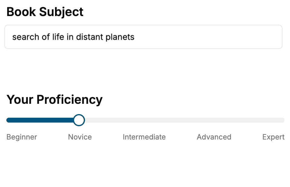
Select the focus of your Photography book and share your background
- 2. Personalize your book
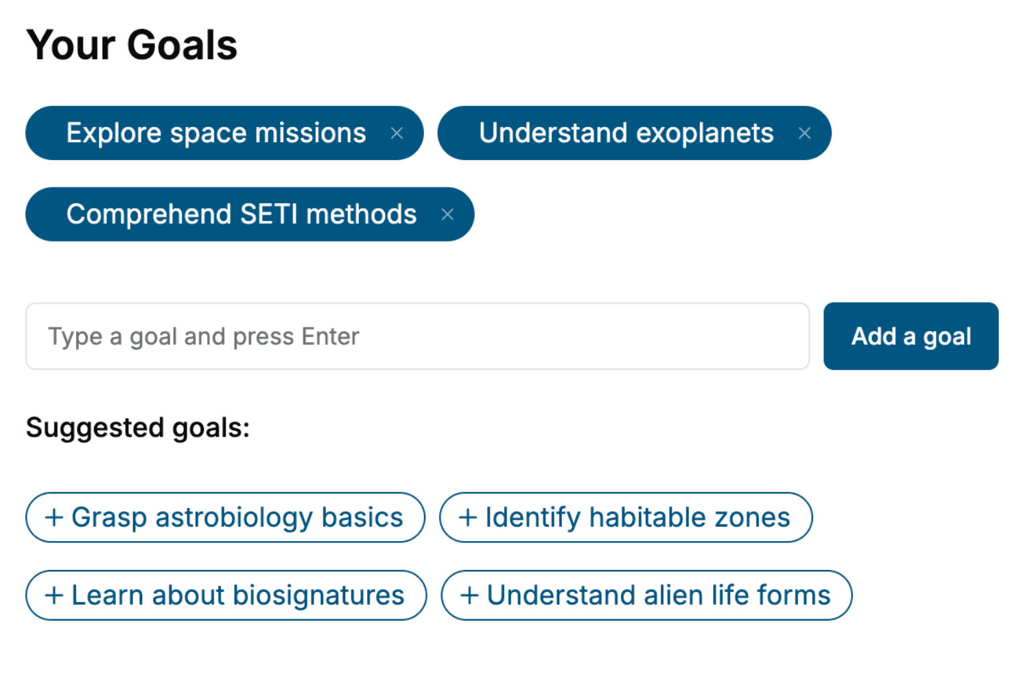
Specify your goals and choose sub-topics to include
- 3. Get your tailored book
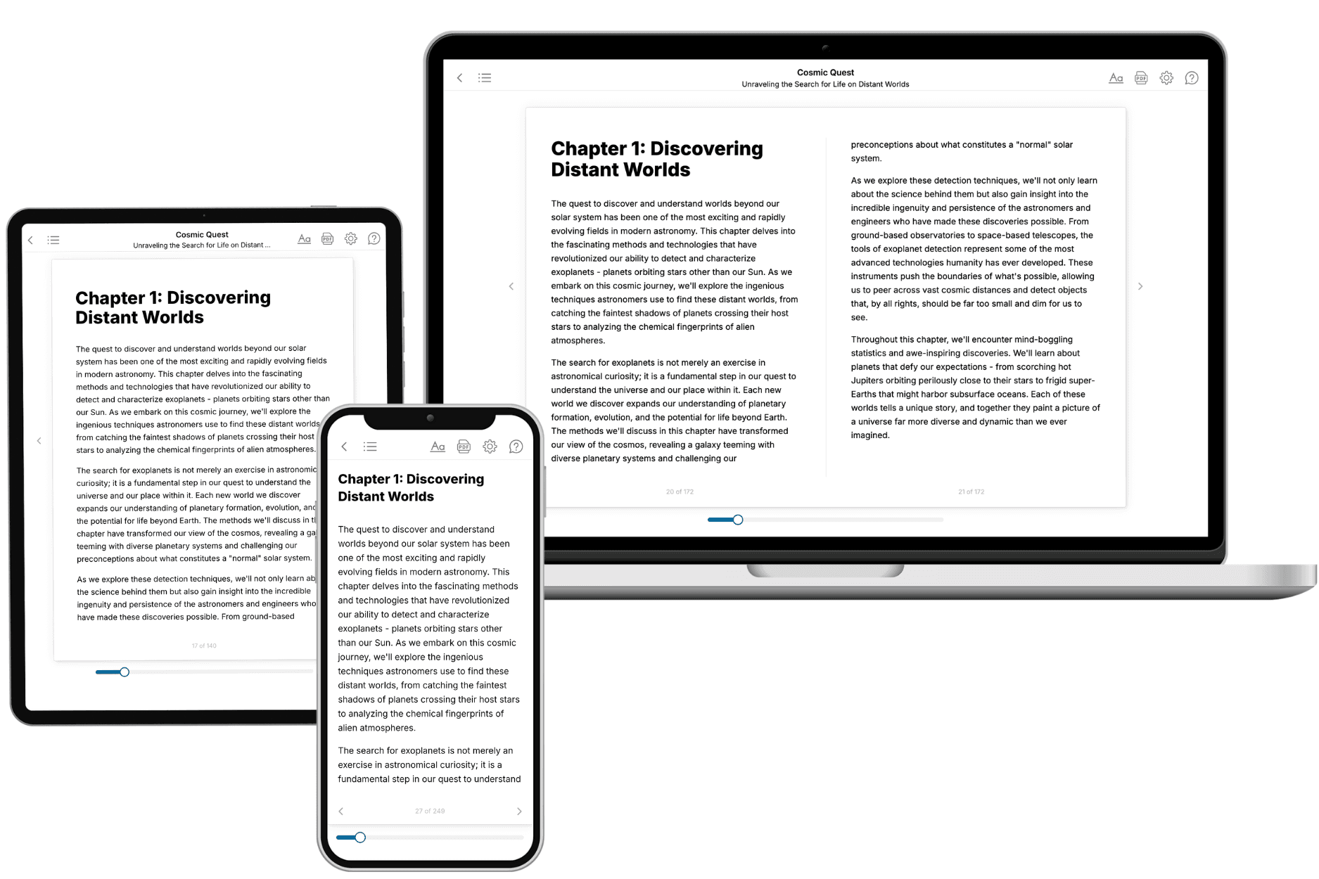
Your book is ready in 10 minutes. Read it online, download as EPUB or PDF, or send to Kindle.
Frequently asked questions
- What is TailoredRead?
TailoredRead creates complete, full-length nonfiction ebooks, written specifically for you. Tell us what you want to learn and why, and TailoredRead writes you a complete ebook on it, with charts, tables, and diagrams throughout. Read it online, on Kindle, or on any e-reader, or download it as a PDF or EPUB. Every book is written fresh the day you order it.
- How is the book tailored to me?
Before anything is written, you answer a few short questions about your goals, your background, and the topics you care about. Your book is then planned around your answers: written at your level, focused on your goals, and covering the topics you chose, instead of the one-size-fits-all book a store sells everyone.
- Will it read like generic AI content?
No. Your book isn't a chat transcript: it's planned chapter by chapter before a single word is written, told in a clear book voice, and explains ideas visually with charts, tables, and diagrams. After writing, every book goes through an editorial pass that polishes chapters so the book reads consistent from start to finish. Judge for yourself: browse thousands of sample books on our Explore Books page.
- How accurate is the content?
Our AI first checks whether your subject needs live research. Niche and fast-moving subjects are researched before writing, and the book plan and chapters are grounded in what it finds. After writing, every book goes through a quality pass that checks its facts and consistency, and researched books list their sources in a Notes section at the back.
- How long is the book?
You choose the length: Comprehensive (250-300 pages), Detailed (150-200 pages), Essential (70-100 pages), or Short (30-50 pages).
- Does the book include visuals?
Yes. Every book includes charts, tables, and diagrams: timelines, checklists, step-by-step guides, decision trees, comparison tables, matrices, and bar charts. A typical book includes dozens of these visual elements.
- Can I read it on Kindle? What formats can I download?
Yes. Every book can be read in our online reader or downloaded as a PDF or EPUB. The EPUB can be opened with Kindle, Apple Books, Kobo, and any e-reader. The Commercial and Author licenses also include an editable Word (DOCX) and Markdown download.
- How much does it cost?
About the price of a regular ebook. The exact price depends on your book's length and complexity, from $2 for the shortest books to $35 for the most comprehensive, and it's shown when you review your book, before you commit to anything. Each book is a one-time purchase, yours to keep, no subscription. Licenses that let you share, teach, or publish your book range from $35.99 to $49.99.
- Can I preview the book before purchasing?
Before you pay, you'll see what your book will cover: the title, a detailed description, the estimated length, and the complete chapter-by-chapter table of contents, so you know what you're getting before you decide. The full text itself is written after you purchase.
- How long does it take to create a book?
About 10 minutes. You can start reading the opening chapters while the rest is still being written.