Bootstrap Navigation Mastery
Building Responsive and User-Friendly Menus for Modern Websites
Picture yourself crafting sleek, responsive navigation menus that adapt seamlessly to any device.
284 pages15 chaptersMar 9, 2025Web Development
About this book
Your websites are no longer hindered by clunky, outdated navigation systems. Instead, they showcase smooth, intuitive interfaces that guide users effortlessly through your content. Bootstrap Navigation Mastery is your comprehensive guide to creating powerful, responsive navigation menus using Twitter Bootstrap. This book takes you on a deep dive into the world of modern web navigation, equipping you with the knowledge and skills to build user-friendly interfaces that enhance the overall user experience of your websites. From basic menu structures to advanced dropdown techniques, you'll learn how to leverage Bootstrap's robust framework to its fullest potential. Discover how to customize your navigation to match your brand's unique style while maintaining responsiveness across all devices. With practical examples and step-by-step tutorials, you'll quickly gain the confidence to tackle any navigation challenge that comes your way. Whether you're looking to upgrade existing projects or start new ones from scratch, this book will elevate your Bootstrap skills and empower you to create websites that stand out in today's competitive digital landscape.
Table of contents
- IntroductionThe Importance of Responsive Navigation, Overview of Bootstrap for Navigation, How This Book Is Structured, Prerequisites and SetupRead below
- Chapter 1: Bootstrap Basics for NavigationUnderstanding the Bootstrap Grid System, Responsive Classes in Bootstrap, Navigation Components Overview, Basic Navbar Structure
- Chapter 2: Creating Simple Navigation MenusHorizontal Navigation Bar, Vertical Navigation Menu, Pills and Tabs Navigation, Implementing Breadcrumbs
- Chapter 3: Responsive Navigation TechniquesMobile-First Navigation Design, Creating Collapsible Navigation, Implementing the Hamburger Menu, Working with Bootstrap Breakpoints
- Chapter 4: Dropdown Menus and SubnavigationBasic Dropdown Menus, Multi-Level Dropdown Navigation, Creating a Mega Menu, Hover-Activated Dropdowns
- Chapter 5: Styling Navigation ElementsCustomizing Colors and Backgrounds, Typography in Navigation, Incorporating Icons in Navigation, Adding Animations and Transitions
- Chapter 6: Fixed and Sticky NavigationCreating a Fixed Top Navigation, Implementing Fixed Bottom Navbars, Sticky Navigation Techniques, Handling Scroll Behavior
- Chapter 7: Side Navigation and Off-Canvas MenusBasic Side Navigation Implementation, Creating Off-Canvas Menus, Responsive Side Navigation Patterns, Animating Side Navigation Elements
- Chapter 8: Integrating Search in NavigationAdding a Search Bar to Navigation, Creating an Expandable Search Field, Implementing Search Suggestions, Mobile-Friendly Search Solutions
- Chapter 9: Accessibility in Bootstrap NavigationUsing ARIA Roles and Attributes, Keyboard Navigation Support, Optimizing for Screen Readers, Ensuring Sufficient Color Contrast
- Chapter 10: Performance Optimization for NavigationLazy Loading Navigation Elements, Minifying CSS and JavaScript, Caching Strategies for Navigation, Testing Navigation Performance
- Chapter 11: Responsive Images in NavigationOptimizing Images for Navigation, Using SVG Icons in Menus, Handling Retina and High-DPI Displays, Lazy Loading Images in Navigation
- Chapter 12: Advanced Bootstrap Navigation TechniquesImplementing Scrollspy, Using the Affix Plugin, Dynamically Updating Navigation, Working with Custom Events
- Chapter 13: Testing and Debugging NavigationCross-Browser Testing Strategies, Tools for Responsive Design Testing, Troubleshooting Common Navigation Issues, Conducting Navigation Performance Audits
- Chapter 14: Real-World Navigation Case StudiesE-commerce Site Navigation, Portfolio Website Navigation, News Site Mega Menu, Web Application Navigation Patterns
- Chapter 15: Future Trends in Bootstrap NavigationAI-Driven Personalized Navigation, Voice-Activated Navigation, Navigation in AR and VR Interfaces, Upcoming Bootstrap Features for Navigation
- ConclusionKey Takeaways, Next Steps in Your Bootstrap Journey
- Additional ResourcesOfficial Bootstrap Documentation, Community Resources and Forums
Introduction
Welcome to "Bootstrap Navigation Mastery: Building Responsive and User-Friendly Menus for Modern Websites." This comprehensive guide is designed to elevate your skills in creating powerful, responsive navigation menus using Twitter Bootstrap. As a web developer with intermediate experience in front-end development, you're about to embark on a journey that will transform the way you approach website navigation, enhancing both your technical abilities and the user experience of your projects.
In today's digital landscape, responsive design is not just a luxury—it's a necessity. With users accessing websites from a myriad of devices, from smartphones and tablets to desktops and even smart TVs, the ability to create navigation systems that adapt seamlessly to any screen size is crucial. This book will equip you with the knowledge and techniques to master this essential aspect of modern web development, ensuring that your websites are accessible, user-friendly, and visually appealing across all platforms.
Throughout this book, you'll discover how to leverage Bootstrap's robust framework to its fullest potential, creating navigation menus that are not only responsive but also intuitive and engaging. From basic menu structures to advanced dropdown techniques, you'll learn how to build navigation systems that enhance the overall user experience of your websites. By the end of this journey, you'll have the confidence to tackle any navigation challenge that comes your way, whether you're upgrading existing projects or starting new ones from scratch.
Let's dive into the world of Bootstrap navigation and explore how this powerful tool can revolutionize your approach to web development. Get ready to create sleek, responsive navigation menus that will set your websites apart in today's competitive digital landscape.
Overview of Bootstrap for Navigation
Bootstrap has revolutionized the way web developers approach responsive design, and its navigation components are no exception. As one of the most popular front-end frameworks, Bootstrap provides a robust set of tools and pre-built components that make creating responsive navigation menus both efficient and effective. This overview will introduce you to the key features and benefits of using Bootstrap for navigation, setting the stage for the in-depth exploration that follows in subsequent chapters.
At its core, Bootstrap's navigation system is built on a flexible, mobile-first approach. This means that all navigation components are designed to work seamlessly on smaller screens by default, with the ability to expand and adapt as the screen size increases. This mobile-first philosophy aligns perfectly with modern web development practices and ensures that your navigation is accessible and functional across all devices from the outset.
One of Bootstrap's most powerful features for navigation is its grid system. The grid provides a flexible foundation for creating responsive layouts, including navigation structures. With its 12-column system and predefined breakpoints, you can easily create navigation menus that adjust their layout and behavior based on screen size. This adaptability is crucial for ensuring that your navigation remains user-friendly and visually appealing on everything from small smartphones to large desktop monitors.
Bootstrap offers a variety of pre-built navigation components that you can use as starting points for your designs. These include:
- Navbars: Responsive navigation headers that can collapse on smaller screens and expand on larger ones.
- Nav components: Versatile navigation elements that can be styled as tabs, pills, or vertical menus.
- Dropdowns: Toggleable, contextual overlays for displaying lists of links and more.
- Breadcrumbs: Simple navigational aids to help users understand their location within a website's hierarchy.
These components come with built-in JavaScript functionality, making it easy to implement interactive features like collapsible menus and dropdowns without writing extensive custom code. This out-of-the-box functionality significantly reduces development time and ensures consistency in behavior across different browsers and devices.
Another key advantage of using Bootstrap for navigation is its extensive customization options. While the framework provides default styles that are clean and functional, you have the flexibility to modify these styles to match your brand's unique aesthetic. Bootstrap's use of Sass variables and mixins makes it straightforward to customize colors, typography, spacing, and other visual aspects of your navigation elements.
Accessibility is a core consideration in Bootstrap's design, and this extends to its navigation components. Many of Bootstrap's navigation elements come with built-in ARIA attributes and keyboard navigation support, helping you create more inclusive websites with less effort. This focus on accessibility aligns with web standards and best practices, ensuring that your navigation is usable by a wide range of users, including those relying on assistive technologies.
Performance is another area where Bootstrap excels. The framework is designed to be lightweight and modular, allowing you to include only the components and styles you need. This approach helps minimize load times and improves overall site performance, which is crucial for maintaining a positive user experience, especially on mobile devices with potentially slower internet connections.
Bootstrap's extensive documentation and large community are invaluable resources as you work with its navigation components. The official documentation provides clear examples and explanations for each component, while the community offers a wealth of tutorials, plugins, and custom implementations that can inspire and guide your own projects.
As you progress through this book, you'll discover how to leverage these Bootstrap features to create sophisticated, responsive navigation systems. From basic menu structures to complex, multi-level navigation hierarchies, Bootstrap provides the tools and flexibility to bring your design visions to life.
In the chapters that follow, we'll dive deep into each aspect of Bootstrap navigation, exploring how to:
- Implement and customize various navigation components
- Create responsive layouts that adapt seamlessly across devices
- Enhance navigation with interactive features and animations
- Optimize navigation for accessibility and performance
- Integrate navigation with other Bootstrap components for cohesive designs
By mastering these techniques, you'll be well-equipped to create navigation systems that not only meet the functional needs of your websites but also enhance the overall user experience. Whether you're building a simple portfolio site or a complex web application, the skills you'll gain will enable you to craft navigation solutions that are both visually appealing and highly usable.
As we proceed, keep in mind that while Bootstrap provides an excellent foundation, true mastery comes from understanding how to adapt and extend these tools to meet the unique requirements of each project. Let's embark on this journey to unlock the full potential of Bootstrap for creating outstanding navigation experiences.
How This Book Is Structured
"Bootstrap Navigation Mastery" is designed to take you on a comprehensive journey through the world of responsive navigation using Bootstrap. The structure of this book is carefully crafted to build your knowledge and skills progressively, ensuring that you have a solid foundation before moving on to more advanced concepts. Whether you're looking to enhance your current projects or embark on new ones, this book will guide you through every aspect of creating effective, user-friendly navigation systems.
We begin with the fundamentals, ensuring that you have a strong grasp of the core concepts that underpin responsive navigation in Bootstrap. The early chapters focus on:
- Understanding the Bootstrap grid system and its role in creating responsive layouts
- Exploring the basic navigation components provided by Bootstrap
- Learning how to implement simple navigation menus using Bootstrap's built-in classes and components
As you progress through the book, you'll delve into more advanced topics that will elevate your navigation designs:
- Creating responsive navigation techniques that adapt seamlessly to different screen sizes
- Implementing dropdown menus and multi-level navigation structures
- Customizing the appearance of navigation elements to match your brand's aesthetic
- Exploring fixed and sticky navigation options for improved user experience
The latter part of the book focuses on optimization and advanced techniques:
- Ensuring accessibility in your navigation designs
- Optimizing navigation performance for faster load times and smoother interactions
- Integrating search functionality into your navigation systems
- Exploring cutting-edge navigation patterns and future trends
Throughout the book, you'll find practical examples and hands-on exercises that reinforce the concepts discussed. These exercises are designed to be progressively more challenging, allowing you to apply what you've learned in real-world scenarios. By the end of each chapter, you'll have created tangible navigation components that you can use as building blocks for your own projects.
To enhance your learning experience, the book includes:
- Code snippets and examples that you can easily copy and adapt for your own use
- Best practices and tips drawn from real-world development experiences
- Common pitfalls to avoid when working with Bootstrap navigation
- Case studies that demonstrate how to apply the concepts in various project types
The book concludes with a look at emerging trends in web navigation and how Bootstrap is evolving to meet these new challenges. This forward-looking perspective will help you stay ahead of the curve in your development career, anticipating future needs and preparing you to adapt to new technologies as they emerge.
Each chapter builds upon the knowledge gained in previous sections, creating a cohesive learning experience that takes you from Bootstrap basics to advanced navigation mastery. By the time you reach the end of this book, you'll have a comprehensive understanding of how to create responsive, accessible, and visually appealing navigation systems using Bootstrap.
Remember, the key to mastering any skill is practice. As you work through this book, take the time to experiment with the concepts presented, adapt them to your own projects, and explore beyond the examples provided. The more you engage with the material, the more proficient you'll become in creating outstanding navigation experiences.
Now, let's begin our journey into the world of Bootstrap navigation mastery. The next section will cover the prerequisites and setup needed to get the most out of this book, ensuring you're fully prepared for the exciting learning experience ahead.
Prerequisites and Setup
Before diving into the intricacies of Bootstrap navigation, it's essential to ensure you have the right foundation and tools in place. This section will guide you through the prerequisites and setup process, preparing you for a smooth and productive learning experience as you work through "Bootstrap Navigation Mastery."
First and foremost, this book assumes you have an intermediate level of experience with front-end web development. You should be comfortable with:
- HTML5 and its semantic elements
- CSS3, including flexbox and basic responsive design principles
- JavaScript fundamentals and DOM manipulation
- Basic command line usage for package management and build processes
To get the most out of this book, you'll need to set up your development environment. Here's a step-by-step guide to help you prepare:
- Text Editor or IDE: Choose a code editor you're comfortable with. Popular options include Visual Studio Code, Sublime Text, or Atom. Ensure your editor has syntax highlighting for HTML, CSS, and JavaScript.
- Web Browser: Use a modern web browser like Google Chrome, Mozilla Firefox, or Microsoft Edge. These browsers come with powerful developer tools that we'll use extensively throughout the book.
- Node.js and npm: Install Node.js (which includes npm) from the official website (https://nodejs.org). We'll use npm to manage packages and run build scripts.
- Git: Install Git for version control. You can download it from https://git-scm.com/. While not strictly necessary, Git will be helpful for managing your project files and following along with examples.
Once you have these tools installed, you're ready to set up a basic project structure for working with Bootstrap. Follow these steps to create a new project:
- Open your terminal or command prompt.
- Navigate to the directory where you want to create your project.
- Run the following commands:
This creates a new directory, initializes a Node.js project, and installs the latest version of Bootstrap 5.mkdir bootstrap-nav-project cd bootstrap-nav-project npm init -y npm install bootstrap@5.3.0 - Create a basic HTML file named
index.htmlin your project directory with the following structure:<!DOCTYPE html> <html lang="en"> <head> <meta charset="UTF-8"> <meta name="viewport" content="width=device-width, initial-scale=1.0"> <title>Bootstrap Navigation Project</title> <link rel="stylesheet" href="node_modules/bootstrap/dist/css/bootstrap.min.css"> </head> <body> <h1>Welcome to Bootstrap Navigation Mastery</h1> <script src="node_modules/bootstrap/dist/js/bootstrap.bundle.min.js"></script> </body> </html>
With this setup, you're ready to start exploring Bootstrap navigation components. As we progress through the book, we'll build upon this basic structure, adding more complex navigation elements and customizing them to create responsive and user-friendly designs.
To ensure you're getting the most out of the examples and exercises in this book, consider the following best practices:
- Always refer to the official Bootstrap documentation (https://getbootstrap.com/docs/) alongside this book. The documentation is regularly updated and provides comprehensive information on all Bootstrap components.
- Experiment with the code examples provided. Try modifying them and observe how changes affect the navigation behavior and appearance.
- Use browser developer tools to inspect elements, test responsiveness, and debug your navigation implementations.
- Create a separate branch or project for each major concept or chapter to keep your work organized and easily referenceable.
As you work through the book, you may encounter challenges or have questions. Don't hesitate to seek help from the Bootstrap community through forums, Stack Overflow, or the official Bootstrap GitHub repository. The web development community is known for its helpfulness, and engaging with it can provide valuable insights and solutions.
Remember, mastering Bootstrap navigation is not just about memorizing classes and components—it's about understanding the principles behind responsive design and user experience. As you progress through this book, focus on grasping the concepts and reasoning behind each technique, rather than simply copying code.
With your development environment set up and a basic understanding of what lies ahead, you're now ready to embark on your journey to becoming a Bootstrap navigation expert. The following chapters will guide you through increasingly complex navigation scenarios, equipping you with the skills to create sophisticated, responsive navigation systems for any web project.
Let's begin our exploration of Bootstrap navigation, starting with the fundamental components and gradually building up to advanced techniques and best practices. Your path to mastering responsive and user-friendly navigation starts here!
This is the end of the free sample. The full book has 15 chapters.
Want this book written for you?
Tell us your goals and background, and get your own version of this book, tailored by AI to you.


Benefits of AI-tailored books
- Read one book, not ten:
- all the Web Development knowledge you need, gathered into a single book.
- Save days of learning:
- tell us your goals, choose your topics, and the whole book is built around them.
- Learn effortlessly:
- Web Development book written for your specific background and expertise.
- Understand at a glance:
- includes charts, tables, timelines, checklists, decision trees, and more.
- Stay current:
- written the day you order it, not years ago.
- Trust what you read:
- every book is checked for accuracy, with real research when your subject needs it.
Create your unique book in 3 steps
- 1. Select your focus
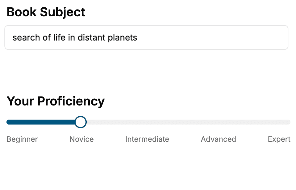
Select the focus of your Web Development book and share your background
- 2. Personalize your book
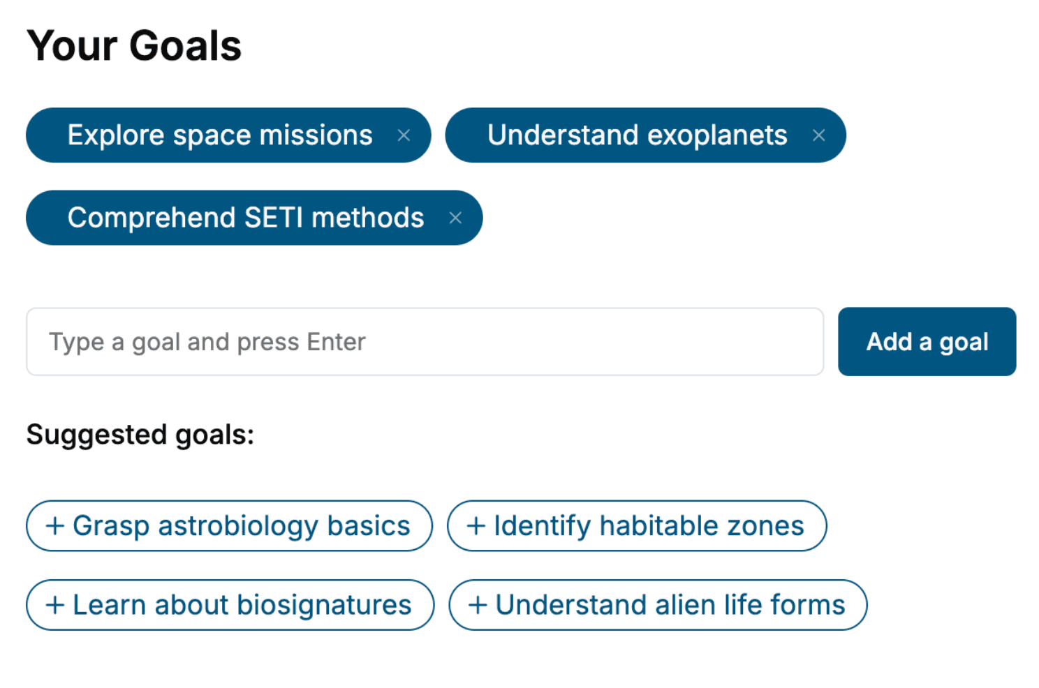
Specify your goals and choose sub-topics to include
- 3. Get your tailored book
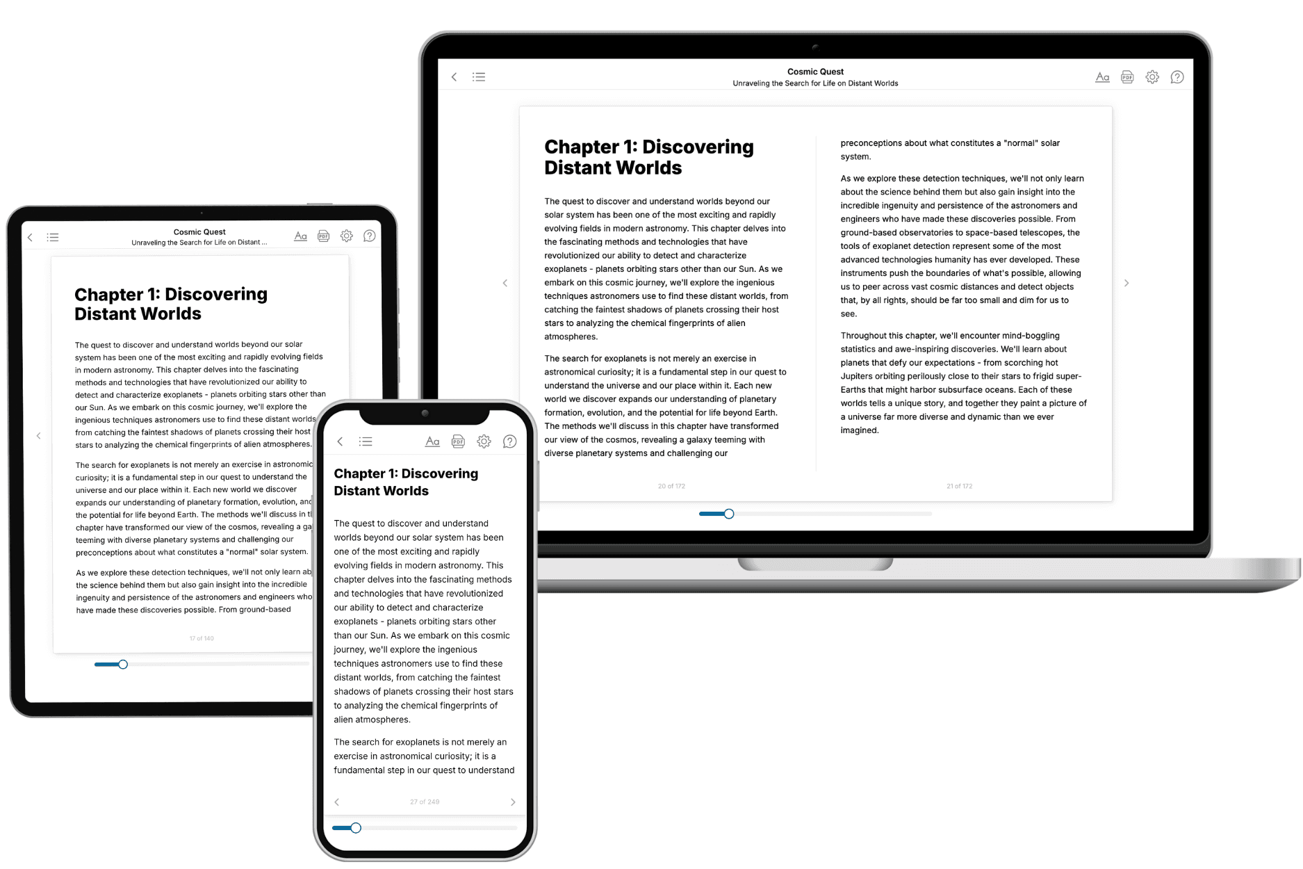
Your book is ready in 10 minutes. Read it online, download as EPUB or PDF, or send to Kindle.
Frequently asked questions
- What is TailoredRead?
TailoredRead creates complete, full-length nonfiction ebooks, written specifically for you. Tell us what you want to learn and why, and TailoredRead writes you a complete ebook on it, with charts, tables, and diagrams throughout. Read it online, on Kindle, or on any e-reader, or download it as a PDF or EPUB. Every book is written fresh the day you order it.
- How is the book tailored to me?
Before anything is written, you answer a few short questions about your goals, your background, and the topics you care about. Your book is then planned around your answers: written at your level, focused on your goals, and covering the topics you chose, instead of the one-size-fits-all book a store sells everyone.
- Will it read like generic AI content?
No. Your book isn't a chat transcript: it's planned chapter by chapter before a single word is written, told in a clear book voice, and explains ideas visually with charts, tables, and diagrams. After writing, every book goes through an editorial pass that polishes chapters so the book reads consistent from start to finish. Judge for yourself: browse thousands of sample books on our Explore Books page.
- How accurate is the content?
Our AI first checks whether your subject needs live research. Niche and fast-moving subjects are researched before writing, and the book plan and chapters are grounded in what it finds. After writing, every book goes through a quality pass that checks its facts and consistency, and researched books list their sources in a Notes section at the back.
- How long is the book?
You choose the length: Comprehensive (250-300 pages), Detailed (150-200 pages), Essential (70-100 pages), or Short (30-50 pages).
- Does the book include visuals?
Yes. Every book includes visual elements such as timelines, checklists, step-by-step guides, decision trees, comparison tables, and matrices, and many include bar charts. A typical book includes dozens of these visual elements.
- Can I read it on Kindle? What formats can I download?
Yes. Every book can be read in our online reader or downloaded as a PDF or EPUB. The EPUB can be opened with Kindle, Apple Books, Kobo, and any e-reader. The Commercial and Author licenses also include an editable Word (DOCX) and Markdown download.
- How much does it cost?
About the price of a regular ebook. The exact price depends on your book's length and complexity, from $2 for the shortest books to $35 for the most comprehensive, and it's shown when you review your book, before you commit to anything. Each book is a one-time purchase, yours to keep, no subscription. Licenses that let you share, teach, or publish your book range from $35.99 to $49.99.
- Can I preview the book before purchasing?
Before you pay, you'll see what your book will cover: the title, a detailed description, the estimated length, and the complete chapter-by-chapter table of contents, so you know what you're getting before you decide. The full text itself is written after you purchase.
- How long does it take to create a book?
About 10 minutes. You can start reading the opening chapters while the rest is still being written.