Bootstrap Navigation Mastery
Crafting Responsive and Dynamic Navbars for Modern Websites
Your journey to becoming a Bootstrap navigation expert starts here.
284 pages14 chaptersFeb 23, 2025Web Development
About this book
This comprehensive guide takes you from the basics of responsive design to advanced techniques in creating dynamic and user-friendly navigation bars. You'll dive deep into the world of Bootstrap's powerful components, learning how to leverage them for seamless user experiences across all devices. As you progress through the book, you'll discover the intricacies of customizing navbars to match your unique design vision. From mobile-first approaches to accessibility considerations, you'll gain the skills to create navigation systems that are both visually appealing and highly functional. By the end of this journey, you'll have the confidence to tackle any navigation challenge. Whether you're building a simple portfolio site or a complex web application, you'll have the tools and knowledge to create responsive navbars that enhance user engagement and elevate your web development projects to new heights.
Table of contents
- IntroductionThe Importance of Responsive Design, Bootstrap: A Brief Overview, The Role of Navigation in User Experience, How This Book Is StructuredRead below
- Chapter 1: Bootstrap FundamentalsIntroduction to Bootstrap, Understanding the Grid System, Responsive Classes in Bootstrap, Overview of Bootstrap Components
- Chapter 2: Navbar EssentialsBasic Navbar Structure, Essential Navbar Components, Implementing Responsive Collapse, Navbar Positioning Options
- Chapter 3: Responsive Design PrinciplesMobile-First Approach, Understanding Breakpoints, Creating Fluid Layouts, Handling Responsive Images in Navbars
- Chapter 4: Customizing Your NavbarImplementing Custom Color Schemes, Typography and Font Customization, Integrating Brand Elements, Using Custom CSS with Bootstrap
- Chapter 5: Advanced Navbar FeaturesImplementing Dropdown Menus, Creating Mega Menus, Adding Search Functionality, Integrating Social Media Links
- Chapter 6: Accessibility in Navigation DesignUsing ARIA Labels and Roles, Implementing Keyboard Navigation, Ensuring Proper Color Contrast, Optimizing for Screen Readers
- Chapter 7: Responsive Navigation PatternsOff-Canvas Navigation, Priority Plus Navigation, Implementing Sticky Navigation, Responsive Tabs and Accordions
- Chapter 8: Performance OptimizationMinifying CSS and JavaScript, Implementing Lazy Loading, Caching Strategies for Faster Load Times, Testing and Measuring Performance
- Chapter 9: JavaScript and BootstrapEvent Handling in Bootstrap Navbars, Creating Custom Animations, Loading Dynamic Content in Navbars, Managing Navbar State with JavaScript
- Chapter 10: Working with Responsive ImagesOptimizing Images for Web, Using srcset and sizes Attributes, Integrating SVG in Navbars, Creating Responsive Background Images
- Chapter 11: Cross-Browser CompatibilityBrowser Testing Strategies, Using Polyfills for Older Browsers, Managing Vendor Prefixes, Implementing Fallback Techniques
- Chapter 12: Best Practices and Common PitfallsNaming Conventions and Organization, Responsive Typography Techniques, Avoiding Common Bootstrap Conflicts, Performance Optimization Tips
- Chapter 13: Real-World Case StudiesBuilding an E-commerce Navbar, Crafting Navigation for a Portfolio Site, Designing a News Portal Menu, Creating an App Dashboard Navigation
- Chapter 14: Future Trends in Responsive NavigationAI-Driven Personalization in Navbars, Voice-Activated Navigation, AR and VR Navigation Concepts, Adapting to Emerging Web Technologies
- Conclusion
- Glossary
- Further Reading
Introduction
Welcome to "Bootstrap Navigation Mastery: Crafting Responsive and Dynamic Navbars for Modern Websites." This comprehensive guide is designed to elevate your web development skills, specifically focusing on creating responsive and user-friendly navigation bars using Bootstrap. As an intermediate front-end developer, you're about to embark on a journey that will transform your approach to building website navigation, ensuring your projects are not only visually appealing but also highly functional across all devices.
In today's digital landscape, the importance of responsive design cannot be overstated. With users accessing websites from a myriad of devices - from smartphones and tablets to desktops and even smart TVs - the ability to create interfaces that adapt seamlessly to different screen sizes is no longer a luxury; it's a necessity. Navigation, being the primary means by which users interact with and explore a website, plays a crucial role in this responsive ecosystem. A well-designed, responsive navbar can significantly enhance user experience, improve engagement, and ultimately contribute to the success of a web project.
Throughout this book, you'll dive deep into the world of Bootstrap, exploring its powerful components and learning how to leverage them to create navigation systems that are both aesthetically pleasing and highly functional. From understanding the basics of responsive design to implementing advanced features and optimizing performance, this guide will equip you with the knowledge and skills to tackle any navigation challenge with confidence.
As we progress, you'll discover how to customize navbars to align with unique design visions, implement accessibility features to ensure inclusivity, and integrate dynamic elements that enhance user interaction. By the end of this journey, you'll have mastered the art of creating responsive navbars that not only meet the demands of modern web development but also elevate your projects to new heights of user engagement and satisfaction.
Let's begin by exploring the core concepts that will form the foundation of your Bootstrap navigation mastery.
The Importance of Responsive Design
Responsive design has become the cornerstone of modern web development, and for good reason. In an era where digital content is consumed on a vast array of devices with varying screen sizes, the ability to create websites that adapt fluidly to different viewports is not just beneficial - it's essential. Responsive design ensures that your website provides an optimal viewing and interaction experience across a wide range of devices, from mobile phones to desktop computers.
The significance of responsive design extends far beyond mere aesthetics. It directly impacts user experience, engagement, and ultimately, the success of a website. Consider these compelling statistics: according to Statista, mobile devices accounted for 54.8% of global website traffic in the first quarter of 2021[1]. This trend underscores the critical need for websites to perform seamlessly on smaller screens. Furthermore, Google has implemented mobile-first indexing, meaning it predominantly uses the mobile version of a site's content for indexing and ranking[2]. This shift in search engine behavior emphasizes the importance of responsive design not just for user experience, but also for search engine optimization (SEO) and overall online visibility.
Responsive design offers numerous benefits that directly contribute to a website's effectiveness and user satisfaction:
- Improved User Experience: By adapting to the user's device, responsive design ensures content is easily readable and navigable without the need for zooming or horizontal scrolling. This seamless experience keeps users engaged and reduces bounce rates.
- Cost-Effectiveness: Instead of maintaining separate websites for desktop and mobile users, responsive design allows for a single, flexible site that works across all devices, reducing development and maintenance costs.
- Better SEO Performance: As mentioned earlier, Google's mobile-first indexing favors responsive websites, potentially leading to improved search engine rankings.
- Increased Conversion Rates: A consistent user experience across devices can lead to higher conversion rates. According to a study by Google, 61% of users are unlikely to return to a mobile site they had trouble accessing, and 40% visit a competitor's site instead[3].
- Future-Proofing: Responsive design principles help ensure your website remains functional and appealing as new devices with different screen sizes enter the market.
When it comes to navigation bars, the principles of responsive design are particularly crucial. The navbar is often the first point of interaction for users, serving as the primary means of exploring and understanding a website's structure. A responsive navbar adapts to different screen sizes, transforming from a full horizontal menu on larger screens to a compact, often collapsible menu on smaller devices. This adaptability ensures that navigation remains intuitive and accessible regardless of the device being used.
Implementing responsive design in navigation requires careful consideration of several factors:
- Layout Flexibility: The navbar must be able to reorganize its elements based on available screen space, often transitioning from a horizontal layout to a vertical or collapsed layout on smaller screens.
- Touch-Friendly Interactions: On mobile devices, navigation elements need to be large enough and spaced appropriately to be easily tapped with a finger.
- Performance Optimization: Responsive navbars should be lightweight and fast-loading, especially on mobile devices where bandwidth may be limited.
- Content Prioritization: As screen real estate becomes limited on smaller devices, it's essential to prioritize the most important navigation items and consider alternative ways to present less critical options.
Throughout this book, you'll learn how to address these considerations using Bootstrap's powerful responsive features. You'll discover techniques for creating navbars that not only look great on all devices but also enhance the overall user experience of your websites. By mastering responsive navigation design, you'll be equipped to create websites that are more accessible, user-friendly, and effective in achieving their goals, whether that's increasing engagement, driving conversions, or simply providing information in the most efficient manner possible.
As we delve deeper into the world of Bootstrap and responsive navigation, keep in mind that the skills you'll acquire are not just about following a set of rules or implementing specific components. They're about understanding the underlying principles of responsive design and learning to apply them creatively to solve real-world design challenges. This knowledge will empower you to create innovative, user-centric navigation solutions that stand out in the crowded digital landscape.
Bootstrap: A Brief Overview
Bootstrap has revolutionized the way web developers approach front-end design and development. Created by Mark Otto and Jacob Thornton at Twitter in 2010, Bootstrap was initially conceived as a framework to ensure consistency across internal tools. It was later released as an open-source project in 2011, and since then, it has grown to become one of the most popular front-end frameworks in the world. As of 2021, Bootstrap is used by approximately 20% of all websites globally, a testament to its versatility and effectiveness[4].
At its core, Bootstrap is a comprehensive toolkit for web development that provides a solid foundation of CSS styles, layout tools, and JavaScript components. It's designed to help developers quickly build responsive, mobile-first projects on the web. The framework's key features include:
- A Responsive Grid System: Bootstrap's 12-column grid system allows for flexible, responsive layouts that adapt to various screen sizes.
- Pre-styled Components: The framework includes a wide range of pre-designed components such as buttons, forms, cards, and navigation elements, which can be easily customized.
- JavaScript Plugins: Bootstrap comes with several JavaScript plugins that add interactive features to websites without requiring extensive coding.
- Customization Options: While Bootstrap provides a consistent base design, it's highly customizable, allowing developers to tailor the look and feel to match specific project requirements.
- Extensive Documentation: Bootstrap offers comprehensive documentation, making it accessible for developers of all skill levels.
One of Bootstrap's greatest strengths is its approach to responsive design. The framework is built on a mobile-first philosophy, ensuring that websites are optimized for smaller screens by default and then scale up for larger devices. This approach aligns perfectly with modern web development practices and user expectations in an increasingly mobile-centric digital landscape.
For navigation design, Bootstrap offers a range of components and utilities that make creating responsive navbars straightforward and efficient. The framework's navbar component is highly flexible, allowing for easy implementation of common navigation patterns while providing the foundation for more complex, custom designs. Some key features of Bootstrap's navigation capabilities include:
- Collapsible Menus: Bootstrap's navbar can automatically collapse into a mobile-friendly menu on smaller screens, typically accessed via a "hamburger" icon.
- Dropdown Menus: The framework supports multi-level dropdown menus, which can be easily integrated into the main navigation structure.
- Positioning Options: Navbars can be fixed to the top or bottom of the viewport, or set to change position as the user scrolls.
- Color Schemes: Bootstrap provides several pre-defined color schemes for navbars, which can be further customized to match brand guidelines.
- Accessibility Features: The framework includes built-in accessibility features, such as proper ARIA attributes, to ensure navigation is usable by all visitors.
While Bootstrap provides these powerful tools out of the box, mastering their use requires understanding not just how to implement them, but when and why to use specific features. Throughout this book, you'll learn to leverage Bootstrap's navigation components effectively, customizing them to create unique, responsive designs that go beyond the basic implementations.
It's worth noting that Bootstrap has evolved significantly since its inception. The latest major version, Bootstrap 5, introduced several important changes and improvements:
- Dropping jQuery Dependency: Bootstrap 5 no longer requires jQuery, relying instead on vanilla JavaScript. This change reduces the framework's overall file size and improves performance.
- Enhanced Grid System: The grid system now includes a new breakpoint and offers more flexibility in responsive layouts.
- Improved Customization: Bootstrap 5 makes it easier to customize default styles without overriding CSS, thanks to an expanded set of Sass variables and maps.
- New Utilities and Components: The framework introduces new utility classes and components, expanding the toolkit available to developers.
As you progress through this book, you'll gain a deep understanding of how to harness Bootstrap's features to create sophisticated, responsive navigation systems. You'll learn not just the mechanics of implementing Bootstrap components, but also the principles behind effective navigation design and how to apply them in real-world scenarios. By mastering Bootstrap's navigation capabilities, you'll be well-equipped to create websites that are not only visually appealing and functionally robust but also optimized for the diverse array of devices used to access the web today.
How This Book Is Structured
"Bootstrap Navigation Mastery" is designed to take you on a comprehensive journey through the world of responsive navbar design using Bootstrap. The book is structured to build your knowledge progressively, starting with fundamental concepts and moving towards more advanced techniques and real-world applications. This approach ensures that you not only learn how to implement Bootstrap's navigation features but also understand the principles behind effective navigation design and how to apply them in various scenarios.
The book is divided into several key sections, each focusing on a crucial aspect of Bootstrap navigation development:
- Bootstrap Fundamentals: This section lays the groundwork for your journey, introducing you to Bootstrap's core concepts, grid system, and component overview. Understanding these basics is crucial for effectively utilizing Bootstrap's navigation features.
- Navbar Essentials: Here, you'll dive into the specifics of Bootstrap's navbar component, learning about its structure, essential elements, and how to implement responsive collapse functionality.
- Responsive Design Principles: This section explores the core principles of responsive design, with a focus on how they apply to navigation. You'll learn about mobile-first approaches, breakpoints, and creating fluid layouts.
- Customization: Discover how to tailor Bootstrap navbars to match your unique design requirements, including custom color schemes, typography, and brand integration.
- Advanced Features: Delve into more sophisticated navbar functionalities, such as dropdown menus, mega menus, and integrating search and social media elements.
- Accessibility: Learn how to ensure your navigation is accessible to all users, covering topics like ARIA labels, keyboard navigation, and optimizing for screen readers.
- Responsive Patterns: Explore various responsive navigation patterns and learn when and how to implement them effectively.
- Performance Optimization: Understand techniques for optimizing your navbars for speed and efficiency, crucial for providing a smooth user experience.
- JavaScript Integration: Discover how to enhance your navbars with dynamic functionality using JavaScript, including custom animations and state management.
- Cross-Browser Compatibility: Learn strategies for ensuring your navigation works consistently across different browsers and devices.
- Best Practices and Common Pitfalls: Gain insights into industry best practices and learn how to avoid common mistakes in navbar design and implementation.
- Real-World Case Studies: Apply your knowledge to practical scenarios through detailed case studies covering various types of websites and applications.
- Future Trends: Look ahead to emerging trends in responsive navigation, preparing you for the future of web development.
Each chapter is designed to be both comprehensive and practical, combining theoretical knowledge with hands-on examples and exercises. You'll find:
- Detailed Explanations: Clear, in-depth explanations of concepts and techniques, ensuring you understand not just the "how" but also the "why" behind each aspect of navbar design.
- Code Examples: Practical, real-world code snippets that you can use and adapt in your own projects. These examples are designed to be clear and easy to understand, even for those newer to Bootstrap.
- Best Practice Tips: Throughout the book, you'll find highlighted tips and best practices drawn from industry experience, helping you avoid common pitfalls and optimize your workflow.
- Exercises and Challenges: Each chapter includes exercises to reinforce your learning and challenges that encourage you to apply your skills creatively.
- Case Studies: Real-world case studies demonstrate how the concepts you've learned can be applied in practical scenarios, giving you insights into problem-solving in actual development situations.
The book is designed to be both a comprehensive learning resource and a practical reference guide. Whether you're reading it cover to cover or dipping into specific sections as needed, you'll find valuable insights and techniques to enhance your Bootstrap navigation skills.
As you progress through the book, you'll build a robust understanding of Bootstrap navigation design, from basic implementations to advanced, customized solutions. By the end, you'll have the skills and knowledge to create responsive, accessible, and visually appealing navbars that enhance the user experience of your websites and web applications.
Remember, the key to mastering any skill is practice. As you work through the book, take the time to experiment with the code examples, complete the exercises, and apply what you've learned to your own projects. Don't be afraid to push the boundaries and try new things – some of the best learning comes from experimentation and even from making mistakes.
Whether you're looking to enhance your current web development skills or aiming to specialize in responsive design, "Bootstrap Navigation Mastery" will provide you with the knowledge and tools you need to excel in creating modern, user-friendly website navigation. Let's embark on this journey to elevate your Bootstrap skills and create exceptional user experiences through masterful navigation design.
Notes
Introduction
- 1. Statista, Percentage of mobile device website traffic worldwide from 1st quarter 2015 to 1st quarter 2021, 2021
- 2. Google Developers, Mobile-first indexing best practices, 2020
- 3. Google, What Users Want Most From Mobile Sites Today, 2012
- 4. W3Techs, Usage statistics of Twitter Bootstrap for websites, 2021
- 5. Nielsen Norman Group, F-Shaped Pattern For Reading Web Content, 2006
- 6. G. Lindgaard and others, "Attention web designers," Behaviour & Information Technology, 2006
- 7. Baymard Institute, 41 Cart Abandonment Rate Statistics, 2021
This is the end of the free sample. The full book has 14 chapters.
Want this book written for you?
Tell us your goals and background, and get your own version of this book, tailored by AI to you.


Benefits of AI-tailored books
- Read one book, not ten:
- all the Web Development knowledge you need, gathered into a single book.
- Save days of learning:
- tell us your goals, choose your topics, and the whole book is built around them.
- Learn effortlessly:
- Web Development book written for your specific background and expertise.
- Understand at a glance:
- includes charts, tables, timelines, checklists, decision trees, and more.
- Stay current:
- written the day you order it, not years ago.
- Trust what you read:
- every book is checked for accuracy, with real research when your subject needs it.
Create your unique book in 3 steps
- 1. Select your focus
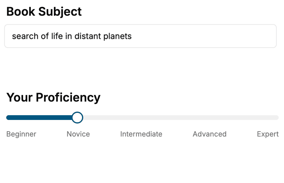
Select the focus of your Web Development book and share your background
- 2. Personalize your book
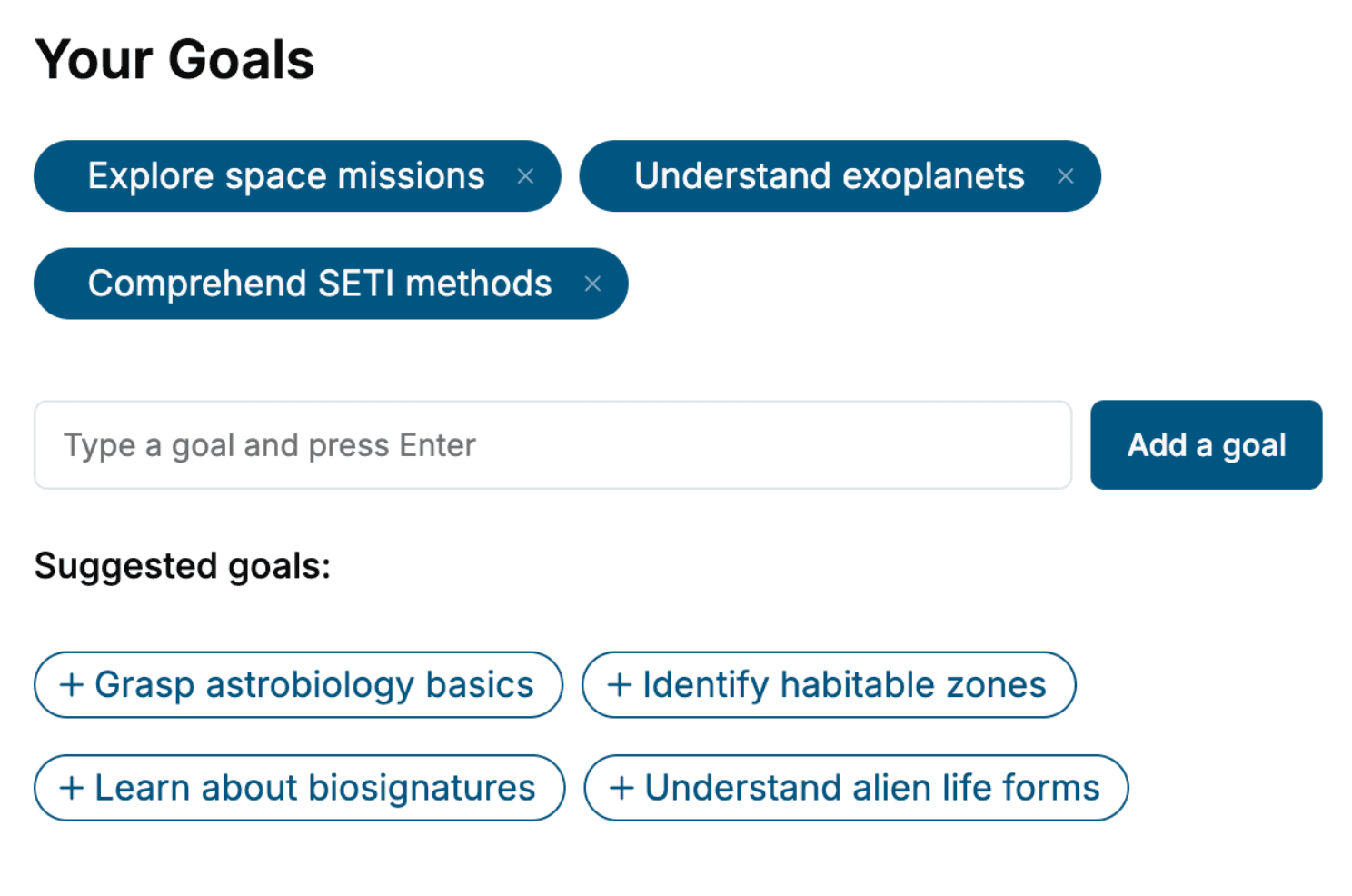
Specify your goals and choose sub-topics to include
- 3. Get your tailored book
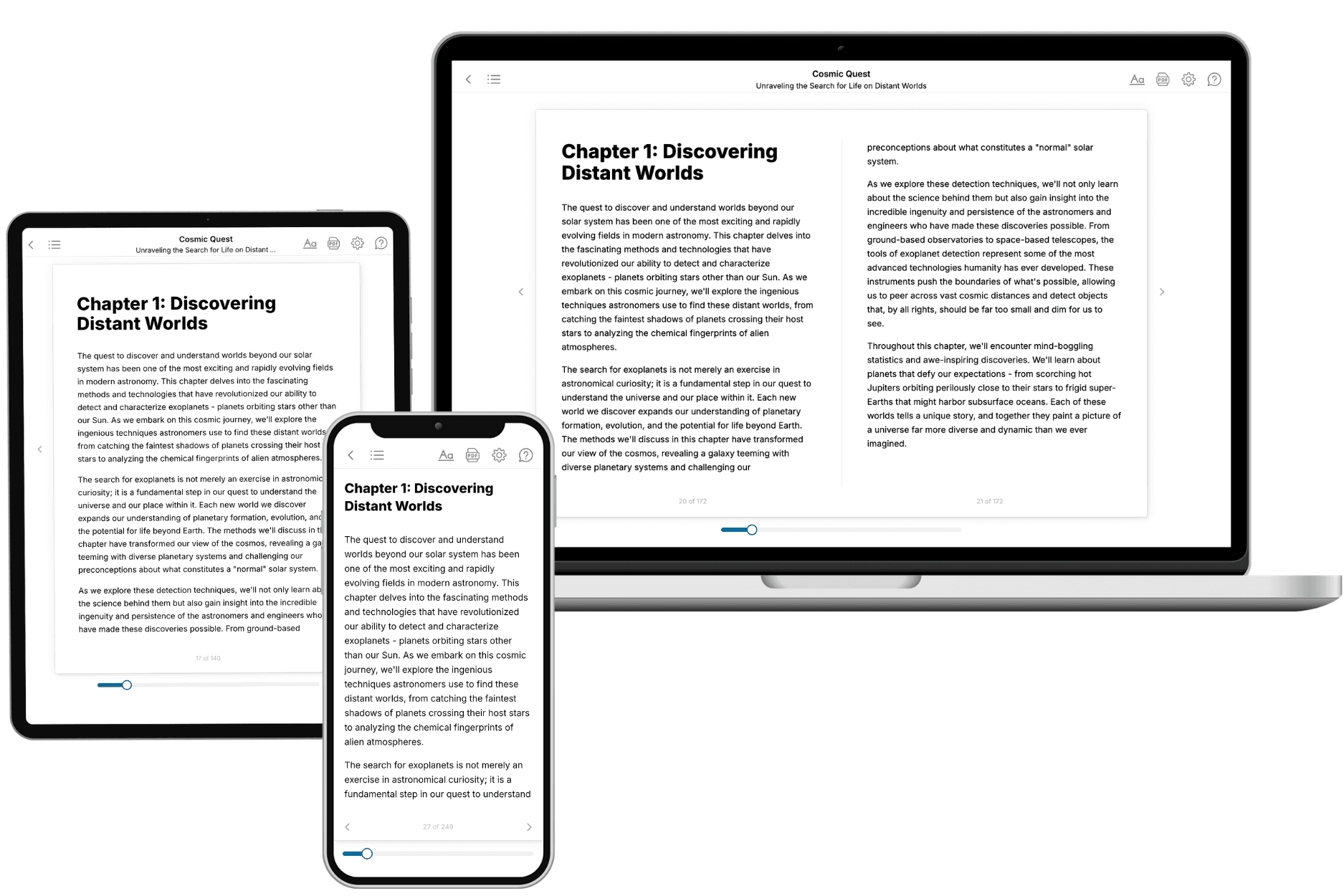
Your book is ready in 10 minutes. Read it online, download as EPUB or PDF, or send to Kindle.
Frequently asked questions
- What is TailoredRead?
TailoredRead creates complete, full-length nonfiction ebooks, written specifically for you. Tell us what you want to learn and why, and TailoredRead writes you a complete ebook on it, with charts, tables, and diagrams throughout. Read it online, on Kindle, or on any e-reader, or download it as a PDF or EPUB. Every book is written fresh the day you order it.
- How is the book tailored to me?
Before anything is written, you answer a few short questions about your goals, your background, and the topics you care about. Your book is then planned around your answers: written at your level, focused on your goals, and covering the topics you chose, instead of the one-size-fits-all book a store sells everyone.
- Will it read like generic AI content?
No. Your book isn't a chat transcript: it's planned chapter by chapter before a single word is written, told in a clear book voice, and explains ideas visually with charts, tables, and diagrams. After writing, every book goes through an editorial pass that polishes chapters so the book reads consistent from start to finish. Judge for yourself: browse thousands of sample books on our Explore Books page.
- How accurate is the content?
Our AI first checks whether your subject needs live research. Niche and fast-moving subjects are researched before writing, and the book plan and chapters are grounded in what it finds. After writing, every book goes through a quality pass that checks its facts and consistency, and researched books list their sources in a Notes section at the back.
- How long is the book?
You choose the length: Comprehensive (250-300 pages), Detailed (150-200 pages), Essential (70-100 pages), or Short (30-50 pages).
- Does the book include visuals?
Yes. Every book includes charts, tables, and diagrams: timelines, checklists, step-by-step guides, decision trees, comparison tables, matrices, and bar charts. A typical book includes dozens of these visual elements.
- Can I read it on Kindle? What formats can I download?
Yes. Every book can be read in our online reader or downloaded as a PDF or EPUB. The EPUB can be opened with Kindle, Apple Books, Kobo, and any e-reader. The Commercial and Author licenses also include an editable Word (DOCX) and Markdown download.
- How much does it cost?
About the price of a regular ebook. The exact price depends on your book's length and complexity, from $2 for the shortest books to $35 for the most comprehensive, and it's shown when you review your book, before you commit to anything. Each book is a one-time purchase, yours to keep, no subscription. Licenses that let you share, teach, or publish your book range from $35.99 to $49.99.
- Can I preview the book before purchasing?
Before you pay, you'll see what your book will cover: the title, a detailed description, the estimated length, and the complete chapter-by-chapter table of contents, so you know what you're getting before you decide. The full text itself is written after you purchase.
- How long does it take to create a book?
About 10 minutes. You can start reading the opening chapters while the rest is still being written.