Responsive Tables in Bootstrap
Fluid data grids that adapt cleanly to every screen size
Struggling with unresponsive, clunky tables that break your carefully crafted layouts?
253 pages13 chaptersJan 17, 2025Web Development
About this book
Say goodbye to table troubles and hello to sleek, mobile-friendly designs. "Bootstrap Responsive Tables" is your comprehensive guide to creating fluid and adaptive data presentations that work seamlessly across all devices. This book takes you on a deep dive into the world of Bootstrap's table components and responsive utilities. You'll learn how to transform static, overflow-prone tables into dynamic, user-friendly data displays that adapt effortlessly to any screen size. From basic responsive techniques to advanced customization strategies, you'll discover how to leverage Bootstrap's powerful features to present your data with clarity and style. By the time you finish this book, you'll have the skills to create stunning, responsive tables that enhance your web applications and impress your users. Whether you're building data-heavy dashboards or simple product listings, you'll be equipped with the knowledge to tackle any table challenge with confidence.
Table of contents
- IntroductionThe Importance of Responsive Design in Modern Web Development, Challenges in Table Design for Multiple Devices, Bootstrap as a Solution for Responsive Tables, What You'll Learn in This BookRead below
- Chapter 1: Bootstrap Basics for Responsive DesignIntroduction to Bootstrap, Understanding the Grid System, Responsive Utilities in Bootstrap, The Mobile-First Approach
- Chapter 2: Table Fundamentals in BootstrapBasic Table Structure, Essential Table Classes, Customizing Table Appearance, Table Variants and Contextual Classes
- Chapter 3: Introduction to Responsive TablesChallenges of Making Tables Responsive, Bootstrap's Responsive Table Options, Using the Responsive Wrapper, Implementing Horizontal Scroll for Wide Tables
- Chapter 4: Data Presentation StrategiesPrioritizing Content for Small Screens, Techniques for Column Hiding and Revealing, Stacking Data Vertically on Mobile, Responsive Typography for Tables
- Chapter 5: Advanced Responsive Table TechniquesCreating Custom Breakpoints, Handling Nested Tables Responsively, Responsive Design for Complex Table Headers, Transforming Tables into Cards on Mobile
- Chapter 6: CSS Customization for Responsive TablesWriting Custom CSS for Tables, Leveraging Media Queries for Responsiveness, Integrating Sass for Efficient Styling, Adding Animations and Transitions
- Chapter 7: JavaScript Enhancements for Responsive TablesDynamic Content Loading, Implementing Sorting and Filtering, Creating Responsive Pagination, Managing Table State Across Devices
- Chapter 8: Accessibility Considerations for Responsive TablesUsing Semantic Markup, Implementing ARIA Attributes, Ensuring Keyboard Navigation, Optimizing for Screen Readers
- Chapter 9: Performance Optimization for Responsive TablesImplementing Lazy Loading, Code Splitting for Table Components, Minimizing Reflows and Repaints, Caching Strategies for Table Data
- Chapter 10: Integrating Responsive Tables with Other Bootstrap ComponentsTables in Modal Windows, Responsive Tables in Tab Panels, Combining Tables with Accordions, Table Data in Responsive Navbars
- Chapter 11: Testing and Debugging Responsive TablesCross-Browser Testing Strategies, Testing on Various Devices and Screen Sizes, Using Browser Developer Tools for Debugging, Implementing Automated Tests for Responsiveness
- Chapter 12: Real-World Case StudiesResponsive Product Tables for E-commerce, Data-Heavy Dashboard Tables, Creating Responsive Comparison Tables, Responsive Scheduling and Calendar Tables
- Chapter 13: Future Trends in Responsive Table DesignEmerging Technologies and Their Impact, Evolving Design Patterns for Data Presentation, Upcoming Bootstrap Features for Tables, Strategies for Staying Updated in the Field
- ConclusionKey Takeaways, Next Steps in Your Responsive Design Journey
- AppendixAdditional Resources and Tools, Bootstrap Responsive Table Cheat Sheet
Introduction
In the ever-evolving landscape of web development, the ability to create responsive and adaptable designs has become not just a desirable skill, but an essential one. As the variety of devices used to access the internet continues to expand, from smartphones and tablets to desktop computers and even smart TVs, the challenge of presenting information in a clear, accessible, and visually appealing manner across all these platforms has grown exponentially. This challenge is particularly acute when it comes to displaying tabular data, which has traditionally been one of the most difficult elements to make truly responsive.
Tables are a fundamental component of web design, used to organize and present complex data in a structured format. However, their rigid structure often conflicts with the fluid nature of responsive design. The horizontal space required to display a table comfortably on a desktop screen is simply not available on a smartphone, leading to issues such as horizontal scrolling, tiny unreadable text, or broken layouts. These problems can significantly degrade the user experience, potentially driving visitors away from your site or application.
This is where Bootstrap, one of the most popular front-end frameworks, comes into play. Bootstrap provides a robust set of tools and utilities specifically designed to tackle the challenges of responsive web design, including those posed by tables. By leveraging Bootstrap's responsive table features, developers can create data presentations that automatically adjust to different screen sizes, ensuring that information remains accessible and visually coherent across all devices.
Throughout this book, you'll embark on a journey to master the art of creating responsive tables using Bootstrap. Whether you're building a data-heavy dashboard, an e-commerce product listing, or a simple scheduling application, the skills you'll acquire will enable you to present your data with clarity and style, regardless of the device your users prefer. From understanding the fundamental principles of responsive design to implementing advanced customization techniques, this book will equip you with the knowledge and tools to tackle any table-related challenge in your web development projects.
The Importance of Responsive Design in Modern Web Development
Responsive design has become a cornerstone of modern web development, and for good reason. In an age where users access websites and applications from a myriad of devices with varying screen sizes and resolutions, creating a consistent and user-friendly experience across all these platforms is crucial. Responsive design is not just about making a website look good on different devices; it's about providing an optimal viewing and interaction experience with minimal resizing, panning, and scrolling, regardless of the device being used.
The importance of responsive design is underscored by several key factors. First and foremost is the dramatic shift in user behavior over the past decade. Mobile internet usage has surpassed desktop usage, with over 54.8% of global website traffic coming from mobile devices as of 2021[1]. This trend shows no signs of slowing down, making it imperative for developers to prioritize mobile-friendly designs.
Search engines, particularly Google, have also recognized the importance of mobile-friendly websites. In 2015, Google updated its algorithm to give preference to mobile-friendly sites in search results, a change colloquially known as "Mobilegeddon"[2]. This update, and subsequent ones, have made responsive design not just a user experience consideration, but also a critical factor in search engine optimization (SEO).
From a business perspective, responsive design can lead to increased engagement and conversion rates. A study by Google found that 61% of users are unlikely to return to a mobile site they had trouble accessing, and 40% visit a competitor's site instead[3]. By providing a seamless experience across all devices, you can reduce bounce rates, increase time on site, and ultimately drive more conversions.
Responsive design also offers significant benefits in terms of maintenance and cost-effectiveness. Instead of maintaining separate versions of a website for desktop and mobile users, a responsive design allows for a single codebase that adapts to different screen sizes. This not only reduces development and maintenance costs but also ensures consistency across all platforms.
In the context of table design, the importance of responsiveness becomes even more pronounced. Tables are often used to present complex data sets, financial information, product comparisons, and other critical information. If these tables are not responsive, they can become virtually unusable on smaller screens, potentially leading to frustrated users and lost opportunities. By implementing responsive table designs, you ensure that your data remains accessible and comprehensible, regardless of the device being used to view it.
As we delve deeper into the world of responsive table design using Bootstrap, keep in mind that the skills you'll be learning are not just about creating visually appealing layouts. They're about improving user experience, enhancing accessibility, boosting SEO performance, and ultimately contributing to the overall success of your web projects. The ability to create truly responsive designs, particularly when it comes to challenging elements like tables, is a skill that will set you apart as a web developer and provide immense value to your projects and clients.
Challenges in Table Design for Multiple Devices
Designing tables that work effectively across multiple devices presents a unique set of challenges that can test even the most experienced web developers. The inherent structure of tables, with their rows and columns, is fundamentally at odds with the fluid, adaptable nature of responsive design. This conflict gives rise to several specific challenges that must be addressed to create truly responsive table designs.
One of the primary challenges is dealing with horizontal overflow. Tables are often designed to display a significant amount of data in a structured format, which can lead to tables that are wider than the viewport on smaller devices. This results in horizontal scrolling, which can be frustrating for users and disrupt the flow of information. According to a study by the Nielsen Norman Group, horizontal scrolling is one of the most significant usability issues on mobile devices, with users often missing content that requires scrolling sideways[4].
Another major challenge is maintaining readability and legibility across different screen sizes. As the viewport narrows, the text and data within table cells can become compressed, leading to tiny, unreadable text. This is particularly problematic for tables with many columns or complex data sets. A study by MIT age lab found that font sizes below 12 pixels can significantly reduce reading speed and comprehension, especially on mobile devices[5]. Balancing the need for comprehensive data presentation with readability on smaller screens is a delicate act that requires careful consideration and design.
Data prioritization presents another significant challenge in responsive table design. On larger screens, it's possible to display a wide range of data points simultaneously. However, on smaller screens, decisions must be made about which data is most critical and should be displayed prominently, and which can be hidden or accessed through additional interactions. This process of data triage can be complex and often requires a deep understanding of user needs and behaviors across different devices.
Maintaining context and relationships between data points is also challenging when adapting tables for smaller screens. In a traditional table layout, the relationships between data in different columns are clear due to their horizontal alignment. However, when tables are restructured for mobile viewing (for example, by stacking rows vertically), these relationships can become less apparent. Ensuring that users can still understand the connections between different data points is crucial for effective information communication.
Accessibility is another critical consideration that becomes more complex in responsive table design. Tables often rely on visual cues to convey information hierarchy and relationships. When these visual structures are altered for responsive layouts, care must be taken to ensure that the semantic structure of the table is maintained and that screen readers and other assistive technologies can still accurately interpret and convey the information. The Web Content Accessibility Guidelines (WCAG) provide specific recommendations for making tables accessible, but implementing these in a responsive context can be challenging[6].
Performance considerations also come into play when designing responsive tables. Complex table structures with many rows and columns can lead to increased page load times and reduced performance, especially on mobile devices with limited processing power and potentially slower network connections. A study by Google found that 53% of mobile site visits are abandoned if pages take longer than 3 seconds to load[7]. Balancing comprehensive data presentation with performance optimization is a key challenge in responsive table design.
Lastly, the challenge of cross-browser and cross-device compatibility cannot be overstated. Different browsers and devices may interpret and render CSS and HTML differently, leading to inconsistencies in how tables are displayed. Ensuring that your responsive table designs work consistently across a wide range of browsers, operating systems, and devices requires extensive testing and often necessitates the use of polyfills or fallback solutions.
These challenges in responsive table design underscore the complexity of creating truly adaptable and user-friendly data presentations. However, they also highlight the importance of mastering these skills. By learning to overcome these challenges, you'll be able to create table designs that not only look great but also provide an optimal user experience across all devices. As we progress through this book, we'll explore strategies and techniques for addressing each of these challenges, equipping you with the tools you need to create effective responsive tables using Bootstrap.
Bootstrap as a Solution for Responsive Tables
In the face of the numerous challenges presented by responsive table design, Bootstrap emerges as a powerful and versatile solution. Developed by Twitter and released as an open-source project in 2011, Bootstrap has since become one of the most popular front-end frameworks, boasting over 152,000 stars on GitHub as of 2021[8]. Its popularity stems from its comprehensive set of pre-built components and utilities that significantly streamline the process of creating responsive, mobile-first websites and applications.
Bootstrap's approach to responsive design is based on a flexible grid system, responsive utilities, and a suite of pre-styled components that automatically adapt to different screen sizes. When it comes to tables specifically, Bootstrap offers a range of classes and utilities that address many of the common challenges we've discussed, making it an excellent choice for developers looking to create responsive table designs efficiently.
One of the key features Bootstrap provides for responsive tables is the .table-responsive class. When applied to a table or its container, this class enables horizontal scrolling for tables on small devices (under 768px wide), while allowing the table to display normally on larger screens. This simple solution addresses the challenge of horizontal overflow without requiring complex custom CSS or JavaScript. For more granular control, Bootstrap also offers responsive classes like .table-responsive-sm, .table-responsive-md, and so on, allowing you to specify at which breakpoints the table should become scrollable.
Bootstrap also provides a range of table styling options that can enhance readability across different devices. Classes like .table-striped, .table-hover, and .table-bordered can be used to improve visual distinction between rows and columns, making it easier for users to track data across the table. These styles are designed to work responsively, adapting to different screen sizes while maintaining their visual enhancements.
To address the challenge of maintaining context in responsive layouts, Bootstrap offers utilities that can be used to reorder or hide columns based on screen size. By combining these utilities with custom CSS, it's possible to create table layouts that prioritize the most important data on smaller screens while still providing access to all information. This approach aligns with the concept of progressive enhancement, ensuring that the core content is always accessible while providing a richer experience on devices that can support it.
Bootstrap's grid system, while not specifically designed for tables, can be leveraged to create custom responsive layouts for tabular data. By using grid classes within table cells, it's possible to create complex layouts that adapt smoothly to different screen sizes. This flexibility allows for creative solutions to the challenge of data prioritization and presentation on smaller screens.
In terms of accessibility, Bootstrap follows WCAG 2.0 guidelines and provides ARIA attributes for many of its components. While tables require careful consideration to ensure they remain accessible when made responsive, Bootstrap's approach to semantic HTML and its built-in accessibility features provide a solid foundation for creating accessible table designs.
Performance is another area where Bootstrap shines. The framework is designed to be modular, allowing developers to include only the components and utilities they need. This helps to keep file sizes small and improves load times, which is particularly important for mobile users. Additionally, Bootstrap's CSS is written with performance in mind, using efficient selectors and avoiding overly specific rules that can slow down rendering.
Cross-browser compatibility is a core focus of Bootstrap. The framework is extensively tested across a wide range of browsers and devices, helping to ensure consistent behavior of responsive components, including tables. This can significantly reduce the time and effort required for cross-browser testing and debugging.
Perhaps one of the most significant advantages of using Bootstrap for responsive table design is the extensive community and ecosystem that has grown around the framework. This community has produced a wealth of resources, including third-party plugins, extensions, and templates that can further enhance Bootstrap's table capabilities. For example, plugins like DataTables build on Bootstrap's foundation to provide advanced features like sorting, filtering, and pagination, all while maintaining responsiveness.
While Bootstrap provides a robust set of tools for creating responsive tables, it's important to note that it's not a magic solution that will automatically solve all responsive design challenges. Effective use of Bootstrap for responsive tables still requires a solid understanding of responsive design principles, careful planning, and often custom CSS and JavaScript to achieve the desired results. However, by providing a consistent and well-documented set of tools and utilities, Bootstrap significantly reduces the complexity of responsive table design and allows developers to focus on solving the unique challenges of their specific projects.
As we progress through this book, we'll explore in detail how to leverage Bootstrap's features to create responsive tables that are not only functional and accessible but also visually appealing and user-friendly across all devices. By mastering these techniques, you'll be well-equipped to tackle even the most complex table design challenges in your web development projects.
What You'll Learn in This Book
This book is designed to take you on a comprehensive journey through the world of responsive table design using Bootstrap. Whether you're a beginner looking to understand the basics of responsive design or an experienced developer seeking to enhance your skills with Bootstrap's table components, this book has something to offer. Here's an overview of what you can expect to learn as you progress through the chapters:
We'll start by laying a solid foundation with an in-depth look at Bootstrap basics for responsive design. You'll gain a thorough understanding of Bootstrap's grid system, which is fundamental to creating responsive layouts. We'll explore responsive utilities that Bootstrap provides, and delve into the mobile-first approach that underpins effective responsive design. This knowledge will serve as the bedrock for all the table-specific techniques we'll cover later.
Next, we'll dive into table fundamentals in Bootstrap. You'll learn about the basic structure of tables in HTML and how Bootstrap enhances this with its own classes. We'll cover essential table classes that Bootstrap provides, explore ways to customize table appearance, and look at table variants and contextual classes that can be used to convey meaning through color and styles.
With this foundation in place, we'll move on to the core of responsive table design. You'll learn about the challenges specific to making tables responsive and explore Bootstrap's built-in options for addressing these challenges. We'll cover techniques like using responsive wrappers and implementing horizontal scrolling for wide tables on small screens.
As we progress, we'll delve into more advanced topics. You'll learn strategies for data presentation, including how to prioritize content for small screens, techniques for hiding and revealing columns based on screen size, and methods for stacking data vertically on mobile devices. We'll also explore how to apply responsive typography principles to ensure your table text remains readable across all devices.
The book will then take you into the realm of advanced responsive table techniques. You'll learn how to create custom breakpoints to fine-tune your table's responsiveness, handle nested tables responsively, design complex table headers that adapt to different screen sizes, and even transform tables into card-like layouts on mobile devices for improved usability.
To give you full control over your table designs, we'll cover CSS customization techniques. You'll learn how to write custom CSS to enhance Bootstrap's built-in styles, leverage media queries for more precise control over responsiveness, and integrate Sass to streamline your styling workflow. We'll also explore how to add animations and transitions to your tables for a more dynamic user experience.
Recognizing that modern web development often requires more than just HTML and CSS, we'll dedicate a chapter to JavaScript enhancements for responsive tables. You'll learn techniques for dynamically loading table content, implementing sorting and filtering functionality that works across devices, creating responsive pagination, and managing table state as users switch between devices.
Accessibility is a crucial consideration in web design, and tables present unique accessibility challenges. We'll cover how to use semantic markup to improve table accessibility, implement ARIA attributes for better screen reader support, ensure keyboard navigation works smoothly, and optimize your tables for various assistive technologies.
Performance is another critical factor in responsive design, especially when dealing with large data sets. You'll learn techniques for optimizing the performance of your responsive tables, including implementing lazy loading for large data sets, using code splitting to reduce initial load times, minimizing reflows and repaints to improve rendering performance, and implementing effective caching strategies for table data.
To provide a holistic view of responsive table design, we'll explore how to integrate responsive tables with other Bootstrap components. You'll learn how to effectively use tables within modal windows, tab panels, and accordions, as well as how to incorporate table data into responsive navbars.
Testing and debugging are essential skills for any web developer, and responsive design adds extra complexity to this process. We'll cover strategies for cross-browser testing, techniques for testing on various devices and screen sizes, how to use browser developer tools effectively for debugging responsive layouts, and even touch on implementing automated tests for responsiveness.
To bring all this knowledge together, we'll examine real-world case studies. You'll see how to apply the techniques you've learned to create responsive product tables for e-commerce sites, data-heavy dashboard tables, responsive comparison tables, and scheduling and calendar tables that work across all devices.
Finally, we'll look to the future of responsive table design. We'll explore emerging technologies and their potential impact on table design, discuss evolving design patterns for data presentation, look at upcoming Bootstrap features that may affect table design, and provide strategies for staying updated in this rapidly evolving field.
By the end of this book, you'll have a comprehensive understanding of how to create responsive tables using Bootstrap. You'll be equipped with the knowledge and skills to tackle complex table design challenges, optimize performance, ensure accessibility, and create user-friendly data presentations that work seamlessly across all devices. Whether you're building a simple product listing or a complex data dashboard, you'll have the tools you need to create responsive table designs that enhance the user experience and contribute to the success of your web projects.
Notes
Introduction
- 1. Statista, Percentage of mobile device website traffic worldwide from 1st quarter 2015 to 1st quarter 2021, 2021
- 2. Google Developers, Rolling out the mobile-friendly update, 2015
- 3. Google, What Users Want Most From Mobile Sites Today, 2012
- 4. Nielsen Norman Group, Mobile Usability Update, 2011
- 5. MIT AgeLab, Age-Related Differences in Reading with Digital Devices, 2013
- 6. W3C, Web Content Accessibility Guidelines (WCAG) 2.1, 2018
- 7. Google, Find out how you stack up to new industry benchmarks for mobile page speed, 2018
- 8. GitHub, twbs/bootstrap repository, 2021
This is the end of the free sample. The full book has 13 chapters.
Want this book written for you?
Tell us your goals and background, and get your own version of this book, tailored by AI to you.


Benefits of AI-tailored books
- Read one book, not ten:
- all the Web Development knowledge you need, gathered into a single book.
- Save days of learning:
- tell us your goals, choose your topics, and the whole book is built around them.
- Learn effortlessly:
- Web Development book written for your specific background and expertise.
- Understand at a glance:
- includes charts, tables, timelines, checklists, decision trees, and more.
- Stay current:
- written the day you order it, not years ago.
- Trust what you read:
- every book is checked for accuracy, with real research when your subject needs it.
Create your unique book in 3 steps
- 1. Select your focus
Select the focus of your Web Development book and share your background
- 2. Personalize your book
Specify your goals and choose sub-topics to include
- 3. Get your tailored book
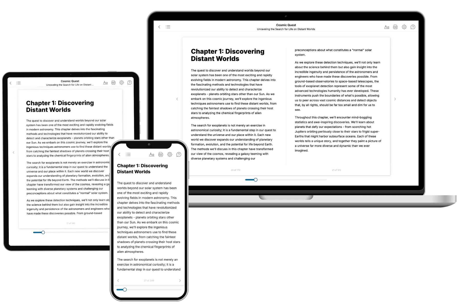
Your book is ready in 10 minutes. Read it online, download as EPUB or PDF, or send to Kindle.
Frequently asked questions
- What is TailoredRead?
TailoredRead creates complete, full-length nonfiction ebooks, written specifically for you. Tell us what you want to learn and why, and TailoredRead writes you a complete ebook on it, with charts, tables, and diagrams throughout. Read it online, on Kindle, or on any e-reader, or download it as a PDF or EPUB. Every book is written fresh the day you order it.
- How is the book tailored to me?
Before anything is written, you answer a few short questions about your goals, your background, and the topics you care about. Your book is then planned around your answers: written at your level, focused on your goals, and covering the topics you chose, instead of the one-size-fits-all book a store sells everyone.
- Will it read like generic AI content?
No. Your book isn't a chat transcript: it's planned chapter by chapter before a single word is written, told in a clear book voice, and explains ideas visually with charts, tables, and diagrams. After writing, every book goes through an editorial pass that polishes chapters so the book reads consistent from start to finish. Judge for yourself: browse thousands of sample books on our Explore Books page.
- How accurate is the content?
Our AI first checks whether your subject needs live research. Niche and fast-moving subjects are researched before writing, and the book plan and chapters are grounded in what it finds. After writing, every book goes through a quality pass that checks its facts and consistency, and researched books list their sources in a Notes section at the back.
- How long is the book?
You choose the length: Comprehensive (250-300 pages), Detailed (150-200 pages), Essential (70-100 pages), or Short (30-50 pages).
- Does the book include visuals?
Yes. Every book includes charts, tables, and diagrams: timelines, checklists, step-by-step guides, decision trees, comparison tables, matrices, and bar charts. A typical book includes dozens of these visual elements.
- Can I read it on Kindle? What formats can I download?
Yes. Every book can be read in our online reader or downloaded as a PDF or EPUB. The EPUB can be opened with Kindle, Apple Books, Kobo, and any e-reader. The Commercial and Author licenses also include an editable Word (DOCX) and Markdown download.
- How much does it cost?
About the price of a regular ebook. The exact price depends on your book's length and complexity, from $2 for the shortest books to $35 for the most comprehensive, and it's shown when you review your book, before you commit to anything. Each book is a one-time purchase, yours to keep, no subscription. Licenses that let you share, teach, or publish your book range from $35.99 to $49.99.
- Can I preview the book before purchasing?
Before you pay, you'll see what your book will cover: the title, a detailed description, the estimated length, and the complete chapter-by-chapter table of contents, so you know what you're getting before you decide. The full text itself is written after you purchase.
- How long does it take to create a book?
About 10 minutes. You can start reading the opening chapters while the rest is still being written.