Building Elevation Design
A Creative Coloring Guide to Architectural Facades and Exterior Aesthetics
Imagine being able to visualize architectural designs with confidence, understanding exactly how color, material, and form work together to create stunning building facades.
207 pages9 chaptersMar 2, 2026Architecture
About this book
This coloring book transforms the study of building elevation design from abstract theory into tangible, creative practice. Whether you're a design student, architect, or architecture enthusiast, you'll explore the fundamental principles that make buildings visually compelling—proportion, rhythm, balance, and material expression. Each carefully curated elevation drawing invites you to experiment with color palettes, material textures, and design variations while learning how professional architects approach facade design. Through guided coloring activities, you'll discover how different styles—classical, modern, sustainable, and contemporary—solve the challenge of creating beautiful, functional building exteriors. This book bridges the gap between understanding elevation design theory and applying it creatively, making architectural concepts accessible and engaging through the meditative practice of coloring.
Table of contents
- IntroductionWhy Building Elevation Design Matters, How Coloring Deepens Your Design Understanding, How to Use This Book, Materials and Coloring TipsRead below
- Chapter 1: Fundamentals of Building Elevation DesignWhat Is a Building Elevation?, Types of Elevations and Their Functions, Key Components of Building Facades, Coloring Exercise: Basic Elevation Elements
- Chapter 2: Proportion, Scale, and RhythmUnderstanding Proportion in Facades, Scale and Human Perception, Creating Visual Rhythm Through Repetition, Coloring Exercise: Rhythm and Pattern Exploration
- Chapter 3: Color and Material ExpressionColor Theory in Architectural Design, Material Palettes and Texture Representation, How Color Influences Perception and Emotion, Coloring Exercise: Material and Color Combinations
- Chapter 4: Classical and Traditional Elevation StylesClassical Architecture and Symmetry, Ornamental Details and Embellishment, Coloring Exercise: Classical Facade Design
- Chapter 5: Modern and Contemporary Elevation DesignModernist Principles and Minimalism, Contemporary Design Strategies and Innovation, Coloring Exercise: Modern Facade Exploration
- Chapter 6: Light, Shadow, and DepthHow Light and Shadow Shape Perception, Creating Depth and Dimension on Facades, Rendering Texture and Surface Quality, Coloring Exercise: Light and Shadow Effects
- Chapter 7: Sustainable and Green Elevation DesignSustainable Material Choices, Green Walls, Vegetation, and Living Facades, Elevation Design for Energy Efficiency, Coloring Exercise: Sustainable Facade Design
- Chapter 8: Context and Urban IntegrationDesigning Elevations Within Urban Context, Balancing Innovation with Neighborhood Character, Coloring Exercise: Contextual Elevation Design
- Chapter 9: Advanced Elevation Techniques and ExperimentationCombining Multiple Materials and Textures, Dynamic Forms and Sculptural Facades, Coloring Exercise: Complex Elevation Design
- ConclusionYour Elevation Design Journey, Continuing Your Creative Practice
- Glossary of Architectural Terms
- Further Reading and Resources
Introduction
Every building tells a story before you ever step inside. The way a facade is composed, the materials chosen, the rhythm of windows across a wall, the play of shadow on a textured surface — all of these elements communicate something about the building's purpose, its era, and the values of the people who designed it. Building elevation design is, at its core, a visual language. Learning to read and speak that language fluently is one of the most rewarding skills any architecture enthusiast, design student, or creative professional can develop.
This book takes a different approach to learning that language. Rather than presenting elevation design as a purely academic subject filled with technical diagrams and dense theory, it invites you to engage with architectural concepts through the hands-on, meditative practice of coloring. Each chapter pairs focused design knowledge with carefully drawn elevation illustrations that you can bring to life with color, texture, and material choices. The act of coloring is not just a creative exercise — it is a powerful learning tool that forces you to make real design decisions and observe their consequences directly on the page.
Whether you are a student working through your first architecture courses, a professional looking to sharpen your visual intuition, or simply someone who loves buildings and wants to understand them more deeply, this book meets you where you are. The concepts build progressively, starting with the fundamentals of what an elevation actually is and moving through proportion, color theory, historical styles, light and shadow, sustainability, and advanced compositional techniques. By the time you reach the final chapter, you will have developed a richer, more confident eye for facade design — and a portfolio of colored elevations that reflect your own creative sensibility.
Think of this book as a studio companion. It is not meant to be read passively on a couch and set aside. It is meant to be used at a desk or table, with your coloring tools nearby, your curiosity engaged, and your willingness to experiment fully switched on. Some of your color choices will work beautifully. Others will teach you something unexpected. Both outcomes are equally valuable. Architecture is learned by doing, and this book gives you a safe, enjoyable space to do exactly that.
Why Building Elevation Design Matters
A building's elevation is the face it presents to the world. It is the first thing a passerby sees, the image that gets photographed and shared, and the visual element that most directly shapes how a neighborhood feels to the people who live and work in it. Elevation design is not a superficial concern — it has real consequences for how cities look, how communities feel, and how buildings age over time. Understanding it is essential for anyone who wants to engage seriously with the built environment.
Historically, architects devoted enormous attention to facade design because they understood its cultural weight. The classical temples of ancient Greece used precise proportional systems to create facades that felt both monumental and harmonious. Gothic cathedrals used vertical rhythm and ornamental detail to draw the eye upward and inspire awe. The modernist movement of the twentieth century stripped facades back to their structural essentials, arguing that honesty of material and form was more meaningful than applied decoration. Each of these approaches reflects a set of values about what buildings should communicate and how they should relate to the people around them.[1]
Today, elevation design faces a broader and more complex set of demands than ever before. A contemporary facade must balance aesthetic ambition with energy performance, contextual sensitivity with design innovation, material durability with environmental responsibility. Architects working on facade design now collaborate with engineers, material scientists, and sustainability consultants to achieve results that would have been impossible even a generation ago. Understanding these pressures gives you a much richer appreciation for the design decisions you see on buildings around you.
For design students specifically, developing a strong intuition for elevation composition is a foundational skill that supports almost every other area of architectural practice. A student who understands how proportion creates harmony, how material contrast creates visual interest, and how shadow reveals form will make better decisions at every stage of the design process — from early sketches to final presentation drawings. These are not abstract skills. They are practical tools that show up in every project.
Even if you are not pursuing a professional career in architecture, understanding elevation design enriches your experience of the built world in meaningful ways. You begin to notice things you previously walked past without seeing: the way a cornice line ties a row of buildings together, the way a recessed window creates depth and shadow, the way a change in material signals a shift in a building's program. This kind of informed observation is one of the genuine pleasures of architectural literacy, and it is available to anyone willing to develop it.
The coloring exercises in this book are designed to make these observations active rather than passive. When you choose a warm terracotta for a brick facade or a cool gray for a concrete panel system, you are not just filling in a drawing. You are practicing the same kind of material thinking that professional architects engage in during design development. The scale is different, but the cognitive process is remarkably similar — and the insights you gain are genuinely transferable.
Key insight: Building elevations are not decoration applied to a structure. They are the structure's primary means of communicating with the world around it. Every design decision on a facade — from the size of a window to the color of a cladding panel — carries meaning and consequence.
How Coloring Deepens Your Design Understanding
There is a long tradition in architectural education of learning through drawing. Before digital tools transformed the profession, architects spent years developing their hand-drawing skills precisely because the act of drawing forces a kind of close observation that passive study cannot replicate. When you draw a building, you have to understand it. You have to decide where every line goes, how every element relates to every other element, and how the whole composition holds together. Coloring works in a similar way, engaging your visual intelligence in an active, decision-making mode.
Research in cognitive science supports the idea that active engagement with visual material produces deeper learning than passive reading or observation.[2] When you color an elevation drawing, you are making a series of micro-decisions: Which material goes here? How dark should this shadow be? Does this window frame need to contrast with the wall, or should it blend in? Each of these decisions requires you to apply design knowledge, test it against your visual intuition, and evaluate the result. That cycle of application and evaluation is exactly how design judgment develops.
Coloring also makes abstract concepts concrete in a way that reading alone cannot. Consider the concept of visual rhythm — the repetition of elements across a facade that creates a sense of order and movement. You can read a definition of visual rhythm and understand it intellectually. But when you color a row of windows and then step back to see how the alternating light and dark values create a pulse across the facade, you understand rhythm in a different, more embodied way. That understanding sticks.
The meditative quality of coloring is also worth acknowledging. Architecture can be an intellectually demanding subject, and sustained concentration on complex theory can be exhausting. Coloring provides a way to engage with design concepts in a more relaxed, exploratory state of mind. Many designers report that their best ideas come when they are working in a low-pressure, playful mode — sketching freely, experimenting without stakes. The coloring exercises in this book are designed to create exactly that kind of productive, relaxed engagement.
Coloring elevation drawings also builds your ability to visualize design decisions before they are built — a skill that is enormously valuable in professional practice. Architects constantly need to imagine how a material will look at full scale, how a color will read in different lighting conditions, and how a facade will age over time. Practicing these visualizations through coloring exercises trains your eye and your imagination in ways that directly support professional design work.
Here is a simple example of how this works in practice. Imagine you are coloring a modernist facade with large glass panels and a concrete frame. You might start by coloring the concrete a neutral warm gray. Then you try the glass in a cool blue-green tint. Immediately, you notice a tension between the warm and cool tones. You adjust the concrete to a cooler gray, and suddenly the composition feels more unified. That is a real design insight — one that professional architects encounter on actual projects — and you arrived at it through the act of coloring.
- Active decision-making: Every color choice requires you to apply and test design knowledge
- Embodied understanding: Abstract concepts like rhythm and proportion become visible and tangible
- Visualization practice: You build the ability to imagine design outcomes before they are realized
- Low-stakes experimentation: You can try bold or unconventional choices without real-world consequences
- Reflective observation: Stepping back from a colored drawing trains your critical eye
How to Use This Book
This book is organized to take you on a progressive journey through building elevation design. Each chapter introduces a set of related concepts, explains them with clear examples and context, and then presents one or more coloring exercises that let you apply what you have learned. The chapters are designed to build on each other, so working through them in order will give you the most coherent learning experience. That said, if a particular chapter topic calls to you, there is nothing wrong with jumping ahead — the coloring exercises are self-contained enough to be valuable on their own.
Each chapter follows a consistent structure that makes it easy to navigate:
- Concept introduction: A clear explanation of the chapter's core design principles, with real-world examples drawn from architectural history and contemporary practice
- Visual analysis: Guidance on how to read and interpret the elevation drawings provided, identifying the key design elements at work
- Coloring exercise: A structured activity that invites you to apply the chapter's concepts through specific color and material choices
- Reflection prompts: Questions to help you evaluate your choices and deepen your understanding of what worked and why
The coloring exercises vary in their level of direction. Some exercises give you specific guidance — for example, asking you to color a facade using only two materials and to use value contrast to distinguish them. Others are more open-ended, inviting you to develop your own material palette and make independent design decisions. Both types of exercise are valuable. The directed exercises help you understand specific principles; the open-ended exercises help you develop your own design voice.
It is strongly recommended that you keep a simple design journal alongside this book. After completing each coloring exercise, take a few minutes to write down what you tried, what surprised you, and what you would do differently. This reflective practice accelerates learning significantly. Over time, your journal will become a record of your developing design sensibility — a genuinely useful document that you can return to as your skills grow.
Do not worry about making your coloring technically perfect. This is not a book about coloring technique for its own sake. The goal is design understanding, not artistic perfection. A rough, exploratory coloring that tries something bold and learns from it is far more valuable than a careful, cautious coloring that plays it safe. Give yourself permission to experiment, to make unexpected choices, and to be surprised by the results. That spirit of experimentation is at the heart of good design practice.
If you are using this book in a classroom or studio setting, the exercises work well as group activities. Comparing different students' color choices for the same elevation drawing is a rich source of discussion and insight. Why did one person choose warm earth tones while another chose cool industrial grays? What does each choice communicate about the building's character? These conversations mirror the kind of design critique that happens in professional practice, and they are enormously valuable for developing critical design thinking.
A note on the drawings: The elevation drawings in this book are carefully composed to highlight specific design principles. They are not meant to represent specific real buildings, though many are inspired by real architectural traditions and styles. Each drawing has been created to give you the clearest possible canvas for exploring the concepts introduced in its chapter.
Finally, remember that this book is a starting point, not a destination. The concepts introduced here open doors to much deeper areas of study — architectural history, material science, environmental design, urban theory, and more. A list of recommended further reading is provided at the back of the book for those who want to explore any of these areas in greater depth. The goal is to send you away from each chapter with more curiosity than you arrived with.
Materials and Coloring Tips
One of the great pleasures of this kind of coloring book is that it works with a wide range of materials, from simple colored pencils to professional-grade markers and watercolors. You do not need expensive tools to get meaningful results. What matters most is that you have enough color variety to explore material palettes effectively and that your tools give you enough control to distinguish between different surfaces and textures. Here is a practical overview of the most useful options.
Colored pencils are the most versatile and forgiving option for architectural coloring. They allow for precise line work, subtle blending, and easy layering of tones. For elevation drawings, colored pencils are particularly good at representing textured surfaces like brick, stone, and timber, because you can vary your pressure and stroke direction to suggest surface quality. A set of 36 to 48 colors gives you enough range to work with most material palettes. Look for pencils with good lightfastness if you want your finished drawings to last.
Alcohol-based markers (such as those made by Copic, Prismacolor, or similar brands) are excellent for achieving flat, even tones that read well in architectural drawings. They are particularly effective for representing smooth, uniform surfaces like painted render, metal cladding, and glass. Markers dry quickly and layer well, but they are less forgiving than pencils — a mistake is harder to correct. If you are new to markers, practice on a spare sheet of paper before working on the elevation drawings.
Watercolors offer a beautiful, luminous quality that works especially well for representing glass, sky, and reflective surfaces. They require a bit more skill to control, but the results can be stunning. If you use watercolors, make sure the paper in your book is heavy enough to handle moisture without warping. A light wash technique — applying diluted color in thin, transparent layers — is generally the most effective approach for architectural subjects.
Regardless of which medium you choose, here are some practical tips that will improve your results across all the exercises in this book:
- Start light: Begin with lighter tones and build up to darker values gradually. It is much easier to darken a surface than to lighten it.
- Use value contrast strategically: The most important tool in architectural coloring is not color — it is value (the relative lightness or darkness of a tone). Strong value contrast between surfaces creates depth and clarity.
- Vary your stroke direction: For textured surfaces like brick or timber, vary the direction of your pencil strokes to suggest the grain or pattern of the material.
- Leave highlights: On glass and polished metal surfaces, leaving small areas of white paper untouched creates a convincing sense of reflection and shine.
- Test your palette first: Before committing to a color scheme on the main drawing, do a quick test on a scrap of paper to see how your chosen colors work together.
- Step back regularly: Hold your drawing at arm's length, or even across the room, to evaluate how the overall composition reads. Details that look fine up close can create problems at a distance.
For representing specific architectural materials, here are some starting-point color suggestions that you can adapt to your own palette:
- Brick: Warm terracotta or burnt sienna as the base, with darker reddish-brown for shadow areas and a slightly lighter tone for highlight areas. Add thin horizontal lines in a slightly darker tone to suggest mortar joints.
- Concrete: Cool or neutral gray as the base, with blue-gray for shadow areas. Concrete often has subtle warm or cool undertones depending on the aggregate used — experiment with both.
- Glass: A light blue-green or gray-blue for the base, with a slightly darker tone for shadow areas and white highlights left untouched. Reflections can be suggested with diagonal strokes of a slightly different tone.
- Timber: Warm golden-brown or honey tones for natural timber, with darker brown for shadow areas and fine parallel lines to suggest wood grain.
- Stone: Varies enormously by stone type. Limestone tends toward warm cream or buff tones; granite toward cool gray with flecks of darker color; sandstone toward warm orange-brown.
- Metal cladding: Cool silver-gray for aluminum or steel, with strong value contrast between lit and shadowed surfaces to suggest the material's reflectivity.
A word about shadow rendering, which is one of the most important skills in architectural coloring. Shadows on building elevations are not simply darker versions of the surface color. They often have a slightly different hue — typically cooler and more blue-violet in tone, because they are lit by reflected skylight rather than direct sunlight.[3] Adding a touch of blue or purple to your shadow tones will make your elevations feel more realistic and three-dimensional. This is a technique used by professional architectural illustrators and renderers, and it makes a significant difference to the quality of the finished result.
Finally, do not underestimate the value of a good eraser and a sharp pencil. Clean, precise edges between different materials and surfaces are one of the hallmarks of professional architectural drawing. A kneaded eraser is particularly useful for lifting color from areas where you want to create highlights or correct mistakes without damaging the paper surface. Taking the time to keep your tools in good condition will make the coloring process more enjoyable and your results more satisfying.
Getting started: If you are unsure where to begin, start with Chapter 1 and a simple set of colored pencils. The first coloring exercise is deliberately straightforward, designed to build your confidence with the basic elements of elevation drawing before moving on to more complex material and color challenges. There is no wrong way to begin — the most important thing is simply to start.
This is the end of the free sample. The full book has 9 chapters.
Want this book written for you?
Tell us your goals and background, and get your own version of this book, tailored by AI to you.


Benefits of AI-tailored books
- Read one book, not ten:
- all the Architecture knowledge you need, gathered into a single book.
- Save days of learning:
- tell us your goals, choose your topics, and the whole book is built around them.
- Learn effortlessly:
- Architecture book written for your specific background and expertise.
- Understand at a glance:
- includes charts, tables, timelines, checklists, decision trees, and more.
- Stay current:
- written the day you order it, not years ago.
- Trust what you read:
- every book is checked for accuracy, with real research when your subject needs it.
Create your unique book in 3 steps
- 1. Select your focus
Select the focus of your Architecture book and share your background
- 2. Personalize your book
Specify your goals and choose sub-topics to include
- 3. Get your tailored book
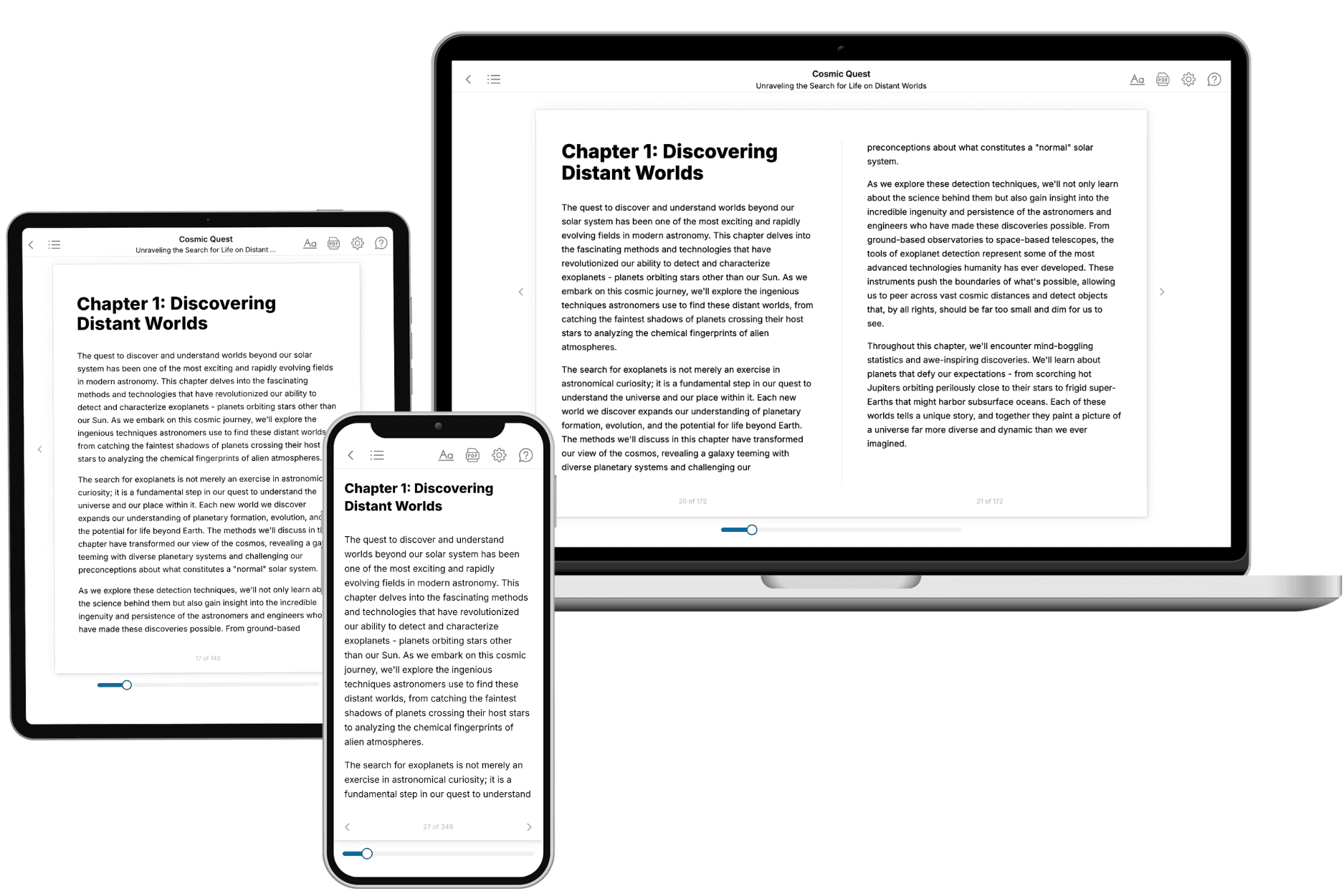
Your book is ready in 10 minutes. Read it online, download as EPUB or PDF, or send to Kindle.

Frequently asked questions
- What is TailoredRead?
TailoredRead creates complete, full-length nonfiction ebooks, written specifically for you. Tell us what you want to learn and why, and TailoredRead writes you a complete ebook on it, with charts, tables, and diagrams throughout. Read it online, on Kindle, or on any e-reader, or download it as a PDF or EPUB. Every book is written fresh the day you order it.
- How is the book tailored to me?
Before anything is written, you answer a few short questions about your goals, your background, and the topics you care about. Your book is then planned around your answers: written at your level, focused on your goals, and covering the topics you chose, instead of the one-size-fits-all book a store sells everyone.
- Will it read like generic AI content?
No. Your book isn't a chat transcript: it's planned chapter by chapter before a single word is written, told in a clear book voice, and explains ideas visually with charts, tables, and diagrams. After writing, every book goes through an editorial pass that polishes chapters so the book reads consistent from start to finish. Judge for yourself: browse thousands of sample books on our Explore Books page.
- How accurate is the content?
Our AI first checks whether your subject needs live research. Niche and fast-moving subjects are researched before writing, and the book plan and chapters are grounded in what it finds. After writing, every book goes through a quality pass that checks its facts and consistency, and researched books list their sources in a Notes section at the back.
- How long is the book?
You choose the length: Comprehensive (250-300 pages), Detailed (150-200 pages), Essential (70-100 pages), or Short (30-50 pages).
- Does the book include visuals?
Yes. Every book includes charts, tables, and diagrams: timelines, checklists, step-by-step guides, decision trees, comparison tables, matrices, and bar charts. A typical book includes dozens of these visual elements.
- Can I read it on Kindle? What formats can I download?
Yes. Every book can be read in our online reader or downloaded as a PDF or EPUB. The EPUB can be opened with Kindle, Apple Books, Kobo, and any e-reader. The Commercial and Author licenses also include an editable Word (DOCX) and Markdown download.
- How much does it cost?
About the price of a regular ebook. The exact price depends on your book's length and complexity, from $2 for the shortest books to $35 for the most comprehensive, and it's shown when you review your book, before you commit to anything. Each book is a one-time purchase, yours to keep, no subscription. Licenses that let you share, teach, or publish your book range from $35.99 to $49.99.
- Can I preview the book before purchasing?
Before you pay, you'll see what your book will cover: the title, a detailed description, the estimated length, and the complete chapter-by-chapter table of contents, so you know what you're getting before you decide. The full text itself is written after you purchase.
- How long does it take to create a book?
About 10 minutes. You can start reading the opening chapters while the rest is still being written.