Cinematic Color Grading Mastery
Professional Techniques for Visual Effects and Graphic Design
Achieve broadcast-quality color grading that elevates your visual effects and graphic design work from amateur to professional.
207 pages9 chaptersAug 26, 2026Color Theory
About this book
This comprehensive guide bridges the gap between basic color adjustment and cinematic mastery, providing you with the technical knowledge and practical workflows used by industry professionals. You'll learn the science behind color perception, master essential grading tools and techniques, and develop a systematic approach to color correction and creative enhancement. Whether you're grading footage for film, television, or digital media, this book equips you with proven methods for achieving consistency, emotional impact, and technical excellence. Discover how to work efficiently within industry-standard color spaces, leverage advanced tools like curves and LUTs, and adapt your grading for different delivery formats. With real-world examples and step-by-step workflows, you'll transform your understanding of color from intuitive guesswork into confident, intentional creative decisions.
Table of contents
- IntroductionWhy Color Grading Matters in Modern Visual Media, How This Book Is Organized, Getting the Most from This GuideRead below
- Chapter 1: Color Science FundamentalsHow Light and Color Perception Work, Understanding Color Spaces and Gamuts, Gamma, Linear Workflows, and Bit Depth, RGB, HSL, and Other Color Models Explained
- Chapter 2: The Professional Grading WorkflowThe Three-Act Grading Structure, Primary Correction: Setting the Foundation, Secondary Correction: Isolating and Refining, Creative Enhancement: Adding Visual Impact
- Chapter 3: Essential Grading Tools and ControlsColor Wheels and Lift-Gamma-Gain Controls, Mastering Curves for Precise Tonal Control, Using Scopes and Waveforms for Accurate Monitoring, LUTs, Presets, and Starting Points
- Chapter 4: Color Psychology and Visual StorytellingHow Color Choices Influence Viewer Emotion, Cultural Meanings and Color Symbolism, Genre-Specific Color Grading Conventions, Using Color to Support Narrative and Character
- Chapter 5: Achieving Consistency and Color MatchingMatching Color Across Multiple Shots, Using Reference Frames and Targets, Maintaining Continuity in Sequences, Efficient Batch Grading and Standardization
- Chapter 6: Advanced Grading TechniquesSelective Color Grading and Masking, Color Grading for Visual Effects Integration, Creating Stylized and Cinematic Looks, Troubleshooting Common Grading Challenges
- Chapter 7: Technical Setup and CalibrationMonitor Calibration and Color Accuracy, Optimizing Your Viewing Environment, Color Management Workflows and Standards, Choosing Grading Hardware and Software
- Chapter 8: Grading for Different Delivery FormatsBroadcast and Television Standards, Cinema and DCP Distribution, Grading for Streaming and Digital Platforms, Adapting Grades Across Multiple Formats
- Chapter 9: Real-World Grading WorkflowsCommercial and Advertising Grading, Documentary and Narrative Grading, Color Grading for Motion Graphics and Design, Time Management and Efficient Grading Sessions
- ConclusionYour Path to Grading Mastery, Continuing Your Education and Growth
- Glossary of Color Grading Terms
- Further Reading and Resources
Introduction
A single shot of a hospital corridor can feel sterile and cold, or warm and hopeful, depending entirely on how its color has been shaped after the camera stopped rolling. The framing might be identical, the actors' performances unchanged, the dialogue word for word the same. Yet a colorist working on that footage can push the shadows toward blue-green, lift the skin tones slightly, and suddenly the scene reads as clinical detachment rather than quiet compassion. This is not decoration. It is a deliberate craft decision that changes what an audience feels before they consciously register why.
Grading sits at the intersection of technical precision and creative judgment, and that combination is exactly what makes it difficult to learn from intuition alone. Anyone can drag a saturation slider and notice the image looks more vivid. Far fewer understand why a Vectorscope reading tells you a skin tone has drifted toward magenta, or why a grade that looks perfect on a laptop screen falls apart on a calibrated reference monitor. The gap between amateur color adjustment and professional color grading is not talent. It is a body of specific, learnable knowledge about how light, perception, and software actually behave.
This book exists to close that gap systematically. Rather than presenting grading as a collection of tricks or a single "cinematic" preset to apply and forget, it builds a foundation of color science, then layers on workflow discipline, creative technique, and technical delivery knowledge. Each piece depends on the ones before it. Understanding the Three-Act Grading Structure, for instance, means little without first grasping how Gamma and Bit Depth shape the raw material you are working with.
The three subsections that follow set the stage for everything ahead. The first makes the case for why color grading deserves serious attention as a storytelling discipline, not an afterthought bolted onto editing. The second maps out how the book's chapters connect, so the overall shape of the learning path is clear before diving into details. The third offers concrete guidance on how to actually use this material, whether that means following it cover to cover or returning to specific chapters as reference during real projects.
Why Color Grading Matters in Modern Visual Media
Consider two versions of the same commercial: one graded flat and neutral, the other with a warm, slightly desaturated look applied to the highlights. Consumer research on advertising has long shown that color influences purchase intent and brand recall before viewers process any spoken message[1]. In moving images, that effect compounds across every frame, meaning a poorly graded thirty-second spot can undercut months of creative work in production and copywriting. Color is not the final polish; it is one of the primary channels through which meaning reaches the viewer.
Film history offers a clear demonstration of how far grading choices can shape audience memory. The muted, desaturated look applied to certain war and crime films became so associated with gritty realism that entire genres adopted similar palettes as shorthand for seriousness. Meanwhile the now-familiar Teal-and-Orange Look found in countless blockbusters exists largely because human skin tones sit naturally in the orange range, and pushing complementary teal into shadows and backgrounds makes faces pop against the frame[2]. Neither look happened by accident. Both emerged from colorists solving a specific perceptual problem.
Visual effects work depends on grading in a way that is easy to underestimate. A computer-generated creature or environment can be modeled and lit with total technical accuracy, and still look fake the instant it sits in a shot with mismatched color temperature or contrast. The final grading pass is often what makes a composite believable, because it forces every element in the frame, live-action and synthetic alike, to share the same light logic. Without that final unification step, even technically excellent VFX work reads as obviously artificial to any attentive viewer.
Graphic design and motion graphics face a parallel challenge, even though the source material rarely comes from a camera. A title sequence, a product animation, or a branded video package all rely on color choices that must feel intentional and cohesive across every frame and every asset. When a design team applies grading principles borrowed from film production, such as maintaining consistent white balance and building a limited, purposeful color palette, the resulting work reads as considered and premium rather than assembled from mismatched stock elements. The discipline transfers because the underlying perceptual principles are the same regardless of source.
Streaming platforms have also raised the technical bar for what counts as professional grading. A project intended for wide release now often needs to satisfy both SDR Delivery and HDR Delivery specifications, sometimes for the same piece of content distributed across different services. That requirement did not exist in the same form even a decade ago, and it means colorists today need working knowledge of specifications that used to be the exclusive concern of broadcast engineers. The bar for "professional enough to publish" keeps rising, and understanding grading fundamentals is what allows a creator to meet it rather than fall short.
None of this means every project needs an aggressive, stylized grade. Plenty of strong work relies on grading that is nearly invisible, correcting for lens characteristics, matching shots from different cameras, and keeping skin tones natural under changing lighting conditions. That restraint is itself a skill built on the same technical foundation as more dramatic creative looks. A colorist who understands Color Science deeply enough to push a look aggressively is also the one best equipped to know when the right choice is to hold back and let the image speak plainly.
The throughline connecting all of these examples, from advertising to VFX to streaming delivery, is that color grading operates on viewers whether or not they notice it consciously. That invisibility is precisely what makes it worth studying with rigor. A director of photography's lens choice draws attention if examined closely; an editor's cut is visible in every transition. Grading, done well, disappears into the emotional texture of the piece, which means its craft can only be evaluated by understanding the mechanisms behind it, not by simply admiring the result.
How This Book Is Organized
The chapters ahead follow a deliberate sequence, moving from foundational science toward increasingly specialized, real-world application. This mirrors how professional colorists actually build expertise: first the physics and perception underlying color, then the standard workflow used across the industry, then the specific tools that execute that workflow, and only after that the creative and contextual judgment that separates competent grading from memorable grading. Skipping ahead to creative technique without the earlier grounding tends to produce work that looks appealing in isolation but breaks down under scrutiny on a calibrated monitor or in a different delivery format.
The section on color science fundamentals covers how light and perception work, what Color Space and Color Gamut actually mean in practice, how Gamma and Linear Workflow affect image data, and how the RGB Color Model and HSL Color Model represent color differently for different purposes. This material can feel abstract at first, but every later technique traces back to it. A curve adjustment that behaves unpredictably almost always has an explanation rooted in bit depth or gamma handling, and understanding that connection turns confusing software behavior into predictable, controllable results.
From there, the book introduces the Three-Act Grading Structure that organizes professional sessions: Primary Correction to establish a technically sound base image, Secondary Correction to isolate and adjust specific regions or colors, and Creative Enhancement to build the final intentional look. This structure functions like a recipe with a fixed order of operations. Attempting creative stylization before primary correction is like seasoning a dish before checking whether it is even cooked; the steps that follow only work reliably when the foundation beneath them is solid.
A dedicated section on tools follows immediately after, covering Color Wheels, Lift-Gamma-Gain controls, Curves, scopes including the Waveform Monitor and Parade Scope, and the role of LUT files as both technical conversions and creative starting points. These are the physical controls a colorist touches every session, and the book treats them with hands-on specificity rather than abstract description, because reading about a curve adjustment and actually manipulating one to fix a washed-out sky are very different kinds of learning.
The middle chapters shift toward the human side of grading: color psychology, cultural symbolism, genre conventions, and how color choices reinforce character and narrative. This is where the technical skills built earlier get pointed toward actual storytelling decisions. A colorist who can execute a perfect secondary isolation but has no framework for why a particular scene calls for cooler or warmer tones is only half-equipped for professional work. These chapters supply that missing half.
Later sections address the practical realities of maintaining consistency across a full project, from shot matching and reference frames to batch grading techniques that save enormous time on projects with hundreds of shots. Following that, advanced techniques covering masking, VFX integration, and stylized look creation extend the core workflow into more specialized territory. The book then turns to the physical and technical environment, covering monitor calibration and color management, before addressing how delivery destinations from broadcast to cinema to streaming each demand specific technical handling.
The final major section grounds all of this in real project types: commercial work, documentary and narrative grading, and motion graphics, each of which imposes its own constraints and priorities on how a colorist applies everything learned earlier. A commercial shoot with a tight turnaround demands different session habits than a feature film with weeks allocated to the grade. Recognizing those differences, and adapting workflow accordingly, is itself a professional skill covered directly rather than left as an afterthought.
This structure is cumulative by design, which means later chapters will reference concepts introduced earlier without re-explaining them in full. A term like Node-Based Workflow or Power Windows gets its full explanation where it is first introduced and is then used freely afterward, the same way a colorist would use it once comfortable with the concept. Keeping track of where a term was first defined makes it easier to flip back for a refresher if a later chapter assumes familiarity that has faded.
Getting the Most from This Guide
Reading about color grading and actually grading are different activities, and the value of this material multiplies dramatically when paired with hands-on practice. Before moving further, it helps to have grading software open and a piece of footage loaded, even something as simple as a smartphone clip shot near a window. As each concept appears in the coming chapters, whether it is a wheel adjustment or a curve manipulation, pausing to try it immediately on real footage builds muscle memory that passive reading cannot provide. The goal is informed practice, not memorized theory.
It also helps to work with a reasonably capable monitor from the start, even if full calibration equipment covered later in the book is not yet available. A budget or laptop screen can misrepresent shadow detail and color accuracy badly enough to make early practice misleading, since adjustments that look correct on an uncalibrated display can look wrong everywhere else. This does not mean expensive equipment is required immediately, but being aware of the limitation prevents false confidence in early grading decisions, and revisiting early practice work once a properly calibrated setup is in place often reveals surprising inaccuracies.
For readers with a background in photography or graphic design but limited video experience, the concepts in the color science section may already feel partially familiar, since Color Space and RGB Color Model fundamentals apply across still and moving image work. Even so, resist the urge to skip that section entirely. Video-specific concerns like Log Encoding and frame-to-frame consistency introduce complications that static image work does not require, and a shaky grasp of those specifics tends to surface as confusing, hard-to-diagnose problems several chapters later.
Conversely, readers coming from a video editing background with little formal color theory training may want to slow down through the color psychology and cultural symbolism material, since it is easy to underestimate how much of professional grading judgment depends on that kind of contextual knowledge rather than technical execution alone. Two colorists with identical technical skill can produce very different quality results if only one of them understands why a scene calls for a particular emotional register.
Treat the glossary at the end of the book as an active tool rather than a reference to consult only when stuck. Canonical terms like Transfer Function, White Point, and Selective Color Grading appear repeatedly across chapters, and looking them up the first time they feel unclear, rather than pushing through with a fuzzy understanding, prevents small gaps from compounding into real confusion by the time advanced techniques are introduced.
Real project work rarely follows a tidy chapter order, and once the foundational material has been covered once, this book is designed to function equally well as a working reference. A colorist mid-project struggling with a specific VFX composite matching issue can jump directly to the relevant advanced technique section without rereading everything before it, provided the earlier foundational chapters have already been absorbed at least once. Treating chapter titles as searchable landmarks, rather than requiring linear rereading, makes the material far more useful once actual client work begins.
Finally, approach every technique in this book with a healthy skepticism toward rigid rules. The three-act structure, the standard tool workflows, and the genre conventions described in later chapters represent strong defaults built from decades of professional practice, not unbreakable laws. Once the underlying reasoning behind a convention is genuinely understood, breaking it deliberately for a specific creative reason is exactly the kind of confident, intentional decision this book aims to make possible. The destination is not rule-following. It is judgment built on real understanding.
This is the end of the free sample. The full book has 9 chapters.
Want this book written for you?
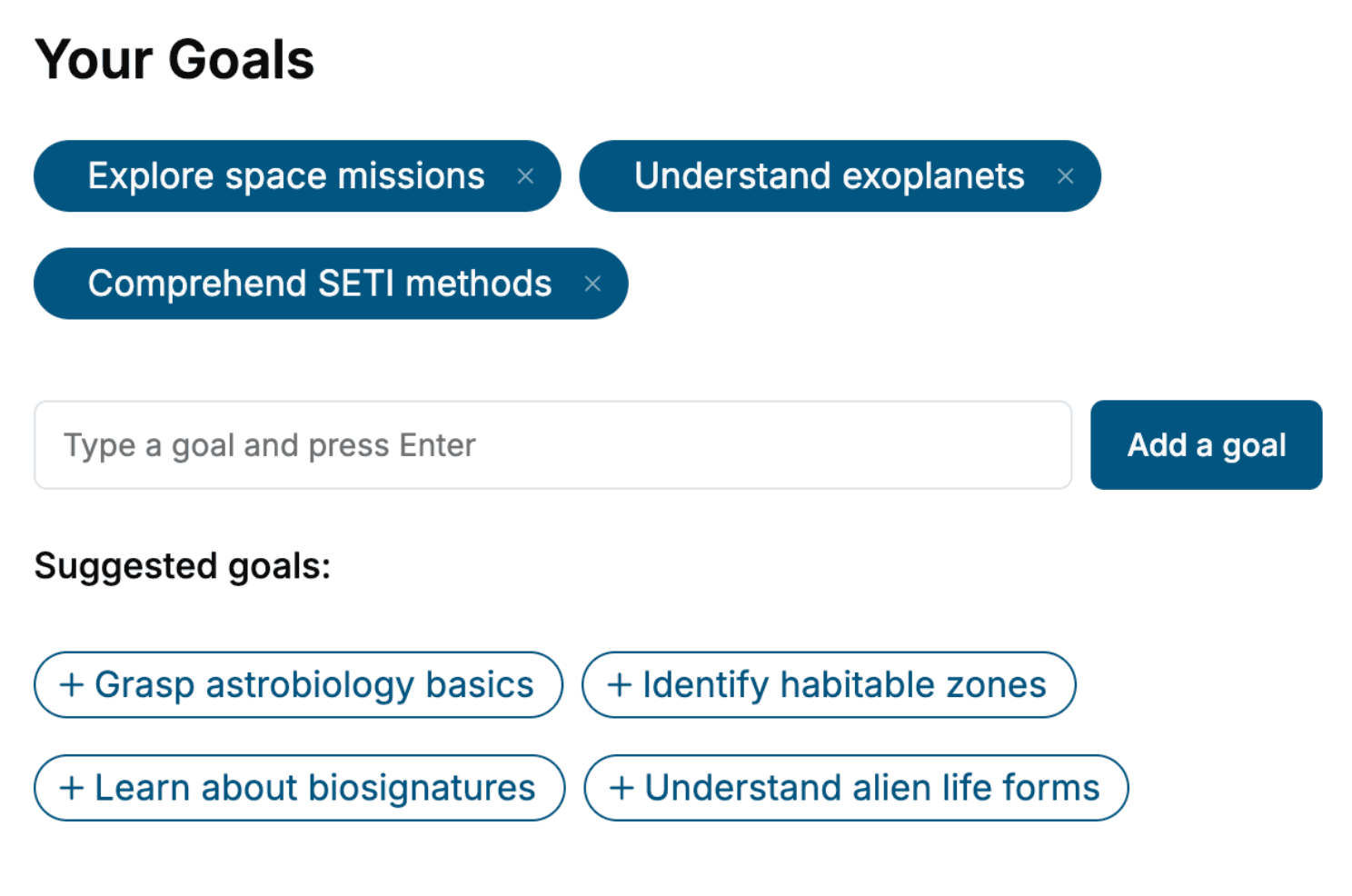
Tell us your goals and background, and get your own version of this book, tailored by AI to you.


Benefits of AI-tailored books
- Read one book, not ten:
- all the Color Theory knowledge you need, gathered into a single book.
- Save days of learning:
- tell us your goals, choose your topics, and the whole book is built around them.
- Learn effortlessly:
- Color Theory book written for your specific background and expertise.
- Understand at a glance:
- includes charts, tables, timelines, checklists, decision trees, and more.
- Stay current:
- written the day you order it, not years ago.
- Trust what you read:
- every book is checked for accuracy, with real research when your subject needs it.
Create your unique book in 3 steps
- 1. Select your focus
Select the focus of your Color Theory book and share your background
- 2. Personalize your book
Specify your goals and choose sub-topics to include
- 3. Get your tailored book
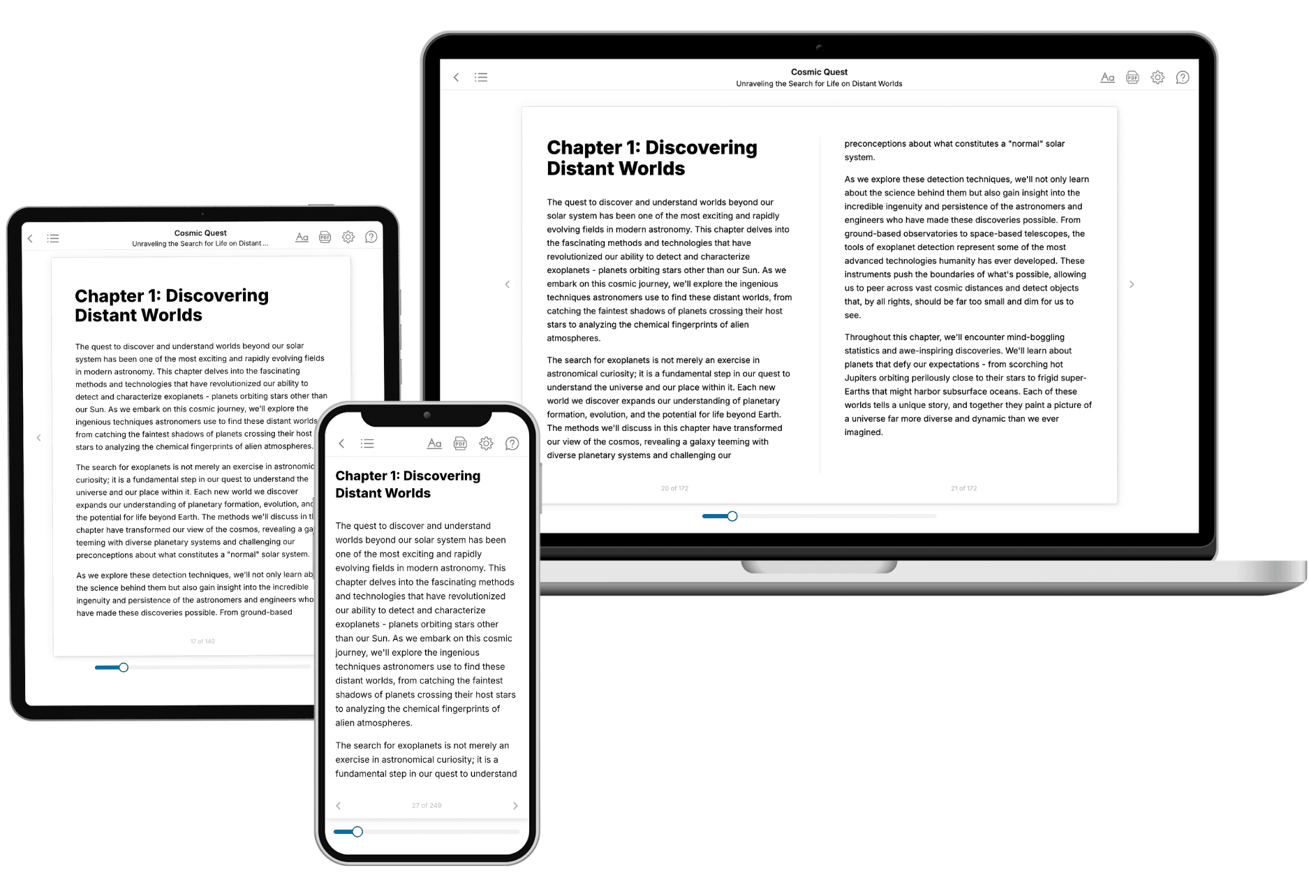
Your book is ready in 10 minutes. Read it online, download as EPUB or PDF, or send to Kindle.

Frequently asked questions
- What is TailoredRead?
TailoredRead creates complete, full-length nonfiction ebooks, written specifically for you. Tell us what you want to learn and why, and TailoredRead writes you a complete ebook on it, with charts, tables, and diagrams throughout. Read it online, on Kindle, or on any e-reader, or download it as a PDF or EPUB. Every book is written fresh the day you order it.
- How is the book tailored to me?
Before anything is written, you answer a few short questions about your goals, your background, and the topics you care about. Your book is then planned around your answers: written at your level, focused on your goals, and covering the topics you chose, instead of the one-size-fits-all book a store sells everyone.
- Will it read like generic AI content?
No. Your book isn't a chat transcript: it's planned chapter by chapter before a single word is written, told in a clear book voice, and explains ideas visually with charts, tables, and diagrams. After writing, every book goes through an editorial pass that polishes chapters so the book reads consistent from start to finish. Judge for yourself: browse thousands of sample books on our Explore Books page.
- How accurate is the content?
Our AI first checks whether your subject needs live research. Niche and fast-moving subjects are researched before writing, and the book plan and chapters are grounded in what it finds. After writing, every book goes through a quality pass that checks its facts and consistency, and researched books list their sources in a Notes section at the back.
- How long is the book?
You choose the length: Comprehensive (250-300 pages), Detailed (150-200 pages), Essential (70-100 pages), or Short (30-50 pages).
- Does the book include visuals?
Yes. Every book includes charts, tables, and diagrams: timelines, checklists, step-by-step guides, decision trees, comparison tables, matrices, and bar charts. A typical book includes dozens of these visual elements.
- Can I read it on Kindle? What formats can I download?
Yes. Every book can be read in our online reader or downloaded as a PDF or EPUB. The EPUB can be opened with Kindle, Apple Books, Kobo, and any e-reader. The Commercial and Author licenses also include an editable Word (DOCX) and Markdown download.
- How much does it cost?
About the price of a regular ebook. The exact price depends on your book's length and complexity, from $2 for the shortest books to $35 for the most comprehensive, and it's shown when you review your book, before you commit to anything. Each book is a one-time purchase, yours to keep, no subscription. Licenses that let you share, teach, or publish your book range from $35.99 to $49.99.
- Can I preview the book before purchasing?
Before you pay, you'll see what your book will cover: the title, a detailed description, the estimated length, and the complete chapter-by-chapter table of contents, so you know what you're getting before you decide. The full text itself is written after you purchase.
- How long does it take to create a book?
About 10 minutes. You can start reading the opening chapters while the rest is still being written.