Color Alchemy
Master the Art of Acrylic Color Mixing and Harmony
Imagine standing before your canvas, a world of vibrant possibilities at your fingertips.
83 pages4 chaptersJul 8, 2025PaintingCreated by Beatrice
About this book
With each brushstroke, you bring to life the exact hues you've envisioned, effortlessly blending and harmonizing colors to create stunning acrylic masterpieces. This isn't just a dream – it's the reality that awaits you in the pages of "Color Alchemy: Master the Art of Acrylic Color Mixing and Harmony." Tailored for the intermediate artist eager to elevate their craft, this guide delves deep into the science and artistry of color. You'll uncover the secrets of pigment properties, explore advanced blending techniques, and learn to craft personal palettes that sing with creativity. From mastering the subtle interplay of values to conquering the challenges of layering, each chapter builds your skills and confidence. Packed with practical exercises, insider tips, and eye-opening color theory, this book is your personal mentor in the studio. You'll discover how to mix vibrant hues with precision, create seamless gradients, and achieve perfect color harmony in every piece. Whether you're looking to capture the golden glow of a sunset or the nuanced skin tones of a portrait, "Color Alchemy" provides the knowledge and techniques to bring your vision to life. Prepare to transform your artistic practice and watch as your work takes on new depths of expression and technical mastery. Your journey to becoming a true color alchemist begins here.
Table of contents
- Chapter 1: Foundations of Color TheoryThe Color Wheel: Your Mixing Compass, Primary, Secondary, and Tertiary Colors, Understanding Hue, Value, and ChromaRead below
- Chapter 2: Acrylic Paint EssentialsPigment Properties and Behavior, Opacity vs. Transparency: Controlling Your Mix, Acrylic Mediums and Their Effects on Color
- Chapter 3: Advanced Mixing TechniquesColor Ratios and Proportions, Creating Smooth Gradients and Transitions, Mixing Neutrals and Complex Grays
- Chapter 4: Harmony and Personal PaletteColor Schemes for Balanced Compositions, Developing Your Signature Color Palette
- Conclusion
Chapter 1: Foundations of Color Theory
As you embark on your journey to master acrylic color mixing, it's essential to build a solid foundation in color theory. This chapter will equip you with the fundamental knowledge and tools necessary to understand how colors interact, blend, and harmonize. By grasping these core concepts, you'll be better prepared to tackle more advanced techniques and create stunning, vibrant artwork with confidence.
Color theory is not just a set of abstract rules; it's a practical framework that artists have developed and refined over centuries. Understanding color theory will enhance your ability to mix colors accurately, create harmonious compositions, and evoke specific moods and emotions in your paintings. Whether you're aiming to capture the subtle nuances of a landscape or the bold energy of an abstract piece, a strong grasp of color theory will be your guide.
In this chapter, we'll explore three crucial aspects of color theory: the color wheel, the classification of colors, and the properties that define each color. These elements form the bedrock of color mixing and will serve as your constant companions throughout your artistic journey. Let's dive in and uncover the secrets that will transform your approach to color in acrylic painting.
The Color Wheel: Your Mixing Compass
The color wheel is an indispensable tool for any artist, serving as a visual representation of color relationships and a guide for mixing. Imagine it as a map that helps you navigate the vast world of color. Understanding how to use the color wheel effectively will significantly enhance your ability to create harmonious color schemes and mix precise hues.
At its most basic, the traditional color wheel consists of 12 colors arranged in a circular format. These colors are divided into three categories: primary, secondary, and tertiary. The arrangement of these colors is not arbitrary; it's based on the natural progression of hues and their relationships to one another. By studying the color wheel, you'll gain insights into which colors complement each other, which ones contrast, and how to create balanced compositions.
The origins of the color wheel can be traced back to Sir Isaac Newton's experiments with light in the 17th century. Newton discovered that white light could be separated into a spectrum of colors, which he then arranged into a circular diagram. This groundbreaking work laid the foundation for our modern understanding of color theory. Since then, artists and color theorists have expanded upon Newton's ideas, developing more sophisticated color wheels that incorporate concepts like saturation and value[1].
For acrylic painters, the color wheel serves multiple purposes. Firstly, it helps you understand the relationships between different hues. Colors that are adjacent on the wheel are analogous and tend to create harmonious combinations when used together. Colors opposite each other on the wheel are complementary and can create striking contrasts. Secondly, the color wheel is an invaluable aid in color mixing. By understanding the position of colors on the wheel, you can predict the results of mixing different pigments and make informed decisions about which colors to combine to achieve your desired hue.
To make the most of the color wheel in your acrylic painting practice, consider creating your own physical color wheel using your acrylic paints. This exercise will not only reinforce your understanding of color relationships but also give you hands-on experience in mixing colors. Start with the primary colors (red, blue, and yellow) at equidistant points on the circle. Then, mix adjacent primaries to create the secondary colors (orange, green, and purple) between them. Finally, mix primaries with their adjacent secondaries to create the tertiary colors (yellow-orange, red-orange, red-purple, blue-purple, blue-green, and yellow-green).
As you work with the color wheel, you'll begin to develop an intuitive sense of how colors interact. You'll notice that some colors seem to vibrate when placed next to each other, while others create a sense of calm and harmony. These observations will inform your color choices in future paintings, allowing you to create more intentional and impactful compositions.
Remember that while the traditional 12-color wheel is a useful starting point, it's not the only way to represent color relationships. As you advance in your color theory knowledge, you may encounter more complex color wheels that incorporate tints, shades, and tones. These expanded wheels can provide even more nuanced guidance for color mixing and harmonization.
In your acrylic painting practice, the color wheel will become an indispensable reference tool. Keep it nearby as you work, and don't hesitate to consult it when you're unsure about which colors to mix or how to create a particular effect. With time and practice, you'll find that the principles of the color wheel become second nature, allowing you to mix colors with confidence and create harmonious compositions with ease.
As we move forward in this chapter, we'll delve deeper into the specific categories of colors and their properties. Each of these concepts builds upon the foundation of the color wheel, so keep this visual guide in mind as we explore the fascinating world of color theory.
Primary, Secondary, and Tertiary Colors
Understanding the classification of colors into primary, secondary, and tertiary categories is crucial for mastering acrylic color mixing. This knowledge forms the backbone of color theory and provides a systematic approach to creating a wide range of hues. By grasping these concepts, you'll be able to mix colors with precision and expand your palette beyond the limitations of pre-mixed paints.
Let's start with primary colors, which are the foundation of all other colors. In traditional color theory, the primary colors are red, blue, and yellow. These are considered "pure" colors because they cannot be created by mixing other colors together. In theory, all other colors can be derived from these three primaries. However, it's important to note that in practice, especially with acrylic paints, the concept of "pure" primaries is somewhat idealized. The pigments used in acrylic paints may not perfectly align with theoretical primary colors, which can affect your mixing results[2].
When working with acrylic paints, it's beneficial to choose a "primary set" that works well for your needs. This might include a warm and cool version of each primary color, such as cadmium red and alizarin crimson for red, ultramarine blue and phthalo blue for blue, and cadmium yellow and lemon yellow for yellow. Having these options allows for more nuanced color mixing and can help you achieve a broader range of hues.
Secondary colors are created by mixing equal parts of two primary colors. The three secondary colors are:
- Green (blue + yellow)
- Orange (red + yellow)
- Purple (blue + red)
Tertiary colors are created by mixing a primary color with an adjacent secondary color on the color wheel. There are six tertiary colors:
- Yellow-green (yellow + green)
- Blue-green (blue + green)
- Blue-purple (blue + purple)
- Red-purple (red + purple)
- Red-orange (red + orange)
- Yellow-orange (yellow + orange)
When working with acrylic paints, it's important to remember that the theoretical color mixing principles may not always translate perfectly in practice. Factors such as the specific pigments used in your paints, the opacity of the colors, and even the brand of acrylic paint can affect your mixing results. This is why experimentation and careful observation are crucial skills to develop alongside your theoretical knowledge.
To deepen your understanding of primary, secondary, and tertiary colors, try creating a color mixing chart. Start with your primary colors and systematically mix them to create secondaries and tertiaries. Record the exact proportions you use for each mixture. This chart will serve as a valuable reference tool and help you develop a more intuitive sense of color relationships.
As you become more comfortable with these color categories, you'll start to see how they can be used to create harmony or contrast in your paintings. For example, a composition based primarily on tertiary colors often has a sophisticated, muted feel, while one that emphasizes primary colors might appear more bold and energetic. Understanding these relationships allows you to make informed decisions about your color choices and create more intentional, impactful artwork.
Remember that while these color categories provide a useful framework, they're not rigid rules. Many contemporary artists and color theorists challenge traditional notions of primary, secondary, and tertiary colors, exploring alternative color systems and mixing approaches. As you develop your skills, don't be afraid to question and experiment beyond these basic categories.
In the next section, we'll delve into the properties that define individual colors: hue, value, and chroma. Understanding these properties will further enhance your ability to mix and manipulate colors effectively in your acrylic paintings.
Understanding Hue, Value, and Chroma
To truly master color mixing in acrylic painting, it's essential to understand the three fundamental properties that define each color: hue, value, and chroma. These properties work together to create the vast spectrum of colors we perceive, and learning to manipulate them will give you unprecedented control over your color palette. Let's explore each of these properties in depth and discuss how they apply to acrylic color mixing.
Hue is the most basic and intuitive property of color. It refers to the pure color itself - what we typically mean when we name a color like "red" or "blue." On the color wheel, hue is represented by the position of a color. For example, red, yellow, and blue are distinct hues, as are the secondary and tertiary colors we discussed earlier. When mixing acrylics, changing the hue means adding a different color to your mixture. For instance, adding yellow to blue will shift the hue towards green.
It's important to note that while we often think of hues in terms of distinct categories (like "red" or "blue"), in reality, hues exist on a continuous spectrum. This is why we can have colors like "blue-green" or "yellow-orange" that seem to sit between two hues. Understanding this continuum is crucial for fine-tuning your color mixtures and achieving precisely the hue you want in your paintings.
Value refers to the lightness or darkness of a color. It's essentially how much light the color reflects, ranging from the darkest values (near black) to the lightest (near white). Value is independent of hue - you can have light blue and dark blue, for example, which share the same hue but have different values. In acrylic painting, you can change the value of a color by adding white to lighten it (creating a tint) or black to darken it (creating a shade). However, be cautious when using black, as it can sometimes make colors appear muddy. Many artists prefer to darken colors by mixing in complementary hues instead.
Understanding and controlling value is crucial for creating depth, form, and contrast in your paintings. Value differences are what allow us to perceive three-dimensional shapes on a two-dimensional canvas. A strong grasp of value relationships can elevate your artwork from flat and lifeless to dynamic and realistic. Practice creating value scales with your acrylic paints, starting with a pure hue and gradually adding white or black to create a range of tints and shades.
Chroma, also known as saturation or intensity, refers to the purity or strength of a color. High-chroma colors are vivid and intense, while low-chroma colors appear more muted or gray. Chroma is often confused with value, but they're distinct properties. A high-chroma color can have any value, from very light to very dark. In acrylic mixing, you can reduce the chroma of a color by adding its complementary color or by mixing in gray. Increasing chroma is more challenging and often requires using purer pigments.
Manipulating chroma allows you to create subtle variations within a single hue, adding richness and depth to your color palette. High-chroma colors can draw attention to specific areas of your painting, while low-chroma colors can create a sense of distance or atmosphere. Learning to control chroma is particularly important for realistic painting, as most colors in nature are not at full saturation.
When working with these properties in acrylic painting, it's helpful to think of them as three dimensions of color. Hue is like choosing a direction on a map, value is like moving up or down in elevation, and chroma is like moving towards or away from the center of a circle. By adjusting these three properties, you can navigate to any color in the visible spectrum.
To practice working with hue, value, and chroma, try this exercise: Choose a single hue and create a grid of color swatches. Along one axis, vary the value from light to dark. Along the other axis, vary the chroma from high to low. This will give you a visual representation of how these properties interact for a single hue. Repeat this exercise with different hues to deepen your understanding.
Remember that while these properties can be discussed separately, they're always working together in any color you see or mix. A change in one property often affects our perception of the others. For example, reducing the chroma of a color can make it appear darker, even if the value hasn't changed. This interconnectedness is part of what makes color mixing so complex and fascinating.
As you continue to explore color mixing in your acrylic painting practice, keep these properties in mind. When you're trying to match a specific color, ask yourself: Is the hue correct? How about the value? And the chroma? By breaking down colors into these components, you'll find it easier to analyze and recreate any color you encounter.
In the next chapters, we'll build on this foundation of color theory as we delve into the specific properties of acrylic paints and advanced mixing techniques. The concepts of hue, value, and chroma will be crucial as you learn to control opacity, create smooth gradients, and develop your personal color palette. Keep practicing and observing, and you'll soon find yourself mixing colors with confidence and precision.
This is the end of the free sample. The full book has 4 chapters.
Want this book written for you?
Tell us your goals and background, and get your own version of this book, tailored by AI to you.


Benefits of AI-tailored books
- Read one book, not ten:
- all the Painting knowledge you need, gathered into a single book.
- Save days of learning:
- tell us your goals, choose your topics, and the whole book is built around them.
- Learn effortlessly:
- Painting book written for your specific background and expertise.
- Understand at a glance:
- includes charts, tables, timelines, checklists, decision trees, and more.
- Stay current:
- written the day you order it, not years ago.
- Trust what you read:
- every book is checked for accuracy, with real research when your subject needs it.
Create your unique book in 3 steps
- 1. Select your focus
Select the focus of your Painting book and share your background
- 2. Personalize your book
Specify your goals and choose sub-topics to include
- 3. Get your tailored book
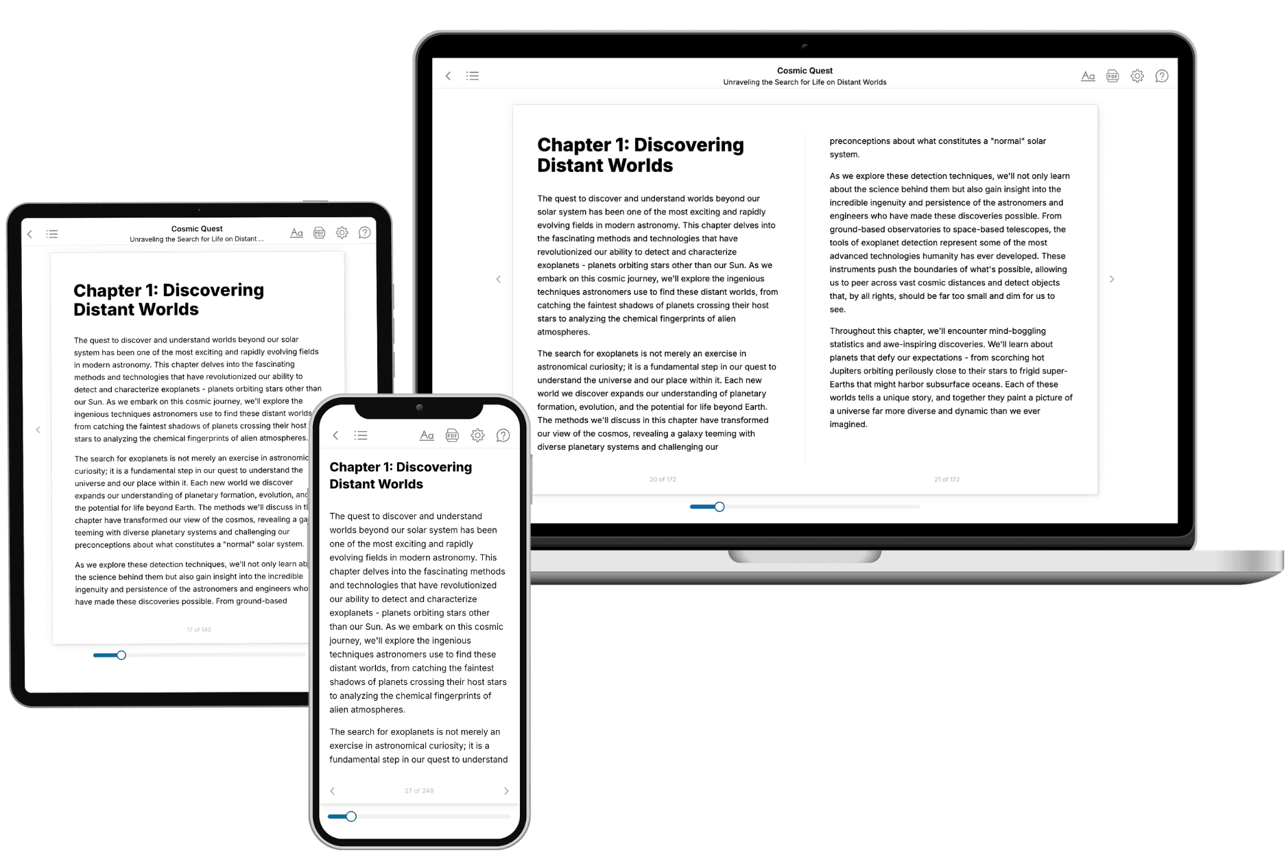
Your book is ready in 10 minutes. Read it online, download as EPUB or PDF, or send to Kindle.
Frequently asked questions
- What is TailoredRead?
TailoredRead creates complete, full-length nonfiction ebooks, written specifically for you. Tell us what you want to learn and why, and TailoredRead writes you a complete ebook on it, with charts, tables, and diagrams throughout. Read it online, on Kindle, or on any e-reader, or download it as a PDF or EPUB. Every book is written fresh the day you order it.
- How is the book tailored to me?
Before anything is written, you answer a few short questions about your goals, your background, and the topics you care about. Your book is then planned around your answers: written at your level, focused on your goals, and covering the topics you chose, instead of the one-size-fits-all book a store sells everyone.
- Will it read like generic AI content?
No. Your book isn't a chat transcript: it's planned chapter by chapter before a single word is written, told in a clear book voice, and explains ideas visually with charts, tables, and diagrams. After writing, every book goes through an editorial pass that polishes chapters so the book reads consistent from start to finish. Judge for yourself: browse thousands of sample books on our Explore Books page.
- How accurate is the content?
Our AI first checks whether your subject needs live research. Niche and fast-moving subjects are researched before writing, and the book plan and chapters are grounded in what it finds. After writing, every book goes through a quality pass that checks its facts and consistency, and researched books list their sources in a Notes section at the back.
- How long is the book?
You choose the length: Comprehensive (250-300 pages), Detailed (150-200 pages), Essential (70-100 pages), or Short (30-50 pages).
- Does the book include visuals?
Yes. Every book includes charts, tables, and diagrams: timelines, checklists, step-by-step guides, decision trees, comparison tables, matrices, and bar charts. A typical book includes dozens of these visual elements.
- Can I read it on Kindle? What formats can I download?
Yes. Every book can be read in our online reader or downloaded as a PDF or EPUB. The EPUB can be opened with Kindle, Apple Books, Kobo, and any e-reader. The Commercial and Author licenses also include an editable Word (DOCX) and Markdown download.
- How much does it cost?
About the price of a regular ebook. The exact price depends on your book's length and complexity, from $2 for the shortest books to $35 for the most comprehensive, and it's shown when you review your book, before you commit to anything. Each book is a one-time purchase, yours to keep, no subscription. Licenses that let you share, teach, or publish your book range from $35.99 to $49.99.
- Can I preview the book before purchasing?
Before you pay, you'll see what your book will cover: the title, a detailed description, the estimated length, and the complete chapter-by-chapter table of contents, so you know what you're getting before you decide. The full text itself is written after you purchase.
- How long does it take to create a book?
About 10 minutes. You can start reading the opening chapters while the rest is still being written.