Color Blindness in Computer Graphics
Understanding Color Spaces, Perception, and Accessible Design for Digital Creators
What if the colors you carefully selected in your design are completely invisible to millions of users?
238 pages11 chaptersNov 4, 2025Computer Graphics
About this book
Color blindness isn't about seeing in black and white—it's about perceiving color differently, and understanding this distinction is crucial for anyone creating digital graphics. This book bridges the gap between color science and practical design, exploring how color spaces work in computer graphics and why they matter for accessibility. You'll discover the technical foundations of color perception, learn how different types of color blindness affect visual interpretation, and master proven techniques for creating graphics that work for everyone. Whether you're developing games, building data visualizations, designing user interfaces, or creating digital art, this guide provides the knowledge and tools you need to ensure your work is both beautiful and accessible to all viewers.
Table of contents
- IntroductionWhy Color Matters in Digital Design, The Scope of Color Blindness, What You'll Learn in This BookRead below
- Chapter 1: Understanding Color PerceptionHow the Human Eye Perceives Color, Cone Cells and Color Receptors, How the Brain Interprets Color Signals
- Chapter 2: Types of Color BlindnessProtanopia: Red-Blind Vision, Deuteranopia: Green-Blind Vision, Tritanopia: Blue-Yellow Blindness, Achromatopsia: Complete Color Blindness
- Chapter 3: Color Spaces in Computer GraphicsRGB: The Foundation of Digital Display, CMYK: Color Space for Print, HSL and HSV: Intuitive Color Models, LAB Color Space: Perceptually Uniform Design
- Chapter 4: Color Space Conversion and ManagementPrinciples of Color Space Conversion, Gamma Correction and Linear Workflows, ICC Profiles and Color Management, Implementing Color Management in Your Workflow
- Chapter 5: Simulating Color BlindnessHow Color Blindness Simulation Works, Tools and Software for Testing, Manual Testing Techniques
- Chapter 6: Designing for Color-Blind AccessibilityContrast Ratios and Luminance Values, Using Patterns, Textures, and Shapes, Choosing Color-Blind Friendly Palettes, WCAG Guidelines and Accessibility Standards
- Chapter 7: Data Visualization for AllMaking Charts and Graphs Accessible, Designing Accessible Heatmaps, Effective Legends and Data Labels
- Chapter 8: User Interface Design PrinciplesStrategic Color Use in Interfaces, Status Indicators and Alerts, Interactive Elements and Feedback, Form Design and Error States
- Chapter 9: Game Development and Color BlindnessAccessible Game User Interfaces, Color-Blind Friendly Gameplay Mechanics, Environmental Design and Navigation
- Chapter 10: Tools and TechnologiesGraphics APIs and Color Management, Design Software Features and Plugins, Testing Frameworks and Automation, Emerging Technologies and Future Tools
- Chapter 11: Real-World Case StudiesCase Study: Accessible Data Dashboard, Case Study: Game Redesign for Inclusivity, Case Study: Web Application Accessibility Audit
- ConclusionKey Takeaways, Your Next Steps
- Glossary
- Further Reading and Resources
Introduction
Imagine spending hours perfecting a color scheme for your latest project—carefully selecting complementary hues, adjusting saturation levels, and ensuring every element looks visually stunning on your monitor. You launch your design with confidence, only to discover that a significant portion of your audience can't distinguish between the critical elements you've color-coded. The red error messages blend into the background. The green success indicators look identical to warnings. Your carefully crafted data visualization becomes an indecipherable puzzle. This scenario plays out thousands of times daily across websites, applications, games, and digital products worldwide, affecting millions of users who experience color vision deficiencies.
Color blindness isn't a niche concern or an edge case that affects only a handful of users. It's a widespread condition that impacts approximately 300 million people globally—roughly equivalent to the entire population of the United States. For digital creators, developers, and designers, understanding color blindness represents both an ethical responsibility and a practical necessity. When you create graphics, interfaces, or visualizations that rely exclusively on color to convey information, you're inadvertently excluding a substantial segment of your potential audience. The consequences extend beyond poor user experience; they can result in safety issues, legal compliance problems, and lost business opportunities.
This book bridges the gap between color theory and practical implementation, combining technical knowledge about color spaces with actionable strategies for accessible design. You'll explore how computer graphics systems represent and process color information, understand the biological and perceptual basis of color vision deficiencies, and learn proven techniques for creating visual content that works for everyone. Whether you're building data dashboards, designing game interfaces, developing mobile applications, or creating digital art, the principles and practices covered here will transform how you approach color in your work. The goal isn't to eliminate color from your designs—it's to use color more intelligently, supplementing it with additional visual cues that ensure your message reaches every viewer clearly and effectively.
Why Color Matters in Digital Design
Color serves as one of the most powerful communication tools available to digital creators. It conveys meaning instantly, guides attention, establishes hierarchy, and evokes emotional responses without requiring a single word. In user interfaces, color differentiates interactive elements from static content, signals system states, and provides immediate feedback on user actions. In data visualization, color encodes quantitative information, highlights patterns, and enables rapid comparison across categories. In games and digital art, color creates atmosphere, establishes visual identity, and enhances storytelling. The human visual system processes color information remarkably quickly—our brains can distinguish between different hues in milliseconds, making color an efficient channel for transmitting information.
However, this efficiency comes with a critical caveat: color communication only works when both the sender and receiver interpret colors similarly. When you design a form that displays error messages in red and success confirmations in green, you're making an assumption about your users' color perception. For someone with deuteranopia, the most common form of color blindness, these red and green elements may appear nearly identical. The information you intended to communicate instantly becomes ambiguous or completely lost. This isn't a theoretical problem—it manifests in real-world consequences every day. Users abandon shopping carts because they can't distinguish between available and unavailable product options. Gamers struggle with puzzles that require matching colored objects. Analysts misinterpret data visualizations because they can't differentiate between color-coded categories.
The digital design landscape has evolved significantly over the past two decades, with increasing emphasis on accessibility and inclusive design practices. Legal frameworks like the Americans with Disabilities Act (ADA) and the European Accessibility Act now mandate digital accessibility in many contexts. The Web Content Accessibility Guidelines (WCAG) provide specific technical requirements for color contrast and information encoding. Beyond legal compliance, there's a growing recognition that accessible design benefits everyone, not just users with disabilities. High-contrast interfaces work better in bright sunlight. Pattern-based differentiation helps users with aging vision. Clear visual hierarchies improve comprehension for all users regardless of their color perception abilities.
Understanding color spaces—the mathematical models that define how colors are represented in digital systems—becomes essential when designing for accessibility. Different color spaces organize color information in fundamentally different ways, and these organizational structures directly impact how effectively you can create accessible designs. The RGB color space, which dominates digital displays, organizes colors based on the intensity of red, green, and blue light. The LAB color space, by contrast, separates luminance from color information, making it easier to ensure adequate contrast regardless of hue. When you understand these underlying structures, you can make informed decisions about color selection, conversion, and management that preserve accessibility across different devices and viewing conditions.
The relationship between color and meaning in digital design extends beyond simple associations like "red means stop" or "green means go." Color creates visual rhythm, establishes brand identity, and influences user behavior in subtle but measurable ways. Research in color psychology demonstrates that color choices affect everything from perceived trustworthiness to conversion rates in e-commerce applications[1]. However, these effects depend entirely on users being able to perceive the colors as intended. When you design with color blindness in mind, you're not diminishing the power of color—you're ensuring that power reaches its full potential by making your color choices work for the broadest possible audience.
Modern digital creation tools offer unprecedented control over color, with millions of possible hues, sophisticated color management systems, and advanced rendering capabilities. This technical sophistication can create a false sense of security, leading designers to assume that if colors look correct on their calibrated monitors, they'll work for everyone. The reality is more complex. Color perception varies not only between individuals with different types of color vision deficiencies but also across different display technologies, ambient lighting conditions, and viewing contexts. A color scheme that works perfectly on your desktop monitor might fail completely on a mobile device viewed outdoors. Designing for color blindness forces you to think more holistically about color, considering not just hue but also contrast, saturation, and luminance—factors that contribute to robust, accessible designs across all viewing conditions.
The technical challenges of color-blind accessible design intersect with creative opportunities. When you can't rely solely on color to differentiate elements, you're pushed to explore other visual dimensions: texture, pattern, shape, size, position, and motion. These additional channels often result in richer, more sophisticated designs that communicate more effectively even to users with typical color vision. Consider a data visualization that uses both color and pattern to encode categories—the patterns provide redundancy for color-blind users while also making the chart easier to interpret when printed in black and white or viewed in poor lighting conditions. This principle of redundant encoding—conveying the same information through multiple visual channels—represents a cornerstone of accessible design that benefits all users.
The Scope of Color Blindness
Color vision deficiency affects approximately 8% of males and 0.5% of females of Northern European descent, with rates varying across different populations and ethnic groups[2]. These percentages translate to substantial absolute numbers—in the United States alone, roughly 13 million people experience some form of color blindness. Globally, the number exceeds 300 million individuals. To put this in perspective, if you're designing a website that receives 10,000 visitors per month, approximately 800 of those visitors likely have some form of color vision deficiency. If you're developing a mobile application with 100,000 users, around 8,000 of them experience colors differently than you might expect. These aren't negligible minorities—they represent user populations larger than many entire market segments that companies specifically target.
The most common forms of color blindness fall into the category of red-green color blindness, which includes both protanopia (reduced sensitivity to red light) and deuteranopia (reduced sensitivity to green light). Together, these conditions account for approximately 99% of all color blindness cases. People with red-green color blindness don't see the world in black and white—a common misconception—but rather have difficulty distinguishing between certain color combinations. Red and green may appear similar, as might brown and green, or blue and purple. The specific confusions depend on the type and severity of the condition. Deuteranopia, the most prevalent form, affects approximately 5% of males, making it more common than many conditions that receive significant attention in design discussions.
Blue-yellow color blindness, known as tritanopia, is considerably rarer, affecting approximately 0.01% of the population. While the numbers are smaller, tritanopia presents unique challenges because it affects color combinations that designers often assume are "safe" for color-blind users. The standard advice to avoid red-green combinations doesn't help someone with tritanopia, who struggles instead with blue-yellow distinctions. Complete color blindness, or achromatopsia, is extremely rare, affecting only about 1 in 30,000 people. Individuals with achromatopsia see the world in shades of gray, but they also typically experience other vision problems including light sensitivity and reduced visual acuity. Understanding this spectrum of conditions—from the common to the rare—helps you make informed decisions about which accessibility strategies provide the broadest benefit.
The genetic basis of color blindness explains its demographic distribution. The genes responsible for red and green color perception are located on the X chromosome, which is why red-green color blindness predominantly affects males. Males have only one X chromosome, so a single defective gene results in color blindness. Females have two X chromosomes, providing a backup copy that usually compensates for a defective gene. This genetic pattern means that while 8% of males experience red-green color blindness, only about 0.5% of females do. However, females can be carriers, and approximately 15% of women carry one copy of a color blindness gene. Blue-yellow color blindness follows a different genetic pattern, affecting males and females equally because the relevant gene is located on chromosome 7 rather than the X chromosome.
Color vision deficiency isn't always a binary condition—there's a spectrum of severity. Some individuals have anomalous trichromacy, where all three types of cone cells function but one type is abnormal, resulting in shifted color perception rather than complete inability to distinguish certain colors. Others have dichromacy, where one type of cone cell is completely absent or non-functional. Anomalous trichromacy is actually more common than complete dichromacy, but it's often less severe and may go undiagnosed. Someone with mild deuteranomaly might struggle with subtle color distinctions but function normally in most situations. Someone with complete deuteranopia faces more significant challenges. This variability means that designing for color blindness isn't about accommodating a single, uniform experience—it's about creating designs robust enough to work across a range of color perception abilities.
The impact of color blindness extends beyond simple inconvenience. In educational settings, color-blind students may struggle with color-coded materials, maps, and diagrams. In professional contexts, color vision deficiency can limit career options—pilots, electricians, and certain medical professionals often face color vision requirements. In daily life, color-blind individuals develop coping strategies: memorizing the position of traffic lights rather than relying on color, asking others to verify color-coded information, or avoiding situations where color identification is critical. When digital designers create accessible interfaces, they're not just improving user experience—they're reducing the cognitive load and stress that color-blind users experience when navigating a world designed primarily for typical color vision.
The business case for color-blind accessible design is compelling. Beyond the ethical imperative of inclusion, there are practical benefits:
- Expanded market reach: Accessible designs work for 100% of your audience, not just 92%
- Reduced support costs: Clear, accessible interfaces generate fewer user errors and support requests
- Legal compliance: Many jurisdictions now require digital accessibility, with penalties for non-compliance
- Brand reputation: Companies known for accessibility attract both users and talent who value inclusive practices
- Improved usability: Accessible designs typically work better for everyone, not just users with disabilities
Understanding the scope of color blindness also means recognizing that it's just one aspect of visual diversity. Aging affects color perception, with older adults experiencing reduced color discrimination even without diagnosed color blindness. Certain medical conditions and medications can affect color vision temporarily or permanently. Environmental factors like screen glare, ambient lighting, and display quality influence how everyone perceives colors. When you design for color blindness, you're actually designing for this broader spectrum of visual diversity, creating more robust solutions that work across a wider range of real-world conditions. This perspective shifts accessibility from a specialized concern to a fundamental aspect of good design practice.
What You'll Learn in This Book
This book is structured to build your understanding progressively, starting with foundational concepts and advancing to practical implementation strategies. The early chapters establish the biological and technical basis for color perception and color blindness. You'll learn how the human eye detects color through specialized cone cells, how the brain processes these signals, and what happens when this system functions differently. Understanding the biology isn't just academic—it directly informs design decisions. When you know that red-green color blindness results from overlapping sensitivity curves in cone cells, you understand why certain color combinations are problematic and can make informed choices about alternatives.
The middle chapters dive deep into color spaces and color management—the technical infrastructure that underlies all digital color work. You'll explore how different color spaces organize color information and why these organizational structures matter for accessibility. The RGB color space, which powers your display, represents colors as combinations of red, green, and blue light intensities. The LAB color space separates luminance from chromatic information, making it easier to ensure adequate contrast. The HSL color space organizes colors by hue, saturation, and lightness, providing an intuitive framework for color selection. Understanding these models and how to convert between them gives you powerful tools for creating accessible color schemes that work across different media and viewing conditions.
Practical chapters focus on simulation and testing—how to see your designs as color-blind users see them. You'll learn about the algorithms that power color blindness simulation tools, understand their limitations, and discover how to integrate testing into your workflow. Simulation isn't perfect—it can't fully replicate the lived experience of color blindness—but it's an invaluable tool for catching accessibility problems before they reach users. You'll explore both automated testing tools and manual testing techniques, learning when to use each approach. The goal is to make accessibility testing as routine as checking your designs on different screen sizes or browsers.
Design-focused chapters provide actionable strategies for creating accessible graphics and interfaces. These chapters move beyond theory to concrete techniques you can implement immediately:
- How to select color palettes that work for color-blind users while maintaining visual appeal
- How to use contrast ratios and luminance values to ensure readability
- How to combine color with patterns, textures, and shapes for redundant encoding
- How to design data visualizations that remain clear regardless of color perception
- How to create user interface elements that don't rely solely on color to convey state or meaning
- How to implement WCAG guidelines in practical design contexts
Specialized chapters address domain-specific challenges in data visualization, user interface design, and game development. Data visualization presents unique accessibility challenges because color is often the primary encoding channel for quantitative information. You'll learn strategies for creating accessible charts, graphs, and heatmaps that preserve data integrity while remaining interpretable for color-blind users. The user interface chapter focuses on interactive elements, status indicators, and feedback mechanisms—areas where color often carries critical information. The game development chapter addresses challenges specific to gaming, including gameplay mechanics that rely on color matching, environmental navigation, and real-time decision-making under time pressure.
The tools and technologies chapter surveys the current landscape of software, APIs, and frameworks that support color-blind accessible design. You'll learn about built-in accessibility features in popular design tools like Adobe Creative Suite, Figma, and Sketch. You'll explore graphics APIs like WebGL and Metal that provide color management capabilities. You'll discover browser extensions and standalone applications for testing color blindness simulation. The chapter also looks ahead to emerging technologies, including AI-powered accessibility checking and adaptive interfaces that automatically adjust to individual users' color perception abilities. Understanding the available tools helps you choose the right solutions for your specific workflow and project requirements.
Real-world case studies bring together the concepts and techniques from earlier chapters, showing how they apply in actual projects. You'll examine an accessible data dashboard redesign, analyzing the specific decisions that improved accessibility without sacrificing visual design quality. You'll explore a game redesign that made color-dependent gameplay mechanics accessible through alternative visual cues. You'll review a web application accessibility audit, seeing how systematic testing revealed problems and how targeted fixes resolved them. These case studies provide templates you can adapt to your own projects, demonstrating that accessible design doesn't require starting from scratch—often, strategic modifications to existing designs can dramatically improve accessibility.
Throughout the book, you'll find practical examples, code snippets, and step-by-step processes you can implement immediately. The emphasis is on actionable knowledge rather than abstract theory. When discussing color space conversion, you'll see actual conversion formulas and code examples. When covering palette selection, you'll get specific color values and combination strategies. When exploring testing workflows, you'll receive detailed procedures you can follow. The goal is to equip you with both the conceptual understanding and the practical skills needed to create genuinely accessible digital graphics and interfaces.
By the end of this book, you'll have developed a new perspective on color in digital design. You'll automatically consider accessibility when selecting colors, designing interfaces, or creating visualizations. You'll understand the technical foundations well enough to make informed decisions about color management and conversion. You'll have a toolkit of testing methods and design strategies ready to apply to any project. Most importantly, you'll recognize that designing for color blindness isn't a constraint that limits creativity—it's an opportunity to create more robust, sophisticated, and inclusive designs that work better for everyone. The principles you learn here will make you a more thoughtful, skilled, and effective digital creator, capable of reaching and serving the broadest possible audience with your work.
This is the end of the free sample. The full book has 11 chapters.
Want this book written for you?
Tell us your goals and background, and get your own version of this book, tailored by AI to you.


Benefits of AI-tailored books
- Read one book, not ten:
- all the Computer Graphics knowledge you need, gathered into a single book.
- Save days of learning:
- tell us your goals, choose your topics, and the whole book is built around them.
- Learn effortlessly:
- Computer Graphics book written for your specific background and expertise.
- Understand at a glance:
- includes charts, tables, timelines, checklists, decision trees, and more.
- Stay current:
- written the day you order it, not years ago.
- Trust what you read:
- every book is checked for accuracy, with real research when your subject needs it.
Create your unique book in 3 steps
- 1. Select your focus
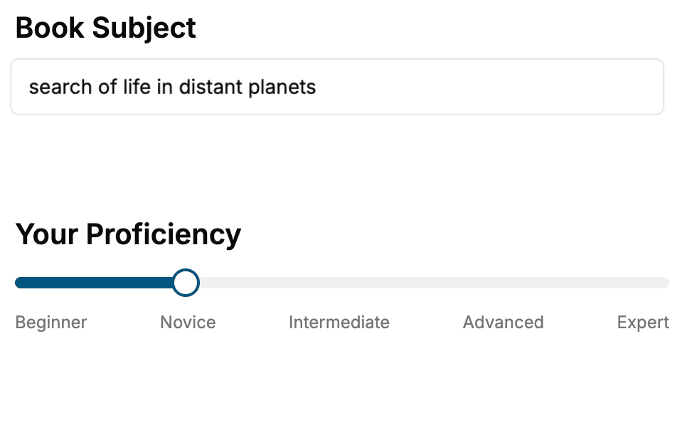
Select the focus of your Computer Graphics book and share your background
- 2. Personalize your book
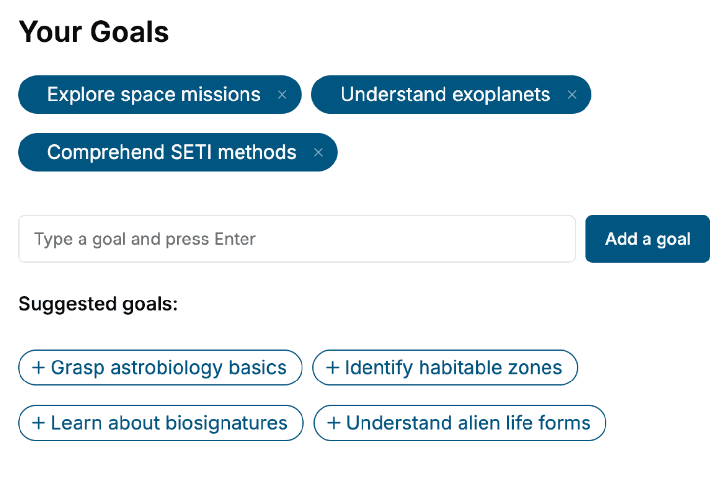
Specify your goals and choose sub-topics to include
- 3. Get your tailored book
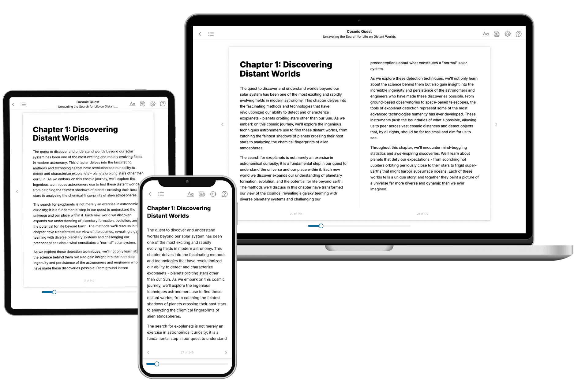
Your book is ready in 10 minutes. Read it online, download as EPUB or PDF, or send to Kindle.
Frequently asked questions
- What is TailoredRead?
TailoredRead creates complete, full-length nonfiction ebooks, written specifically for you. Tell us what you want to learn and why, and TailoredRead writes you a complete ebook on it, with charts, tables, and diagrams throughout. Read it online, on Kindle, or on any e-reader, or download it as a PDF or EPUB. Every book is written fresh the day you order it.
- How is the book tailored to me?
Before anything is written, you answer a few short questions about your goals, your background, and the topics you care about. Your book is then planned around your answers: written at your level, focused on your goals, and covering the topics you chose, instead of the one-size-fits-all book a store sells everyone.
- Will it read like generic AI content?
No. Your book isn't a chat transcript: it's planned chapter by chapter before a single word is written, told in a clear book voice, and explains ideas visually with charts, tables, and diagrams. After writing, every book goes through an editorial pass that polishes chapters so the book reads consistent from start to finish. Judge for yourself: browse thousands of sample books on our Explore Books page.
- How accurate is the content?
Our AI first checks whether your subject needs live research. Niche and fast-moving subjects are researched before writing, and the book plan and chapters are grounded in what it finds. After writing, every book goes through a quality pass that checks its facts and consistency, and researched books list their sources in a Notes section at the back.
- How long is the book?
You choose the length: Comprehensive (250-300 pages), Detailed (150-200 pages), Essential (70-100 pages), or Short (30-50 pages).
- Does the book include visuals?
Yes. Every book includes charts, tables, and diagrams: timelines, checklists, step-by-step guides, decision trees, comparison tables, matrices, and bar charts. A typical book includes dozens of these visual elements.
- Can I read it on Kindle? What formats can I download?
Yes. Every book can be read in our online reader or downloaded as a PDF or EPUB. The EPUB can be opened with Kindle, Apple Books, Kobo, and any e-reader. The Commercial and Author licenses also include an editable Word (DOCX) and Markdown download.
- How much does it cost?
About the price of a regular ebook. The exact price depends on your book's length and complexity, from $2 for the shortest books to $35 for the most comprehensive, and it's shown when you review your book, before you commit to anything. Each book is a one-time purchase, yours to keep, no subscription. Licenses that let you share, teach, or publish your book range from $35.99 to $49.99.
- Can I preview the book before purchasing?
Before you pay, you'll see what your book will cover: the title, a detailed description, the estimated length, and the complete chapter-by-chapter table of contents, so you know what you're getting before you decide. The full text itself is written after you purchase.
- How long does it take to create a book?
About 10 minutes. You can start reading the opening chapters while the rest is still being written.