Color Vision Deficiencies in Computer Graphics
Designing Accessible Digital Experiences for All Users
Many developers assume that if their design looks good on their monitor, it works for everyone.
207 pages9 chaptersJan 5, 2026Computer Graphics
About this book
The reality is starkly different. Millions of users experience color vision deficiencies that make standard color palettes confusing, inaccessible, or completely unusable. This book bridges the gap between color science and practical development, showing you exactly how to create graphics and interfaces that work beautifully for all users. You'll learn how color spaces affect perception, why certain color combinations fail for people with color blindness, and how to implement accessible design patterns without sacrificing aesthetics. Through real-world examples, testing strategies, and proven techniques, you'll discover that accessibility isn't a constraint—it's an opportunity to build better products. Whether you're developing games, data visualizations, or web applications, this guide provides the knowledge and tools to ensure your work is truly inclusive.
Table of contents
- IntroductionWhy Color Accessibility Matters in Digital Design, What You'll Learn in This Book, How to Use This GuideRead below
- Chapter 1: Understanding Color Vision and DeficienciesHow the Human Eye Perceives Color, The Three Main Types of Color Vision Deficiencies, Prevalence and Real-World Impact
- Chapter 2: Color Spaces and Digital RepresentationWhat Are Color Spaces and Why They Matter, sRGB: The Web Standard and Its Limitations, Extended Color Spaces: Adobe RGB and Display P3, Choosing the Right Color Space for Your Project
- Chapter 3: How Color Vision Deficiencies Affect PerceptionProtanopia: Red-Blind Vision, Deuteranopia: Green-Blind Vision, Tritanopia: Blue-Yellow Vision Deficiency, Complete Color Blindness and Achromatopsia
- Chapter 4: Designing Accessible Color PalettesContrast Ratios and WCAG Guidelines, Building Color Palettes That Work for Everyone, Color Combinations to Avoid, Testing Your Palettes for Accessibility
- Chapter 5: Communicating Beyond ColorRedundant Encoding: Never Rely on Color Alone, Using Patterns, Textures, and Shapes, Strategic Use of Labels and Annotations
- Chapter 6: Simulation Tools and Testing MethodologiesPopular Simulation Tools and How to Use Them, Browser Extensions for Real-Time Testing, Automated Accessibility Testing, Conducting User Testing with Color Vision Deficient Users
- Chapter 7: Implementing Accessible GraphicsAccessible Data Visualization and Charts, Color Accessibility in Game Development, Accessible UI Components and Buttons, Maps, Diagrams, and Technical Illustrations
- Chapter 8: Web Standards and ComplianceWCAG 2.1 Color and Contrast Requirements, Legal and Regulatory Considerations, Industry Best Practices and Standards
- Chapter 9: Real-World Case Studies and ExamplesCase Study 1: Redesigning a Financial Dashboard, Case Study 2: Making a Game Accessible to All Players, Case Study 3: Improving Medical Imaging Software
- ConclusionKey Takeaways and Next Steps, The Future of Color Accessibility in Digital Design
- Glossary
- Further Reading and Resources
Introduction
Every day, millions of people interact with digital interfaces that weren't designed for them. They struggle to distinguish between error messages and success notifications, misinterpret data visualizations, and miss critical information encoded only in color. These users aren't experiencing technical glitches or poor internet connections—they're encountering designs that fail to account for color vision deficiencies. The problem isn't with their eyes; it's with how we build digital experiences. As developers and designers, we have the power and responsibility to change this reality.
Color vision deficiencies affect approximately 300 million people worldwide, yet many digital products treat accessible color design as an optional enhancement rather than a fundamental requirement. This oversight creates unnecessary barriers that exclude a significant portion of your potential users. The challenge isn't just about compliance with accessibility standards or avoiding legal issues—it's about recognizing that good design works for everyone. When you design with color accessibility in mind from the start, you create clearer interfaces, more effective visual hierarchies, and better user experiences for all users, regardless of how they perceive color.
This book provides practical, actionable guidance for implementing color accessibility in computer graphics and digital design. You'll learn the science behind color vision deficiencies, understand how different color spaces affect perception, and discover proven techniques for creating inclusive visual experiences. Whether you're developing web applications, designing data visualizations, building games, or creating any form of digital content, this guide will equip you with the knowledge and tools to ensure your work is accessible to everyone. The goal isn't to limit your creative options—it's to expand your understanding so you can make informed decisions that serve all users effectively.
The intersection of color science, human perception, and digital technology creates unique challenges that require both technical knowledge and design sensitivity. Many developers understand RGB values and hex codes but lack insight into how those colors appear to someone with protanopia or deuteranopia. Similarly, designers may create beautiful color palettes without realizing that certain combinations become indistinguishable to users with color vision deficiencies. This book bridges that gap, connecting the technical aspects of color rendering with the human experience of color perception across the full spectrum of visual abilities.
Why Color Accessibility Matters in Digital Design
The statistics surrounding color vision deficiencies reveal a reality that many developers overlook. Approximately 8% of males and 0.5% of females have some form of color vision deficiency, with the vast majority experiencing red-green color blindness[1]. In practical terms, this means that in a company of 100 employees, roughly four people will have difficulty distinguishing certain color combinations. In a user base of one million people, approximately 42,500 males and 2,500 females will experience color vision deficiencies. These aren't edge cases or rare scenarios—they represent a substantial portion of your audience who deserve equal access to your digital products.
The impact of inaccessible color design extends far beyond inconvenience. Consider a financial application that uses red and green to indicate losses and gains without additional visual indicators. Users with red-green color blindness cannot quickly assess their portfolio performance, forcing them to click through individual items or rely on numerical values alone. In a medical context, color-coded patient status indicators that lack redundant encoding could lead to misinterpretation of critical information. In gaming, enemies and allies distinguished only by color create frustrating or impossible gameplay experiences. These scenarios demonstrate how color accessibility directly affects usability, safety, and user satisfaction across diverse applications.
Beyond the moral imperative of inclusive design, there are compelling business and legal reasons to prioritize color accessibility. Many jurisdictions now require digital accessibility compliance under laws such as the Americans with Disabilities Act (ADA) in the United States, the European Accessibility Act in the EU, and similar legislation worldwide. Non-compliance can result in lawsuits, financial penalties, and reputational damage. More importantly, accessible design expands your potential market. When your product works well for users with color vision deficiencies, you're not just avoiding exclusion—you're actively welcoming a significant demographic that competitors may be inadvertently turning away.
The relationship between accessibility and overall design quality is often misunderstood. Many developers fear that designing for color accessibility will constrain their creative options or result in visually bland interfaces. The opposite is true. Accessible color design forces you to think more carefully about visual hierarchy, contrast, and information architecture. When you can't rely solely on color to convey meaning, you develop more robust design patterns that use shape, position, texture, and typography effectively. These techniques benefit all users, not just those with color vision deficiencies. A well-designed accessible interface is clearer, more intuitive, and more effective for everyone.
The technical landscape of digital design has evolved significantly, offering new opportunities and challenges for color accessibility. Modern displays support wider color gamuts through technologies like Display P3 and HDR, while web standards continue to expand color capabilities through CSS Color Module Level 4 and beyond. However, these advances don't automatically improve accessibility—in fact, they can introduce new problems if not implemented thoughtfully. Understanding how color spaces, rendering engines, and display technologies interact with color vision deficiencies is essential for creating truly accessible digital experiences in today's diverse device ecosystem.
Color accessibility also intersects with other aspects of inclusive design, creating a holistic approach to user experience. Users with color vision deficiencies may also have other accessibility needs, such as screen reader compatibility, keyboard navigation, or adjustable text sizes. When you design with multiple accessibility considerations in mind, you create products that work across a broader range of abilities, devices, and contexts. This comprehensive approach to accessibility isn't just good practice—it's essential for reaching the full diversity of human users in an increasingly digital world.
The cost of retrofitting accessibility into existing products far exceeds the investment required to build it in from the start. When color accessibility is an afterthought, you face the challenge of redesigning established visual systems, updating documentation, retraining users, and potentially breaking existing workflows. Conversely, when you incorporate accessible color practices from the beginning of a project, they become natural parts of your design system and development workflow. This proactive approach saves time, reduces technical debt, and ensures that accessibility remains consistent as your product evolves. The question isn't whether you can afford to prioritize color accessibility—it's whether you can afford not to.
What You'll Learn in This Book
This book is structured to take you from foundational understanding to practical implementation of color accessibility in computer graphics. You'll begin by exploring the science of color vision and the specific mechanisms that cause different types of color vision deficiencies. Understanding how the human eye processes color through cone cells, and what happens when certain cone types are absent or dysfunctional, provides the essential context for all subsequent design decisions. This scientific foundation isn't just academic—it directly informs why certain color combinations fail and others succeed for users with different types of color blindness.
The technical aspects of color representation form a critical component of accessible design. You'll learn how color spaces like sRGB, Adobe RGB, and Display P3 define the range of colors available in digital systems, and how these choices affect users with color vision deficiencies. The book covers color models including RGB, HSL, and LAB, explaining when each is most appropriate for accessibility work. You'll understand how gamma correction, color profiles, and rendering pipelines influence the final appearance of colors on different devices. This technical knowledge enables you to make informed decisions about color implementation at every stage of development.
Practical design techniques occupy the core of this book, providing actionable strategies you can implement immediately. You'll discover how to build accessible color palettes that maintain visual appeal while ensuring distinguishability for users with various types of color vision deficiencies. The book presents specific contrast ratios required by WCAG guidelines and explains how to calculate and verify them in your designs. You'll learn redundant encoding techniques that communicate information through multiple visual channels—color plus shape, color plus pattern, color plus labels—ensuring that no user is excluded from understanding your interface.
Testing and validation methodologies receive extensive coverage, as creating accessible designs requires verification beyond your own color perception. You'll explore simulation tools that allow you to preview how your designs appear to users with protanopia, deuteranopia, and tritanopia. The book covers both manual testing approaches and automated accessibility testing tools, explaining the strengths and limitations of each. You'll learn how to conduct effective user testing with participants who have color vision deficiencies, gathering insights that no simulation can provide. These testing strategies ensure that your accessibility efforts translate into real-world usability improvements.
Domain-specific applications demonstrate how color accessibility principles apply across different types of digital products. Dedicated sections address data visualization, where color often carries critical information about trends, categories, and relationships. You'll see how game developers can implement colorblind modes and design gameplay that doesn't depend solely on color discrimination. The book covers UI component design, showing how buttons, form elements, and navigation systems can remain clear and functional for all users. Each domain presents unique challenges and opportunities for accessible color implementation.
Real-world case studies illustrate the transformation from inaccessible to accessible design through concrete examples. You'll examine a financial dashboard redesign that improved usability for colorblind users while enhancing clarity for all users. A game development case study shows how accessibility features expanded the player base and received positive reviews from the entire gaming community. A medical imaging software example demonstrates how color accessibility can have life-or-death implications in professional contexts. These case studies provide templates and inspiration for your own accessibility initiatives.
The book also addresses the broader context of web standards, legal requirements, and industry best practices. You'll understand WCAG 2.1 guidelines in depth, learning not just what the standards require but why those requirements exist and how to exceed minimum compliance. Legal considerations across different jurisdictions help you understand the regulatory landscape and potential risks of non-compliance. Industry best practices from leading technology companies provide proven patterns and approaches that you can adapt to your specific context. This comprehensive view ensures that your accessibility work aligns with both technical standards and real-world expectations.
Throughout the book, you'll find practical tools, resources, and references that support ongoing accessibility work. Code examples demonstrate implementation techniques in common frameworks and languages. Tool recommendations help you build an accessibility testing toolkit appropriate for your workflow. Resource lists point you toward color palette generators, contrast checkers, and simulation software. The goal is not just to teach you about color accessibility but to equip you with everything needed to make it a sustainable part of your development practice. By the end of this book, you'll have both the knowledge and the practical resources to create truly inclusive digital experiences.
How to Use This Guide
This book is designed to serve both as a comprehensive learning resource and as a practical reference guide you can return to throughout your projects. If you're new to color accessibility, reading the chapters in sequence provides a logical progression from foundational concepts to advanced implementation techniques. Each chapter builds on previous material, creating a cohesive understanding of how color vision deficiencies affect digital design and what you can do about it. However, the book is also structured so that experienced developers can jump directly to specific topics of immediate interest, such as testing methodologies or domain-specific applications, without losing essential context.
The early chapters establish the scientific and technical foundation necessary for informed decision-making. If you're unfamiliar with how the human eye perceives color or how color spaces work, these sections provide essential background without requiring advanced knowledge of biology or color science. Even if you consider yourself knowledgeable about color theory, these chapters offer insights specifically relevant to accessibility that may differ from traditional design education. The technical depth is calibrated for developers and designers who need practical understanding rather than academic expertise—you'll learn what matters for implementation without unnecessary complexity.
As you progress through the book, you'll encounter increasingly specific and actionable content. The middle chapters focus on design techniques, testing strategies, and implementation patterns that you can apply directly to your current projects. These sections include code examples, tool recommendations, and step-by-step processes that translate concepts into practice. When you encounter a specific challenge in your work—such as choosing colors for a data visualization or testing a new UI component—you can reference these chapters for targeted guidance. The practical examples are designed to be adaptable across different technologies, frameworks, and design contexts.
The case studies in later chapters serve multiple purposes depending on your needs and experience level. For those learning about color accessibility for the first time, they demonstrate how the principles and techniques from earlier chapters come together in real-world scenarios. For experienced practitioners, they offer inspiration and validation for accessibility initiatives you may be planning or implementing. Each case study includes specific challenges faced, solutions implemented, and outcomes achieved, providing a template you can adapt to your own context. The diversity of case studies—spanning financial applications, games, and medical software—ensures relevance across different domains.
Throughout the book, you'll find different types of content designed to support various learning styles and use cases:
- Conceptual explanations that build understanding of why certain approaches work or fail
- Technical specifications that provide precise details about color spaces, contrast ratios, and standards
- Practical examples that show specific implementations in code or design tools
- Visual comparisons that illustrate how designs appear to users with different types of color vision
- Checklists and frameworks that guide you through complex processes systematically
- Tool recommendations that help you build an effective accessibility workflow
Consider using this book as part of a broader accessibility learning journey. While color accessibility is crucial, it's one component of inclusive design alongside considerations like keyboard navigation, screen reader compatibility, and cognitive accessibility. The principles you learn here—such as redundant encoding and user testing—apply across accessibility domains. As you implement color accessibility improvements, look for opportunities to address other accessibility aspects simultaneously. The resources section at the end of the book points you toward additional learning materials that complement the color-specific focus of this guide.
For team environments, this book can serve as a shared reference that establishes common understanding and vocabulary around color accessibility. Designers, developers, product managers, and quality assurance professionals all play roles in creating accessible products, and this book addresses each perspective. Consider using specific chapters as discussion starters in team meetings or as onboarding materials for new team members. The case studies work particularly well as team learning exercises, where you can discuss how similar challenges might apply to your own products and what solutions would be most appropriate in your context.
The book includes numerous references to tools, standards, and resources that will evolve over time. While the fundamental principles of color vision and accessibility remain stable, specific tools and technologies continue to advance. Use the tool recommendations as starting points for building your accessibility toolkit, but remain open to new options as they emerge. The standards and guidelines referenced throughout the book—particularly WCAG—represent current best practices, but stay informed about updates and new versions. The resources section provides links to organizations and communities where you can stay current with accessibility developments beyond the publication of this book.
Finally, approach this book with the understanding that perfect accessibility is an ongoing goal rather than a final destination. You'll likely discover accessibility issues in your existing work as you learn more about color vision deficiencies. Rather than feeling discouraged, view these discoveries as opportunities for improvement. Start with the most impactful changes—those affecting critical user flows or large user populations—and progressively enhance accessibility across your products. The knowledge and techniques in this book will serve you throughout your career as you continue refining your approach to inclusive design. Color accessibility isn't a checkbox to mark complete; it's a perspective that will inform and improve everything you create.
Notes
Introduction
- 1. M. P. Simunovic, "Colour vision deficiency," Eye, 2010
This is the end of the free sample. The full book has 9 chapters.
Want this book written for you?
Tell us your goals and background, and get your own version of this book, tailored by AI to you.


Benefits of AI-tailored books
- Read one book, not ten:
- all the Computer Graphics knowledge you need, gathered into a single book.
- Save days of learning:
- tell us your goals, choose your topics, and the whole book is built around them.
- Learn effortlessly:
- Computer Graphics book written for your specific background and expertise.
- Understand at a glance:
- includes charts, tables, timelines, checklists, decision trees, and more.
- Stay current:
- written the day you order it, not years ago.
- Trust what you read:
- every book is checked for accuracy, with real research when your subject needs it.
Create your unique book in 3 steps
- 1. Select your focus
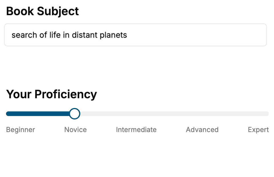
Select the focus of your Computer Graphics book and share your background
- 2. Personalize your book
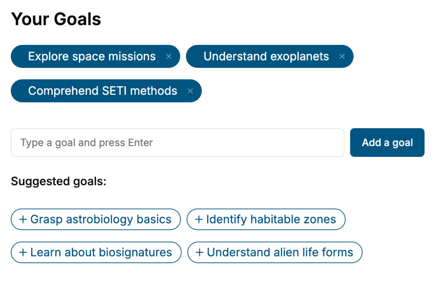
Specify your goals and choose sub-topics to include
- 3. Get your tailored book
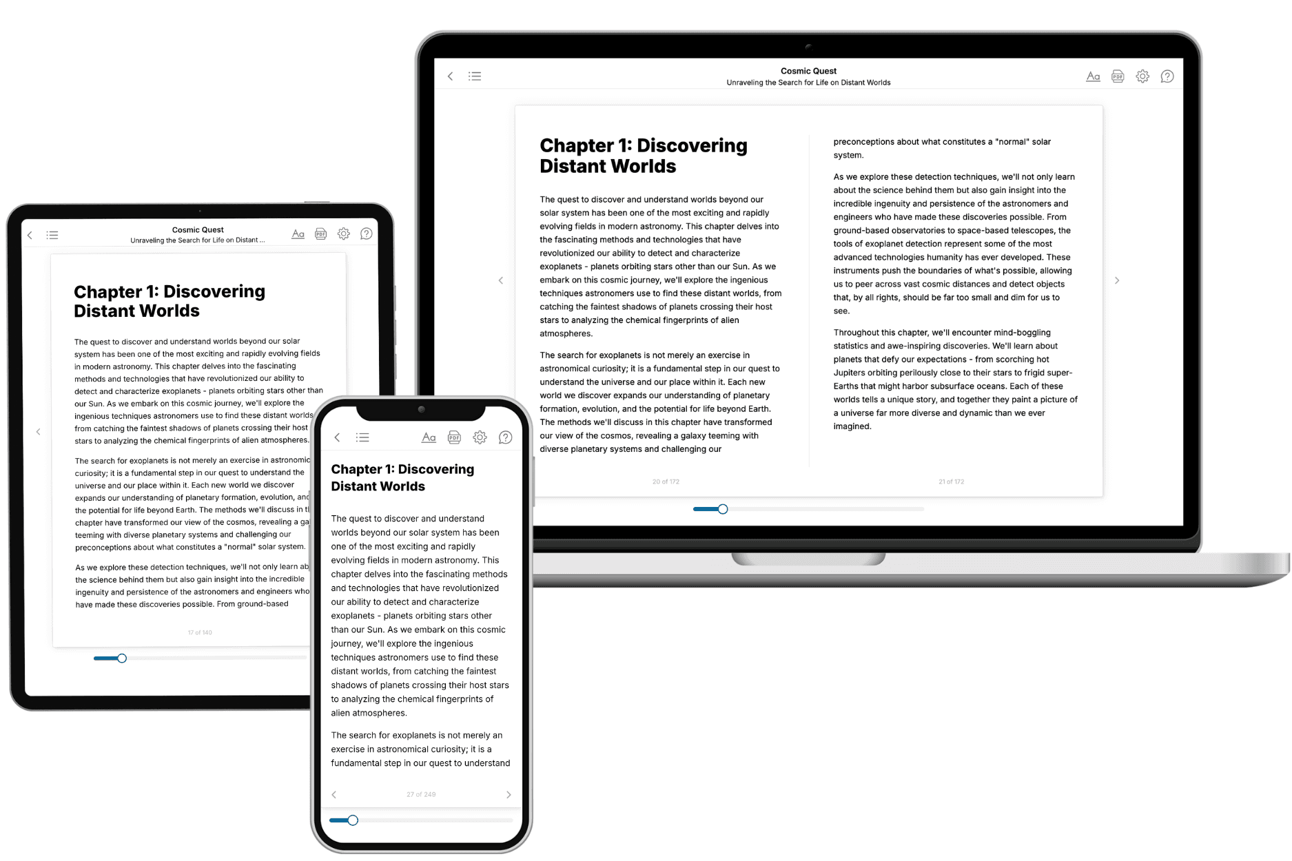
Your book is ready in 10 minutes. Read it online, download as EPUB or PDF, or send to Kindle.
Frequently asked questions
- What is TailoredRead?
TailoredRead creates complete, full-length nonfiction ebooks, written specifically for you. Tell us what you want to learn and why, and TailoredRead writes you a complete ebook on it, with charts, tables, and diagrams throughout. Read it online, on Kindle, or on any e-reader, or download it as a PDF or EPUB. Every book is written fresh the day you order it.
- How is the book tailored to me?
Before anything is written, you answer a few short questions about your goals, your background, and the topics you care about. Your book is then planned around your answers: written at your level, focused on your goals, and covering the topics you chose, instead of the one-size-fits-all book a store sells everyone.
- Will it read like generic AI content?
No. Your book isn't a chat transcript: it's planned chapter by chapter before a single word is written, told in a clear book voice, and explains ideas visually with charts, tables, and diagrams. After writing, every book goes through an editorial pass that polishes chapters so the book reads consistent from start to finish. Judge for yourself: browse thousands of sample books on our Explore Books page.
- How accurate is the content?
Our AI first checks whether your subject needs live research. Niche and fast-moving subjects are researched before writing, and the book plan and chapters are grounded in what it finds. After writing, every book goes through a quality pass that checks its facts and consistency, and researched books list their sources in a Notes section at the back.
- How long is the book?
You choose the length: Comprehensive (250-300 pages), Detailed (150-200 pages), Essential (70-100 pages), or Short (30-50 pages).
- Does the book include visuals?
Yes. Every book includes charts, tables, and diagrams: timelines, checklists, step-by-step guides, decision trees, comparison tables, matrices, and bar charts. A typical book includes dozens of these visual elements.
- Can I read it on Kindle? What formats can I download?
Yes. Every book can be read in our online reader or downloaded as a PDF or EPUB. The EPUB can be opened with Kindle, Apple Books, Kobo, and any e-reader. The Commercial and Author licenses also include an editable Word (DOCX) and Markdown download.
- How much does it cost?
About the price of a regular ebook. The exact price depends on your book's length and complexity, from $2 for the shortest books to $35 for the most comprehensive, and it's shown when you review your book, before you commit to anything. Each book is a one-time purchase, yours to keep, no subscription. Licenses that let you share, teach, or publish your book range from $35.99 to $49.99.
- Can I preview the book before purchasing?
Before you pay, you'll see what your book will cover: the title, a detailed description, the estimated length, and the complete chapter-by-chapter table of contents, so you know what you're getting before you decide. The full text itself is written after you purchase.
- How long does it take to create a book?
About 10 minutes. You can start reading the opening chapters while the rest is still being written.