CSS Grid Mastery
Build Responsive, Modern Layouts with CSS3 Grid
Are you still struggling to create flexible, responsive layouts that work across all devices?
176 pages8 chaptersFeb 24, 2026CSS
About this book
CSS Grid isn't just another layout tool—it's a complete paradigm shift in how modern web design works. This book takes you beyond basic grid concepts to show you how to build sophisticated, production-ready layouts that adapt beautifully to any screen size. You'll discover how Grid's two-dimensional power solves layout challenges that would require complex workarounds with older methods. Through practical examples and real-world patterns, you'll learn to think in terms of grid lines, tracks, and areas. Whether you're building navigation systems, card-based galleries, or complex dashboards, you'll gain the confidence to tackle any layout challenge. This comprehensive guide bridges the gap between understanding Grid basics and applying it effectively in professional projects, complete with responsive design strategies and browser compatibility considerations.
Table of contents
- IntroductionWhy CSS Grid Matters in Modern Web Development, How Grid Compares to Floats, Flexbox, and Other Methods, What You'll Master in This Book, How to Get the Most from This GuideRead below
- Chapter 1: Grid FundamentalsUnderstanding Grid Containers and Grid Items, Grid Lines, Tracks, and the Grid Coordinate System, Gaps, Gutters, and Spacing in Grid Layouts
- Chapter 2: Positioning Content on the GridGrid Placement Properties and Shorthand, Using Grid Template Areas for Semantic Layouts, Auto-Placement and the Grid Algorithm
- Chapter 3: Sizing Tracks and Managing SpaceFixed, Flexible, and Fractional Units, The minmax() Function and Responsive Sizing, Auto-fit and Auto-fill for Dynamic Grids
- Chapter 4: Responsive Design with GridMedia Queries and Grid Layout Changes, Mobile-First Grid Strategies, Creating Truly Fluid and Flexible Layouts
- Chapter 5: Advanced Grid TechniquesNamed Grid Lines and Custom Naming Conventions, Subgrid for Nested Layout Control, Alignment and Justification in Grid
- Chapter 6: Combining Grid with Flexbox and Other CSSWhen and How to Use Grid with Flexbox, Grid with CSS Variables, Transforms, and Transitions, Building Reusable Component Patterns
- Chapter 7: Real-World Layout PatternsNavigation and Header Layouts, Card-Based Galleries and Product Grids, Dashboard and Complex Multi-Section Layouts
- Chapter 8: Performance and Browser CompatibilityBrowser Support and Feature Detection, Creating Fallbacks for Older Browsers, Performance Optimization and Best Practices
- ConclusionYour Path to Grid Mastery, Next Steps and Continued Learning
- Additional Resources and References
Introduction
Web layout has always been one of the most frustrating parts of front-end development. For years, developers wrestled with floats, clearfixes, and positioning hacks just to get a simple two-column layout to behave. Then Flexbox arrived and made a lot of things easier, but it was still fundamentally a one-dimensional tool. CSS Grid changed everything. It gave developers a genuine two-dimensional layout system built directly into the browser, and it did so in a way that finally matched how designers had been thinking about page structure all along.
If you've been building websites for a while, you've probably already picked up some Grid basics. Maybe you've used display: grid to arrange a few cards in a row, or you've seen grid-template-columns in a tutorial and thought it looked promising. But there's a significant gap between knowing the basics and actually using Grid with confidence on real projects. That gap is exactly what this book is designed to close. You'll move from understanding individual properties to thinking in terms of complete layout systems.
This book is written for intermediate web developers and designers who already have a working knowledge of CSS. You don't need to be an expert, but you should be comfortable with selectors, the box model, and basic styling. From that foundation, this guide will take you through everything you need to build sophisticated, responsive layouts that work across all modern browsers. Each chapter builds on the last, moving from core concepts to advanced techniques to real-world application patterns that you can use immediately in your own projects.
Throughout these pages, you'll find practical code examples, concrete layout patterns, and honest explanations of when Grid is the right tool and when something else might serve you better. The goal isn't to make Grid sound like a magic solution to every problem. The goal is to give you a deep enough understanding that you can make smart decisions about your layouts and execute them cleanly. By the time you finish, Grid won't feel like a foreign language. It'll feel like a natural extension of how you think about design.
Why CSS Grid Matters in Modern Web Development
Before CSS Grid, creating complex page layouts required a lot of creative workarounds. Developers used floats to arrange columns, then had to clear them to prevent parent containers from collapsing. They used negative margins to create gutters. They used position: absolute to place elements precisely, which broke them out of the document flow entirely. These techniques worked, but they were fragile. A small change in content or screen size could break the whole layout in unexpected ways.
CSS Grid was introduced as a W3C specification and became widely supported in major browsers in 2017.[1] Its adoption was remarkably fast compared to other CSS features, largely because developers had been waiting for exactly this kind of tool. Within a year of broad browser support, Grid was being used in production on major websites and web applications around the world. Today, browser support sits above 97% globally, making it a safe and practical choice for virtually any project.
What makes Grid genuinely different is its two-dimensional nature. Flexbox is excellent at arranging items along a single axis, either in a row or in a column. Grid lets you control both axes simultaneously. You can define rows and columns together, and then place items precisely within that structure. This means you can build a full page layout, including header, sidebar, main content, and footer, with a handful of CSS declarations instead of deeply nested HTML and complex float logic.
Grid also changes the relationship between HTML structure and visual layout. With older methods, you often had to add extra wrapper elements just to achieve a certain visual arrangement. Grid lets you separate structure from presentation more cleanly. Your HTML can reflect the logical order of your content, while your CSS handles the visual arrangement independently. This is better for accessibility, easier to maintain, and more aligned with the original intent of separating content from style.
Consider a common real-world scenario: a magazine-style article page with a large featured image that spans multiple columns, a pull quote that breaks out of the text column, and a sidebar that runs alongside the main content. With floats, this would require significant markup gymnastics. With Grid, you can define the layout structure once and place each element exactly where it belongs using a few lines of CSS. The code is readable, the intent is clear, and changes are easy to make.
Beyond individual page layouts, Grid has also changed how design systems and component libraries are built. Teams can define consistent grid structures at the application level and reuse them across dozens of components. This creates visual consistency without duplicating layout logic everywhere. For larger projects, this kind of systematic thinking about layout is not just convenient. It's essential for keeping codebases manageable as they grow.
The bottom line is that CSS Grid isn't just a new way to do the same old things. It represents a genuine upgrade in how the web handles layout. Learning it well isn't optional for modern front-end work. It's a core skill that will make you faster, more capable, and better equipped to handle the increasingly complex design requirements of today's web applications.
How Grid Compares to Floats, Flexbox, and Other Methods
To understand where Grid fits, it helps to look at the full history of CSS layout methods. Each approach emerged to solve specific problems, and each has its own strengths and limitations. Knowing the differences will help you choose the right tool for each situation, because Grid doesn't replace everything that came before it. It complements the existing toolkit.
Floats were originally designed for wrapping text around images, not for building page layouts. Developers repurposed them for layout because there was no better option at the time. The result was a generation of techniques involving clearfixes, overflow hacks, and carefully calculated percentage widths. Floats are still valid for their original purpose, wrapping text around an image, but using them for full page layout is now considered outdated practice. If you're maintaining legacy code that uses floats for layout, Grid gives you a clear migration path.
Flexbox was a major step forward when it arrived. It made it easy to distribute space along a single axis, align items vertically within a container, and build navigation bars, toolbars, and card rows with much less effort. Flexbox is still the right choice for many situations, particularly for component-level layout where you're arranging items in a single row or column. The key distinction is this:
- Use Flexbox when you're laying out items in one direction and want them to wrap or distribute naturally based on their content size.
- Use Grid when you need to control both rows and columns simultaneously, or when you want items to align across multiple rows.
A practical example makes this clearer. Imagine a row of navigation links. Flexbox is perfect here. You want the links to sit in a row, distribute space evenly, and maybe wrap to a second line on small screens. Now imagine a full page layout with a header, a two-column content area, and a footer. Grid is the better choice because you need to define both the horizontal columns and the vertical rows, and you want elements to align across both dimensions.
CSS Multicolumn Layout is another option that sometimes gets overlooked. It's designed specifically for flowing text content across multiple columns, like a newspaper layout. It's not suitable for placing arbitrary elements in specific positions, but it's excellent for long-form text that should flow naturally from one column to the next. Grid doesn't replace this either. They solve different problems.
Absolute and relative positioning still have their place for specific use cases, like overlaying a badge on a card, or positioning a tooltip relative to a button. But using positioning for overall page layout creates brittle, hard-to-maintain code. Grid handles the macro-level structure, while positioning handles micro-level adjustments within components.
One of the most important things to understand is that Grid and Flexbox are not competitors. They're designed to work together. A common and effective pattern is to use Grid for the overall page structure and Flexbox for the internal layout of individual components. For example, a card component might live inside a Grid layout, but the card itself uses Flexbox to arrange its image, title, and button vertically. This combination gives you the best of both tools.
A useful mental model: Grid is for layout. Flexbox is for alignment. Use Grid to define where sections of your page live. Use Flexbox to control how content flows within those sections. In practice, the line blurs, but this framing helps you make faster decisions when you're starting a new layout.
The comparison isn't really about which method is best in absolute terms. It's about understanding what each tool was designed to do and matching the tool to the task. Grid excels at two-dimensional layout control. Flexbox excels at one-dimensional flow. Floats are for text wrapping. Positioning is for precise, context-relative placement. Knowing all of these and when to reach for each one is what separates a competent CSS developer from a truly skilled one.
What You'll Master in This Book
This book is organized to take you from foundational understanding to practical mastery in a logical sequence. Each chapter introduces new concepts and builds directly on what came before. Here's a clear picture of what you'll be able to do by the time you reach the final chapter.
In Chapter 1: Grid Fundamentals, you'll learn how Grid containers and Grid items relate to each other, and why that relationship is the key to everything else. You'll get comfortable with the Grid coordinate system, including lines, tracks, and cells, and you'll learn how to control spacing between items using gaps and gutters. These fundamentals are the vocabulary you'll use throughout the rest of the book.
In Chapter 2: Positioning Content on the Grid, you'll move beyond automatic placement and learn how to put items exactly where you want them. You'll use placement properties like grid-column and grid-row, and you'll discover how grid-template-areas lets you define layouts using readable, named regions. You'll also understand how the browser's auto-placement algorithm works, so you can predict and control what happens when you don't specify positions explicitly.
In Chapter 3: Sizing Tracks and Managing Space, you'll learn how to control the size of your rows and columns using fixed units, flexible fractions, and the powerful minmax() function. You'll understand the difference between auto-fit and auto-fill, and you'll see how these tools let you create grids that adapt to their content and container without writing a single media query.
In Chapter 4: Responsive Design with Grid, you'll combine Grid's built-in flexibility with media queries to build layouts that work beautifully at every screen size. You'll learn mobile-first strategies, understand when to change your grid structure versus when to let Grid handle adaptation automatically, and build truly fluid layouts that feel intentional at every breakpoint.
In Chapter 5: Advanced Grid Techniques, you'll go deeper with named grid lines, the subgrid feature for nested layout control, and the full range of alignment and justification properties. These tools give you fine-grained control over complex layouts and make your CSS more readable and maintainable at scale.
In Chapter 6: Combining Grid with Flexbox and Other CSS, you'll learn how to use Grid alongside Flexbox, CSS custom properties, transforms, and transitions to build sophisticated component-based layouts. You'll see concrete patterns for combining these tools effectively without creating unnecessary complexity.
In Chapter 7: Real-World Layout Patterns, you'll apply everything you've learned to build three categories of layouts that appear constantly in real projects:
- Navigation and header layouts that adapt from mobile to desktop
- Card-based galleries and product grids with consistent alignment
- Dashboard layouts with multiple sections, sidebars, and data panels
In Chapter 8: Performance and Browser Compatibility, you'll learn how to check browser support, write fallbacks for older browsers using feature detection, and optimize your Grid code for performance. You'll leave with a clear understanding of how to ship Grid-based layouts confidently in production environments.
By the end of this book, you won't just know Grid syntax. You'll have a mental model for approaching any layout challenge, a toolkit of proven patterns, and the practical experience of applying them to realistic scenarios. That combination of knowledge and practice is what turns a developer who knows Grid into one who truly masters it.
How to Get the Most from This Guide
Reading about CSS is useful, but the real learning happens when you write code. This guide is designed to be used actively, not just read passively. Every chapter includes code examples that you should type out and experiment with in your own browser. Don't just copy and paste. Change values, break things intentionally, and observe what happens. That kind of hands-on exploration builds intuition that reading alone can't provide.
To follow along with the examples, you'll need a modern browser and a code editor. Any of the major browsers work well for Grid development, but Firefox's Grid Inspector is particularly useful. It overlays a visual representation of your grid directly on the page, showing you grid lines, track sizes, and item placement at a glance. Chrome and Edge also have Grid debugging tools in their DevTools panels. Getting comfortable with these tools early will save you significant debugging time throughout the book.[2]
For a code editor, Visual Studio Code is a popular choice with excellent CSS support and extensions like CSS Grid Snippets that can speed up your workflow. That said, any editor you're already comfortable with will work fine. The important thing is that you can write and preview HTML and CSS quickly without friction slowing down your experimentation.
Here's a recommended approach for working through each chapter:
- Read the chapter once to get the big picture before diving into code.
- Work through the examples by typing them out yourself, not copying them.
- Modify each example by changing at least two or three values to see how the layout responds.
- Try to recreate the layout from memory after closing the book, then check your work.
- Apply the concept to a small personal project or experiment before moving to the next chapter.
The chapters are designed to be read in order, especially the first four. Grid fundamentals, positioning, sizing, and responsive design all build on each other in a specific sequence. If you skip ahead to advanced techniques without a solid grasp of the basics, you'll likely find yourself confused and backtracking. That said, once you've completed the first four chapters, the later chapters are more modular. You can dip into Chapter 7's real-world patterns, for example, without having read Chapter 6 first.
If you get stuck on a concept, the best approach is to simplify. Strip your example down to the smallest possible case that demonstrates the behavior you're trying to understand. Remove all the extra styling, reduce the number of grid items, and focus on just the property that's confusing you. This technique, sometimes called minimal reproduction, is one of the most effective debugging strategies in CSS development and it works especially well with Grid.
You'll also find it helpful to keep the MDN Web Docs page for CSS Grid open as a reference while you work.[3] MDN is the most reliable and comprehensive reference for CSS properties, and it includes browser compatibility tables that are updated regularly. When you encounter a property you're not sure about, MDN should be your first stop for clarification.
Finally, don't worry about memorizing every property and value combination. Professional developers look things up constantly. The goal of this book is not to fill your head with syntax. It's to give you a clear mental model of how Grid works, so that when you do look something up, you understand what you're reading and can apply it correctly. Syntax can be referenced. Understanding has to be built. That's what this guide is here to help you do.
A note on code examples: All code examples in this book are written in plain HTML and CSS with no frameworks or build tools required. You can run every example by creating a simple HTML file and opening it in your browser. This keeps the focus on Grid itself, without the noise of tooling or framework conventions getting in the way.
One more practical tip: build a personal reference file as you go through the book. Each time you learn a new Grid property or pattern, add a small working example to your reference file with a comment explaining what it does. By the time you finish the book, you'll have a custom cheat sheet built from your own experiments, written in your own words, and tested in your own browser. That kind of personalized reference is far more useful than any generic cheat sheet you could download online.
This is the end of the free sample. The full book has 8 chapters.
Want this book written for you?
Tell us your goals and background, and get your own version of this book, tailored by AI to you.


Benefits of AI-tailored books
- Read one book, not ten:
- all the CSS knowledge you need, gathered into a single book.
- Save days of learning:
- tell us your goals, choose your topics, and the whole book is built around them.
- Learn effortlessly:
- CSS book written for your specific background and expertise.
- Understand at a glance:
- includes charts, tables, timelines, checklists, decision trees, and more.
- Stay current:
- written the day you order it, not years ago.
- Trust what you read:
- every book is checked for accuracy, with real research when your subject needs it.
Create your unique book in 3 steps
- 1. Select your focus
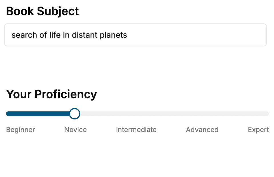
Select the focus of your CSS book and share your background
- 2. Personalize your book
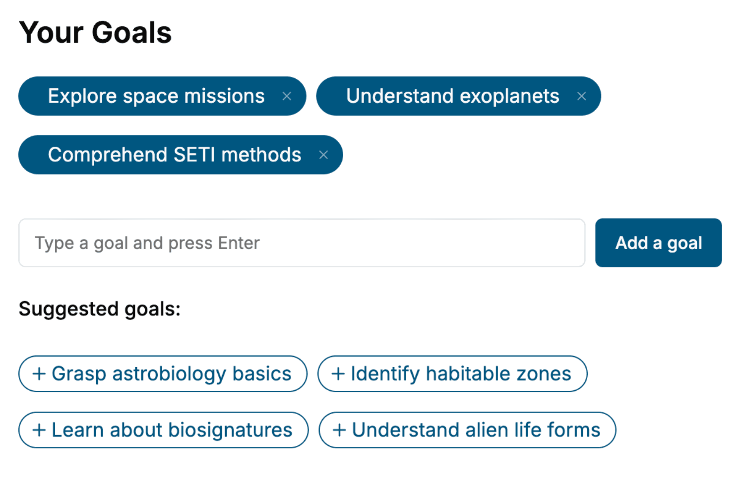
Specify your goals and choose sub-topics to include
- 3. Get your tailored book
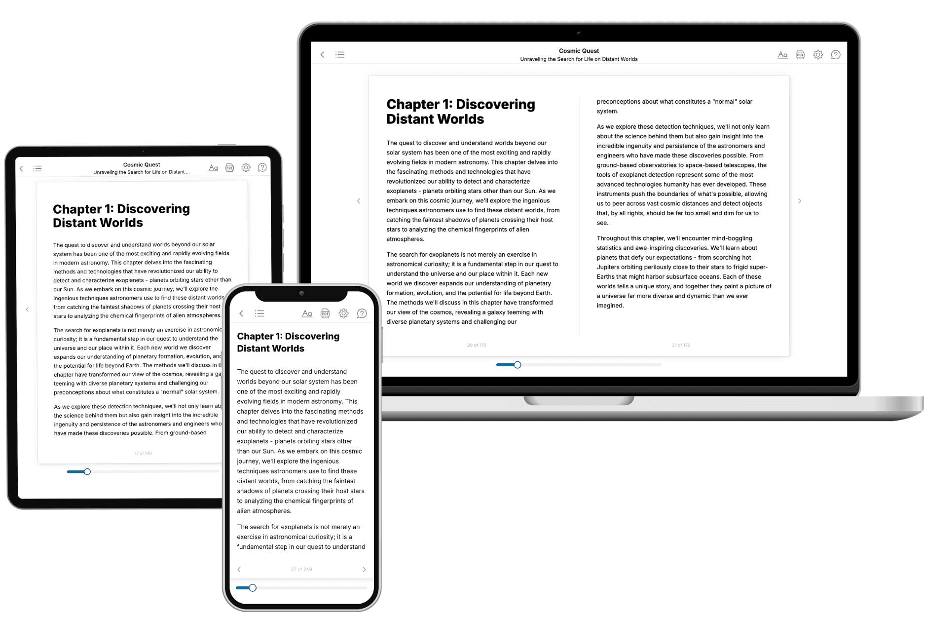
Your book is ready in 10 minutes. Read it online, download as EPUB or PDF, or send to Kindle.
Frequently asked questions
- What is TailoredRead?
TailoredRead creates complete, full-length nonfiction ebooks, written specifically for you. Tell us what you want to learn and why, and TailoredRead writes you a complete ebook on it, with charts, tables, and diagrams throughout. Read it online, on Kindle, or on any e-reader, or download it as a PDF or EPUB. Every book is written fresh the day you order it.
- How is the book tailored to me?
Before anything is written, you answer a few short questions about your goals, your background, and the topics you care about. Your book is then planned around your answers: written at your level, focused on your goals, and covering the topics you chose, instead of the one-size-fits-all book a store sells everyone.
- Will it read like generic AI content?
No. Your book isn't a chat transcript: it's planned chapter by chapter before a single word is written, told in a clear book voice, and explains ideas visually with charts, tables, and diagrams. After writing, every book goes through an editorial pass that polishes chapters so the book reads consistent from start to finish. Judge for yourself: browse thousands of sample books on our Explore Books page.
- How accurate is the content?
Our AI first checks whether your subject needs live research. Niche and fast-moving subjects are researched before writing, and the book plan and chapters are grounded in what it finds. After writing, every book goes through a quality pass that checks its facts and consistency, and researched books list their sources in a Notes section at the back.
- How long is the book?
You choose the length: Comprehensive (250-300 pages), Detailed (150-200 pages), Essential (70-100 pages), or Short (30-50 pages).
- Does the book include visuals?
Yes. Every book includes charts, tables, and diagrams: timelines, checklists, step-by-step guides, decision trees, comparison tables, matrices, and bar charts. A typical book includes dozens of these visual elements.
- Can I read it on Kindle? What formats can I download?
Yes. Every book can be read in our online reader or downloaded as a PDF or EPUB. The EPUB can be opened with Kindle, Apple Books, Kobo, and any e-reader. The Commercial and Author licenses also include an editable Word (DOCX) and Markdown download.
- How much does it cost?
About the price of a regular ebook. The exact price depends on your book's length and complexity, from $2 for the shortest books to $35 for the most comprehensive, and it's shown when you review your book, before you commit to anything. Each book is a one-time purchase, yours to keep, no subscription. Licenses that let you share, teach, or publish your book range from $35.99 to $49.99.
- Can I preview the book before purchasing?
Before you pay, you'll see what your book will cover: the title, a detailed description, the estimated length, and the complete chapter-by-chapter table of contents, so you know what you're getting before you decide. The full text itself is written after you purchase.
- How long does it take to create a book?
About 10 minutes. You can start reading the opening chapters while the rest is still being written.