Font Management Across Platforms
Master Typography in Cross-Platform Development
Why does your carefully chosen typeface look completely different on your user's phone than it does on your desktop?
207 pages10 chaptersApr 24, 2026Typography
About this book
Font management in cross-platform development is far more complex than simply selecting a typeface and hoping for the best. This practical guide cuts through the confusion and gives you actionable strategies for implementing typography that works consistently across web, mobile, and desktop environments. You'll learn how to navigate platform-specific rendering differences, optimize font loading for performance, build resilient fallback systems, and test your typography effectively. Whether you're struggling with invisible text during font loads, dealing with rendering inconsistencies, or trying to reduce your bundle size, this book provides the concrete techniques and decision frameworks you need to master font management and deliver a polished user experience everywhere your application runs.
Table of contents
- IntroductionWhy Font Management Matters in Modern Development, The Cross-Platform Typography Challenge, What You'll Master in This BookRead below
- Chapter 1: Understanding Font Rendering Across PlatformsHow Operating Systems Render Fonts, Windows, macOS, iOS, and Android Rendering Differences, Antialiasing, Hinting, and Subpixel Rendering, Browser-Specific Font Rendering Behavior
- Chapter 2: Font Selection and ClassificationSystem Fonts vs. Web Fonts vs. Variable Fonts, Understanding Font Families and Typeface Categories, Font Licensing, Formats, and Distribution, Criteria for Selecting Fonts for Cross-Platform Use
- Chapter 3: Font Loading Strategies and PerformanceFont Loading Methods: @font-face, CDNs, and Local Storage, Managing FOUT and FOIT: Flash of Unstyled and Invisible Text, Using font-display Property for Optimal Performance, Preloading, Prefetching, and Resource Hints
- Chapter 4: Building Robust Fallback SystemsConstructing Effective Font Fallback Chains, Leveraging System Fonts as Reliable Fallbacks, Font Metric Compatibility and Layout Stability, Graceful Degradation When Fonts Fail to Load
- Chapter 5: Variable Fonts and Modern TypographyWhat Are Variable Fonts and Why They Matter, Understanding Axes, Weights, and Style Variations, Performance and Design Benefits of Variable Fonts, Implementing Variable Fonts in Your Projects
- Chapter 6: Font Optimization and File Size ReductionFont Subsetting: Reducing File Size by 70-90%, Modern Font Formats: WOFF2, WOFF, and Compression, Lazy Loading Fonts and Conditional Loading Strategies, Analyzing and Monitoring Font Bundle Size
- Chapter 7: Mobile-Specific Font ConsiderationsFont Rendering on iOS and Android Devices, Responsive Typography and Viewport-Based Sizing, Optimizing Font Size and Spacing for Touch Interfaces, Performance Optimization for Mobile Networks
- Chapter 8: Testing and Debugging TypographyComprehensive Testing Strategies Across Devices and Browsers, Tools and Techniques for Debugging Font Issues, Identifying and Fixing Rendering Inconsistencies, Measuring and Testing Font Loading Performance
- Chapter 9: Accessibility and Font DesignSelecting Fonts for Readability and Accessibility, Font Size, Line Height, and Letter Spacing for Accessibility, Color Contrast and Readability Standards, Fonts and Assistive Technology Compatibility
- Chapter 10: Real-World Implementation PatternsFont Management in Web Applications, Font Handling in Native Mobile Applications, Typography in Design Systems and Component Libraries, Case Studies: Font Strategies from Real Projects
- ConclusionKey Takeaways and Best Practices, Your Path Forward in Font Management
- Appendix: Font Resources and ToolsPopular Font Services and Foundries, Tools for Font Optimization and Testing, Quick Reference Guides and Checklists
Introduction
Picture this: you spend hours selecting the perfect typeface for your application. You test it on your development machine, it looks sharp and professional, and you ship it with confidence. Then a colleague opens the app on their Windows laptop, and the font looks heavier and slightly blurry. A user on an older Android phone reports that the text never loads at all. Someone else complains that the page jumps around while the font is coming in. None of this was visible during your testing. Welcome to the world of cross-platform font management, where the gap between intention and reality can be surprisingly wide.
Typography is one of those areas in software development that looks deceptively simple from the outside. You pick a font, you apply it with a CSS rule or a style property, and you move on. But underneath that simple action lies a complex stack of rendering engines, operating system behaviors, network conditions, and browser quirks that all influence how your text actually appears to users. The decisions you make about fonts affect not just aesthetics but also performance, accessibility, and the overall reliability of your application across different environments.
This book is a practical guide built for developers and designers who are done guessing and ready to understand what is actually happening with their fonts. It covers the full picture, from how operating systems render glyphs at the pixel level, to how you can cut your font file sizes by 80% without losing visual quality, to how you build fallback systems that keep your layout stable even when a font fails to load. Every chapter is grounded in real scenarios and gives you concrete techniques you can apply immediately in your own projects.
The goal here is not to turn you into a type designer or a typography historian. The goal is to give you the knowledge and tools to make smart, confident decisions about fonts in cross-platform development. By the time you finish this book, font management will feel less like a dark art and more like a well-understood engineering discipline with clear trade-offs and proven solutions.
Why Font Management Matters in Modern Development
Fonts are not just a visual detail. They are a core part of how users experience your product. Research consistently shows that typography affects readability, trust, and even how long users stay engaged with content. A poorly rendered or slow-loading font can make an otherwise polished application feel unfinished or untrustworthy. On the other hand, well-managed typography signals quality and attention to detail, even when users cannot articulate exactly why something feels right.
From a performance standpoint, fonts are often one of the heaviest assets a web or mobile application loads. A single font family with multiple weights and styles can easily exceed 500 kilobytes in unoptimized formats. On a slow mobile connection, that translates directly into delayed rendering and frustrated users. Google's research on page speed has repeatedly shown that even a one-second delay in load time can reduce conversions by several percentage points.[1] Fonts are a significant contributor to that delay when they are not managed carefully.
Font loading also directly affects layout stability, which is now a measured ranking factor in Google's Core Web Vitals. The Cumulative Layout Shift (CLS) metric penalizes pages where content moves around as fonts load and swap in. If your fallback font has different character widths than your primary font, text will reflow and push other elements around the page. This is not just an annoyance for users; it is a measurable signal that affects your search ranking and your users' perception of quality.
Accessibility is another dimension where font decisions carry real consequences. Users with dyslexia, low vision, or other reading difficulties are directly affected by font choice, size, line height, and letter spacing. Choosing a font that is difficult to read at small sizes, or failing to support user-defined text scaling, can make your application unusable for a meaningful portion of your audience. Accessibility is not an optional feature; in many jurisdictions it is a legal requirement, and it is always the right thing to do.
For teams working on design systems or component libraries, font management becomes even more critical. A single font decision made at the system level propagates across dozens or hundreds of components and potentially multiple products. Getting it right early saves enormous amounts of rework later. Getting it wrong means inconsistency at scale, where different parts of a product look subtly different because font rendering behaves differently across the platforms those components run on.
Finally, font management matters because the landscape keeps changing. Variable fonts have shifted what is possible in terms of design flexibility and file size. New browser APIs give developers more control over font loading behavior than ever before. Operating system updates change rendering behavior in ways that can break assumptions you made years ago. Staying current with font management practices is not a one-time task; it is an ongoing part of building software that works well for real users.
Typography is the detail and the presentation of a story. It represents the voice of an atmosphere, or historical setting of some kind. Good typography is invisible; bad typography gets in the way. In cross-platform development, bad font management is almost always visible, even when users cannot name what they are seeing.
The practical takeaway is straightforward: font management deserves the same engineering rigor you apply to performance optimization, security, or accessibility. It is not a cosmetic concern. It is a technical discipline with measurable outcomes, and treating it as such will make your applications better across every platform they run on.
The Cross-Platform Typography Challenge
The core challenge with cross-platform typography is that there is no single, unified system for rendering text. Every major platform, including Windows, macOS, iOS, Android, and the various browsers that run on top of them, has its own rendering engine with its own defaults, its own antialiasing approach, and its own set of built-in fonts. When you specify a font in your application, you are not guaranteeing a specific visual output. You are making a request that each platform will fulfill in its own way.
Consider a concrete example. Suppose you use Inter, a popular open-source typeface, as your primary UI font. On macOS with a Retina display, Inter renders beautifully with smooth curves and crisp edges, thanks to macOS's subpixel antialiasing and the high pixel density of the screen. On a mid-range Android device with a standard 1080p display, the same font at the same size may look slightly heavier or softer, because Android's rendering engine applies different hinting and antialiasing algorithms. On Windows with ClearType enabled, the font may appear slightly different again, with more pronounced horizontal stems due to ClearType's subpixel rendering approach.
These differences are not bugs. They are the result of each platform optimizing for its own hardware and user expectations. macOS has historically prioritized design fidelity, rendering fonts close to how a type designer intended them to look. Windows has historically prioritized pixel-grid alignment, making fonts sharper at small sizes on lower-resolution screens. Android and iOS have their own philosophies that have evolved over time. None of these approaches is wrong; they are just different, and that difference is what makes cross-platform font management genuinely complex.
The challenge multiplies when you factor in the variety of devices in the real world. Your users are not all on the latest iPhone or a high-end Windows workstation. They are on budget Android phones with 720p screens, on older iPads, on Chromebooks, on Linux desktops running Firefox. Each of these environments has different font rendering characteristics, different default fonts, and different network conditions that affect how quickly your fonts load. Designing for the best-case scenario and hoping for the best is a strategy that consistently fails real users.
Font availability is another layer of complexity. System fonts, the fonts that come pre-installed with an operating system, vary significantly across platforms. San Francisco is the default UI font on Apple devices but is not available on Windows or Android. Segoe UI is the default on Windows but is not available on macOS or mobile platforms. If you rely on a system font without a proper fallback chain, users on other platforms will see their browser's default font, which is usually Times New Roman or a similar serif font that almost certainly does not match your design intent.
Web fonts solve the availability problem but introduce new challenges around loading, performance, and licensing. When you serve a custom font from a CDN or bundle it with your application, you control the visual output more precisely. But you also take on responsibility for file size, loading behavior, and the experience users have during the window between when the page starts rendering and when the font finishes loading. That window is where Flash of Unstyled Text (FOUT) and Flash of Invisible Text (FOIT) occur, two of the most common and most frustrating font-related issues in web development.
Mobile applications add yet another dimension. In native iOS and Android development, font management works differently than on the web. You bundle fonts directly with your application binary, which means they are always available but also means they contribute to your app's download size. Each platform has its own APIs for loading and applying fonts, and the behavior of those APIs can differ between operating system versions. A font that renders perfectly on iOS 17 may behave differently on iOS 15, which a significant portion of users may still be running.
The good news is that all of these challenges are well-understood and solvable. The cross-platform typography problem is not a mystery; it is an engineering problem with documented solutions. The key is knowing which tools and techniques to apply in which situations, and understanding the trade-offs involved in each decision. That is exactly what this book is designed to give you.
- Rendering differences across operating systems mean the same font can look noticeably different on different devices
- Font availability varies by platform, making fallback chains essential for consistent results
- Loading behavior affects both performance metrics and user experience during the font load window
- File size impacts load times, especially on mobile networks and lower-end devices
- API differences between web, iOS, and Android require platform-specific implementation knowledge
What You'll Master in This Book
This book is organized to take you from foundational understanding to practical implementation, building knowledge in a logical sequence. Each chapter addresses a specific aspect of font management and gives you both the conceptual framework and the hands-on techniques to apply it. Here is a clear picture of what you will walk away with after reading each part of the book.
Chapter 1 digs into how operating systems actually render fonts at the pixel level. Understanding what antialiasing, hinting, and subpixel rendering actually do, and why they differ across platforms, gives you the foundation to make sense of everything else. You will stop being surprised by rendering differences and start being able to predict and account for them in your design and development decisions.
Chapter 2 covers font selection and classification. You will learn the practical differences between system fonts, web fonts, and variable fonts, and when each type is the right choice. You will also get a clear framework for evaluating fonts based on cross-platform performance, licensing requirements, and design needs. This chapter will help you make font selection decisions that hold up across all the environments your application runs in.
Chapter 3 is where font loading strategies come into focus. You will learn how to use the @font-face rule effectively, how to work with font CDNs, and how to use the font-display property to control the loading experience. You will understand exactly what causes FOUT and FOIT, and you will have concrete techniques for preventing both. This chapter also covers preloading and resource hints, which are among the highest-impact optimizations available for font performance.
Chapter 4 tackles fallback systems. A robust fallback chain is what separates a professional font implementation from a fragile one. You will learn how to construct fallback chains that degrade gracefully across platforms, how to use system fonts as reliable fallbacks, and how to use font metric compatibility techniques to minimize layout shift when fonts swap in. This chapter gives you the tools to build font systems that work even when things go wrong.
Chapter 5 introduces variable fonts in depth. Variable fonts are one of the most significant advances in web typography in the past decade, and they offer real benefits in terms of both file size and design flexibility. You will learn how variable font axes work, how to implement them in your projects, and how to use them to replace multiple static font files with a single, more capable file. You will also learn where variable fonts are not yet the right choice and what to do in those cases.
Chapter 6 focuses on optimization. Font subsetting, compression, and modern formats like WOFF2 can reduce font file sizes by 70 to 90 percent without any visible quality loss. You will learn the specific tools and techniques for achieving these reductions, how to implement lazy loading for fonts that are not needed on initial page load, and how to monitor your font bundle size over time to catch regressions before they reach users.
Chapter 7 addresses mobile-specific considerations. Mobile devices have unique constraints around screen density, network conditions, and user interaction patterns that require specific approaches to typography. You will learn how to implement responsive typography that scales correctly across screen sizes, how to optimize font size and spacing for touch interfaces, and how to manage font loading on slow mobile networks without degrading the user experience.
Chapter 8 covers testing and debugging. Typography issues are notoriously hard to catch without a systematic testing approach, because they often only appear on specific devices or in specific network conditions. You will get a practical testing strategy that covers the most important device and browser combinations, along with specific tools for debugging font loading issues, identifying rendering inconsistencies, and measuring font loading performance against real-world benchmarks.
Chapter 9 addresses accessibility. Font selection, sizing, line height, letter spacing, and color contrast all have direct impacts on readability for users with visual impairments or reading difficulties. You will learn the specific standards and guidelines that apply to typography, how to test your font implementation against those standards, and how to make font choices that work well with assistive technologies like screen readers and display zoom features.
Chapter 10 brings everything together with real-world implementation patterns. You will see how font management works in practice across web applications, native mobile apps, and design systems. Case studies from real projects illustrate how the techniques covered throughout the book apply in different contexts and at different scales. This chapter is designed to help you connect the concepts to your own work and adapt the patterns to your specific situation.
Throughout the book, you will find concrete code examples, decision frameworks, and checklists that you can use directly in your projects. The goal is not just to explain concepts but to give you tools you can reach for when you are in the middle of a real problem. Here is a quick summary of the key skills you will develop:
- Predict and account for rendering differences across Windows, macOS, iOS, and Android
- Select fonts that perform well across all target platforms and meet licensing requirements
- Implement font loading strategies that prevent FOUT, FOIT, and layout shift
- Build fallback chains that keep your layout stable even when primary fonts fail
- Use variable fonts to reduce file size while maintaining design flexibility
- Subset and compress fonts to achieve 70 to 90 percent file size reductions
- Optimize typography for mobile devices and slow network conditions
- Test and debug font issues systematically across devices and browsers
- Meet accessibility standards for font size, spacing, contrast, and assistive technology compatibility
- Apply font management patterns in web apps, native apps, and design systems
One thing worth noting before you dive in: this book assumes you are comfortable with HTML, CSS, and at least one of the major application development platforms (web, iOS, or Android). It does not assume deep expertise in typography or type design. The goal is to meet you where you are as a developer or designer and give you the specific knowledge you need to handle fonts with confidence. You do not need to become a type expert to manage fonts well; you just need the right mental models and the right tools, and this book provides both.
Font management is one of those areas where a relatively small investment in understanding pays off enormously in practice. The developers who understand how fonts actually work are the ones who can diagnose a rendering issue in minutes instead of hours, who can make a font loading optimization that shaves 300 milliseconds off their page load time, and who can build a design system that looks consistent across every platform it runs on. That is the level of capability this book is designed to give you, and it is entirely within reach.
Notes
Introduction
- 1. Google/SOASTA Research, The State of Online Retail Performance, Think with Google, 2017
This is the end of the free sample. The full book has 10 chapters.
Want this book written for you?
Tell us your goals and background, and get your own version of this book, tailored by AI to you.


Benefits of AI-tailored books
- Read one book, not ten:
- all the Typography knowledge you need, gathered into a single book.
- Save days of learning:
- tell us your goals, choose your topics, and the whole book is built around them.
- Learn effortlessly:
- Typography book written for your specific background and expertise.
- Understand at a glance:
- includes charts, tables, timelines, checklists, decision trees, and more.
- Stay current:
- written the day you order it, not years ago.
- Trust what you read:
- every book is checked for accuracy, with real research when your subject needs it.
Create your unique book in 3 steps
- 1. Select your focus
Select the focus of your Typography book and share your background
- 2. Personalize your book
Specify your goals and choose sub-topics to include
- 3. Get your tailored book
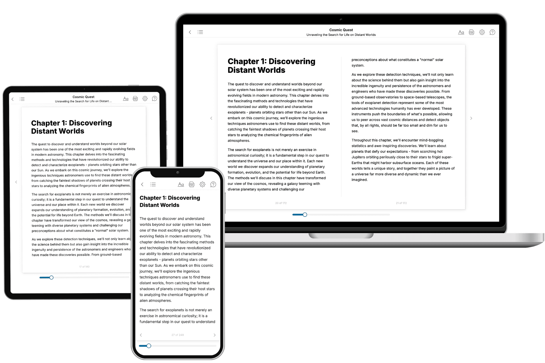
Your book is ready in 10 minutes. Read it online, download as EPUB or PDF, or send to Kindle.


Frequently asked questions
- What is TailoredRead?
TailoredRead creates complete, full-length nonfiction ebooks, written specifically for you. Tell us what you want to learn and why, and TailoredRead writes you a complete ebook on it, with charts, tables, and diagrams throughout. Read it online, on Kindle, or on any e-reader, or download it as a PDF or EPUB. Every book is written fresh the day you order it.
- How is the book tailored to me?
Before anything is written, you answer a few short questions about your goals, your background, and the topics you care about. Your book is then planned around your answers: written at your level, focused on your goals, and covering the topics you chose, instead of the one-size-fits-all book a store sells everyone.
- Will it read like generic AI content?
No. Your book isn't a chat transcript: it's planned chapter by chapter before a single word is written, told in a clear book voice, and explains ideas visually with charts, tables, and diagrams. After writing, every book goes through an editorial pass that polishes chapters so the book reads consistent from start to finish. Judge for yourself: browse thousands of sample books on our Explore Books page.
- How accurate is the content?
Our AI first checks whether your subject needs live research. Niche and fast-moving subjects are researched before writing, and the book plan and chapters are grounded in what it finds. After writing, every book goes through a quality pass that checks its facts and consistency, and researched books list their sources in a Notes section at the back.
- How long is the book?
You choose the length: Comprehensive (250-300 pages), Detailed (150-200 pages), Essential (70-100 pages), or Short (30-50 pages).
- Does the book include visuals?
Yes. Every book includes visual elements such as timelines, checklists, step-by-step guides, decision trees, comparison tables, and matrices, and many include bar charts. A typical book includes dozens of these visual elements.
- Can I read it on Kindle? What formats can I download?
Yes. Every book can be read in our online reader or downloaded as a PDF or EPUB. The EPUB can be opened with Kindle, Apple Books, Kobo, and any e-reader. The Commercial and Author licenses also include an editable Word (DOCX) and Markdown download.
- How much does it cost?
About the price of a regular ebook. The exact price depends on your book's length and complexity, from $2 for the shortest books to $35 for the most comprehensive, and it's shown when you review your book, before you commit to anything. Each book is a one-time purchase, yours to keep, no subscription. Licenses that let you share, teach, or publish your book range from $35.99 to $49.99.
- Can I preview the book before purchasing?
Before you pay, you'll see what your book will cover: the title, a detailed description, the estimated length, and the complete chapter-by-chapter table of contents, so you know what you're getting before you decide. The full text itself is written after you purchase.
- How long does it take to create a book?
About 10 minutes. You can start reading the opening chapters while the rest is still being written.