Less is More
The Art and Science of Minimalist User Interface Design
Creating a user interface that feels effortless is harder than it looks.
191 pages10 chaptersApr 15, 2026User Interfaces
About this book
Most designers struggle with the paradox of minimalism: how do you remove elements without removing functionality? How do you create visual interest without clutter? This book cuts through the confusion and teaches you the proven principles behind minimalist UI design that actually works. You'll discover why removing elements often requires adding more thought, not less. Learn how to use white space strategically, master the psychology of visual hierarchy, and build interfaces that guide users intuitively. Through real-world examples and practical frameworks, you'll understand when minimalism serves users and when it doesn't. This isn't about following trends—it's about designing with intention, clarity, and purpose. Whether you're refining an existing product or starting from scratch, these principles will help you create interfaces that users love because they're simple to understand and effortless to use.
Table of contents
- IntroductionWhy Minimalism Matters in Modern Design, Common Misconceptions About Minimalist UI, How to Use This BookRead below
- Chapter 1: The Philosophy Behind Minimalist DesignDefining Minimalism in the Digital Context, Historical Roots: From Art to Interface Design, Minimalism vs. Simplicity: Understanding the Difference
- Chapter 2: The Psychology of Visual PerceptionCognitive Load Theory and User Attention, Gestalt Principles in Minimalist Design, How Minimalism Reduces Decision Paralysis
- Chapter 3: Mastering White SpaceWhite Space as a Design Element, Creating Visual Breathing Room, Using White Space to Establish Hierarchy
- Chapter 4: Typography and Color in Minimalist DesignTypography as a Primary Design Tool, Strategic Color Use in Minimal Palettes, Achieving Contrast and Readability
- Chapter 5: Building Visual Hierarchy Without DecorationCore Principles of Visual Hierarchy, Using Size, Weight, and Position Strategically, Guiding User Attention Through Design
- Chapter 6: Minimalism Across Different PlatformsMinimalist Design for Mobile Interfaces, Applying Minimalism to Web Design, Minimalism in Desktop and Enterprise Applications
- Chapter 7: User Research and ValidationResearch Methods for Minimalist Design, Testing Whether Your Minimalism Works, Incorporating User Feedback and Iterating
- Chapter 8: Design Systems and Scalable MinimalismBuilding Design Systems for Consistency, Creating Minimal Component Libraries, Scaling Minimalist Principles Across Products
- Chapter 9: Real-World Case StudiesCase Study: Redesigning a Mobile Application, Case Study: Simplifying a SaaS Platform, Case Study: Minimalist E-Commerce Interface
- Chapter 10: Common Pitfalls and How to Avoid ThemThe Danger of Over-Minimalism, Maintaining Accessibility in Minimal Designs, Balancing Aesthetics with Functionality
- ConclusionKey Takeaways for Your Design Practice, Next Steps in Your Minimalist Design Journey
Introduction
There is a moment every designer knows well. You are staring at a screen filled with buttons, banners, tooltips, icons, and labels, and something feels deeply wrong. The interface has everything the product team asked for, every feature is visible, every option is accessible, and yet the whole thing feels exhausting to look at. Users click the wrong things, abandon flows halfway through, and send support tickets asking how to do tasks that should be obvious. The interface is complete, but it is not working. That feeling is the starting point for this book.
Minimalist UI design is one of the most misunderstood disciplines in the field. Many designers assume it means making things look clean or following a particular visual trend. Others think it means stripping out features until a product barely functions. Neither of those ideas is correct. Real minimalism in interface design is a rigorous, user-centered practice. It is about understanding what users actually need, removing everything that gets in the way of that need, and presenting the right information at the right moment with as little friction as possible. That is harder than it sounds, and it requires more thought, not less.
This book exists because the gap between understanding minimalism as an aesthetic and applying it as a functional design strategy is enormous. Plenty of resources will show you beautiful, sparse interfaces and tell you to be inspired. Far fewer will explain the cognitive science behind why those interfaces work, give you practical frameworks for making decisions under constraint, or warn you about the real ways minimalism can fail users when applied carelessly. That is what this book sets out to do. Whether you are redesigning an existing product or building something new from scratch, the principles here are meant to be used, not just admired.
The chapters ahead move from philosophy to psychology to practical craft. You will explore the historical roots of minimalist thinking, learn how the human brain processes visual information, and develop hands-on skills in white space, typography, color, and hierarchy. You will also look at real-world case studies, learn how to test whether your minimalism is actually working for users, and understand how to build design systems that keep minimalist principles consistent as products grow. By the end, you will have a complete toolkit for designing interfaces that feel effortless because they were built with intention and discipline.
Why Minimalism Matters in Modern Design
The digital world has never been noisier. The average person encounters thousands of interface interactions every day, from mobile apps and websites to dashboards, kiosks, and smart device screens. Each of those interactions asks something of the user's attention, memory, and decision-making capacity. Cognitive science research consistently shows that the human brain has a limited capacity for processing information at any given moment.[1] When an interface overloads that capacity, users make mistakes, feel frustrated, and disengage. Minimalism is, at its core, a response to that problem.
Consider what happens when a user lands on a cluttered e-commerce homepage. There are promotional banners competing for attention, a navigation bar with twelve top-level categories, pop-up overlays asking for email sign-ups, and product carousels auto-scrolling in three different sections. Every single one of those elements was added with good intentions. Someone wanted to promote a sale, someone else wanted to surface popular categories, and the marketing team wanted to grow the email list. But the combined effect is paralysis. Studies on choice overload have shown that presenting too many options can actually reduce the likelihood that users will make any decision at all.[2] Minimalism solves this by forcing designers to prioritize ruthlessly.
Beyond reducing cognitive load, minimalist interfaces have measurable business benefits. Cleaner designs tend to load faster, which directly affects user retention and conversion rates. Google's research found that pages with fewer visual elements and faster load times had significantly lower bounce rates.[3] Accessibility also improves when interfaces are stripped of unnecessary complexity. Users with cognitive disabilities, older users, and people using assistive technologies all benefit from interfaces that communicate clearly without visual noise. Minimalism is not just an aesthetic preference; it is a practical strategy with real outcomes.
The rise of mobile-first design has made minimalism even more critical. Small screens demand ruthless prioritization. There is simply no room for decorative elements, redundant labels, or features that serve edge cases rather than core user needs. The constraints of mobile design have pushed the entire industry toward cleaner, more focused interfaces, and those lessons have started flowing back into web and desktop design as well. Learning to design minimally for mobile teaches habits that improve every other context you work in.
Minimalism also matters because it ages well. Interfaces built around decorative trends, whether skeuomorphic textures, heavy gradients, or complex animation systems, tend to feel dated within a few years. Interfaces built around clear hierarchy, strong typography, and purposeful white space remain functional and visually coherent for much longer. Apple's iOS design language, Google's Material Design, and Stripe's dashboard interface are all examples of minimalist systems that have evolved gracefully over time without requiring complete visual overhauls. Investing in minimalist principles is investing in longevity.
Finally, minimalism matters because it reflects respect for the user. Every unnecessary element in an interface is a small tax on the user's time and attention. Removing that tax is an act of empathy. When you design minimally, you are saying that you have done the hard work of figuring out what matters so that users do not have to. That is a powerful design philosophy, and it is one that users respond to, even if they cannot articulate exactly why a particular interface feels so good to use.
The core promise of minimalist UI design: Do the hard thinking so the user does not have to. Every decision to remove, simplify, or clarify is a gift to the person on the other side of the screen.
Common Misconceptions About Minimalist UI
Before going further, it is worth clearing up some persistent myths about minimalist design. These misconceptions cause real problems in practice. They lead designers to strip out functionality users actually need, create interfaces that look minimal but feel confusing, or dismiss minimalism entirely as a style choice that does not apply to their complex product. Getting these ideas straight early will save a lot of frustration later.
Misconception 1: Minimalism means removing features. This is probably the most damaging misunderstanding. Minimalism is not about reducing what a product can do. It is about reducing the visual and cognitive effort required to do it. A feature-rich enterprise application can absolutely be minimalist in its design. The goal is to surface the right features at the right time, hide complexity until it is needed, and present information in a way that does not overwhelm. Removing features is a product strategy decision. Minimalist design is about how those features are presented.
Misconception 2: Minimalist design is easy to create. The opposite is true. Designing a minimal interface requires far more decision-making than designing a cluttered one. When you have limited visual elements to work with, every single one has to carry its weight. You cannot rely on decorative elements to fill space or create visual interest. You have to solve every layout, hierarchy, and communication problem with typography, spacing, and color alone. As the architect Ludwig Mies van der Rohe famously put it, less is more
, but achieving that less takes considerably more effort than adding more.
Misconception 3: White space is wasted space. This idea comes from a scarcity mindset, the feeling that every pixel of screen real estate should be earning its keep by displaying content. In reality, white space is one of the most powerful tools in a designer's toolkit. It creates visual breathing room, guides the eye, establishes hierarchy, and makes content easier to read and understand. Research on reading comprehension has shown that increasing white space around text blocks can improve comprehension by up to 20%.[4] White space is not empty. It is doing work.
Misconception 4: Minimalism only works for certain types of products. Some designers believe minimalism is appropriate for portfolio sites and lifestyle apps but cannot work for complex tools like analytics dashboards, medical software, or project management platforms. This is a false constraint. Minimalism is a set of principles, not a fixed visual style. Those principles, prioritizing what matters, reducing cognitive load, creating clear hierarchy, can be applied to any product. The approach looks different in a data-heavy dashboard than it does in a meditation app, but the underlying thinking is the same.
Misconception 5: Minimalism means monochrome and flat. Many designers associate minimalism with a specific visual style: white backgrounds, black text, maybe one accent color, and completely flat UI elements. While that aesthetic is certainly one expression of minimalist principles, it is not the only one. Minimalism is about restraint and purpose, not a specific color palette or visual treatment. A warm, richly textured interface can be minimalist if every element serves a clear purpose. A stark black-and-white interface can be cluttered and confusing if it lacks clear hierarchy and structure.
Understanding what minimalism is not helps clarify what it actually is. It is a discipline of intentional decision-making. It is the practice of asking, for every element in an interface, whether it is earning its place. It is a commitment to the user's experience over the designer's desire to add, embellish, or demonstrate capability. That discipline is what this book is about, and it applies regardless of the product type, visual style, or platform you are designing for.
One more misconception worth addressing is the idea that minimalism is a trend that will eventually pass. Design trends do come and go, and some visual expressions of minimalism will certainly evolve. But the underlying principles are grounded in cognitive science and human psychology, not fashion. As long as human attention is limited and digital interfaces compete for it, the principles of reducing cognitive load, creating clear hierarchy, and removing friction will remain relevant. Minimalism, properly understood, is not a trend. It is a response to how human beings actually process information.
How to Use This Book
This book is structured to take you from foundational understanding to practical application. The early chapters build the conceptual and psychological framework you need to make good minimalist design decisions. The middle chapters focus on specific craft skills: white space, typography, color, and visual hierarchy. The later chapters address real-world application, including platform-specific considerations, user research, design systems, and common pitfalls. The case studies in Chapter 9 show how all of these principles work together in actual design projects.
You do not have to read this book from cover to cover in order, though doing so will give you the most complete picture. If you are already comfortable with the philosophy of minimalism and want to jump straight into practical techniques, Chapters 3 through 5 are where the hands-on craft content lives. If you are working on a specific platform challenge, Chapter 6 addresses mobile, web, and desktop contexts separately. If you are dealing with a team or organizational challenge around scaling minimalist design, Chapter 8 on design systems will be particularly useful.
Throughout the book, you will find several recurring elements designed to make the content as actionable as possible:
- Concrete examples: Every major concept is illustrated with a specific, real-world scenario or case study. Abstract principles are only useful when you can see how they apply in practice.
- Frameworks and checklists: Where appropriate, concepts are distilled into practical frameworks you can apply directly to your own work. These are tools, not rules.
- What to do and what not to do: Many sections include explicit comparisons between effective minimalist approaches and common mistakes. Seeing both sides of a decision makes the right choice much clearer.
- Footnotes and references: Claims backed by research are cited so you can explore the underlying science further if you want to go deeper.
One important note about how to approach the frameworks in this book: treat them as starting points, not rigid formulas. Minimalist design is fundamentally about judgment, and good judgment develops through practice and feedback, not through following rules mechanically. The frameworks here are meant to give you a structured way to think through design decisions, especially when you are under time pressure or working in a team where you need to explain your reasoning. Use them as scaffolding while you build your own intuition, and then adapt them to fit your specific context.
You will also notice that this book places significant emphasis on user research and testing. This is intentional. One of the most common failures in minimalist design is when designers remove elements that they personally find unnecessary but that users actually rely on. What feels minimal and clean to an expert designer can feel incomplete or confusing to a first-time user. The only way to know whether your minimalism is working is to test it with real users. Chapter 7 covers this in detail, but the principle runs throughout the entire book: design decisions should be validated, not just assumed.
If you are working in a team environment, this book can also serve as a shared reference point for design conversations. Minimalism often becomes a source of conflict in product teams, with designers wanting to simplify and stakeholders wanting to add more. Having a common vocabulary and a shared understanding of the principles behind minimalist decisions can make those conversations much more productive. The frameworks and research cited here give you language and evidence to support design choices that might otherwise feel subjective.
Finally, approach this book with a spirit of experimentation. The best way to internalize these principles is to apply them to real work, make mistakes, observe what happens, and adjust. Consider keeping a design journal as you work through the chapters, noting which ideas resonate, which challenge your existing assumptions, and how you are applying them in your current projects. Minimalist design is a practice in the truest sense of the word. It gets better the more you do it, and it never really stops evolving.
A practical starting point: Before moving to Chapter 1, take five minutes to look at an interface you are currently working on or using regularly. Ask yourself: if you had to remove 30% of the visual elements on the screen, which ones would you remove first, and why? That question is the beginning of minimalist thinking.
The goal of this book is not to turn every interface into a sparse, white, nearly empty screen. The goal is to help you develop the discipline and judgment to make every element in your designs earn its place. When you can look at a screen and confidently say that nothing there is accidental, that every choice serves the user's needs and supports their goals, you are practicing minimalist design. That is a skill worth building, and this book is here to help you build it.
Notes
Introduction
- 1. J. Sweller, "Cognitive load during problem solving," Cognitive Science, 1988
- 2. S. S. Iyengar and M. R. Lepper, "When choice is demotivating," Journal of Personality and Social Psychology, 2000
- 3. Google/SOASTA Research, The State of Online Retail Performance, Think with Google, 2017
- 4. D. Y. M. Lin, "Evaluating older adults' retention in hypertext perusal," Computers in Human Behavior, 2004
This is the end of the free sample. The full book has 10 chapters.
Want this book written for you?
Tell us your goals and background, and get your own version of this book, tailored by AI to you.


Benefits of AI-tailored books
- Read one book, not ten:
- all the User Interfaces knowledge you need, gathered into a single book.
- Save days of learning:
- tell us your goals, choose your topics, and the whole book is built around them.
- Learn effortlessly:
- User Interfaces book written for your specific background and expertise.
- Understand at a glance:
- includes charts, tables, timelines, checklists, decision trees, and more.
- Stay current:
- written the day you order it, not years ago.
- Trust what you read:
- every book is checked for accuracy, with real research when your subject needs it.
Create your unique book in 3 steps
- 1. Select your focus
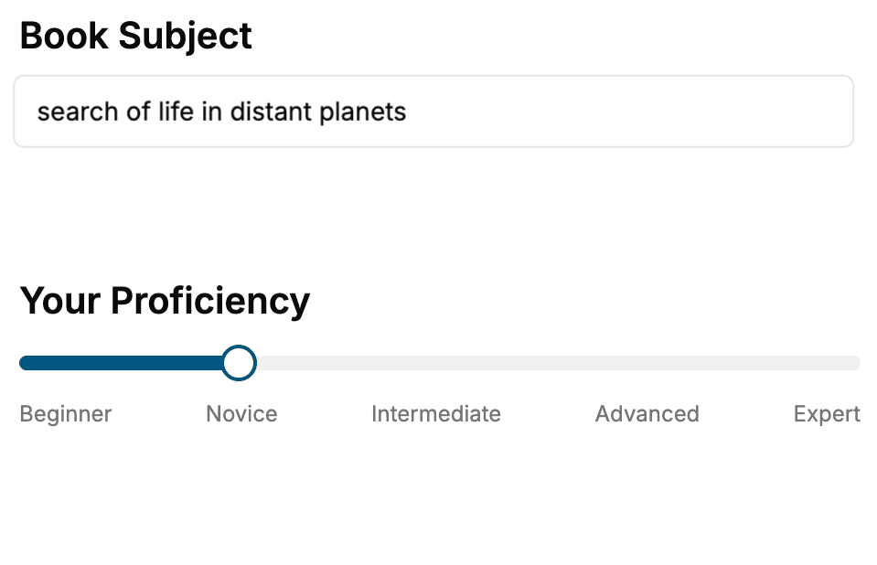
Select the focus of your User Interfaces book and share your background
- 2. Personalize your book
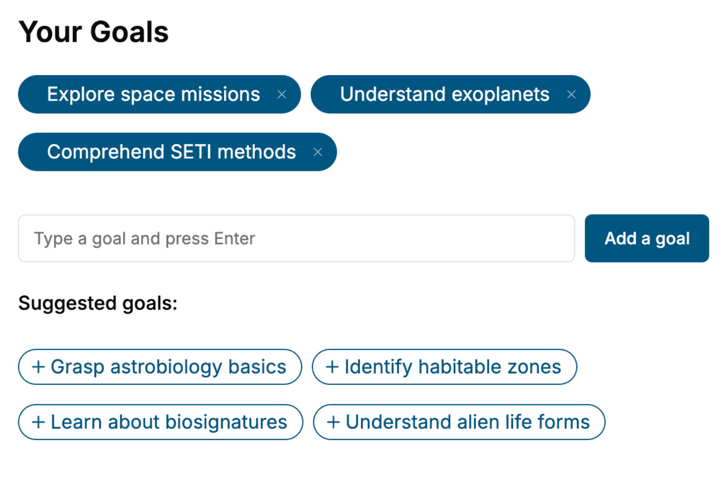
Specify your goals and choose sub-topics to include
- 3. Get your tailored book
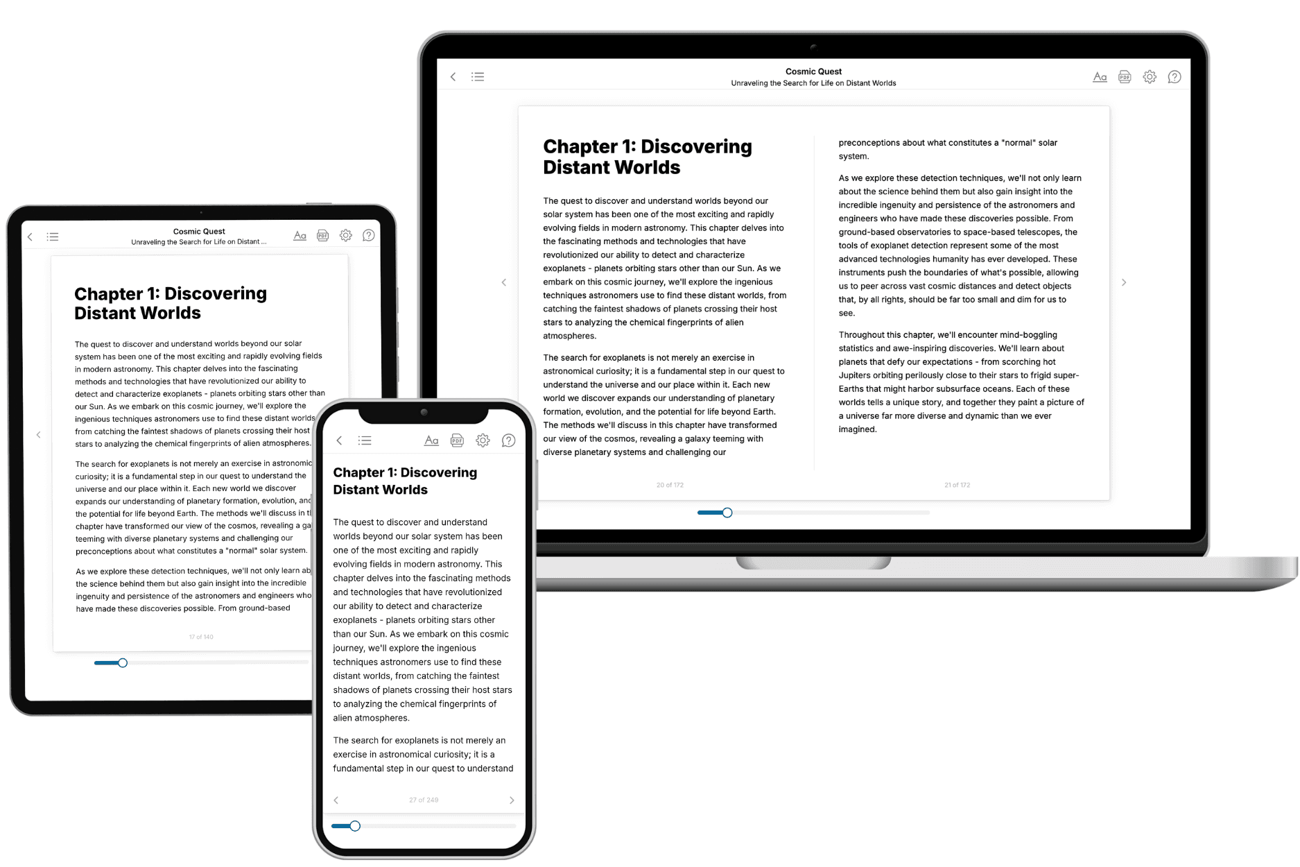
Your book is ready in 10 minutes. Read it online, download as EPUB or PDF, or send to Kindle.
Frequently asked questions
- What is TailoredRead?
TailoredRead creates complete, full-length nonfiction ebooks, written specifically for you. Tell us what you want to learn and why, and TailoredRead writes you a complete ebook on it, with charts, tables, and diagrams throughout. Read it online, on Kindle, or on any e-reader, or download it as a PDF or EPUB. Every book is written fresh the day you order it.
- How is the book tailored to me?
Before anything is written, you answer a few short questions about your goals, your background, and the topics you care about. Your book is then planned around your answers: written at your level, focused on your goals, and covering the topics you chose, instead of the one-size-fits-all book a store sells everyone.
- Will it read like generic AI content?
No. Your book isn't a chat transcript: it's planned chapter by chapter before a single word is written, told in a clear book voice, and explains ideas visually with charts, tables, and diagrams. After writing, every book goes through an editorial pass that polishes chapters so the book reads consistent from start to finish. Judge for yourself: browse thousands of sample books on our Explore Books page.
- How accurate is the content?
Our AI first checks whether your subject needs live research. Niche and fast-moving subjects are researched before writing, and the book plan and chapters are grounded in what it finds. After writing, every book goes through a quality pass that checks its facts and consistency, and researched books list their sources in a Notes section at the back.
- How long is the book?
You choose the length: Comprehensive (250-300 pages), Detailed (150-200 pages), Essential (70-100 pages), or Short (30-50 pages).
- Does the book include visuals?
Yes. Every book includes charts, tables, and diagrams: timelines, checklists, step-by-step guides, decision trees, comparison tables, matrices, and bar charts. A typical book includes dozens of these visual elements.
- Can I read it on Kindle? What formats can I download?
Yes. Every book can be read in our online reader or downloaded as a PDF or EPUB. The EPUB can be opened with Kindle, Apple Books, Kobo, and any e-reader. The Commercial and Author licenses also include an editable Word (DOCX) and Markdown download.
- How much does it cost?
About the price of a regular ebook. The exact price depends on your book's length and complexity, from $2 for the shortest books to $35 for the most comprehensive, and it's shown when you review your book, before you commit to anything. Each book is a one-time purchase, yours to keep, no subscription. Licenses that let you share, teach, or publish your book range from $35.99 to $49.99.
- Can I preview the book before purchasing?
Before you pay, you'll see what your book will cover: the title, a detailed description, the estimated length, and the complete chapter-by-chapter table of contents, so you know what you're getting before you decide. The full text itself is written after you purchase.
- How long does it take to create a book?
About 10 minutes. You can start reading the opening chapters while the rest is still being written.