Mastering Colorimetry
The Complete Guide to Color Spaces and Digital Color Management
Most digital professionals work with color every day, yet struggle to understand why their images don't look right across different devices and displays.
253 pages12 chaptersNov 18, 2025Computer Graphics Development
About this book
The disconnect between what you see on screen and what prints, or how colors shift between applications, stems from a fundamental gap in colorimetry knowledge. This book fills that gap by making color science accessible and immediately applicable to your work. You'll discover how the human eye perceives color, why different color spaces exist, and how to leverage them strategically in graphics development. From RGB and CMYK fundamentals to advanced topics like gamma correction, HDR workflows, and perceptual color spaces, each chapter builds practical skills you can implement today. Whether you're optimizing images for web, managing color in 3D rendering, or ensuring consistency across production pipelines, this guide provides the theoretical foundation and practical techniques you need to make confident color decisions and achieve professional results.
Table of contents
- IntroductionWhy Colorimetry Matters in Digital Work, Common Color Problems and Their Root Causes, What You'll Learn in This Book, How to Use This GuideRead below
- Chapter 1: The Science of Color PerceptionLight, Wavelengths, and the Visible Spectrum, How the Human Eye Perceives Color, Cone Cells, Sensitivity Curves, and Color Blindness, How the Brain Interprets Color Signals
- Chapter 2: Fundamentals of Color SpacesWhat Is a Color Space and Why Multiple Spaces Exist, Device-Dependent vs. Device-Independent Color Spaces, Color Gamut, Coverage, and Limitations, Choosing the Right Color Space for Your Task
- Chapter 3: RGB Color Space and Digital DisplaysRGB Fundamentals and Additive Color, sRGB: The Web Standard and Its Limitations, Wide-Gamut RGB Spaces: Adobe RGB and ProPhoto, RGB in Modern Graphics Pipelines and Rendering
- Chapter 4: CMYK and Print Color SpacesCMYK Fundamentals and Subtractive Color, Converting from RGB to CMYK: Challenges and Best Practices, Understanding Ink Limitations and Color Gamut in Print, Color Management in Print Production Workflows
- Chapter 5: Perceptual Color SpacesLAB Color Space: Lightness, A, and B Channels, LCH: The Cylindrical Representation of LAB, Perceptual Uniformity and Why It Matters, Practical Applications of Perceptual Color Spaces
- Chapter 6: HSL, HSV, and Intuitive Color ModelsHSL: Hue, Saturation, and Lightness, HSV: Hue, Saturation, and Value, Key Differences Between HSL and HSV, When and Why to Use Intuitive Color Models
- Chapter 7: Gamma Correction and Linear Color SpacesWhat Is Gamma and Why It Exists, Linear vs. Nonlinear Color Spaces, Gamma Correction in Graphics Rendering and Blending, Gamma Workflow Best Practices and Common Mistakes
- Chapter 8: Color Space Conversions and TransformationsMathematical Foundations of Color Space Conversions, Conversion Matrices and Matrix Operations, Precision, Rounding Errors, and Quality Loss, Optimization Techniques for Real-Time Conversions
- Chapter 9: Bit Depth, Quantization, and Color PrecisionBit Depth: 8-Bit, 16-Bit, and 32-Bit Color, Quantization, Banding, and Posterization Artifacts, Dithering Techniques to Reduce Visible Banding, Choosing Appropriate Bit Depth for Your Application
- Chapter 10: HDR and Wide-Gamut Color WorkflowsHDR Fundamentals: Beyond Standard Dynamic Range, HDR Color Spaces: Rec. 2020, DCI-P3, and ACES, Tone Mapping and Converting HDR to SDR, Implementing HDR in Modern Production Pipelines
- Chapter 11: Color Management Systems and ProfilesICC Profiles: Input, Working, and Output Profiles, Building a Complete Color Management Workflow, Device Calibration and Profiling, Achieving Consistency Across Platforms and Devices
- Chapter 12: Practical Colorimetry in Graphics DevelopmentColor Management in 3D Rendering and Lighting, Optimizing Color for Web and Digital Distribution, Color Grading and Post-Production Workflows, Debugging and Troubleshooting Common Color Problems
- ConclusionKey Takeaways and Core Principles, Continuing Your Colorimetry Journey
- Glossary
- Further Reading and Resources
Introduction
Color is everywhere in digital work, yet it remains one of the most misunderstood aspects of graphics development and visual media production. You've likely experienced the frustration of colors that look perfect on your monitor but print completely differently, or images that shift dramatically when viewed on a client's device. Perhaps you've spent hours adjusting colors in one application only to find they appear washed out or oversaturated when imported into another. These aren't random technical glitches or equipment failures—they're symptoms of a fundamental gap in understanding how color actually works in digital systems. The disconnect between what you intend and what your audience sees stems from the complex interplay of color spaces, device profiles, and mathematical transformations that happen behind the scenes every time you work with digital images.
Most professionals learn color management through trial and error, developing workarounds and rules of thumb that seem to work most of the time. You might know that you need to convert to CMYK before sending files to print, or that sRGB is the standard for web graphics, but the underlying reasons remain mysterious. This approach works until it doesn't—until you encounter a project that requires HDR output, or need to maintain color consistency across a complex production pipeline, or face a color problem that your usual fixes can't solve. At that point, the lack of foundational knowledge becomes a serious limitation. Understanding colorimetry isn't just academic knowledge; it's practical expertise that directly impacts the quality of your work and your ability to solve real-world problems efficiently.
This book bridges the gap between abstract color science and practical implementation in digital workflows. You don't need a physics degree or advanced mathematics background to master colorimetry—you need clear explanations of how color systems work, why they're designed the way they are, and how to apply that knowledge in your daily work. Whether you're a graphics programmer implementing rendering algorithms, a digital artist managing color across multiple applications, or a production professional ensuring consistency from capture to final output, this guide provides the theoretical foundation and practical techniques you need. Each chapter builds on the previous ones, starting with how human vision perceives color and progressing through increasingly sophisticated color management concepts, always maintaining focus on real-world applications and actionable insights you can implement immediately.
Why Colorimetry Matters in Digital Work
Every pixel you create, every image you process, and every visual element you design exists within a color space—a mathematical framework that defines how numeric values translate into perceived colors. Without understanding these frameworks, you're essentially working blind, making adjustments based on what looks right on your particular display at this particular moment. This approach fails as soon as your work moves to a different context. The vibrant red that looks perfect on your calibrated monitor might appear muddy brown on a client's laptop, or the subtle skin tones you carefully graded might print with an unnatural magenta cast. These problems aren't caused by bad equipment or incompetent vendors; they're the inevitable result of working without a proper understanding of how color spaces interact and transform.
Consider a typical scenario in web development: you design an interface using colors picked directly from your monitor, export graphics as PNG files, and publish them online. On your screen, everything looks exactly as intended. But users viewing your site see something different—sometimes subtly, sometimes dramatically. The issue isn't that their displays are "wrong" or yours is "right." The problem is that you've implicitly assumed everyone's device interprets RGB values the same way yours does, which is fundamentally incorrect. Different displays have different color gamuts, different white points, and different gamma curves. Without explicitly defining which RGB color space you're working in and ensuring proper color management throughout your workflow, you're leaving color reproduction to chance. Understanding colorimetry means you can make informed decisions about which color space to use, how to convert between spaces without quality loss, and how to ensure your intended colors reach your audience as accurately as possible.
The stakes are even higher in professional production environments where color accuracy directly impacts business outcomes. In product photography for e-commerce, inaccurate color representation leads to returns and customer dissatisfaction when the delivered product doesn't match what appeared on screen. In medical imaging, color shifts can obscure diagnostic information or create false positives. In film and video production, inconsistent color grading across shots destroys visual continuity and undermines storytelling. In architectural visualization, incorrect material colors can lead to expensive mistakes when clients approve renders that don't accurately represent the final built environment. These aren't edge cases—they're everyday situations where colorimetry knowledge separates professional-quality work from amateur results.
Modern graphics pipelines have become increasingly complex, incorporating HDR imaging, wide-gamut displays, physically-based rendering, and sophisticated color grading tools. These technologies offer unprecedented creative control and visual fidelity, but they also multiply the opportunities for color management errors. When you're working with linear color spaces for accurate lighting calculations, converting to perceptual spaces for color adjustments, and outputting to multiple target devices with different capabilities, you need more than surface-level knowledge. You need to understand the mathematical transformations happening at each stage, the precision requirements for different operations, and the potential pitfalls that can introduce artifacts or quality loss. Colorimetry provides the conceptual framework that makes these complex workflows comprehensible and manageable.
Perhaps most importantly, understanding colorimetry gives you diagnostic power when things go wrong. Instead of randomly adjusting settings or applying fixes you don't fully understand, you can systematically identify where in your workflow color is being mishandled. Is the problem in your source material, your working space, your conversion process, or your output profile? Are you seeing quantization artifacts from insufficient bit depth, or gamma errors from mixing linear and nonlinear operations? Is your color shift caused by gamut clipping, or by an incorrect profile assignment? With solid colorimetry knowledge, these questions have clear answers, and problems that seem mysterious become straightforward to diagnose and fix. This diagnostic capability alone justifies the investment in learning color science properly.
The digital color landscape continues to evolve rapidly, with new standards, technologies, and workflows emerging regularly. HDR displays are becoming mainstream, bringing Rec. 2020 and DCI-P3 color spaces into everyday use. Web browsers are implementing better color management, making wide-gamut workflows practical for web graphics. Game engines are adopting physically-based rendering with proper linear color handling. Virtual and augmented reality introduce new challenges for color reproduction in immersive environments. Without foundational colorimetry knowledge, each new technology requires learning a new set of arbitrary rules and workarounds. With that foundation, you can quickly understand how new technologies fit into the broader color management framework and adapt your workflows accordingly. The principles of color science remain constant even as the specific technologies change.
Ultimately, colorimetry matters because color is information, and information must be preserved and communicated accurately throughout your production pipeline. Every color space conversion, every bit depth reduction, and every device rendering introduces opportunities for that information to be lost or corrupted. Understanding the science behind these processes allows you to make informed tradeoffs, choosing where to accept small quality losses in exchange for practical benefits, and where to maintain maximum fidelity because the application demands it. This isn't about achieving some theoretical perfect color reproduction—it's about having the knowledge and tools to achieve your specific creative and technical goals reliably and efficiently, regardless of the complexity of your workflow or the diversity of your target output devices.
Common Color Problems and Their Root Causes
One of the most frequently encountered color problems is the dramatic shift that occurs when converting images from RGB to CMYK for print production. You've carefully adjusted your design on screen, achieving exactly the vibrant colors you want, only to receive printed proofs that look dull, muddy, or completely wrong. The root cause isn't a printing error—it's the fundamental difference between additive color (RGB, using light) and subtractive color (CMYK, using ink). RGB displays can produce colors that simply don't exist in the CMYK gamut, particularly bright, saturated colors in the cyan, green, and orange ranges. When you convert to CMYK, these out-of-gamut colors must be mapped to the nearest printable equivalent, which often means significant desaturation. Without understanding the relative gamuts of these color spaces and planning your design accordingly, you're setting yourself up for disappointment at the printing stage.
Another pervasive issue is inconsistent color appearance across different displays and devices. You export an image that looks perfect on your desktop monitor, but it appears washed out on your laptop, oversaturated on your phone, and completely different on your client's screen. This problem stems from the lack of proper color management and the assumption that all RGB displays are equivalent. In reality, different displays have different native color gamuts—some cover only the sRGB space, while others extend into Adobe RGB or even DCI-P3 territory. Additionally, displays have different white points and gamma curves. When you don't explicitly embed color profiles in your images and ensure that viewing applications respect those profiles, each display interprets the raw RGB numbers according to its own characteristics, producing wildly different visual results. The solution requires understanding device-independent color spaces and implementing proper color management workflows.
Banding and posterization artifacts plague many digital images, particularly in areas with subtle gradients like skies, skin tones, or smooth color transitions. You might notice visible steps or bands where there should be smooth color progression, especially after applying adjustments or converting between color spaces. The root cause is insufficient bit depth for the color precision required by your workflow. Standard 8-bit color provides only 256 levels per channel, which sounds like a lot but can be inadequate when you're making multiple adjustments or working in perceptually non-uniform color spaces. Each adjustment operation can introduce rounding errors and reduce the effective bit depth. Compounding the problem, some color spaces distribute those 256 levels non-uniformly across the perceptual range, making banding more visible in certain color regions. Understanding bit depth requirements and working in 16-bit or 32-bit when necessary prevents these quality-destroying artifacts.
Incorrect gamma handling creates some of the most subtle yet pervasive color problems in digital graphics. You might notice that blended colors look wrong, that lighting calculations produce unrealistic results, or that images appear too dark or too light when moved between applications. These issues often trace back to mixing linear and gamma-corrected color operations inappropriately. Most image files store colors in a gamma-corrected (nonlinear) space like sRGB, which is efficient for storage and matches how displays work. However, many graphics operations—particularly lighting calculations, blending, and compositing—must be performed in linear color space to produce physically accurate results. When you blend two colors in gamma-corrected space, you get mathematically incorrect results that look muddy or dark. When you apply lighting calculations to gamma-corrected values, your renders look wrong in ways that are hard to pinpoint. Understanding when to work in linear versus nonlinear color spaces is essential for modern graphics development.
Color shifts during format conversions and compression represent another common problem category. You save an image as JPEG and notice the colors have shifted slightly, or you import footage into your editing application and the color grade looks different than it did in the camera. These problems often result from implicit color space conversions happening without your knowledge or control. Many image formats and video codecs have default color space assumptions—JPEG typically assumes sRGB, video formats often use Rec. 709 or Rec. 2020—and when these assumptions don't match your actual working space, automatic conversions occur. If the software doesn't handle these conversions properly, or if color profile information is stripped during compression, you lose color accuracy. Additionally, chroma subsampling in video compression can introduce color shifts and artifacts, particularly around high-contrast edges. Recognizing these issues requires understanding how different file formats handle color information and what metadata is necessary to preserve color accuracy.
Oversaturation or desaturation when adjusting colors in different color spaces is a problem that catches many professionals off guard. You increase saturation in RGB and get garish, unnatural results, or you adjust colors in HSL and find that lightness changes unexpectedly affect saturation. These issues stem from the non-intuitive relationships between color components in different color models. In RGB, increasing saturation by scaling values away from neutral gray affects different hues inconsistently and can easily push colors out of gamut. In HSL, the definition of "saturation" doesn't match perceptual saturation, and lightness adjustments interact with saturation in complex ways. Perceptual color spaces like LAB offer more predictable behavior, but they require understanding their unique characteristics and limitations. Choosing the right color space for specific adjustment tasks and understanding how color components interact within each space prevents these frustrating and time-consuming problems.
Finally, many professionals struggle with color accuracy in HDR workflows, where the expanded dynamic range and wider color gamuts introduce new challenges. You might find that colors clip unexpectedly, that tone mapping produces unnatural results, or that your HDR content looks wrong when displayed on SDR screens. HDR workflows require careful management of color spaces like Rec. 2020 or DCI-P3, understanding of tone mapping algorithms, and awareness of how different display technologies handle HDR content. The problem is compounded by the fact that HDR standards are still evolving, and different platforms implement HDR differently. Without solid colorimetry fundamentals, navigating HDR workflows becomes an exercise in trial and error rather than informed decision-making. Understanding the principles behind HDR color management allows you to work confidently with these advanced technologies and achieve the stunning visual results they enable.
What You'll Learn in This Book
This book begins with the physiological and perceptual foundations of color vision, explaining how your eyes and brain actually process color information. You'll learn about the visible spectrum, how cone cells in the retina respond to different wavelengths, and why color perception is fundamentally subjective and context-dependent. This biological foundation is essential because all color spaces and color management systems are ultimately designed to match or predict human color perception. Understanding how vision works explains why certain color spaces are structured the way they are, why some color differences are more perceptually significant than others, and why color appearance changes based on viewing conditions. This isn't abstract theory—it's the foundation for making informed decisions about color precision, gamut mapping, and perceptual uniformity throughout your workflow.
You'll gain comprehensive understanding of the major color space families and when to use each one. The book covers RGB color spaces in depth, from the ubiquitous sRGB standard to wide-gamut spaces like Adobe RGB and ProPhoto RGB, explaining their different gamuts, gamma curves, and appropriate applications. You'll learn why sRGB dominates web graphics, when Adobe RGB's wider gamut justifies its complexity, and how to work with linear RGB for accurate rendering calculations. The CMYK section explains subtractive color theory, the challenges of RGB-to-CMYK conversion, and practical strategies for print production workflows. You'll understand why CMYK is device-dependent, how ink limitations affect color reproduction, and how to preview print results accurately on screen. This knowledge prevents the common mistake of designing in RGB without considering print limitations until it's too late to make adjustments efficiently.
The book dedicates substantial coverage to perceptual color spaces like LAB and LCH, which are less familiar to many professionals but offer significant advantages for certain tasks. You'll learn how LAB separates lightness from color information, why its perceptual uniformity makes it ideal for color adjustments and comparisons, and how to leverage it for tasks like skin tone correction, color grading, and gamut mapping. The LCH cylindrical representation of LAB provides even more intuitive control over hue, chroma, and lightness independently. You'll see concrete examples of adjustments that are difficult or impossible in RGB but straightforward in LAB, and learn when the additional complexity of working in perceptual spaces pays off in better results. This section also covers the limitations of these spaces and situations where RGB or other models remain more appropriate.
Intuitive color models like HSL and HSV receive thorough treatment, explaining both their appeal and their limitations. You'll understand how these models attempt to match human color intuition by separating hue, saturation, and lightness or value, making them popular in user interfaces and design tools. However, you'll also learn why their mathematical definitions don't perfectly match perceptual reality, leading to unexpected behavior in certain situations. The book provides specific guidance on when HSL and HSV are appropriate choices and when perceptual spaces like LAB or LCH provide better results. You'll see side-by-side comparisons showing how the same adjustment produces different results in different color models, building your intuition for choosing the right tool for each task.
Gamma correction and linear color workflows receive extensive coverage because they're critical for modern graphics development yet widely misunderstood. You'll learn what gamma is, why it exists (both historical reasons and perceptual benefits), and how it affects every aspect of digital imaging. The book explains the crucial difference between linear and gamma-corrected color spaces, why certain operations must be performed in linear space for accurate results, and how to structure your workflow to handle gamma correctly. You'll see specific examples of common mistakes—like blending in gamma-corrected space or applying lighting calculations to sRGB values—and learn how to avoid them. This section includes practical guidance for implementing correct gamma workflows in various contexts, from web graphics to 3D rendering to video production.
Color space conversions and transformations are demystified with clear explanations of the mathematical operations involved and their practical implications. You'll learn how conversion matrices work, how to chain multiple conversions efficiently, and how to minimize precision loss during transformations. The book covers both exact conversions between well-defined spaces and approximate conversions that require gamut mapping or other compromises. You'll understand why some conversions are reversible while others lose information, and how to structure your workflow to preserve maximum color fidelity. This section includes optimization techniques for real-time applications where conversion performance matters, as well as quality-focused approaches for offline processing where accuracy is paramount.
Bit depth, quantization, and color precision are explained in practical terms, showing how these technical specifications directly impact image quality. You'll learn why 8-bit color is sometimes sufficient and when 16-bit or 32-bit is necessary, how to recognize quantization artifacts like banding and posterization, and how to prevent them through proper workflow design. The book covers dithering techniques that can reduce visible banding in lower bit depths, and explains the tradeoffs between file size, processing performance, and color precision. You'll gain the knowledge to make informed decisions about bit depth at each stage of your workflow, balancing quality requirements against practical constraints.
HDR and wide-gamut workflows are covered comprehensively, preparing you for the future of digital imaging. You'll learn about HDR color spaces like Rec. 2020 and DCI-P3, understand tone mapping algorithms that convert HDR content for SDR displays, and discover how to implement HDR workflows in modern production pipelines. The book explains the relationship between dynamic range and color gamut, why they're often expanded together, and how to work with content that exceeds the capabilities of your display. You'll see practical examples of HDR workflows in different contexts—from photography to video production to real-time rendering—and learn the specific technical requirements and best practices for each. This section also covers the evolving landscape of HDR standards and how to future-proof your workflows as the technology continues to develop.
Finally, the book provides comprehensive coverage of color management systems, ICC profiles, and practical techniques for achieving color consistency across devices and platforms. You'll learn how color management systems work, what ICC profiles contain, and how to build complete color-managed workflows from input through working space to output. The book covers device calibration and profiling, explaining both the theory and practical procedures for ensuring your displays and printers are characterized accurately. You'll gain troubleshooting skills for diagnosing and fixing common color management problems, and learn how to verify that color is being handled correctly at each stage of your workflow. This practical knowledge transforms color management from a mysterious black box into a comprehensible system you can control and optimize for your specific needs.
How to Use This Guide
This book is structured to build your colorimetry knowledge progressively, starting with fundamental concepts and advancing to sophisticated techniques and workflows. If you're new to color science, reading the chapters in order provides the most effective learning path. Each chapter assumes familiarity with concepts introduced in previous chapters, and the progression is designed to build a complete mental model of how color works in digital systems. The early chapters on color perception and color space fundamentals establish the conceptual framework that makes later chapters on gamma correction, color conversions, and color management comprehensible. Skipping ahead to advanced topics without this foundation often leads to confusion and misconceptions that are difficult to correct later.
However, if you're already familiar with basic color concepts and have specific problems to solve, the book is organized to support targeted reading as well. Each chapter is relatively self-contained, with cross-references to related concepts in other chapters when necessary. If you're struggling with print color management, you can jump directly to the CMYK chapter and the color management systems chapter. If you're implementing a rendering pipeline and need to understand gamma correction, the dedicated gamma chapter provides comprehensive coverage of that topic. The table of contents and index are designed to help you quickly locate information relevant to your immediate needs. That said, even experienced professionals often discover gaps in their understanding when reading the foundational chapters, so consider reviewing them even if you think you already know the material.
Throughout the book, you'll find concrete examples and practical scenarios that illustrate how theoretical concepts apply to real-world work. These examples are drawn from various domains—web development, print production, 3D rendering, video post-production, and more—to demonstrate the broad applicability of colorimetry principles. When you encounter an example from a domain different from your primary work, don't skip it. The underlying color science principles are the same across domains, and seeing how they apply in different contexts often provides insights that transfer back to your own work. A web developer can learn valuable lessons from print production examples about gamut limitations, and a 3D artist can gain insights from video production examples about color space conversions.
The book includes technical details and mathematical explanations where necessary to provide complete understanding, but you don't need advanced mathematics to benefit from this material. When mathematical concepts are introduced, they're explained in accessible terms with visual aids and practical interpretations. If you're comfortable with basic algebra and can understand the concept of a function that transforms input values to output values, you have sufficient mathematical background. For readers who want deeper technical understanding, footnotes and references point to more detailed mathematical treatments. For those who prefer to focus on practical application, the main text emphasizes conceptual understanding and actionable techniques over mathematical rigor.
As you read, consider how the concepts apply to your specific workflow and tools. The book covers general principles that apply across different software applications and platforms, but the specific implementation details vary. When you learn about gamma correction, think about how your particular graphics API or image editing software handles gamma. When you read about color space conversions, investigate how your tools perform these conversions and what options they provide for controlling the process. The book provides the knowledge foundation, but you'll need to explore how that knowledge maps to your specific technical environment. This active engagement with the material—connecting concepts to your tools and workflows—accelerates learning and ensures you can immediately apply what you're learning.
Practical experimentation is essential for solidifying your understanding of colorimetry concepts. As you progress through the book, try implementing the techniques and workflows described. Create test images with gradients and color patches, convert them between different color spaces, and observe the results. Experiment with different bit depths and see where banding becomes visible. Compare color adjustments in RGB versus LAB and develop intuition for which space works better for different tasks. Set up proper color management in your applications and verify that it's working correctly. This hands-on experience transforms abstract knowledge into practical skill and reveals nuances that are difficult to convey in text alone. The book provides the roadmap, but you'll learn most effectively by actually traveling the path yourself.
Keep in mind that colorimetry is a deep field, and this book focuses on the aspects most relevant to digital graphics and visual media production. Some topics—like the detailed mathematics of color appearance models, the physics of light-matter interaction, or the psychophysics of color perception—receive only brief coverage because they're less directly applicable to everyday work. The further reading section points to resources for exploring these topics in greater depth if your interests or needs require it. The goal here is to provide the colorimetry knowledge that makes you more effective in your professional work, not to provide exhaustive coverage of color science as an academic discipline. This practical focus means you can apply what you learn immediately without wading through material that, while intellectually interesting, doesn't directly improve your ability to manage color in production workflows.
Finally, remember that mastering colorimetry is a journey, not a destination. Even after reading this book and implementing its techniques, you'll continue to encounter new situations that challenge your understanding and require further learning. Color technology continues to evolve, with new standards, devices, and workflows emerging regularly. The foundation you build here will serve you throughout your career, providing the conceptual framework to understand new developments and adapt your workflows accordingly. Revisit chapters as needed when you encounter new challenges or work with unfamiliar technologies. The investment you make in understanding color science properly pays dividends throughout your professional life, enabling you to produce higher-quality work more efficiently and solve problems that stump those without this foundational knowledge.
This is the end of the free sample. The full book has 12 chapters.
Want this book written for you?
Tell us your goals and background, and get your own version of this book, tailored by AI to you.


Benefits of AI-tailored books
- Read one book, not ten:
- all the Computer Graphics Development knowledge you need, gathered into a single book.
- Save days of learning:
- tell us your goals, choose your topics, and the whole book is built around them.
- Learn effortlessly:
- Computer Graphics Development book written for your specific background and expertise.
- Understand at a glance:
- includes charts, tables, timelines, checklists, decision trees, and more.
- Stay current:
- written the day you order it, not years ago.
- Trust what you read:
- every book is checked for accuracy, with real research when your subject needs it.
Create your unique book in 3 steps
- 1. Select your focus
Select the focus of your Computer Graphics Development book and share your background
- 2. Personalize your book
Specify your goals and choose sub-topics to include
- 3. Get your tailored book
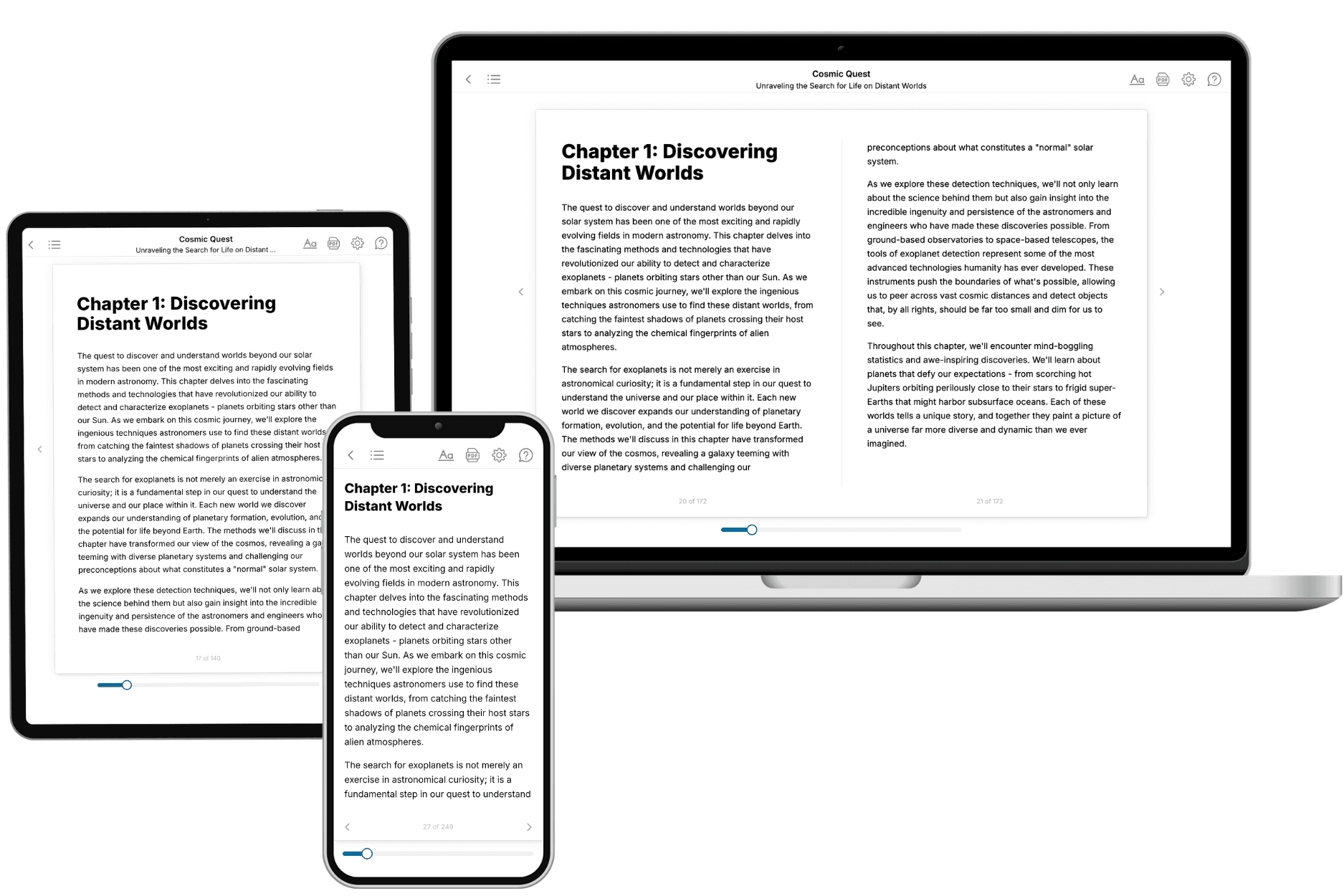
Your book is ready in 10 minutes. Read it online, download as EPUB or PDF, or send to Kindle.

Frequently asked questions
- What is TailoredRead?
TailoredRead creates complete, full-length nonfiction ebooks, written specifically for you. Tell us what you want to learn and why, and TailoredRead writes you a complete ebook on it, with charts, tables, and diagrams throughout. Read it online, on Kindle, or on any e-reader, or download it as a PDF or EPUB. Every book is written fresh the day you order it.
- How is the book tailored to me?
Before anything is written, you answer a few short questions about your goals, your background, and the topics you care about. Your book is then planned around your answers: written at your level, focused on your goals, and covering the topics you chose, instead of the one-size-fits-all book a store sells everyone.
- Will it read like generic AI content?
No. Your book isn't a chat transcript: it's planned chapter by chapter before a single word is written, told in a clear book voice, and explains ideas visually with charts, tables, and diagrams. After writing, every book goes through an editorial pass that polishes chapters so the book reads consistent from start to finish. Judge for yourself: browse thousands of sample books on our Explore Books page.
- How accurate is the content?
Our AI first checks whether your subject needs live research. Niche and fast-moving subjects are researched before writing, and the book plan and chapters are grounded in what it finds. After writing, every book goes through a quality pass that checks its facts and consistency, and researched books list their sources in a Notes section at the back.
- How long is the book?
You choose the length: Comprehensive (250-300 pages), Detailed (150-200 pages), Essential (70-100 pages), or Short (30-50 pages).
- Does the book include visuals?
Yes. Every book includes charts, tables, and diagrams: timelines, checklists, step-by-step guides, decision trees, comparison tables, matrices, and bar charts. A typical book includes dozens of these visual elements.
- Can I read it on Kindle? What formats can I download?
Yes. Every book can be read in our online reader or downloaded as a PDF or EPUB. The EPUB can be opened with Kindle, Apple Books, Kobo, and any e-reader. The Commercial and Author licenses also include an editable Word (DOCX) and Markdown download.
- How much does it cost?
About the price of a regular ebook. The exact price depends on your book's length and complexity, from $2 for the shortest books to $35 for the most comprehensive, and it's shown when you review your book, before you commit to anything. Each book is a one-time purchase, yours to keep, no subscription. Licenses that let you share, teach, or publish your book range from $35.99 to $49.99.
- Can I preview the book before purchasing?
Before you pay, you'll see what your book will cover: the title, a detailed description, the estimated length, and the complete chapter-by-chapter table of contents, so you know what you're getting before you decide. The full text itself is written after you purchase.
- How long does it take to create a book?
About 10 minutes. You can start reading the opening chapters while the rest is still being written.