Mastering CSS Display
Build Responsive, Professional Layouts with Modern Display Properties
Most designers struggle with CSS layouts because they treat display properties as isolated tools rather than understanding them as a cohesive system.
222 pages10 chaptersNov 24, 2025CSS
About this book
This book reveals how display properties work together to control element flow, spacing, and responsiveness—giving you the mental model you need to build layouts confidently. You'll move beyond memorizing syntax to understanding the "why" behind each display value. Learn how block, inline, and inline-block elements behave differently, master the power of Flexbox and Grid for modern layouts, and discover how display interacts with positioning, overflow, and the box model. Through practical examples and real-world scenarios, you'll develop the intuition to choose the right display approach for any design challenge. Whether you're building responsive websites, fixing stubborn layout bugs, or creating complex component systems, this comprehensive guide equips you with the knowledge to make intentional, effective display decisions that result in cleaner code and better user experiences.
Table of contents
- IntroductionWhy Display Properties Matter More Than You Think, What You'll Learn in This Book, How to Use This Book EffectivelyRead below
- Chapter 1: Display Fundamentals: The Foundation of CSS LayoutUnderstanding the Visual Formatting Model, How Display Controls Document Flow, Overview of Display Values and Their Purposes
- Chapter 2: Block, Inline, and Inline-Block: The Core Display ValuesBlock Elements: Full Width and Stacking Behavior, Inline Elements: Flow Within Text and Constraints, Inline-Block: The Hybrid Approach and When to Use It
- Chapter 3: Flexbox: One-Dimensional Layout PowerCreating Flex Containers and Understanding Flex Direction, Controlling Flex Items with Flex Grow, Shrink, and Basis, Alignment and Space Distribution in Flexbox, Common Flexbox Patterns and Real-World Applications
- Chapter 4: Grid: Two-Dimensional Layout ControlSetting Up Grid Containers and Defining Tracks, Placing Items on the Grid with Lines and Areas, Creating Responsive Grids with Auto-Fit and Auto-Fill, Advanced Grid Techniques and Complex Layouts
- Chapter 5: Advanced Display Properties: Beyond Block and FlexDisplay None, Visibility, and Hiding Elements, Display Contents: Removing the Box Without Removing the Element, Table Display Values and When to Use Them
- Chapter 6: Display Interactions: Positioning, Overflow, and the Box ModelHow Display Works with Absolute and Fixed Positioning, Managing Overflow and Containing Content with Display, Display's Impact on Margins, Padding, and the Box Model
- Chapter 7: Responsive Design with Display PropertiesMobile-First Approach to Display Decisions, Using Media Queries to Change Display Behavior, Building Truly Flexible Layouts That Adapt Naturally
- Chapter 8: Debugging Layout Issues: Finding and Fixing Display ProblemsCommon Display-Related Layout Problems and Their Causes, Using Browser DevTools to Inspect Display Behavior, Systematic Debugging Strategies for Layout Issues
- Chapter 9: Performance and Accessibility: The Human Impact of Display ChoicesHow Display Choices Affect Rendering Performance, Ensuring Accessibility Through Proper Display Usage, Balancing Display Properties with Semantic HTML
- Chapter 10: Real-World Projects: Applying Display MasteryBuilding Navigation Systems with Display, Creating Responsive Card and Component Systems, Tackling Complex Multi-Section Layouts
- Conclusion: Your Path ForwardKey Takeaways and Core Principles, Staying Current with CSS Display Evolution
- Glossary of CSS Display Terms
- Further Reading and Resources
Introduction
You've written CSS before. You've centered divs, built navigation bars, and wrestled with layouts that mysteriously break when viewed on different devices. Perhaps you've copied code from Stack Overflow that worked without fully understanding why, or spent hours adjusting margins and padding when the real problem was something more fundamental. If this sounds familiar, you're not alone. The display property is one of the most powerful tools in CSS, yet it's often misunderstood or treated as an afterthought. Most developers learn display values in isolation—memorizing that display: block makes elements stack and display: flex enables flexible layouts—without grasping the underlying system that connects these concepts. This fragmented knowledge leads to frustration, inefficient code, and layouts that feel like they're held together with duct tape rather than built on solid foundations.
The truth is that CSS display properties form a cohesive system that controls how every element on your page interacts with the document flow, responds to its container, and relates to neighboring elements. When you understand this system deeply, layout decisions become intuitive rather than mysterious. You'll know immediately whether a situation calls for flexbox or grid, understand why certain elements refuse to accept width values, and recognize how display choices ripple through your entire layout. This book exists to give you that understanding—not through rote memorization, but by building a mental model of how display properties work together. You'll learn to think like the browser thinks, anticipating how your CSS will render before you even open DevTools.
This introduction sets the stage for your journey toward display mastery. You'll discover why display properties deserve more attention than they typically receive, what specific skills and knowledge you'll gain from this book, and how to approach the material for maximum learning effectiveness. Whether you're building your first responsive website or refactoring a complex application, the principles you'll learn here will transform how you approach CSS layout. The goal isn't just to teach you syntax—it's to fundamentally change how you think about structuring web pages. By the end of this book, you'll have the confidence to tackle any layout challenge with clarity and precision, writing cleaner code that works reliably across browsers and devices.
Why Display Properties Matter More Than You Think
Every visible element on a web page has a display value, whether you explicitly set it or rely on browser defaults. This single property determines whether an element generates a box at all, how that box participates in layout, and how it affects surrounding elements. When you write display: flex, you're not just enabling flexbox—you're fundamentally changing how that element's children calculate their size, position, and relationship to each other. When you set display: none, you're removing the element from the document flow entirely, as if it never existed. These aren't minor styling tweaks; they're architectural decisions that shape your entire layout structure. Yet many developers treat display as just another CSS property, no more important than color or font-size. This misunderstanding leads to brittle layouts that break under unexpected conditions.
Consider a common scenario: you need to center a card component both horizontally and vertically within its container. Without understanding display properties, you might try various combinations of margins, positioning, and transforms, hoping something works. With display knowledge, you immediately recognize this as a flexbox or grid alignment problem and solve it in three lines of CSS. The difference isn't just efficiency—it's about choosing solutions that are maintainable, predictable, and semantically appropriate. Display properties are the foundation upon which all other layout decisions rest. Understanding them deeply means you can:
- Predict how elements will render before writing a single line of code
- Debug layout issues systematically rather than through trial and error
- Choose the right layout approach for each specific situation
- Write CSS that adapts gracefully to content changes and different screen sizes
- Avoid common pitfalls that lead to cross-browser inconsistencies
- Communicate more effectively with designers and other developers about layout decisions
The impact of display choices extends beyond visual appearance into performance and accessibility. When you use display: none to hide content, screen readers typically skip that content entirely—which might be exactly what you want, or it might create accessibility barriers. When you create deeply nested flexbox containers, you might trigger additional layout recalculations that slow down rendering. When you use display: inline-block without understanding whitespace behavior, you might introduce mysterious gaps between elements. These aren't edge cases; they're everyday situations that affect real users. A layout that looks perfect on your development machine might be unusable on a mobile device, not because of media queries, but because of fundamental display property misunderstandings.
Modern web development has evolved significantly, but display properties remain central to everything we build. The introduction of flexbox and grid revolutionized CSS layout, yet both are simply display values that enable new formatting contexts. Understanding display: flex and display: grid requires understanding what display properties do at a fundamental level—how they affect the box model, how they interact with positioning, and how they create relationships between parent and child elements. Many developers jump straight to learning flexbox syntax without grasping these foundations, leading to confusion when layouts don't behave as expected. You might know that justify-content: center centers flex items horizontally, but do you understand why it doesn't work on block elements, or why it behaves differently in grid containers?
The web platform continues to evolve, with new display values and layout features being added to CSS specifications. Properties like display: contents and subgrid capabilities expand what's possible with layout, but they build on the same fundamental concepts that have existed since CSS began. By mastering these fundamentals now, you're not just learning today's best practices—you're building knowledge that will remain relevant as the platform evolves. You'll be able to evaluate new CSS features critically, understanding how they fit into the broader display system rather than treating each new property as an isolated trick to memorize. This deep understanding is what separates developers who struggle with CSS from those who wield it confidently and creatively.
Perhaps most importantly, display mastery changes how you approach design implementation. Instead of seeing a design mockup and wondering "how do I build this?", you'll immediately recognize the underlying structure: "This is a grid container with auto-fit columns and a flexbox navigation bar." You'll spot potential responsive design challenges before they become problems, suggesting design adjustments that make implementation cleaner. You'll write CSS that's easier for others to understand and maintain because it reflects clear intentionality rather than accumulated hacks. This shift from reactive problem-solving to proactive architectural thinking is the real value of display mastery—it transforms CSS from a source of frustration into a powerful, predictable tool for bringing designs to life.
The stakes are higher than they might initially appear. Poor layout decisions compound over time, creating technical debt that becomes increasingly difficult to address. A website built on shaky display property foundations might work initially but become unmaintainable as features are added and requirements change. Responsive behavior breaks in unexpected ways. Performance degrades as the DOM grows. Accessibility issues emerge that are difficult to fix without restructuring entire components. By investing time now to understand display properties thoroughly, you're preventing these problems before they start. You're building on solid ground rather than sand, creating layouts that remain stable and maintainable as your projects grow in complexity.
What You'll Learn in This Book
This book takes you on a structured journey from display fundamentals through advanced techniques and real-world applications. You'll start by building a solid mental model of how CSS layout works at the most fundamental level—the visual formatting model that determines how browsers convert your HTML and CSS into rendered pixels. This foundation is crucial because every display property decision you make operates within this model. You'll learn how elements generate boxes, how those boxes participate in document flow, and how display values fundamentally alter these behaviors. This isn't abstract theory; it's the practical knowledge that explains why your layouts behave the way they do and how to predict their behavior before you write code.
The core display values—block, inline, and inline-block—receive thorough treatment because they're the building blocks of all CSS layout. You'll understand not just what these values do, but why they behave differently and when each is appropriate. For example, you'll learn why inline elements ignore vertical margins and how inline-block creates mysterious spacing issues. You'll discover how block elements interact with floats and clearing, and why certain properties only work on block-level elements. Through concrete examples and visual explanations, you'll develop an intuitive understanding of these fundamental display modes that will inform every layout decision you make. This knowledge is essential before moving to more complex display values because flexbox and grid build upon these same concepts.
Flexbox receives comprehensive coverage because it's become the default choice for one-dimensional layouts in modern web development. You'll learn the complete flexbox system, including:
- How flex containers establish a new formatting context and what that means for child elements
- The relationship between flex direction, main axis, and cross axis
- How flex-grow, flex-shrink, and flex-basis work together to distribute space
- The difference between justify-content, align-items, and align-content
- Common flexbox patterns like sticky footers, equal-height columns, and centered content
- When flexbox is the right choice versus when other display values are more appropriate
Grid layout gets equally thorough treatment as the solution for two-dimensional layout challenges. You'll master grid from first principles, learning how to define grid tracks, place items explicitly and implicitly, and create responsive grids that adapt without media queries. The book covers both basic grid concepts and advanced techniques like named grid areas, grid template areas for semantic layouts, and the powerful auto-fit and auto-fill keywords that enable truly flexible designs. You'll learn when grid is superior to flexbox and how to combine both display modes effectively. Through practical examples, you'll see how grid solves layout problems that were previously difficult or impossible, like overlapping elements without positioning or creating magazine-style layouts with minimal code.
Beyond the major display values, you'll explore specialized properties that solve specific problems. The display: none versus visibility: hidden distinction becomes clear, along with their different impacts on accessibility and layout. You'll learn about display: contents, a powerful but often misunderstood value that removes an element's box while preserving its children in the layout. Table display values get attention for situations where they're still the best solution, despite the availability of flexbox and grid. These "advanced" properties aren't exotic edge cases—they're practical tools that solve real problems when used appropriately. Understanding them expands your layout toolkit and helps you choose the most elegant solution for each situation.
The book dedicates significant attention to how display properties interact with other CSS features. You'll learn how display affects positioning behavior—why absolutely positioned elements ignore certain display values and how fixed positioning creates new stacking contexts. The relationship between display and the box model becomes clear, explaining why margins collapse in some situations but not others, and why padding and borders behave differently on inline versus block elements. Overflow behavior and how it's affected by display choices receives thorough coverage, helping you understand when content will clip, scroll, or overflow its container. These interactions are where many layout bugs originate, and understanding them prevents hours of debugging frustration.
Responsive design with display properties goes beyond simple media queries. You'll learn mobile-first approaches to display decisions, understanding how to structure layouts that enhance progressively as screen size increases. The book covers techniques for creating truly flexible layouts that adapt naturally to their content and container, reducing reliance on breakpoints. You'll discover how modern CSS features like container queries (where supported) change responsive design strategies, and how to build layouts that work gracefully across the full spectrum of devices from smartwatches to ultra-wide monitors. The goal is to help you think responsively from the start rather than treating mobile and desktop as separate design problems.
Debugging receives dedicated coverage because even experts encounter layout issues. You'll learn systematic approaches to diagnosing display-related problems, using browser DevTools effectively to inspect formatting contexts and box generation. The book covers common pitfalls like collapsing margins, flexbox sizing surprises, and grid placement confusion, providing clear explanations and solutions. You'll develop debugging strategies that help you isolate problems quickly rather than making random changes and hoping something works. This systematic approach transforms debugging from frustrating guesswork into a logical process of elimination, saving you countless hours over your career.
Performance and accessibility considerations thread throughout the book because display choices have real impacts on users. You'll learn which display properties trigger layout recalculations, how to minimize reflows and repaints, and when to prioritize performance over convenience. Accessibility coverage includes how different display values affect screen readers, keyboard navigation, and focus management. You'll understand the semantic implications of your display choices and how to balance visual design with accessible structure. These considerations aren't afterthoughts—they're integral to making good display property decisions that serve all users effectively.
The book concludes with real-world projects that synthesize everything you've learned. You'll build complete navigation systems, responsive card layouts, and complex multi-section pages using appropriate display properties for each component. These projects demonstrate how to combine different display values effectively, when to use flexbox versus grid, and how to structure CSS for maintainability. You'll see complete examples with explanations of why each decision was made, helping you develop the judgment to make similar decisions in your own projects. By the end, you'll have both theoretical understanding and practical experience applying display properties to solve real design challenges.
How to Use This Book Effectively
This book is designed for intermediate developers who already understand basic CSS syntax and have written stylesheets before. You should be comfortable with selectors, the cascade, and basic properties like colors and typography. You don't need to be a CSS expert—if you were, you probably wouldn't need this book—but you should have enough experience to recognize when layouts aren't working as expected. If you're completely new to CSS, consider working through a foundational tutorial first to build basic familiarity with the language. If you've been writing CSS for a while but feel like you're missing something fundamental about layout, you're exactly who this book is written for. The goal is to take your existing knowledge and deepen it, filling gaps and connecting concepts you might have learned in isolation.
The chapters are structured to build progressively, with each concept building on previous ones. While you could jump directly to the flexbox or grid chapters if that's your immediate need, you'll get more value by working through the fundamentals first. The early chapters on the visual formatting model and basic display values establish mental models that make advanced topics much easier to understand. Think of it like learning music: you could memorize specific songs without understanding music theory, but understanding theory makes you a better musician who can play anything. Similarly, understanding display fundamentals makes you a better developer who can solve any layout challenge, not just the specific patterns you've memorized.
Each chapter includes practical examples that you should actually code and experiment with. Reading about display properties is useful, but the concepts truly click when you see them in action and modify them yourself. Set up a simple HTML file with a stylesheet, or use a tool like CodePen or JSFiddle to experiment as you read. When you encounter an example, type it out rather than copying and pasting—the act of typing helps cement the syntax in your memory. Then modify the example: change values, add elements, break things intentionally to see what happens. This active experimentation is where real learning occurs. You'll discover edge cases and behaviors that aren't explicitly covered in the text, building intuition that goes beyond what any book can teach directly.
Use browser DevTools extensively as you work through the material. Modern browsers have excellent CSS inspection tools that visualize flexbox and grid layouts, show you which elements are generating which boxes, and help you understand the formatting context hierarchy. When an example doesn't behave as you expect, open DevTools and investigate why. Look at the computed styles, examine the box model, and use the layout inspection tools. This hands-on investigation builds the debugging skills you'll need in real projects. The book includes guidance on using DevTools effectively, but the best way to learn is through practice. Make DevTools your constant companion as you work through examples and projects.
Take notes as you read, particularly when you encounter concepts that challenge your existing understanding. If something surprises you—like learning that inline elements ignore vertical margins—write it down along with a brief explanation of why. These notes become your personal reference guide, capturing the insights most relevant to your learning journey. You might also keep a "questions" list for concepts that aren't immediately clear. Often, questions from early chapters get answered as you progress through later material. If questions remain after finishing the book, they become excellent topics for further research and experimentation. Active reading with note-taking transforms passive consumption into engaged learning.
The book includes code examples throughout, formatted for clarity and annotated with explanations. When you see code blocks, pay attention to the comments and surrounding text that explain what's happening and why. The examples are intentionally simple and focused, isolating specific concepts rather than showing complete production-ready components. This simplicity is deliberate—it helps you understand each concept clearly before combining them in more complex ways. Once you understand the fundamentals, you'll be able to apply them to arbitrarily complex real-world situations. Don't mistake simple examples for simplistic concepts; the principles they demonstrate are powerful and widely applicable.
Consider working through the book with a study partner or group if possible. Explaining concepts to others is one of the most effective ways to solidify your own understanding. When you encounter a tricky concept, try explaining it to someone else (or even to yourself out loud). If you can't explain it clearly, you probably don't understand it as well as you think. Discussion also exposes you to different perspectives and questions you might not have considered. If you don't have a study partner, consider joining online communities focused on CSS and web development. Share what you're learning, ask questions, and help others when you can. Teaching is learning.
Don't rush through the material trying to finish quickly. Display mastery isn't about speed; it's about depth of understanding. It's better to spend a week thoroughly understanding flexbox than to skim through it in an hour and remain confused. When a concept feels unclear, slow down. Re-read the section, experiment with more examples, and seek out additional resources if needed. The "Further Reading" section at the end of the book provides curated resources for deeper exploration of specific topics. Learning CSS layout is a journey, not a race. The time you invest in truly understanding these concepts will pay dividends throughout your career, saving you countless hours of debugging and enabling you to build better layouts more efficiently.
Apply what you learn immediately to real projects whenever possible. If you're working on a website or application, look for opportunities to refactor existing layouts using your new knowledge. You'll likely find places where you used complicated positioning hacks that could be replaced with simple flexbox or grid solutions. This real-world application reinforces learning and demonstrates the practical value of what you're studying. It also helps you develop judgment about when to apply different techniques—something that only comes from experience. Don't refactor everything at once; start with small, low-risk components and gradually apply your knowledge more broadly as your confidence grows.
Finally, remember that mastery is a process, not a destination. Even after finishing this book, you'll continue learning about CSS display properties through experience and experimentation. The web platform evolves, new features are added, and best practices shift over time. What this book provides is a solid foundation and mental model that will serve you regardless of how the specifics change. You'll be equipped to evaluate new CSS features critically, understand how they fit into the broader system, and make informed decisions about when and how to use them. That's the real goal: not to memorize every detail, but to develop the understanding and judgment that makes you an effective, confident CSS developer who can tackle any layout challenge with clarity and skill.
This is the end of the free sample. The full book has 10 chapters.
Want this book written for you?
Tell us your goals and background, and get your own version of this book, tailored by AI to you.


Benefits of AI-tailored books
- Read one book, not ten:
- all the CSS knowledge you need, gathered into a single book.
- Save days of learning:
- tell us your goals, choose your topics, and the whole book is built around them.
- Learn effortlessly:
- CSS book written for your specific background and expertise.
- Understand at a glance:
- includes charts, tables, timelines, checklists, decision trees, and more.
- Stay current:
- written the day you order it, not years ago.
- Trust what you read:
- every book is checked for accuracy, with real research when your subject needs it.
Create your unique book in 3 steps
- 1. Select your focus
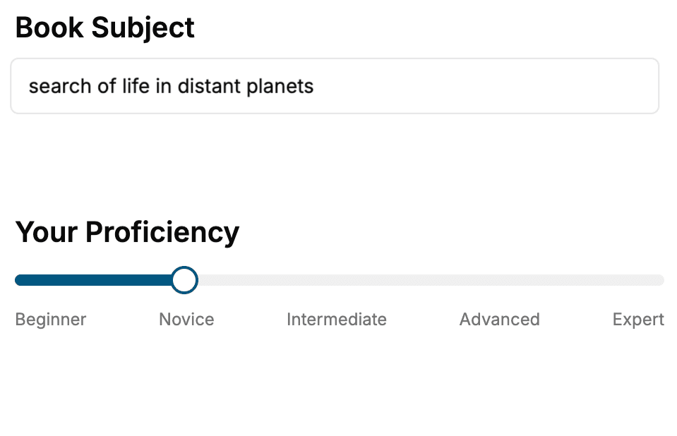
Select the focus of your CSS book and share your background
- 2. Personalize your book
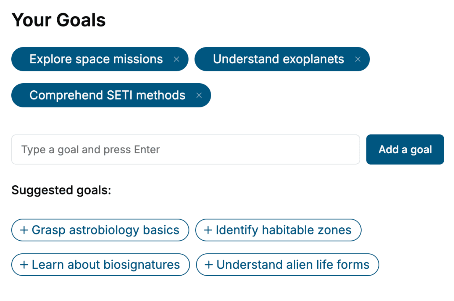
Specify your goals and choose sub-topics to include
- 3. Get your tailored book
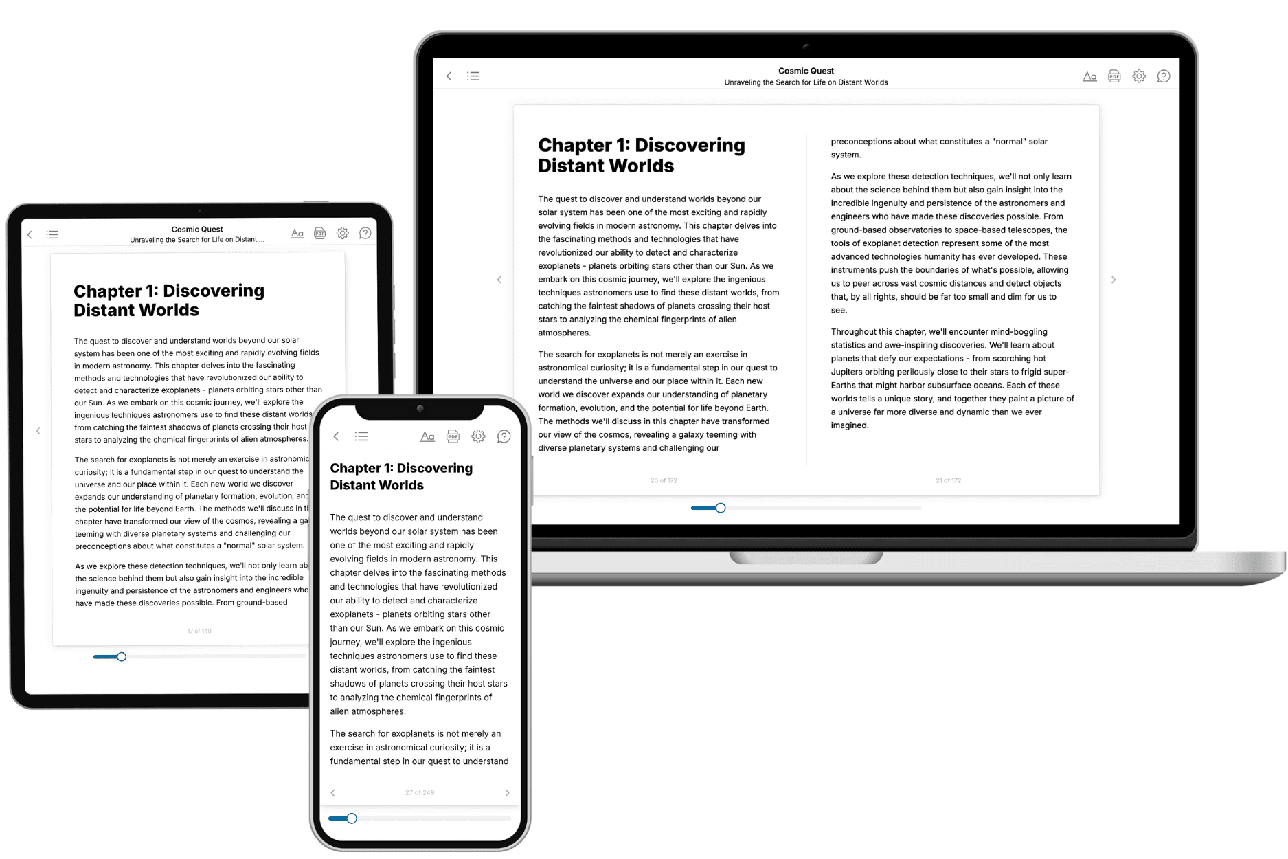
Your book is ready in 10 minutes. Read it online, download as EPUB or PDF, or send to Kindle.
Frequently asked questions
- What is TailoredRead?
TailoredRead creates complete, full-length nonfiction ebooks, written specifically for you. Tell us what you want to learn and why, and TailoredRead writes you a complete ebook on it, with charts, tables, and diagrams throughout. Read it online, on Kindle, or on any e-reader, or download it as a PDF or EPUB. Every book is written fresh the day you order it.
- How is the book tailored to me?
Before anything is written, you answer a few short questions about your goals, your background, and the topics you care about. Your book is then planned around your answers: written at your level, focused on your goals, and covering the topics you chose, instead of the one-size-fits-all book a store sells everyone.
- Will it read like generic AI content?
No. Your book isn't a chat transcript: it's planned chapter by chapter before a single word is written, told in a clear book voice, and explains ideas visually with charts, tables, and diagrams. After writing, every book goes through an editorial pass that polishes chapters so the book reads consistent from start to finish. Judge for yourself: browse thousands of sample books on our Explore Books page.
- How accurate is the content?
Our AI first checks whether your subject needs live research. Niche and fast-moving subjects are researched before writing, and the book plan and chapters are grounded in what it finds. After writing, every book goes through a quality pass that checks its facts and consistency, and researched books list their sources in a Notes section at the back.
- How long is the book?
You choose the length: Comprehensive (250-300 pages), Detailed (150-200 pages), Essential (70-100 pages), or Short (30-50 pages).
- Does the book include visuals?
Yes. Every book includes charts, tables, and diagrams: timelines, checklists, step-by-step guides, decision trees, comparison tables, matrices, and bar charts. A typical book includes dozens of these visual elements.
- Can I read it on Kindle? What formats can I download?
Yes. Every book can be read in our online reader or downloaded as a PDF or EPUB. The EPUB can be opened with Kindle, Apple Books, Kobo, and any e-reader. The Commercial and Author licenses also include an editable Word (DOCX) and Markdown download.
- How much does it cost?
About the price of a regular ebook. The exact price depends on your book's length and complexity, from $2 for the shortest books to $35 for the most comprehensive, and it's shown when you review your book, before you commit to anything. Each book is a one-time purchase, yours to keep, no subscription. Licenses that let you share, teach, or publish your book range from $35.99 to $49.99.
- Can I preview the book before purchasing?
Before you pay, you'll see what your book will cover: the title, a detailed description, the estimated length, and the complete chapter-by-chapter table of contents, so you know what you're getting before you decide. The full text itself is written after you purchase.
- How long does it take to create a book?
About 10 minutes. You can start reading the opening chapters while the rest is still being written.