Mastering CSS Floats
The Complete Guide to Professional Web Layout Design
Picture yourself confidently crafting pixel-perfect web layouts that adapt seamlessly across devices, with every element positioned exactly where you envision it.
284 pages15 chaptersOct 16, 2025CSS
About this book
Your designs flow naturally, your content wraps elegantly around images, and complex multi-column layouts come together effortlessly without the frustration of broken designs or mysterious spacing issues. This comprehensive guide transforms your understanding of CSS floats from basic concepts to advanced mastery. You'll discover how floats interact with the document flow, learn to create sophisticated responsive layouts, and master the art of clearing techniques that prevent layout collapse. Through practical examples and real-world scenarios, you'll build the skills to tackle any float-related challenge with confidence. Beyond the fundamentals, you'll explore advanced techniques for creating magazine-style layouts, image galleries, and complex grid systems using floats. You'll understand when floats are the perfect solution and when modern alternatives like Flexbox or Grid serve you better. Each chapter builds upon the previous, creating a solid foundation that supports increasingly complex design challenges. By the final page, you'll possess the expertise to create professional-grade layouts that work flawlessly across browsers and devices. Your CSS toolkit will be complete with battle-tested techniques, troubleshooting strategies, and optimization methods that ensure your float-based designs perform beautifully in any context.
Table of contents
- IntroductionThe Evolution of CSS Floats in Web Design, Why Floats Still Matter in Modern CSS, How to Approach This Guide, What You Need to Know Before StartingRead below
- Chapter 1: Float FundamentalsUnderstanding the Float Property, How Floats Affect Document Flow, Float Values: Left, Right, and None, Your First Float Examples
- Chapter 2: The Box Model and Floated ElementsBox Model Fundamentals Review, How Margins Behave with Floated Elements, Padding and Borders in Float Contexts, Width and Height Calculations for Floated Elements
- Chapter 3: Mastering Clear and ClearfixThe Clear Property Explained, Traditional Clearfix Techniques, Modern Clearing Solutions, Preventing Container Collapse
- Chapter 4: Text Flow and Content WrappingBasic Text Wrapping Around Floated Elements, Creating Image and Text Layouts, Controlling Text Wrap Behavior, Advanced Wrapping Techniques
- Chapter 5: Building Multi-Column LayoutsCreating Basic Two-Column Layouts, Three-Column Layout Strategies, Sidebar Positioning and Management, Equal Height Column Techniques
- Chapter 6: Responsive Design with FloatsUsing Percentage Widths for Flexibility, Integrating Media Queries with Float Layouts, Mobile-First Float Strategies, Managing Float Behavior at Different Breakpoints
- Chapter 7: Creating Image Galleries and GridsBasic Gallery Structure with Floats, Creating Thumbnail Grid Systems, Achieving Masonry-Style Layouts, Making Galleries Responsive
- Chapter 8: Float-Based Navigation SystemsCreating Horizontal Navigation Bars, Building Dropdown Menu Systems, Navigation Alignment and Spacing, Responsive Navigation Patterns
- Chapter 9: Magazine-Style Complex LayoutsEditorial Design Principles with Floats, Creating Flexible Content Blocks, Designing Asymmetrical Layouts, Establishing Visual Hierarchy
- Chapter 10: Advanced Float Stacking and PositioningUnderstanding Float Stacking Contexts, Z-Index Management with Floated Elements, Creating Layered Design Effects, Controlled Element Overlap Techniques
- Chapter 11: Cross-Browser CompatibilityUnderstanding Browser Float Differences, Internet Explorer Float Quirks, Modern Browser Float Support, Creating Fallback Strategies
- Chapter 12: Troubleshooting Common Float IssuesDiagnosing Layout Breaks and Collapses, Solving Unexpected Spacing Issues, Fixing Alignment Problems, Using Developer Tools for Float Debugging
- Chapter 13: Performance and OptimizationOrganizing CSS for Float-Heavy Layouts, Optimizing DOM Structure for Performance, Understanding Rendering Performance Impact, Strategies for Optimizing Float Layouts
- Chapter 14: Floats vs Modern Layout MethodsWhen to Use Flexbox Instead of Floats, CSS Grid vs Float-Based Layouts, Combining Floats with Modern Methods, Migrating from Float-Based to Modern Layouts
- Chapter 15: Real-World Project ApplicationsBuilding a Complete Blog Layout, Creating a Portfolio Website Structure, E-commerce Product Layout Patterns, News Website Layout Implementation
- Conclusion
- Glossary
Introduction
Welcome to a comprehensive exploration of one of CSS's most fundamental yet frequently misunderstood layout mechanisms. CSS floats have been shaping the web for over two decades, and despite the emergence of newer layout technologies, they remain an essential tool in every web developer's arsenal. This guide will transform your understanding of floats from a source of frustration into a powerful technique you can wield with precision and confidence. Whether you're struggling with collapsed containers, mysterious spacing issues, or simply want to understand why floats behave the way they do, you'll find the answers within these pages.
The journey ahead is designed specifically for developers who already understand CSS basics but want to achieve true mastery over float-based layouts. You've likely encountered floats in your work, perhaps used them for simple image wrapping or basic column layouts, but found yourself puzzled when things didn't behave as expected. This is completely normal. Floats operate according to a unique set of rules that differ significantly from other CSS properties, and understanding these rules unlocks capabilities that even modern layout methods sometimes struggle to replicate. Throughout this guide, you'll discover not just how floats work, but why they work that way, giving you the insight needed to predict and control their behavior in any situation.
What makes this guide different from other CSS resources is its focus on practical application combined with deep technical understanding. You won't find vague explanations or surface-level tutorials here. Instead, each chapter builds systematically on the previous one, starting with fundamental concepts and progressing to advanced techniques used in professional web development. You'll work through real-world scenarios, examine concrete examples with specific measurements and values, and learn battle-tested solutions to common problems. By the time you complete this guide, you'll possess the knowledge to create sophisticated, responsive layouts that work flawlessly across browsers and devices, and you'll understand exactly when floats are the right tool for the job versus when modern alternatives serve you better.
The Evolution of CSS Floats in Web Design
CSS floats were originally introduced to solve a specific problem that print designers had been handling for centuries: wrapping text around images. In the early days of the web, before CSS existed, achieving this simple layout required complex table structures or awkward HTML hacks. When the CSS specification introduced the float property in CSS1 back in 1996, it was revolutionary. For the first time, web developers could create magazine-style layouts where text flowed naturally around images, just as readers expected from their experience with printed materials. This seemingly simple feature opened the door to more sophisticated web design possibilities.
As the web matured through the late 1990s and early 2000s, developers discovered that floats could do much more than wrap text around images. Creative designers began using floats to create multi-column layouts, navigation systems, and complex grid structures. This wasn't what floats were originally designed for, but in the absence of better layout tools, they became the de facto standard for page layout. Websites like A List Apart and CSS Zen Garden showcased stunning designs built entirely with float-based layouts, proving that CSS could create sophisticated visual designs without relying on tables. This era, roughly from 2000 to 2010, represented the golden age of float-based web design.
The evolution of floats took an interesting turn with the rise of responsive web design. When Ethan Marcotte introduced the concept of responsive design in 2010, floats proved surprisingly adaptable to this new paradigm. By combining percentage-based widths with media queries, developers could create layouts that gracefully adapted from desktop to mobile screens. A three-column float-based layout could transform into a single column on small screens simply by changing float values and widths at specific breakpoints. This flexibility ensured that floats remained relevant even as mobile browsing exploded in popularity.
However, the float-based layout approach always had inherent limitations. Developers struggled with common issues like container collapse, where parent elements wouldn't properly contain their floated children. Equal-height columns required JavaScript solutions or clever CSS hacks. Vertical centering was nearly impossible. These challenges led to the development of clearfix techniques, which became essential knowledge for any web developer. The community created numerous solutions to float-related problems, from the original clearfix hack to more elegant modern approaches using pseudo-elements. Each solution represented accumulated wisdom about how floats actually behaved in different contexts.
The introduction of Flexbox in 2009 and CSS Grid in 2011 marked a significant shift in how developers approached layout. These new specifications were designed specifically for layout purposes, addressing many of the pain points that developers had experienced with floats. Flexbox excelled at one-dimensional layouts and component-level design, while Grid provided powerful two-dimensional layout capabilities. Many developers assumed floats would become obsolete, relegated to legacy code that would gradually disappear. Articles proclaimed the death of floats, and tutorials encouraged developers to abandon them entirely in favor of these modern alternatives.
Yet floats didn't disappear. Instead, they found their proper place in the modern CSS ecosystem. While Flexbox and Grid handle many layout scenarios more elegantly, floats still excel at their original purpose: wrapping content around elements. They also provide solutions for specific design challenges that other methods handle less gracefully. Understanding this evolution helps you appreciate why floats work the way they do and why mastering them remains valuable. The history of floats is really the history of web layout itself, reflecting how developers have continuously pushed CSS beyond its original limitations to create increasingly sophisticated designs.
Today's web development landscape requires understanding multiple layout methods and knowing when to apply each one. Floats are no longer the primary tool for page layout, but they remain an essential technique for specific use cases. Modern browsers support floats consistently and predictably, making them more reliable than ever. The accumulated knowledge from two decades of float-based design means that solutions to common problems are well-documented and battle-tested. This combination of reliability, specific use-case excellence, and comprehensive community knowledge makes floats a technique worth mastering, even in an era of advanced layout specifications.
Why Floats Still Matter in Modern CSS
The question of whether floats remain relevant in modern web development deserves a nuanced answer. While it's true that Flexbox and Grid have become the primary tools for page layout, floats continue to serve important purposes that these newer methods don't address as effectively. The most obvious example is text wrapping around images or other content blocks. When you want text to flow naturally around a floated element, creating that magazine-style layout that readers find intuitive, floats remain the most straightforward solution. Flexbox and Grid can't replicate this behavior without complex workarounds that ultimately prove more complicated than simply using a float.
Consider a practical scenario: you're building a blog post layout where images should appear within the content flow, with text wrapping around them naturally. Using floats, this requires a single property: float: left or float: right. The text automatically flows around the image, adjusting dynamically based on the image size and available space. Attempting the same effect with Flexbox requires breaking your content into separate containers, losing the natural flow of the document. Grid requires defining explicit areas and managing content placement manually. For this specific use case, floats provide the simplest, most maintainable solution. This isn't a limitation of modern layout methods; it's simply that they were designed to solve different problems.
Another compelling reason to understand floats is legacy code maintenance. Millions of websites still use float-based layouts, and many will continue to do so for years to come. As a professional developer, you'll inevitably encounter codebases that rely heavily on floats. Without understanding how they work, you'll struggle to maintain, debug, or enhance these sites. Even if you're building new projects exclusively with modern layout methods, the ability to work with floats remains a practical necessity. This isn't about clinging to outdated techniques; it's about being a versatile developer who can work effectively with the full spectrum of CSS layout approaches.
Floats also teach fundamental concepts about CSS layout that apply broadly across all layout methods. Understanding how floats affect document flow, how elements interact with floated siblings, and how the box model applies in float contexts builds mental models that transfer to other CSS features. The concept of taking elements out of normal document flow, which floats introduced, appears in positioned elements and modern layout contexts. The clearing techniques you learn with floats help you understand how to manage layout boundaries and container relationships. These aren't just float-specific skills; they're foundational CSS concepts that make you a better developer overall.
Performance considerations also favor floats in certain situations. Float-based layouts are computationally simple for browsers to render. The browser calculates positions based on straightforward rules without the complex algorithms required for Flexbox or Grid. For simple layouts or components that don't require the advanced features of modern layout methods, floats can actually perform better. This performance difference is usually negligible on modern devices, but it can matter in performance-critical applications or when supporting older devices. Understanding when simpler solutions suffice is part of being an effective developer.
The hybrid approach represents the future of CSS layout. Modern websites often combine multiple layout methods, using each where it excels. You might use Grid for the overall page structure, Flexbox for navigation components, and floats for content wrapping within articles. This isn't inconsistent or confused; it's pragmatic. Each layout method has strengths and weaknesses, and skilled developers choose the right tool for each specific challenge. Mastering floats means you have one more powerful tool in your toolkit, expanding the range of problems you can solve elegantly and efficiently.
Finally, floats matter because they're part of the CSS specification and will remain supported indefinitely. Browsers won't remove float support because doing so would break countless existing websites. This means floats are a stable, reliable feature you can use with confidence. Unlike JavaScript frameworks that come and go, or CSS preprocessor features that may fall out of favor, floats are a permanent part of the web platform. Investing time in understanding them isn't learning a deprecated technique; it's mastering a fundamental web technology that will remain relevant throughout your career. The knowledge you gain from this guide will serve you for years to come, regardless of how web development trends evolve.
How to Approach This Guide
This guide is structured to build your understanding progressively, starting with fundamental concepts and advancing to sophisticated techniques. Each chapter assumes you've absorbed the material from previous chapters, so working through them sequentially will give you the best results. However, the guide is also designed to serve as a reference resource. If you're facing a specific challenge, you can jump directly to the relevant chapter and find targeted solutions. The key is understanding that floats operate as a system of interconnected behaviors, so even when focusing on a specific topic, you may need to reference earlier chapters to fully grasp the underlying principles.
The most effective way to learn from this guide is through active practice. Reading about floats provides theoretical understanding, but actually writing CSS and observing how browsers render your code builds the intuitive grasp that separates competent developers from masters. Each chapter includes specific examples with complete code snippets. Don't just read these examples; type them out yourself, experiment with different values, and observe what changes. Try to break the examples intentionally to see what happens. This hands-on exploration will teach you more than passive reading ever could. Create a dedicated practice project where you can test concepts as you learn them.
When working through examples, use your browser's developer tools extensively. Modern browsers provide excellent inspection tools that let you visualize the box model, see computed styles, and understand how elements relate to each other. For float-based layouts, these tools are invaluable. You can see exactly how much space an element occupies, whether it's actually floated, and how surrounding elements respond. The ability to temporarily modify CSS in the browser lets you test hypotheses immediately. If you're not already comfortable with developer tools, take time to learn them alongside this guide. They're essential for understanding and debugging float behavior.
Pay special attention to the examples marked as common mistakes or anti-patterns. Understanding what not to do is often as valuable as knowing the correct approach. These examples show real problems that developers encounter and explain why certain approaches fail. When you understand the failure modes, you can avoid them in your own work and recognize them quickly when debugging. Many float-related issues stem from a handful of common mistakes, and learning to identify these patterns will save you countless hours of frustration. The troubleshooting chapter later in the guide builds on these examples to provide systematic debugging approaches.
Consider creating a personal reference document as you progress through the guide. When you encounter a particularly useful technique or solution, write it down in your own words with a simple example. This process of translation and summarization reinforces learning and creates a customized resource tailored to your thinking style. Your reference document might include:
- Quick syntax reminders for float-related properties
- Common clearfix patterns you find yourself using repeatedly
- Solutions to specific problems you've encountered in your projects
- Notes about browser-specific behaviors you need to remember
- Links to particularly helpful examples or external resources
Don't rush through the material. Float behavior can seem counterintuitive at first, especially if you're accustomed to other layout methods. Some concepts may require multiple readings and experiments before they click. This is normal and expected. The goal isn't to memorize every detail but to build a mental model of how floats work. Once you have that model, you can reason through new situations even if you haven't encountered them before. Take breaks between chapters to let concepts settle. Return to earlier chapters if you find yourself confused by later material. Deep understanding takes time, but it's worth the investment.
Finally, apply what you learn to real projects as soon as possible. The transition from practice examples to production code reveals nuances that controlled examples can't capture. You'll encounter edge cases, browser quirks, and integration challenges that deepen your understanding. Start with small applications of float techniques in existing projects before attempting complex float-based layouts. This gradual integration builds confidence and helps you develop judgment about when floats are the right solution. Keep notes about challenges you face and solutions you discover. These real-world experiences will make you a more effective developer than any guide alone could achieve.
What You Need to Know Before Starting
This guide assumes you have a solid foundation in HTML and CSS fundamentals. You should be comfortable writing semantic HTML markup, understanding how elements nest within each other, and recognizing the difference between block-level and inline elements. You don't need to be an expert, but you should be able to create a basic web page structure without constantly referencing documentation. If terms like div, span, section, and article are unfamiliar, spend some time with introductory HTML resources before diving into this guide. The examples assume you understand basic HTML structure and can create simple documents.
On the CSS side, you need familiarity with fundamental concepts and syntax. You should understand how to write CSS rules, apply them to HTML elements using selectors, and link stylesheets to HTML documents. Basic properties like width, height, margin, padding, border, and background should be part of your working vocabulary. You should understand the cascade and specificity at least conceptually, even if you don't know every detail. If you've built a few simple web pages with custom styling, you likely have sufficient CSS knowledge to benefit from this guide. The focus here is on deepening your understanding of a specific layout technique, not teaching CSS from scratch.
Understanding the CSS box model is particularly important for working with floats. You should know that every element is represented as a rectangular box with content, padding, border, and margin areas. You should understand how these areas affect the total space an element occupies and how they interact with surrounding elements. If you're unclear about the difference between box-sizing: content-box and box-sizing: border-box, review these concepts before proceeding. The chapter on box model interaction with floats will build on this foundation, but it assumes you start with basic box model knowledge. A weak understanding of the box model will make float behavior seem mysterious and unpredictable.
You'll need a development environment to practice the techniques in this guide. This doesn't require anything elaborate. At minimum, you need:
- A text editor for writing HTML and CSS (VS Code, Sublime Text, Atom, or even Notepad++ work fine)
- A modern web browser for testing (Chrome, Firefox, Safari, or Edge all work well)
- Access to browser developer tools (built into all modern browsers)
- A local file system where you can save and organize practice files
Familiarity with browser developer tools will significantly enhance your learning experience. You should know how to open the developer tools in your browser of choice, inspect elements to see their computed styles, and view the box model visualization. If you've never used developer tools, spend an hour learning the basics before starting this guide. The ability to inspect elements and see exactly how the browser is rendering them is invaluable when learning about floats. You'll use these tools constantly to understand why layouts behave as they do and to debug issues when things don't work as expected. Most browsers have excellent documentation for their developer tools.
Some understanding of responsive design principles will help you get more from the later chapters, though it's not strictly required for the fundamentals. If you know what media queries are and have used them to create basic responsive layouts, you'll be well-prepared. The chapter on responsive design with floats will explain the specific techniques, but it assumes you understand why responsive design matters and have basic familiarity with the concept. If you've never worked with responsive design, you can still learn float fundamentals and return to the responsive chapters later when you're ready to explore that aspect.
Finally, you need patience and curiosity. Float behavior can seem strange at first, especially if you're coming from other layout methods. Some concepts will challenge your assumptions about how CSS should work. Approach this material with an open mind and willingness to experiment. When something doesn't make sense immediately, that's an opportunity to deepen your understanding, not a sign that you're not capable of learning it. The developers who master floats are those who persist through initial confusion and take time to truly understand the underlying principles. If you bring curiosity and persistence to this guide, you'll emerge with skills that set you apart as a developer who truly understands CSS layout at a fundamental level.
This is the end of the free sample. The full book has 15 chapters.
Want this book written for you?
Tell us your goals and background, and get your own version of this book, tailored by AI to you.


Benefits of AI-tailored books
- Read one book, not ten:
- all the CSS knowledge you need, gathered into a single book.
- Save days of learning:
- tell us your goals, choose your topics, and the whole book is built around them.
- Learn effortlessly:
- CSS book written for your specific background and expertise.
- Understand at a glance:
- includes charts, tables, timelines, checklists, decision trees, and more.
- Stay current:
- written the day you order it, not years ago.
- Trust what you read:
- every book is checked for accuracy, with real research when your subject needs it.
Create your unique book in 3 steps
- 1. Select your focus
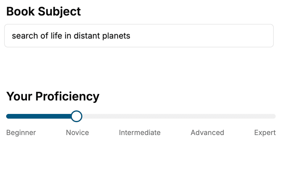
Select the focus of your CSS book and share your background
- 2. Personalize your book
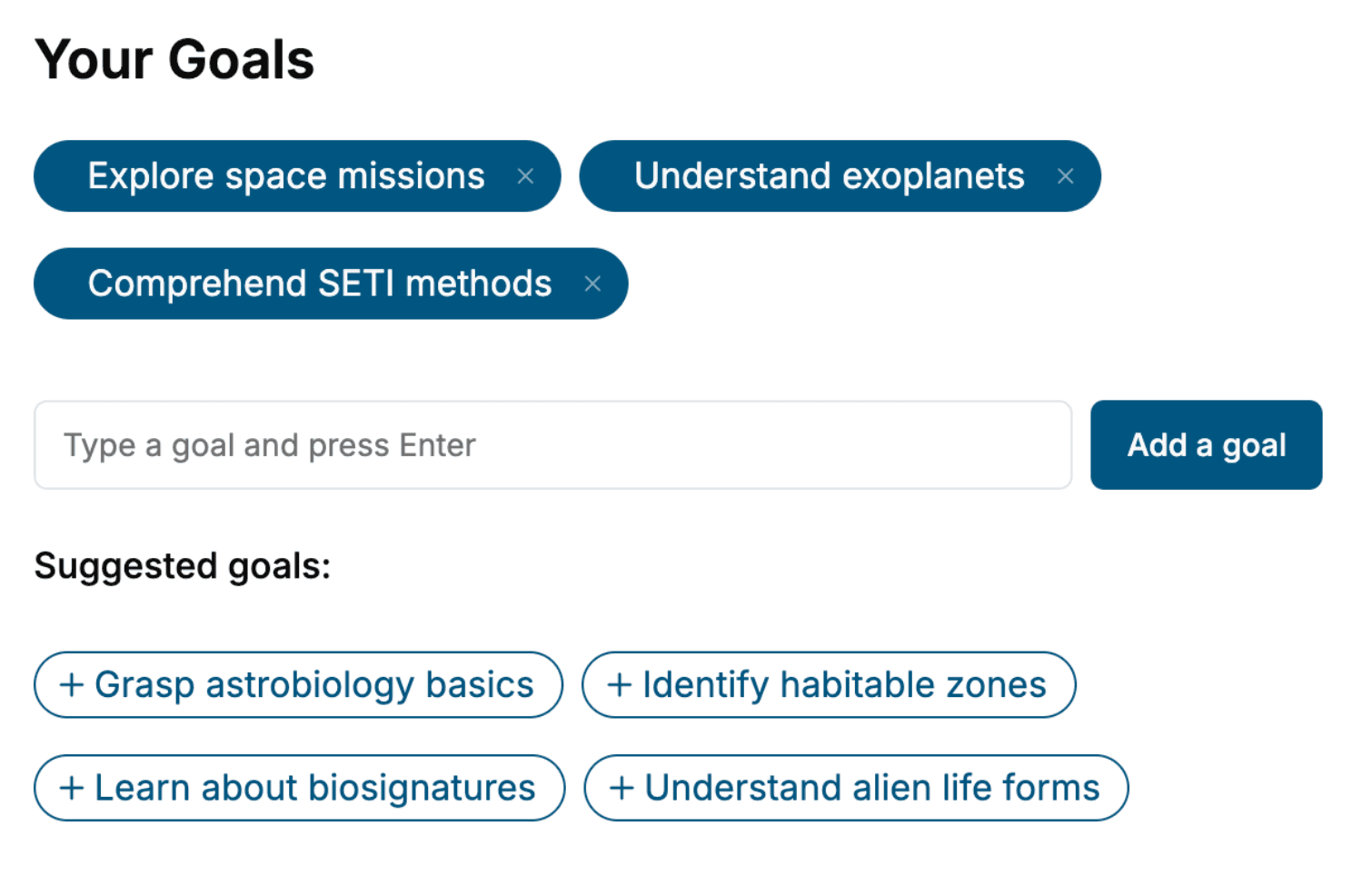
Specify your goals and choose sub-topics to include
- 3. Get your tailored book
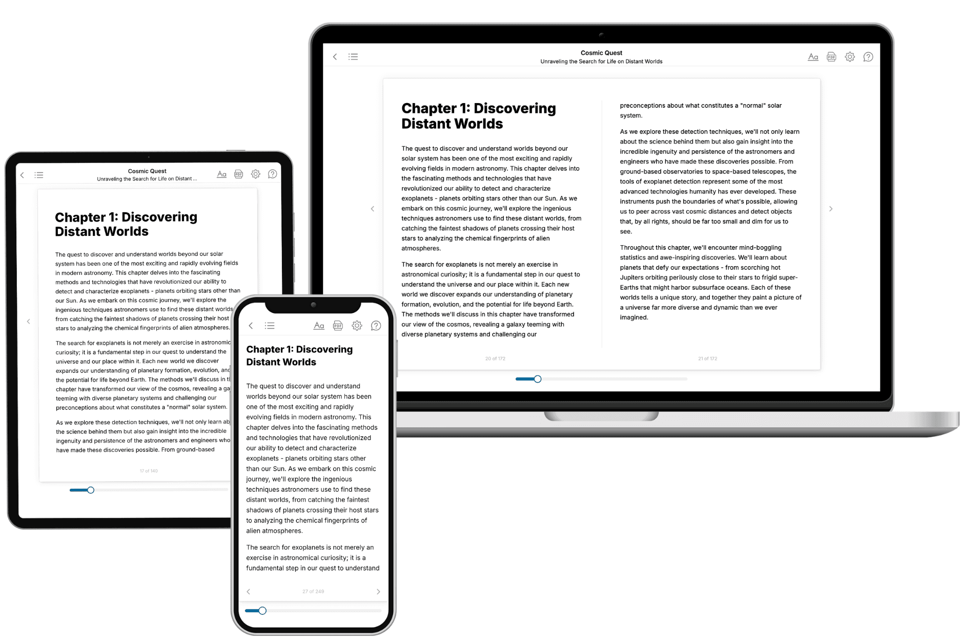
Your book is ready in 10 minutes. Read it online, download as EPUB or PDF, or send to Kindle.
Frequently asked questions
- What is TailoredRead?
TailoredRead creates complete, full-length nonfiction ebooks, written specifically for you. Tell us what you want to learn and why, and TailoredRead writes you a complete ebook on it, with charts, tables, and diagrams throughout. Read it online, on Kindle, or on any e-reader, or download it as a PDF or EPUB. Every book is written fresh the day you order it.
- How is the book tailored to me?
Before anything is written, you answer a few short questions about your goals, your background, and the topics you care about. Your book is then planned around your answers: written at your level, focused on your goals, and covering the topics you chose, instead of the one-size-fits-all book a store sells everyone.
- Will it read like generic AI content?
No. Your book isn't a chat transcript: it's planned chapter by chapter before a single word is written, told in a clear book voice, and explains ideas visually with charts, tables, and diagrams. After writing, every book goes through an editorial pass that polishes chapters so the book reads consistent from start to finish. Judge for yourself: browse thousands of sample books on our Explore Books page.
- How accurate is the content?
Our AI first checks whether your subject needs live research. Niche and fast-moving subjects are researched before writing, and the book plan and chapters are grounded in what it finds. After writing, every book goes through a quality pass that checks its facts and consistency, and researched books list their sources in a Notes section at the back.
- How long is the book?
You choose the length: Comprehensive (250-300 pages), Detailed (150-200 pages), Essential (70-100 pages), or Short (30-50 pages).
- Does the book include visuals?
Yes. Every book includes charts, tables, and diagrams: timelines, checklists, step-by-step guides, decision trees, comparison tables, matrices, and bar charts. A typical book includes dozens of these visual elements.
- Can I read it on Kindle? What formats can I download?
Yes. Every book can be read in our online reader or downloaded as a PDF or EPUB. The EPUB can be opened with Kindle, Apple Books, Kobo, and any e-reader. The Commercial and Author licenses also include an editable Word (DOCX) and Markdown download.
- How much does it cost?
About the price of a regular ebook. The exact price depends on your book's length and complexity, from $2 for the shortest books to $35 for the most comprehensive, and it's shown when you review your book, before you commit to anything. Each book is a one-time purchase, yours to keep, no subscription. Licenses that let you share, teach, or publish your book range from $35.99 to $49.99.
- Can I preview the book before purchasing?
Before you pay, you'll see what your book will cover: the title, a detailed description, the estimated length, and the complete chapter-by-chapter table of contents, so you know what you're getting before you decide. The full text itself is written after you purchase.
- How long does it take to create a book?
About 10 minutes. You can start reading the opening chapters while the rest is still being written.