Mastering CSS Layouts
From Floats to Flexbox and Grid—Build Responsive, Professional Designs
Imagine confidently tackling any layout challenge that comes your way—whether it's a complex multi-column design, a responsive navigation system, or a dynamic card grid that adapts beautifully to every screen size.
191 pages9 chaptersMar 26, 2026CSS
About this book
This book transforms your CSS layout skills from adequate to exceptional. You'll move beyond trial-and-error approaches and gain deep understanding of how modern CSS layout systems actually work. Starting with foundational concepts and progressing through Flexbox, CSS Grid, and advanced techniques, you'll learn not just the "how" but the "why" behind each approach. Real-world examples and practical patterns show you how professional designers solve actual problems. By the end, you'll have the confidence and knowledge to architect layouts that are responsive, accessible, performant, and maintainable—making you a more valuable designer and developer.
Table of contents
- IntroductionWhy Layouts Matter in Modern Web Design, The Evolution of CSS Layout Techniques, How to Use This Book, What You'll Learn and AccomplishRead below
- Chapter 1: CSS Layout FundamentalsUnderstanding the Box Model, The Display Property and Document Flow, Positioning Contexts and Stacking, CSS Units and Responsive Measurements
- Chapter 2: Traditional Layout MethodsFloats and Clearing Techniques, Inline-Block and Vertical Alignment, When and Why to Use Traditional Methods
- Chapter 3: Mastering FlexboxFlexbox Fundamentals and Container Properties, Flex Item Properties and Alignment, Common Flexbox Patterns and Use Cases, Building Responsive Layouts with Flexbox
- Chapter 4: CSS Grid EssentialsGrid Fundamentals and Container Setup, Grid Item Placement and Spanning, Grid Alignment and Distribution, Responsive Grid Layouts and Auto-Fit
- Chapter 5: Advanced Grid TechniquesNamed Grid Areas and Template Regions, Subgrid and Nested Grid Layouts, Grid Auto-Flow and Dynamic Placement
- Chapter 6: Combining Flexbox and GridChoosing Between Flexbox and Grid, Building Hybrid Layouts with Both Systems, Nesting Strategies and Component Architecture, Real-World Layout Examples
- Chapter 7: Responsive Design and Modern TechniquesMedia Queries and Breakpoint Strategy, Container Queries and Component-Based Responsiveness, Fluid Typography and Scalable Spacing, Mobile-First Design and Progressive Enhancement
- Chapter 8: Accessibility and Inclusive Layout DesignSemantic HTML and Layout Structure, Keyboard Navigation and Focus Management, Screen Readers and Layout Announcements, Accessible Layout Patterns and Components
- Chapter 9: Performance Optimization and Best PracticesRendering Performance and Layout Thrashing, CSS Optimization and Code Efficiency, Debugging Layouts and Browser DevTools, Layout Best Practices and Common Pitfalls
- ConclusionYour Layout Design Journey Ahead, Staying Current with CSS Evolution
- Appendix: Quick Reference GuideFlexbox Properties Quick Reference, CSS Grid Properties Quick Reference, Additional Resources and Tools
Introduction
There is a moment that almost every web designer and developer knows well. You are staring at a layout that looks perfect in your head, but the browser has other ideas. Elements are floating where they shouldn't, columns are collapsing unexpectedly, and the spacing that looked clean on your laptop turns into a jumbled mess on a phone screen. You start adding random CSS properties, hoping something sticks. Sometimes it does. Often it doesn't. That cycle of trial and error is frustrating, and it's a sign that something deeper is missing: a clear mental model of how CSS layouts actually work.
This book exists to close that gap. It's not a reference manual that lists every CSS property in alphabetical order. It's a structured, practical guide that builds your understanding from the ground up, moving through foundational concepts, traditional techniques, modern layout systems like Flexbox and CSS Grid, and advanced responsive design strategies. Each chapter connects to the next, so by the time you reach the end, you won't just know individual properties. You'll understand how layout systems think, and that understanding will make you faster, more confident, and far less dependent on guesswork.
CSS layout has changed dramatically over the past decade. The tools available today are genuinely powerful, and they were designed to solve the exact problems that made older approaches so painful. Flexbox arrived and made one-dimensional alignment feel almost effortless. CSS Grid followed and gave designers true two-dimensional control over page structure. Container queries, fluid typography, and modern responsive techniques have continued to push the craft forward. The challenge isn't that the tools are hard to find. The challenge is understanding them deeply enough to use them with confidence and to know which one to reach for in any given situation.
Whether you're building a personal portfolio, a complex web application, or a content-heavy editorial site, the layout decisions you make affect everything: how users navigate your content, how accessible your design is to people with disabilities, how fast your pages load, and how easy your code is to maintain six months from now. Layout is not a cosmetic concern. It is structural, functional, and deeply connected to the quality of the experience you deliver. This book treats it that way.
Why Layouts Matter in Modern Web Design
Layout is the invisible architecture of every web page. When it works well, users don't notice it at all. They simply find what they're looking for, read comfortably, and move through the experience without friction. When it breaks, even slightly, the entire design feels unreliable. A navigation bar that overlaps content on a tablet, a card grid that loses its alignment on a wide monitor, or a form that becomes unusable on a small phone screen: these are layout failures, and they erode trust in ways that are hard to recover from.
The stakes are higher than they've ever been. People access the web from an enormous range of devices, from small smartwatches to ultra-wide desktop monitors, from budget Android phones with slow connections to high-resolution MacBook Pros on fast Wi-Fi. A layout that only works in one context is not a finished layout. It's a starting point. Modern web design demands that your layouts adapt gracefully across all of these environments, and that adaptation has to be intentional, not accidental.[1]
Layout decisions also carry real business consequences. Research consistently shows that users form opinions about a website's credibility within milliseconds of landing on it, and visual layout is one of the primary signals they use.[2] A cluttered, misaligned, or visually inconsistent layout signals carelessness. A clean, well-structured layout signals professionalism and attention to detail. That first impression shapes whether a user stays or leaves, whether they trust your content, and whether they complete the action you're hoping they'll take.
Beyond aesthetics, layout is deeply tied to accessibility. The order in which elements appear in your HTML, the way focus moves through interactive components, and the visual hierarchy you create through spacing and positioning all affect how people with disabilities experience your site. Screen reader users, keyboard-only users, and people with low vision all depend on thoughtful layout decisions to navigate effectively. Treating accessibility as an afterthought almost always means retrofitting fixes that are harder and less effective than getting the structure right from the start.
Performance is another dimension where layout choices matter. Certain CSS properties trigger expensive browser operations like layout recalculation and repainting. Understanding which properties are cheap and which are costly helps you write CSS that renders quickly, especially on lower-powered mobile devices where performance margins are thin. A layout that looks beautiful but causes janky scrolling or slow page loads is not a successful layout, regardless of how it looks in a screenshot.
Finally, maintainability is a practical concern that grows more important as projects scale. CSS that relies on magic numbers, deeply nested selectors, and layout hacks becomes brittle over time. When a new team member joins, or when you return to a project after six months away, poorly structured layout code is genuinely difficult to understand and modify safely. Modern CSS layout techniques, used correctly, produce code that is readable, predictable, and easy to extend. That's not just a nice-to-have. It's a professional standard worth building toward.
Good layout is invisible. It guides users through content without drawing attention to itself. When layout becomes visible, it's usually because something has gone wrong.
The Evolution of CSS Layout Techniques
To appreciate where CSS layout is today, it helps to understand where it came from. The early web was not designed with complex visual layouts in mind. HTML was conceived as a document format, not a design canvas. When designers started wanting more control over visual presentation in the mid-1990s, they reached for whatever tools were available, and for a long time, that meant HTML tables. Tables were never intended for layout, but they offered something that nothing else did at the time: reliable multi-column structure. Entire websites were built inside nested table cells, with invisible spacer GIFs used to control spacing. It worked, but it was semantically wrong, difficult to maintain, and terrible for accessibility.
CSS arrived as a proper solution to the separation of content and presentation. The early versions of CSS gave designers control over colors, fonts, and basic spacing, but layout remained awkward. The float property, originally designed to allow text to wrap around images, became the primary tool for building multi-column layouts. Developers learned to float elements left or right, clear those floats at the right moments, and use various clearfix techniques to prevent containers from collapsing. It worked, but it required a deep understanding of browser quirks and produced code that was hard to read and harder to debug.
The inline-block approach offered an alternative for certain layout patterns, particularly horizontal navigation bars and grid-like arrangements. It was cleaner than floats in some ways, but it introduced its own frustrations, most notably the mysterious whitespace that appeared between inline-block elements because of how browsers handled whitespace in HTML source code. Developers worked around this with font-size hacks, HTML comment tricks, and other workarounds that felt more like exploits than solutions.
The real turning point came with Flexbox, which became widely supported across browsers around 2015. Flexbox was the first CSS layout system designed specifically for the kinds of problems designers were actually trying to solve: distributing space among items in a row or column, aligning elements along an axis, and handling flexible sizing without brittle calculations. It felt like a revelation. Tasks that had required complex float-based workarounds suddenly became a few lines of clean, readable CSS. Centering an element vertically, which had been a running joke in the CSS community for years, became trivial.[3]
CSS Grid followed, reaching broad browser support around 2017. Where Flexbox excels at one-dimensional layouts (either a row or a column), Grid was built for two-dimensional control. It introduced the concept of defining explicit rows and columns, placing items precisely within a grid structure, and creating complex page layouts with a clarity and directness that had never been possible before. Named grid areas made layouts almost self-documenting. The fr unit made proportional sizing intuitive. Auto-placement algorithms handled dynamic content gracefully. Grid didn't replace Flexbox; it complemented it, and the two systems work together beautifully.
More recently, container queries have addressed one of the longest-standing limitations of responsive design. Traditional media queries respond to the size of the viewport, the browser window. But components embedded in different contexts often need to respond to the size of their own container, not the whole page. Container queries make that possible, enabling truly component-based responsive design. Combined with modern features like the clamp() function for fluid typography, logical properties for internationalization support, and the :has() selector for context-aware styling, CSS layout in 2024 is more capable than it has ever been.
Understanding this history matters for practical reasons. You will encounter legacy codebases that use floats and inline-block layouts. You will work with browsers that have varying levels of support for newer features. And you will make better decisions about which technique to use when you understand not just what each approach does, but why it exists and what problem it was designed to solve. This book covers the full spectrum, from traditional methods to cutting-edge techniques, so you can navigate any codebase and any project with confidence.
- 1990s: Table-based layouts dominate; HTML used for visual structure
- Early 2000s: CSS floats replace tables; clearfix hacks become standard practice
- 2010s: Inline-block and CSS frameworks like Bootstrap gain popularity
- 2015: Flexbox reaches broad browser support; one-dimensional layout becomes clean
- 2017: CSS Grid reaches broad support; two-dimensional layout becomes practical
- 2020s: Container queries,
clamp(), subgrid, and logical properties expand the toolkit
How to Use This Book
This book is structured as a progressive journey. Each chapter builds on the concepts introduced before it, so reading from start to finish gives you the most complete and connected understanding. That said, if you already have solid experience with a particular topic, such as the box model or traditional float-based layouts, you can move through those chapters quickly and use them as a reference rather than a primary learning resource. The book is designed to reward both linear reading and selective deep dives.
The early chapters cover foundational concepts that underpin everything else. Chapter 1 explores the box model, the display property, positioning contexts, and CSS units. These topics might seem basic, but a surprising number of layout bugs trace back to misunderstandings in exactly these areas. Even if you've been writing CSS for years, spending time with these fundamentals often reveals gaps that explain why certain things have never quite worked the way you expected. Don't skip them lightly.
Chapter 2 covers traditional layout methods, including floats and inline-block techniques. This chapter is not just historical context. Understanding these approaches helps you work with legacy codebases, and it deepens your appreciation for why Flexbox and Grid were designed the way they were. Chapters 3 through 6 form the core of the book, covering Flexbox, CSS Grid, advanced Grid techniques, and strategies for combining both systems effectively. These chapters are the most hands-on, with specific patterns, code examples, and real-world scenarios throughout.
Chapters 7 through 9 move into broader concerns: responsive design strategies, accessibility considerations, and performance optimization. These chapters treat layout not as an isolated technical skill but as part of a larger craft that includes user experience, inclusivity, and code quality. The appendix at the end provides quick-reference tables for Flexbox and Grid properties, along with a curated list of tools and resources for continued learning.
To get the most out of this book, write code as you read. Every concept becomes clearer when you apply it in a browser. Open a code editor alongside the book, create simple test files, and experiment with the properties and patterns as they're introduced. Change values, break things intentionally, and observe what happens. That active engagement is what converts reading into understanding. The browser's developer tools are your best companion throughout this process, and Chapter 9 covers how to use them effectively for layout debugging.
You don't need any special setup to follow along. A modern browser (Chrome, Firefox, Safari, or Edge) and a text editor are all you need. If you prefer a more structured environment, tools like CodePen or StackBlitz let you experiment directly in the browser without any local setup. The code examples in this book are written to be clear and focused, showing the relevant properties without unnecessary boilerplate. You can adapt them to your own projects as you go.
The best way to learn CSS layout is to build things, break them, and figure out why. This book gives you the mental models. The browser gives you the feedback. Together, they'll make you significantly better.
One more note on approach: this book focuses on understanding over memorization. CSS has hundreds of properties, and trying to memorize all of them is neither practical nor useful. What matters is understanding the systems and principles well enough that you can look up specific syntax when you need it and immediately understand how it fits into the larger picture. That kind of deep, flexible knowledge is what separates developers who struggle with layout from those who handle it with confidence.
What You'll Learn and Accomplish
By the time you finish this book, you will have a comprehensive, practical understanding of CSS layout that covers the full range of techniques used in professional web development today. More importantly, you'll have the mental models to approach new layout challenges systematically rather than reactively. You'll know why things work, not just how to make them work, and that distinction makes an enormous difference in how quickly and confidently you can solve problems you've never encountered before.
Here is a concrete picture of what you'll be able to do after working through this material:
- Explain the CSS box model accurately and use it to predict how elements will be sized and spaced
- Control document flow using the display property and understand when and why to override default behavior
- Use positioning contexts (static, relative, absolute, fixed, sticky) correctly and avoid common stacking context bugs
- Choose appropriate CSS units for different contexts, including responsive measurements like
rem,vw,vh, andclamp() - Read and maintain legacy float-based layouts without confusion
- Build one-dimensional layouts with Flexbox using the full range of container and item properties
- Create two-dimensional page structures with CSS Grid, including named areas, spanning, and auto-placement
- Combine Flexbox and Grid strategically within the same design
- Implement responsive layouts using media queries, container queries, and fluid sizing techniques
- Design layouts that are accessible to keyboard users and screen reader users
- Identify and fix common performance issues related to CSS layout
- Debug layout problems efficiently using browser developer tools
These skills are not abstract. They apply directly to the kinds of projects you're likely working on right now. Consider a few concrete scenarios. You're building a card grid for a product listing page, and you need it to show four columns on desktop, two on tablet, and one on mobile, with consistent spacing and alignment regardless of how many cards are in the grid. CSS Grid with auto-fit and minmax() handles this elegantly, and Chapter 4 shows you exactly how. You're building a navigation bar that needs to stack vertically on mobile and spread horizontally on desktop, with the logo on the left and the links on the right. Flexbox is the right tool, and Chapter 3 walks through this pattern in detail.
You're working on a dashboard layout with a fixed sidebar, a scrollable main content area, and a sticky header. This requires combining Grid for the overall page structure with Flexbox for the header's internal alignment, and positioning for the sticky behavior. Chapter 6 covers exactly this kind of hybrid approach. You're inheriting a codebase that uses floats for its column layout, and you need to understand it well enough to refactor it safely. Chapter 2 gives you that foundation. In each case, the knowledge you build in this book maps directly to real work.
You'll also develop a stronger sense of when to use which tool. One of the most common questions in CSS layout is whether to use Flexbox or Grid for a given situation. The honest answer is that it depends, and this book gives you the framework to make that judgment confidently. Flexbox is generally better for components where the content drives the layout: navigation bars, button groups, form rows, and card headers. Grid is generally better for page-level structure and any layout where you need precise two-dimensional control. But there are nuances, exceptions, and cases where either approach works well, and understanding both systems deeply is what lets you make those calls quickly and correctly.
Accessibility is woven throughout the book rather than treated as a separate concern. Every layout technique is discussed in terms of how it affects the experience for all users, including those using assistive technologies. This reflects how professional web development actually works. Accessibility is not a feature you add at the end. It's a quality that emerges from thoughtful decisions made throughout the design and development process, starting with how you structure your HTML and how you think about layout.
Performance considerations are similarly integrated. You'll learn which CSS properties are expensive to animate, how to avoid layout thrashing, and how to write CSS that renders efficiently across devices. These aren't advanced topics reserved for specialists. They're practical skills that affect the quality of every project you build, and they're more accessible than most developers realize once you understand the basic principles of how browsers render pages.
Finally, this book will help you develop a professional vocabulary for talking about layout. Being able to articulate why a layout works, what technique you used, and what tradeoffs you considered is valuable in code reviews, design discussions, and client conversations. The terminology introduced throughout these chapters, terms like flex container, grid track, stacking context, intrinsic sizing, and logical properties, gives you a precise language for discussing layout decisions with other professionals. That clarity of communication is part of what it means to work at a high level in this field.
CSS layout is one of those skills that rewards investment generously. The more deeply you understand it, the faster you work, the fewer bugs you create, and the more creative freedom you have. Constraints that once felt like walls start to feel like design parameters you can work with intentionally. That shift in perspective is what this book is ultimately about. Let's get started.
Notes
Introduction
- 1. StatCounter Global Stats, Screen Resolution Stats Worldwide, StatCounter. Retrieved from gs.statcounter.com, 2024
- 2. G. Lindgaard and others, "Attention web designers," Behaviour & Information Technology, 2006
- 3. MDN Web Docs, CSS Flexible Box Layout, Mozilla Developer Network. Retrieved from developer.mozilla.org, 2024
This is the end of the free sample. The full book has 9 chapters.
Want this book written for you?
Tell us your goals and background, and get your own version of this book, tailored by AI to you.


Benefits of AI-tailored books
- Read one book, not ten:
- all the CSS knowledge you need, gathered into a single book.
- Save days of learning:
- tell us your goals, choose your topics, and the whole book is built around them.
- Learn effortlessly:
- CSS book written for your specific background and expertise.
- Understand at a glance:
- includes charts, tables, timelines, checklists, decision trees, and more.
- Stay current:
- written the day you order it, not years ago.
- Trust what you read:
- every book is checked for accuracy, with real research when your subject needs it.
Create your unique book in 3 steps
- 1. Select your focus
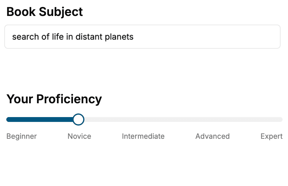
Select the focus of your CSS book and share your background
- 2. Personalize your book
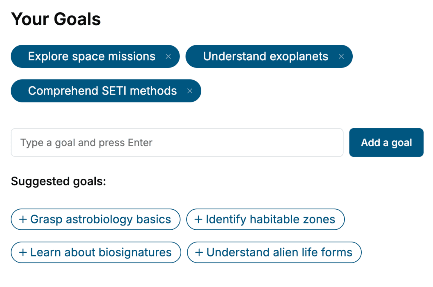
Specify your goals and choose sub-topics to include
- 3. Get your tailored book
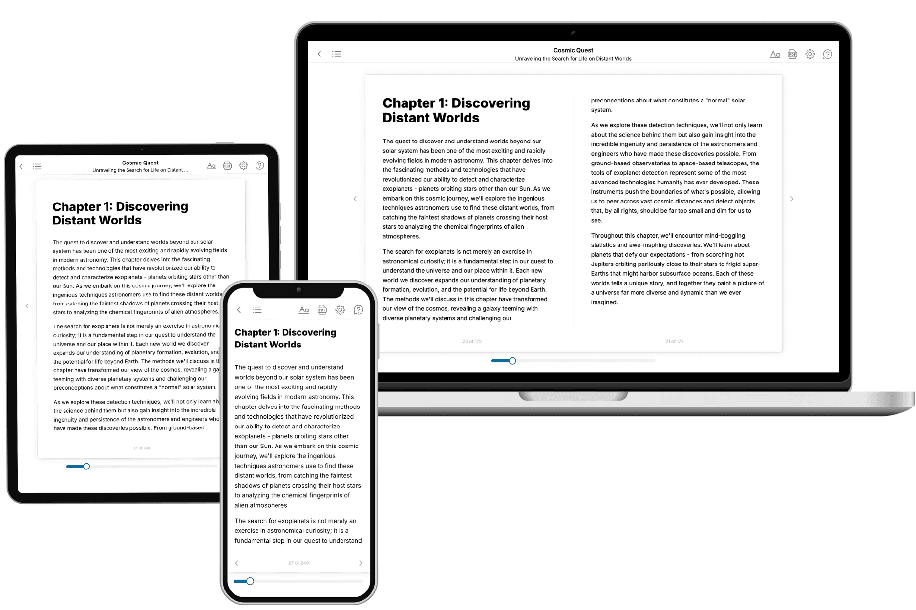
Your book is ready in 10 minutes. Read it online, download as EPUB or PDF, or send to Kindle.
Frequently asked questions
- What is TailoredRead?
TailoredRead creates complete, full-length nonfiction ebooks, written specifically for you. Tell us what you want to learn and why, and TailoredRead writes you a complete ebook on it, with charts, tables, and diagrams throughout. Read it online, on Kindle, or on any e-reader, or download it as a PDF or EPUB. Every book is written fresh the day you order it.
- How is the book tailored to me?
Before anything is written, you answer a few short questions about your goals, your background, and the topics you care about. Your book is then planned around your answers: written at your level, focused on your goals, and covering the topics you chose, instead of the one-size-fits-all book a store sells everyone.
- Will it read like generic AI content?
No. Your book isn't a chat transcript: it's planned chapter by chapter before a single word is written, told in a clear book voice, and explains ideas visually with charts, tables, and diagrams. After writing, every book goes through an editorial pass that polishes chapters so the book reads consistent from start to finish. Judge for yourself: browse thousands of sample books on our Explore Books page.
- How accurate is the content?
Our AI first checks whether your subject needs live research. Niche and fast-moving subjects are researched before writing, and the book plan and chapters are grounded in what it finds. After writing, every book goes through a quality pass that checks its facts and consistency, and researched books list their sources in a Notes section at the back.
- How long is the book?
You choose the length: Comprehensive (250-300 pages), Detailed (150-200 pages), Essential (70-100 pages), or Short (30-50 pages).
- Does the book include visuals?
Yes. Every book includes charts, tables, and diagrams: timelines, checklists, step-by-step guides, decision trees, comparison tables, matrices, and bar charts. A typical book includes dozens of these visual elements.
- Can I read it on Kindle? What formats can I download?
Yes. Every book can be read in our online reader or downloaded as a PDF or EPUB. The EPUB can be opened with Kindle, Apple Books, Kobo, and any e-reader. The Commercial and Author licenses also include an editable Word (DOCX) and Markdown download.
- How much does it cost?
About the price of a regular ebook. The exact price depends on your book's length and complexity, from $2 for the shortest books to $35 for the most comprehensive, and it's shown when you review your book, before you commit to anything. Each book is a one-time purchase, yours to keep, no subscription. Licenses that let you share, teach, or publish your book range from $35.99 to $49.99.
- Can I preview the book before purchasing?
Before you pay, you'll see what your book will cover: the title, a detailed description, the estimated length, and the complete chapter-by-chapter table of contents, so you know what you're getting before you decide. The full text itself is written after you purchase.
- How long does it take to create a book?
About 10 minutes. You can start reading the opening chapters while the rest is still being written.