Mastering CSS Units
Build Responsive, Scalable Designs with Confidence
Master the art of sizing and spacing in CSS by understanding the complete landscape of available units.
207 pages10 chaptersJan 27, 2026CSS
About this book
This guide takes you beyond basic pixel measurements to explore how relative units, viewport-based sizing, and modern CSS features work together to create truly responsive designs. You'll learn when to use em versus rem, how viewport units solve specific design challenges, and why container queries represent the future of component-based design. Through practical examples and real-world scenarios, discover how strategic unit selection prevents common responsive design failures, reduces maintenance overhead, and creates designs that scale beautifully across all devices. Whether you're building a small website or a complex design system, this book provides the knowledge to make confident, informed decisions about every measurement in your CSS.
Table of contents
- IntroductionWhy CSS Units Matter More Than You Think, The Complete Landscape of CSS Units, How to Use This BookRead below
- Chapter 1: Absolute Units: The FoundationUnderstanding Pixels and Device Independence, Centimeters, Millimeters, and Print Units, When Absolute Units Are the Right Choice
- Chapter 2: Relative Units: The Power of FlexibilityThe Em Unit: Relative to Parent Font Size, The Rem Unit: Root-Based Scaling, Percentages: Context-Aware Sizing, Strategic Decisions: Em vs. Rem vs. Percentages
- Chapter 3: Viewport Units: Responsive by DesignViewport Width and Height Units (vw, vh), Viewport Min and Max Units (vmin, vmax), Practical Applications and Common Pitfalls
- Chapter 4: Typography and Spacing: Building Harmonious SystemsFont Size Units and Responsive Typography, Line Height: Unitless Values vs. Explicit Units, Creating Consistent Spacing with Units, Best Practices for Typography-Based Sizing
- Chapter 5: Container Queries: The Future of Component SizingUnderstanding Container Query Units (cqw, cqh, cqi, cqb), Setting Up Container Queries in Your Projects, Real-World Use Cases and Component Patterns
- Chapter 6: Advanced Units and Modern FeaturesCharacter-Based Units (ch, ex) for Typography, CSS Custom Properties and Unit Flexibility, The calc() Function: Combining Units Strategically, Emerging Units and Future Specifications
- Chapter 7: Building Responsive Designs with UnitsMobile-First Approach to Unit Selection, Breakpoints and Unit Scaling Strategies, Fluid Typography and Responsive Spacing, Common Responsive Patterns and Unit Choices
- Chapter 8: Creating Scalable Design SystemsPlanning Your Unit Strategy for Scale, Scale Ratios and Modular Sizing Systems, Implementing Units in Design System Documentation
- Chapter 9: Performance and Accessibility ConsiderationsHow Unit Choices Affect Rendering Performance, Units and Accessibility: Supporting User Preferences, Browser Support and Fallback Strategies, Testing and Debugging Unit-Related Issues
- Chapter 10: Real-World Projects and Case StudiesCase Study: Building a Responsive Website, Case Study: Creating a Component Library, Common Mistakes and How to Avoid Them
- ConclusionKey Takeaways and Your Next Steps, Staying Current with CSS Unit Evolution
- Appendix: Quick Reference GuideUnit Comparison and Use Case Matrix, Unit Conversion and Calculation Guide
Introduction
Every measurement you write in CSS represents a decision that ripples through your entire design. When you set a font size, define a margin, or establish a width, you're not just placing elements on a screen—you're determining how your design will respond to different devices, adapt to user preferences, and scale across contexts. Yet despite their fundamental importance, CSS units remain one of the most misunderstood aspects of web development. Many developers default to pixels for everything, unaware of the flexibility and power that other units provide. Others experiment with relative units but struggle to predict their behavior or understand when each unit type is appropriate.
The landscape of CSS units has evolved dramatically over the past decade. What began as a simple choice between pixels and percentages has expanded into a rich ecosystem of measurement options, each designed to solve specific challenges in responsive design. Modern CSS offers viewport units that scale with browser dimensions, container query units that respond to parent element sizes, and relative units that create harmonious relationships between typography and spacing. Understanding this complete landscape isn't just about knowing what units exist—it's about developing the judgment to select the right unit for each situation, creating designs that are simultaneously flexible, predictable, and maintainable.
This book takes you beyond surface-level explanations to build a comprehensive mental model of how CSS units work, interact, and solve real-world design challenges. You'll discover why certain unit choices prevent common responsive design failures, how strategic unit selection reduces maintenance overhead, and which modern units unlock entirely new design possibilities. Whether you're refining your approach to existing projects or building a design system from scratch, mastering CSS units will transform how you think about sizing, spacing, and responsive design. The knowledge you gain here will influence every stylesheet you write, making your designs more robust, accessible, and future-proof.
Why CSS Units Matter More Than You Think
The unit you choose for a single property can determine whether your design gracefully adapts to different screen sizes or breaks catastrophically on devices you didn't test. Consider a navigation menu with padding set in pixels: it might look perfect on your desktop monitor, but on a mobile device with a different pixel density, that same padding could consume excessive space or appear cramped. Now imagine that same padding defined in em units, automatically scaling with the font size—suddenly, your navigation adapts proportionally across devices without additional media queries. This single decision, repeated across hundreds of properties in a typical stylesheet, compounds into either a flexible, maintainable design or a brittle one that requires constant adjustment.
CSS units directly impact three critical aspects of web development: responsiveness, maintainability, and accessibility. Responsive designs require measurements that adapt to context, whether that context is screen size, parent element dimensions, or user preferences. Maintainable designs need measurements that scale predictably when you adjust base values, allowing you to refine your entire design system by changing a few root variables. Accessible designs must respect user settings for font size and zoom level, ensuring that people with visual impairments can customize their experience. The wrong unit choices undermine all three goals, while strategic unit selection supports them simultaneously.
Many developers learn CSS units through trial and error, developing intuitions that work for familiar scenarios but fail in edge cases. You might know that rem units are "good for accessibility" without understanding exactly how they interact with browser zoom or user font preferences. You might avoid viewport units because you encountered a bug once, missing out on elegant solutions to full-height layouts. These knowledge gaps lead to defensive coding—using only the units you're comfortable with, even when better options exist. The cost isn't immediately obvious, but it accumulates: extra media queries to compensate for inflexible units, JavaScript solutions for problems CSS could solve natively, and designs that require extensive testing because their behavior isn't predictable.
The relationship between units and the CSS cascade adds another layer of complexity that many developers overlook. When you set a font size in em units, it compounds with parent element font sizes, creating nested scaling that can be either powerful or problematic depending on your understanding. When you use percentages for width, the reference point changes based on the property—percentage widths relate to parent width, but percentage heights behave differently and require specific conditions to work reliably. These nuances aren't bugs or quirks; they're intentional design decisions that make sense once you understand the underlying model. Without that understanding, you're left guessing and testing rather than confidently predicting how your styles will behave.
Modern web development has raised the stakes for unit selection. Responsive design is no longer optional—it's expected that websites work seamlessly across phones, tablets, laptops, and large displays. Design systems have become standard practice, requiring consistent, scalable approaches to sizing and spacing. Performance optimization demands efficient CSS that minimizes reflows and repaints. Accessibility requirements have become both legal obligations and ethical imperatives. Each of these trends makes thoughtful unit selection more important. The developers who master CSS units gain a significant advantage: they write less code that does more, create designs that adapt automatically to new contexts, and build systems that remain maintainable as projects grow in complexity.
Perhaps most importantly, understanding CSS units changes how you think about design itself. Instead of treating measurements as arbitrary numbers to adjust until things look right, you begin to see them as relationships and ratios. You recognize that a button's padding should scale with its font size, that a card's width should respond to its container rather than the viewport, and that vertical rhythm emerges naturally when you use consistent unit strategies for spacing. This shift from absolute thinking to relational thinking is what separates developers who fight against CSS from those who work with its grain. The units you choose express your design intent, and when that intent aligns with how CSS actually works, everything becomes easier.
The good news is that mastering CSS units doesn't require memorizing complex formulas or learning entirely new technologies. It requires building a clear mental model of how different units behave, understanding the contexts where each unit type excels, and developing the judgment to match units to design requirements. This book provides that foundation, taking you from basic concepts through advanced techniques, always grounding theory in practical application. By the end, you'll have the knowledge to make confident, informed decisions about every measurement in your CSS, creating designs that are responsive, maintainable, and accessible by default rather than through extensive additional effort.
The Complete Landscape of CSS Units
CSS units fall into several distinct categories, each designed to solve different types of measurement challenges. Absolute units like pixels, centimeters, and inches provide fixed measurements that don't change based on context. Relative units like em, rem, and percentages scale based on other values, creating flexible relationships between elements. Viewport units like vw and vh respond to browser window dimensions, enabling designs that adapt to available screen space. Container query units like cqw and cqh represent the newest addition, allowing components to respond to their parent container rather than the viewport. Understanding these categories provides the framework for knowing which unit to reach for in any situation.
Within the relative units category, the distinction between font-relative and parent-relative units is crucial. The em unit scales based on the font size of the current element (or its parent if font size isn't explicitly set), creating compounding relationships in nested elements. The rem unit always scales based on the root element's font size, providing consistent scaling throughout your document. Percentages reference different properties depending on context—percentage widths relate to parent width, percentage font sizes relate to parent font size, and percentage transforms relate to the element's own dimensions. These different reference points aren't arbitrary; they reflect common design patterns and enable specific types of flexible layouts.
Viewport units introduced a paradigm shift in responsive design by providing direct access to browser dimensions. The vw unit represents one percent of viewport width, while vh represents one percent of viewport height. The vmin unit equals the smaller of vw or vh, and vmax equals the larger, providing ways to respond to viewport orientation. These units solve problems that previously required JavaScript, like creating full-height hero sections or typography that scales with screen size. However, they also introduce challenges around mobile browser behavior, where viewport height changes as address bars show and hide, requiring careful implementation to avoid layout shifts.
Container query units represent the cutting edge of CSS measurement, addressing a fundamental limitation of viewport units: components often need to respond to their container's size rather than the overall viewport. A card component might appear in a narrow sidebar or a wide main content area, requiring different layouts in each context. Container query units like cqw (container query width) and cqh (container query height) enable truly modular components that adapt to their context automatically. The cqi and cqb units provide inline and block dimension measurements that respect writing mode, making components work correctly in both horizontal and vertical text layouts. While browser support is still evolving, these units represent the future of component-based design.
Beyond these main categories, CSS offers specialized units for specific use cases. The ch unit represents the width of the "0" character in the current font, useful for sizing text containers to specific character counts. The ex unit represents the x-height of the current font, occasionally useful for vertical alignment. The lh unit represents the computed line height, enabling spacing that maintains vertical rhythm. These specialized units see less frequent use but solve specific problems elegantly when the situation calls for them. Knowing they exist expands your toolkit, even if you don't use them daily.
The calc() function deserves special mention as it enables combining different unit types in a single value. You can create expressions like calc(100% - 2rem) to subtract a fixed margin from a fluid width, or calc(1rem + 2vw) to create font sizes that scale with viewport but maintain a minimum size. This ability to mix units strategically unlocks solutions that would be impossible with a single unit type. Modern CSS also supports min(), max(), and clamp() functions that enable responsive values without media queries, choosing between multiple measurements based on which is smallest, largest, or within a specified range. These functions work with any unit type, multiplying the possibilities for flexible, context-aware designs.
Understanding the complete landscape of CSS units means recognizing that no single unit is universally "best"—each has strengths and appropriate use cases. Pixels provide predictability and are essential for certain types of precise control. Relative units enable flexibility and scalability. Viewport units create direct relationships with screen dimensions. Container query units enable truly modular components. The art of CSS unit mastery lies not in memorizing which unit to use in every situation, but in understanding the characteristics of each unit type well enough to make informed decisions based on your specific design requirements, maintenance goals, and user needs. This book will build that understanding systematically, giving you the knowledge to navigate the complete landscape with confidence.
As you progress through this book, you'll see how these different unit types work together in real-world designs. A typical modern website might use rem units for typography and spacing to support user font preferences, percentages for fluid grid layouts, viewport units for full-screen hero sections, and container query units for adaptive components. This mixing of units isn't a sign of inconsistency—it's strategic use of the right tool for each job. The key is understanding why each unit was chosen and how they interact, creating a cohesive system rather than a collection of arbitrary measurements. That's the level of mastery this book aims to provide.
How to Use This Book
This book is structured to build your understanding progressively, starting with fundamental concepts and advancing to sophisticated techniques. Each chapter focuses on a specific category of units or application area, providing both theoretical understanding and practical guidance. You can read straight through for a comprehensive education, or jump to specific chapters that address your immediate needs. However, even if you're already familiar with basic units like pixels and percentages, the early chapters contain insights about how these units interact with the CSS cascade and rendering process that will deepen your understanding and inform your later learning.
The first three chapters cover the main unit categories: absolute units, relative units, and viewport units. These chapters establish the foundation you'll build on throughout the rest of the book. You'll learn not just what each unit does, but why it behaves that way, how it interacts with other CSS properties, and when it's the right choice. Each unit type is illustrated with practical examples showing both successful applications and common pitfalls. By the end of these chapters, you'll have a solid grasp of the core unit types that appear in virtually every stylesheet.
Chapters four through six explore specific application areas and advanced features. The typography and spacing chapter shows how unit choices affect readability, visual hierarchy, and vertical rhythm. The container queries chapter introduces the newest addition to the CSS unit landscape and demonstrates how it enables truly modular component design. The advanced units chapter covers specialized units, CSS custom properties, calculation functions, and emerging specifications. These chapters show how to apply your unit knowledge to solve specific design challenges and take advantage of modern CSS capabilities.
The final chapters focus on practical application and real-world considerations. You'll learn how to build responsive designs with strategic unit selection, create scalable design systems with consistent measurement approaches, and address performance and accessibility concerns. The case studies chapter presents complete examples showing how different unit strategies work in actual projects, including the reasoning behind each decision and the tradeoffs involved. These chapters bridge the gap between understanding individual units and applying that knowledge to create complete, production-ready designs.
Throughout the book, you'll find several types of supporting content designed to reinforce learning and provide quick reference:
- Code examples demonstrate concepts with real CSS, showing both the code and its effect
- Comparison tables highlight differences between similar units and help you choose between options
- Best practice guidelines distill lessons into actionable recommendations
- Common mistakes sections show what to avoid and why
- Browser compatibility notes indicate when features require fallbacks or progressive enhancement
The appendix provides quick-reference materials including a comprehensive unit comparison matrix, conversion formulas, and decision trees for choosing between unit types. Keep this section bookmarked for easy access when you need to quickly look up unit behavior or make a decision about which unit to use. The comparison matrix is particularly valuable, presenting all CSS units side-by-side with their characteristics, use cases, and browser support, enabling quick comparison when you're evaluating options.
As you work through the book, consider experimenting with the concepts in your own projects or in isolated test environments. Reading about how em units compound in nested elements is valuable, but actually building a component with nested em values and observing the behavior cements the understanding in a way that reading alone cannot. The book provides the knowledge and mental models; your experimentation transforms that knowledge into practical skill. Create small test cases, try different unit combinations, and observe how changes propagate through your styles. This hands-on practice, combined with the conceptual understanding the book provides, will make you truly proficient with CSS units.
One important note about the examples in this book: they're designed to illustrate specific concepts clearly, which sometimes means simplifying other aspects of the code. Production code would include additional considerations like browser prefixes, fallbacks for older browsers, and integration with larger systems. The examples focus on the unit-related aspects to keep the lessons clear and focused. When you apply these techniques in real projects, you'll need to consider these additional factors, but the core unit selection principles remain the same.
Finally, remember that mastering CSS units is a journey rather than a destination. The CSS specification continues to evolve, with new units and capabilities being added as the web platform advances. Container query units were only recently standardized, and future specifications may introduce additional measurement options. The goal of this book isn't to provide a static reference that becomes outdated, but to build your understanding of the underlying principles that will remain relevant regardless of what new units emerge. When you understand why different unit types exist and what problems they solve, you'll be able to evaluate and adopt new units as they become available, continuing to grow your expertise throughout your career.
With this foundation in place, you're ready to dive into the details. The next chapter begins with absolute units—the foundation that everything else builds upon. Even if you think you know pixels inside and out, you'll discover nuances about device independence, pixel density, and when absolute units are actually the right choice. Let's begin building your comprehensive understanding of CSS units, one measurement at a time.
This is the end of the free sample. The full book has 10 chapters.
Want this book written for you?
Tell us your goals and background, and get your own version of this book, tailored by AI to you.


Benefits of AI-tailored books
- Read one book, not ten:
- all the CSS knowledge you need, gathered into a single book.
- Save days of learning:
- tell us your goals, choose your topics, and the whole book is built around them.
- Learn effortlessly:
- CSS book written for your specific background and expertise.
- Understand at a glance:
- includes charts, tables, timelines, checklists, decision trees, and more.
- Stay current:
- written the day you order it, not years ago.
- Trust what you read:
- every book is checked for accuracy, with real research when your subject needs it.
Create your unique book in 3 steps
- 1. Select your focus
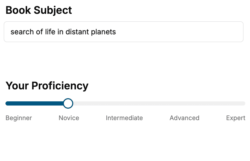
Select the focus of your CSS book and share your background
- 2. Personalize your book
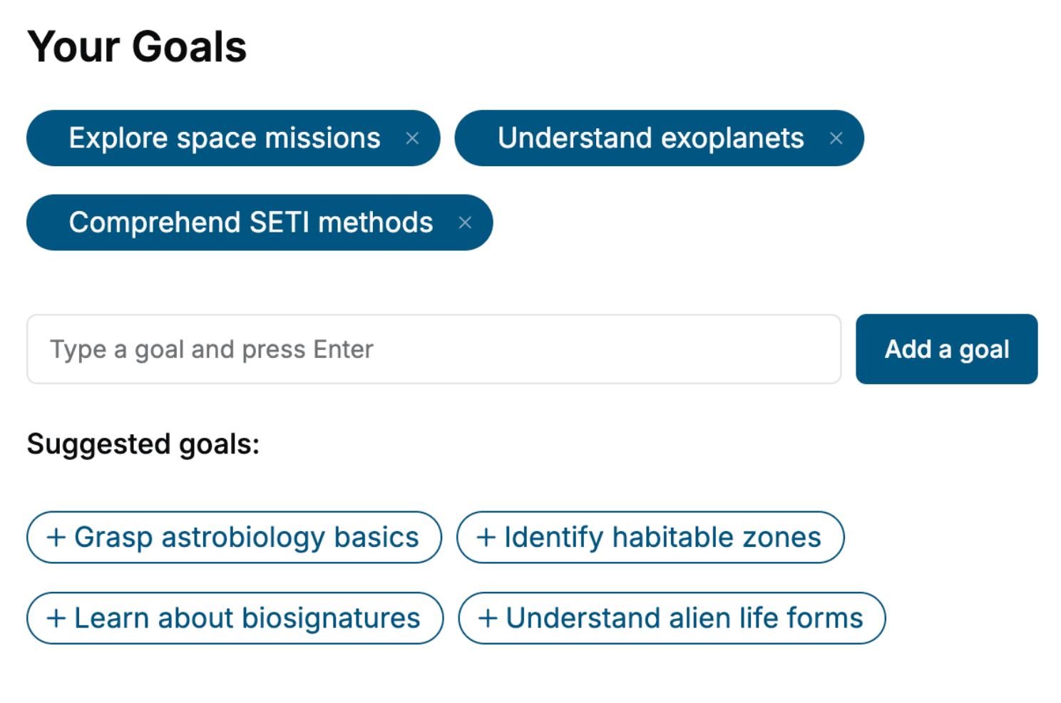
Specify your goals and choose sub-topics to include
- 3. Get your tailored book
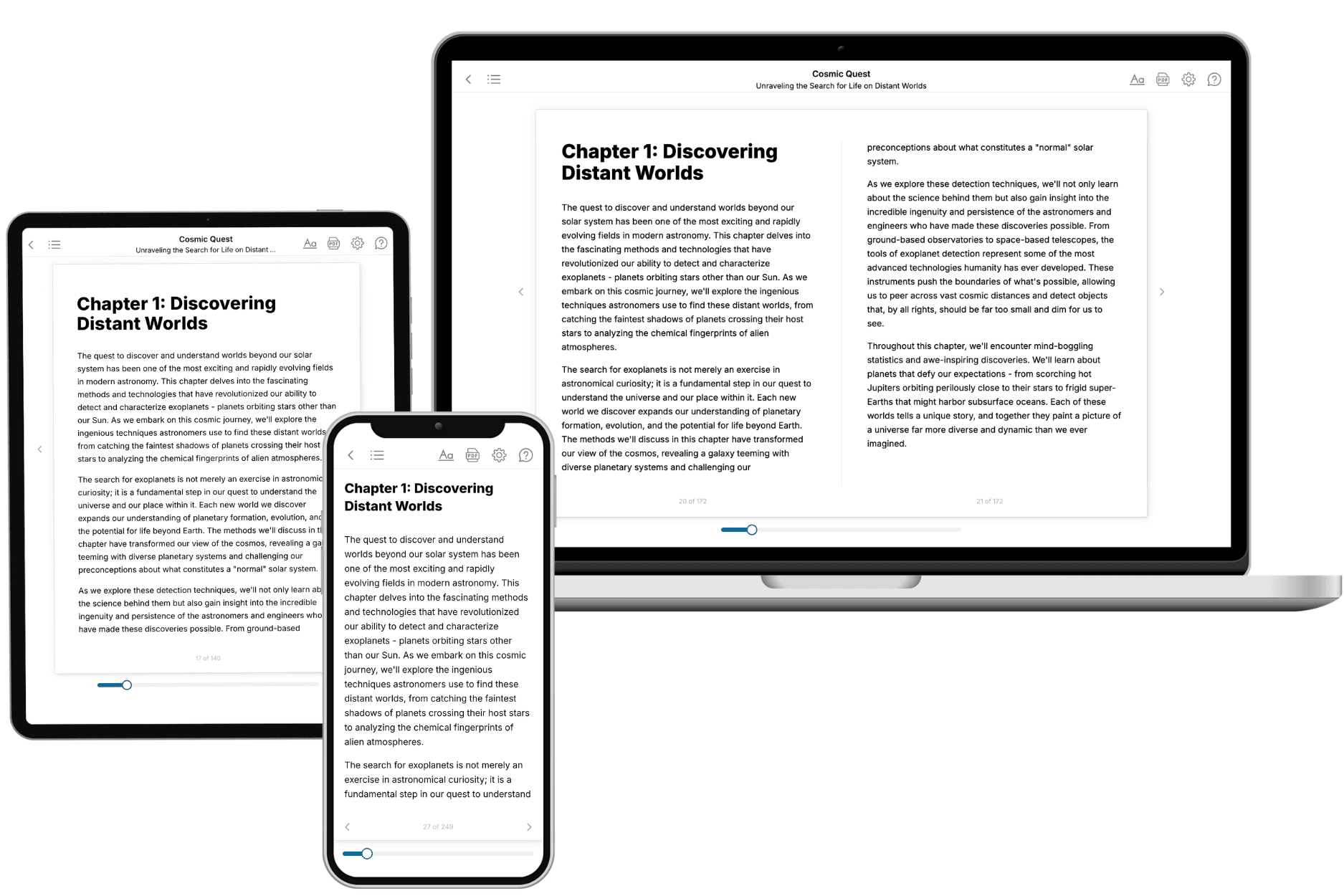
Your book is ready in 10 minutes. Read it online, download as EPUB or PDF, or send to Kindle.
Frequently asked questions
- What is TailoredRead?
TailoredRead creates complete, full-length nonfiction ebooks, written specifically for you. Tell us what you want to learn and why, and TailoredRead writes you a complete ebook on it, with charts, tables, and diagrams throughout. Read it online, on Kindle, or on any e-reader, or download it as a PDF or EPUB. Every book is written fresh the day you order it.
- How is the book tailored to me?
Before anything is written, you answer a few short questions about your goals, your background, and the topics you care about. Your book is then planned around your answers: written at your level, focused on your goals, and covering the topics you chose, instead of the one-size-fits-all book a store sells everyone.
- Will it read like generic AI content?
No. Your book isn't a chat transcript: it's planned chapter by chapter before a single word is written, told in a clear book voice, and explains ideas visually with charts, tables, and diagrams. After writing, every book goes through an editorial pass that polishes chapters so the book reads consistent from start to finish. Judge for yourself: browse thousands of sample books on our Explore Books page.
- How accurate is the content?
Our AI first checks whether your subject needs live research. Niche and fast-moving subjects are researched before writing, and the book plan and chapters are grounded in what it finds. After writing, every book goes through a quality pass that checks its facts and consistency, and researched books list their sources in a Notes section at the back.
- How long is the book?
You choose the length: Comprehensive (250-300 pages), Detailed (150-200 pages), Essential (70-100 pages), or Short (30-50 pages).
- Does the book include visuals?
Yes. Every book includes charts, tables, and diagrams: timelines, checklists, step-by-step guides, decision trees, comparison tables, matrices, and bar charts. A typical book includes dozens of these visual elements.
- Can I read it on Kindle? What formats can I download?
Yes. Every book can be read in our online reader or downloaded as a PDF or EPUB. The EPUB can be opened with Kindle, Apple Books, Kobo, and any e-reader. The Commercial and Author licenses also include an editable Word (DOCX) and Markdown download.
- How much does it cost?
About the price of a regular ebook. The exact price depends on your book's length and complexity, from $2 for the shortest books to $35 for the most comprehensive, and it's shown when you review your book, before you commit to anything. Each book is a one-time purchase, yours to keep, no subscription. Licenses that let you share, teach, or publish your book range from $35.99 to $49.99.
- Can I preview the book before purchasing?
Before you pay, you'll see what your book will cover: the title, a detailed description, the estimated length, and the complete chapter-by-chapter table of contents, so you know what you're getting before you decide. The full text itself is written after you purchase.
- How long does it take to create a book?
About 10 minutes. You can start reading the opening chapters while the rest is still being written.