Mastering ICC Color Profiles
The Complete Guide to Color Accuracy in Digital Graphics and Print
Struggling with color inconsistencies across your design projects?
238 pages11 chaptersMar 30, 2026Color Theory
About this book
Colors that look perfect on your monitor often appear completely different in print, and you're unsure why or how to fix it. This comprehensive guide demystifies ICC color profiles and equips you with the knowledge to achieve reliable, predictable color reproduction in every project. You'll discover how color profiles work behind the scenes, why they matter for your specific workflow, and exactly how to implement them to eliminate guesswork. From understanding the fundamentals of color spaces and device characterization to mastering rendering intents and building robust color management workflows, this book provides both the conceptual foundation and practical techniques you need. Whether you're working in print production, digital design, photography, or software development, you'll learn industry-specific strategies for profile selection, creation, and optimization. By the end, you'll have the confidence and skills to manage color professionally, troubleshoot color problems systematically, and deliver consistent results that meet client expectations and industry standards.
Table of contents
- IntroductionWhy Color Management Matters in Modern Design, Common Color Problems and Their Root Causes, How This Book Will Transform Your Color WorkflowRead below
- Chapter 1: Color Fundamentals and Human PerceptionHow Light Wavelengths Create Color, The Human Eye and Color Perception, Introduction to Color Models and Their Purpose
- Chapter 2: Understanding Color SpacesRGB Color Space: Additive Color for Screens, CMYK Color Space: Subtractive Color for Print, Lab Color Space: Device-Independent Reference, Other Important Color Spaces: HSV, XYZ, and Beyond
- Chapter 3: What Are ICC Color Profiles and Why They ExistThe Anatomy of an ICC Profile, Why Every Device Interprets Color Differently, How Profiles Bridge Device and Perception Gaps
- Chapter 4: Device Characterization and Profile CreationThe Device Characterization Workflow, Measurement Tools and Spectrophotometers, Profiling Software and Creating Custom Profiles, Validating and Testing Your Profiles
- Chapter 5: Rendering Intents and Color ConversionUnderstanding Color Gamut and Out-of-Gamut Colors, The Four Rendering Intents Explained, Choosing the Right Rendering Intent for Your Work
- Chapter 6: Implementing Color Management in Your WorkflowSetting Up a Color-Managed Workflow, Profile Assignment vs. Profile Conversion, Configuring Color Management in Design Software, Best Practices for Consistent Results
- Chapter 7: Color Management for Print ProductionPrint-Specific Color Management Considerations, Converting RGB to CMYK Effectively, Selecting and Using Print Profiles, Soft Proofing and Hard Proofing Techniques
- Chapter 8: Color Management for Digital DisplayMonitor Profiling and Display Calibration, Color Management for Web and Digital Media, Ensuring Consistency Across Different Screens
- Chapter 9: Color Management for Photography and ImagingCamera Profiles and Raw File Processing, Building a Color-Managed Photography Workflow, Preparing Photos for Print and Digital Output
- Chapter 10: Troubleshooting Color ProblemsA Systematic Approach to Diagnosing Color Issues, Common Color Problems and Their Solutions, Profile-Related Problems and How to Fix Them
- Chapter 11: Advanced Topics and OptimizationProfile Maintenance and Recalibration Schedules, Advanced Color Management Techniques, Emerging Technologies and Future Directions
- ConclusionKey Takeaways for Your Color Management Journey, Your Next Steps to Mastery
- Glossary of Color Management Terms
- Further Reading and Resources
Introduction
Picture this: you spend hours perfecting a design on your monitor. The colors are exactly right. The brand red is vibrant and confident, the background gradient is smooth and rich, and the overall palette feels balanced and intentional. You send the file to the printer, and when the job comes back, the red looks muddy and orange, the gradient has banding, and the whole piece feels flat. You stare at the printed sheet and then back at your screen, wondering what went wrong. If this scenario sounds familiar, you are not alone. Color inconsistency is one of the most frustrating and persistent challenges in professional design and print production.
The root of this problem is not bad taste or poor design judgment. It is a technical gap between how different devices capture, display, and reproduce color. Your monitor, your camera, your printer, and your client's screen all interpret color data differently. Without a system to manage those differences, color shifts are not just possible. They are inevitable. That system is called color management, and its most important building block is the ICC color profile. Understanding how profiles work, and how to use them correctly, is the single most impactful skill you can develop for achieving consistent, predictable color across your entire workflow.
This book was written for graphics professionals, designers, and developers who already have a working knowledge of color theory but want to go deeper. You may have heard terms like sRGB, CMYK conversion, or rendering intent without fully understanding what they mean in practice. You may have tried adjusting color settings in Photoshop or Illustrator and found the options confusing or contradictory. Or you may simply be tired of guessing and want a reliable, repeatable process that produces accurate results every time. This book gives you exactly that, from the foundational concepts to the practical techniques you can apply immediately.
The chapters ahead cover the full spectrum of color management, starting with how human vision and light physics create the challenge in the first place, moving through color spaces, ICC profile structure, device characterization, rendering intents, and workflow implementation, and finishing with industry-specific guidance for print, digital display, and photography. Each chapter builds on the last, so by the time you reach the advanced topics, you will have the context to understand and apply them confidently. Along the way, you will find concrete examples, step-by-step processes, and practical frameworks that connect theory to real-world work.
Why Color Management Matters in Modern Design
Color is not just an aesthetic choice. It is a communication tool, a brand asset, and a technical specification. When a company defines its brand color as Pantone 485 C, that choice carries meaning and expectation. Every touchpoint, from business cards to billboards to websites, is supposed to deliver that same red. When color management breaks down, so does brand consistency. Clients notice. Customers notice. And in competitive industries, inconsistency erodes trust in ways that are hard to recover from.
The challenge has grown more complex as design workflows have expanded across more devices and output formats. A single project might start with photography on a digital camera, move through editing on a calibrated monitor, get reviewed on a client's laptop, and end up printed on both a digital press and an offset press. Each of those steps involves a different device with different color characteristics. Without a color management system tying them together, the color you intended can drift significantly at every handoff.
Research and industry surveys consistently show that color-related reprints and corrections are among the most costly sources of waste in print production.[1] A single reprint job can cost hundreds or thousands of dollars, not counting the time lost and the damage to client relationships. Proper color management is not just a quality concern. It is a financial one. Designers and studios that invest in understanding and implementing ICC profiles reduce costly errors and build a reputation for reliability.
Beyond print, digital color management has become increasingly important as screens have diversified. Wide-gamut displays, HDR monitors, and mobile devices with varying color capabilities mean that a design that looks great on one screen can look washed out or oversaturated on another. Web browsers have improved their color management support significantly over the past decade, but only if the files are correctly prepared and tagged with the right profiles. Knowing how to prepare files for digital output is just as critical as knowing how to prepare them for print.
Color management also matters for creative control. When you understand how profiles work, you stop being at the mercy of unpredictable color shifts. You can make deliberate decisions about how colors will translate from one medium to another. You can soft-proof a design to see how it will look in print before sending a single file to the press. You can convert between color spaces with confidence, knowing exactly what will change and why. That level of control transforms color from a source of anxiety into a tool you can use with precision.
Finally, color management is increasingly a professional expectation rather than an optional skill. Print service providers, advertising agencies, and publishing houses all operate within color-managed workflows. When you submit files that are correctly profiled and prepared, you signal professionalism and reduce the back-and-forth that slows production. When you submit files without proper color management, you create problems for everyone downstream. Mastering ICC profiles is not just about your own output quality. It is about being a reliable partner in collaborative production environments.
Real-world example: A packaging design studio was producing labels for a food brand with a signature teal color. The color looked consistent on their calibrated monitors, but every print run came back slightly different. After auditing their workflow, they discovered that files were being sent to the press without embedded profiles, and the press operators were applying their own default settings. Once the studio implemented a proper ICC-based workflow with embedded profiles and press-specific CMYK conversions, the teal became consistent across every run, on every substrate.
The good news is that color management does not require expensive equipment or years of specialized training to get right. It requires understanding a set of clear principles and applying them consistently. That is exactly what this book is designed to help you do. Whether you are a solo freelancer or part of a large production team, the concepts and techniques here will give you a practical foundation for managing color with confidence.
Common Color Problems and Their Root Causes
Before diving into solutions, it helps to understand the landscape of color problems that designers and production professionals encounter most often. These problems tend to fall into a few recognizable patterns, and most of them trace back to the same underlying causes: missing profiles, incorrect profile assignments, unmanaged conversions, or mismatched expectations between devices. Recognizing these patterns is the first step toward diagnosing and fixing them systematically.
The most common problem is the screen-to-print mismatch. Colors that look vibrant and saturated on a monitor appear dull or shifted when printed. This happens because monitors display color using light (additive color), while printers reproduce color using ink on paper (subtractive color). These are fundamentally different physical processes with different gamuts, meaning the range of colors each can reproduce. A bright, saturated blue that a monitor can display easily may simply be outside the range of what a CMYK press can reproduce. Without a color management system to anticipate and handle this gap, the result is an unpredictable shift.
A second common problem is color shifts between applications. You open the same image file in Photoshop and in a web browser, and the colors look noticeably different. Or you place an image into InDesign and it looks different from how it appeared in Lightroom. These shifts usually happen because different applications handle embedded profiles differently, or because one application is color-managed and another is not. Understanding how each tool in your workflow interprets and applies profiles is essential for preventing these surprises.
A third problem is inconsistency between print runs. The same file printed on two different occasions, or on two different printers, produces noticeably different results. This can happen even with the same printer if the device has not been calibrated recently, if the paper stock changed, or if environmental conditions like temperature and humidity affected the ink behavior. ICC profiles that are created once and never updated gradually become inaccurate as devices drift from their characterized state.
Here is a summary of the most common color problems and their typical root causes:
- Dull or muddy colors in print: Out-of-gamut colors being clipped or compressed without a proper rendering intent applied during conversion.
- Unexpected color shifts when opening files: Missing embedded profiles, or a mismatch between the file's embedded profile and the application's working color space.
- Colors that look different on different monitors: Uncalibrated displays, or displays with different native color gamuts (sRGB vs. wide-gamut P3).
- Inconsistent results between print runs: Outdated or unchecked ICC profiles, device drift, or changes in substrate and ink.
- Oversaturated colors on wide-gamut displays: Files tagged with sRGB being displayed on a wide-gamut monitor without proper color management in the viewing application.
- Banding or posterization in gradients: Bit-depth issues combined with aggressive color space conversions.
Many of these problems share a common thread: they occur at the boundaries between devices or applications, where color data is handed off from one system to another. ICC profiles exist precisely to manage these handoffs. A profile describes how a specific device or color space maps to a universal reference, allowing any two devices to communicate color accurately through that shared reference. When profiles are missing, wrong, or outdated, the handoff breaks down and color shifts occur.
Another frequent source of confusion is the difference between assigning a profile and converting to a profile. These are two very different operations with very different effects on your color data, and mixing them up is one of the most common mistakes in color management workflows. Assigning a profile tells the application how to interpret the existing color numbers in a file. Converting to a profile changes the color numbers themselves to produce the same visual appearance in a new color space. Using the wrong operation at the wrong time can cause dramatic and unexpected color shifts.
It is also worth noting that not all color problems are caused by ICC profiles directly. Sometimes the issue is a poorly calibrated monitor that makes colors look different from how they actually are. Sometimes it is a printer that has not been maintained properly. Sometimes it is a client viewing a file on an uncalibrated laptop in a brightly lit room. Color management cannot fix every variable in the chain, but it can control the variables that are within your reach and make the remaining ones more predictable.
Diagnostic example: A photographer was printing fine art prints and consistently found that the shadow areas in her prints were too dark and lacked detail. After investigation, she discovered that her monitor's brightness was set too high, making shadows appear lighter on screen than they actually were in the file. She was compensating by brightening the shadows in editing, which then caused them to print too light. After calibrating her monitor to a standard luminance target of 120 cd/m², her screen-to-print relationship became predictable and the shadow detail issue resolved itself.
Understanding the root causes of color problems changes how you approach them. Instead of making random adjustments and hoping for better results, you can trace a problem back to its source in the workflow and apply a targeted fix. The chapters ahead give you the diagnostic framework and technical knowledge to do exactly that. By the time you finish this book, color problems that once seemed mysterious will have clear, identifiable causes and straightforward solutions.
How This Book Will Transform Your Color Workflow
This book is organized as a progressive journey from foundational concepts to advanced practice. Each chapter builds on the ones before it, so the knowledge accumulates in a way that makes complex topics easier to understand when you reach them. That said, if you already have a solid grasp of certain fundamentals, you can move through those sections quickly and spend more time on the areas where you need the most development. The structure is designed to support both linear reading and targeted reference.
The first two chapters establish the scientific and conceptual foundation. Chapter 1 covers how light and human vision create the experience of color, which explains why color management is necessary in the first place. Chapter 2 explores the major color spaces, including RGB, CMYK, and Lab, and explains what each one is designed to do and where it fits in a professional workflow. These chapters give you the vocabulary and mental models you need to understand everything that follows.
Chapter 3 introduces ICC color profiles directly, explaining what they are, how they are structured, and why they exist. This is where the core concept of the book comes into focus. Chapter 4 goes deeper into device characterization, covering how custom profiles are created using measurement tools and profiling software. If you have ever wondered how a printer profile is made or what a spectrophotometer actually measures, this chapter answers those questions in practical detail.
Chapter 5 tackles one of the most misunderstood topics in color management: rendering intents. This chapter explains what happens when colors cannot be reproduced in a target color space and how the four rendering intents handle that problem differently. Choosing the right rendering intent for a given situation has a significant impact on output quality, and this chapter gives you a clear framework for making that choice.
Chapter 6 brings everything together into a practical workflow. It covers how to set up a color-managed environment, how to assign and convert profiles correctly, and how to configure the most widely used design applications for consistent color management. This chapter is where the conceptual knowledge becomes operational. The following three chapters then apply that workflow to specific industries and use cases:
- Chapter 7 focuses on print production, covering CMYK conversion strategies, print profile selection, and soft proofing techniques.
- Chapter 8 addresses digital display, including monitor calibration, web color management, and cross-screen consistency.
- Chapter 9 covers photography and imaging workflows, from camera profiles and raw processing to preparing images for multiple output destinations.
Chapter 10 is dedicated to troubleshooting. It provides a systematic diagnostic framework for identifying and resolving color problems, along with specific solutions for the most common issues. This chapter is designed to be a practical reference you return to whenever something goes wrong. Chapter 11 covers advanced topics including profile maintenance schedules, advanced color management techniques, and emerging technologies like HDR and wide-gamut display standards that are reshaping the field.
Throughout the book, you will find concrete examples drawn from real-world scenarios in print, digital, and photography workflows. These examples are not hypothetical. They reflect the kinds of situations that professionals encounter regularly, and the solutions presented are grounded in established best practices and industry standards. Where relevant, specific tools, software settings, and measurable targets are provided so you can apply the guidance directly to your own work.
By the end of this book, you will be able to do the following with confidence:
- Explain how ICC profiles work and why they are essential for color accuracy.
- Set up a color-managed workflow in your primary design applications.
- Choose the right color space and rendering intent for any given project.
- Create or select appropriate ICC profiles for your specific devices and output conditions.
- Soft-proof designs for print and anticipate how colors will translate before output.
- Diagnose and resolve color inconsistencies systematically rather than by trial and error.
- Maintain your color management system over time so it stays accurate as devices age.
These are not abstract skills. They are practical capabilities that will change how you work every day. Designers who master color management spend less time on corrections and reprints, deliver more consistent results to clients, and approach complex multi-device projects with a level of confidence that comes from understanding the system rather than guessing at it. That is the transformation this book is designed to produce.
One important note before you begin: color management is a field where theory and practice are deeply intertwined. Reading about rendering intents is useful, but the real understanding comes when you apply a perceptual intent to a photograph and compare it to a relative colorimetric conversion side by side. Whenever possible, follow along with the examples using your own software and files. The concepts will become much more concrete when you can see the effects directly in your own work. The goal is not just to understand color management intellectually, but to develop the hands-on fluency that makes it second nature.
Color management can feel intimidating at first because it sits at the intersection of physics, perception science, and software engineering. But the core ideas are not as complicated as they might seem. Once you understand what a profile is trying to do and why, the rest of the system starts to make intuitive sense. This book is designed to get you to that moment of clarity as efficiently as possible, and then build on it with the practical depth you need to work at a professional level. Let's get started.
Notes
Introduction
- 1. Idealliance, "'Color Management in Print Production," ' G7 Master Qualification Program documentation, 2020
This is the end of the free sample. The full book has 11 chapters.
Want this book written for you?
Tell us your goals and background, and get your own version of this book, tailored by AI to you.


Benefits of AI-tailored books
- Read one book, not ten:
- all the Color Theory knowledge you need, gathered into a single book.
- Save days of learning:
- tell us your goals, choose your topics, and the whole book is built around them.
- Learn effortlessly:
- Color Theory book written for your specific background and expertise.
- Understand at a glance:
- includes charts, tables, timelines, checklists, decision trees, and more.
- Stay current:
- written the day you order it, not years ago.
- Trust what you read:
- every book is checked for accuracy, with real research when your subject needs it.
Create your unique book in 3 steps
- 1. Select your focus
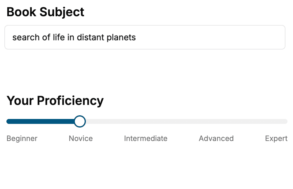
Select the focus of your Color Theory book and share your background
- 2. Personalize your book
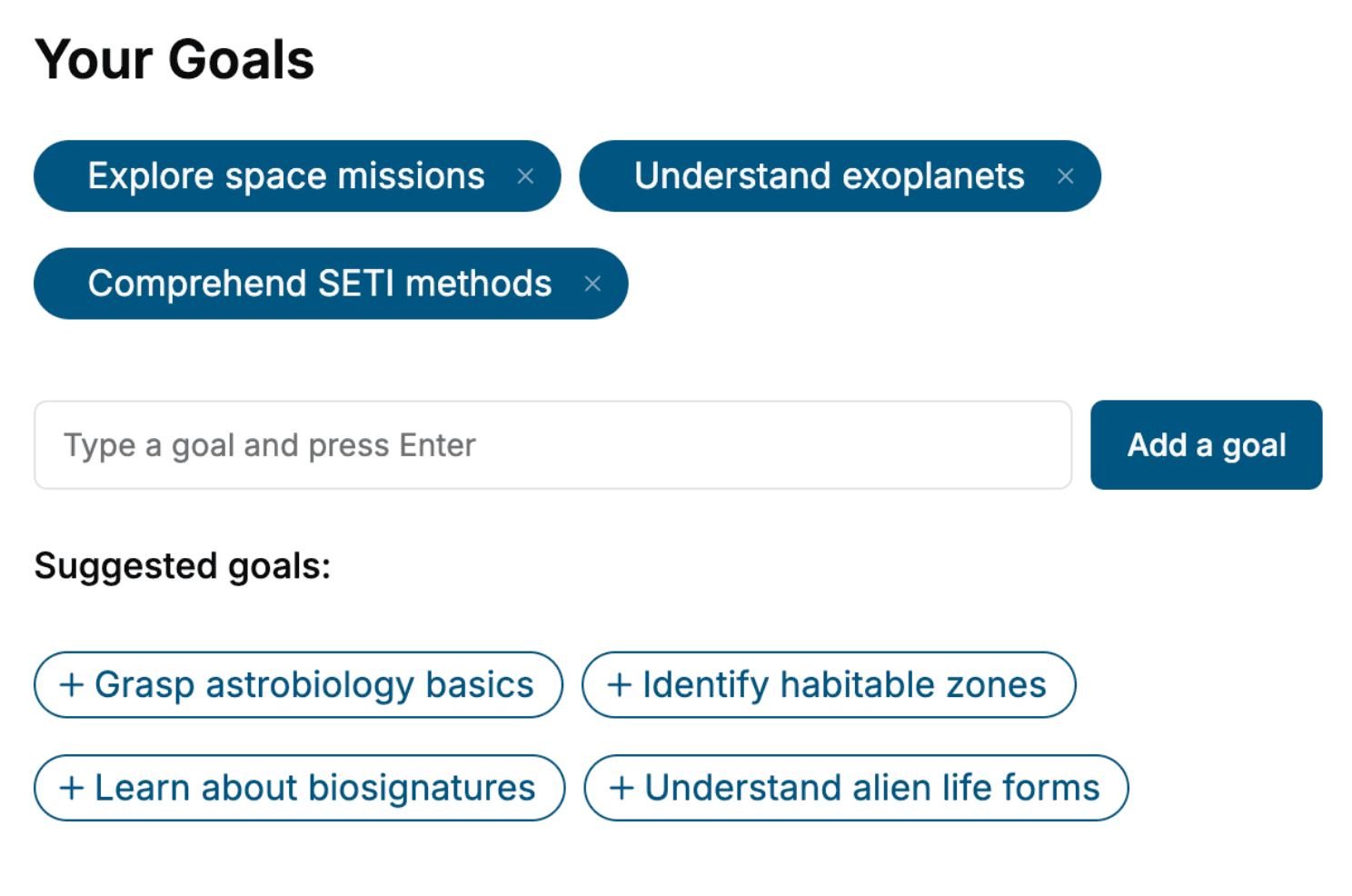
Specify your goals and choose sub-topics to include
- 3. Get your tailored book
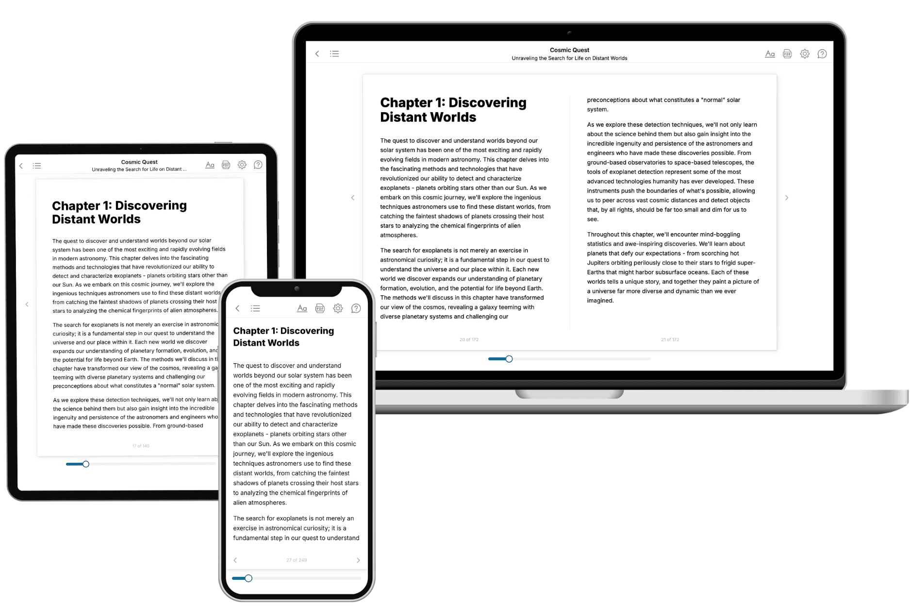
Your book is ready in 10 minutes. Read it online, download as EPUB or PDF, or send to Kindle.
Frequently asked questions
- What is TailoredRead?
TailoredRead creates complete, full-length nonfiction ebooks, written specifically for you. Tell us what you want to learn and why, and TailoredRead writes you a complete ebook on it, with charts, tables, and diagrams throughout. Read it online, on Kindle, or on any e-reader, or download it as a PDF or EPUB. Every book is written fresh the day you order it.
- How is the book tailored to me?
Before anything is written, you answer a few short questions about your goals, your background, and the topics you care about. Your book is then planned around your answers: written at your level, focused on your goals, and covering the topics you chose, instead of the one-size-fits-all book a store sells everyone.
- Will it read like generic AI content?
No. Your book isn't a chat transcript: it's planned chapter by chapter before a single word is written, told in a clear book voice, and explains ideas visually with charts, tables, and diagrams. After writing, every book goes through an editorial pass that polishes chapters so the book reads consistent from start to finish. Judge for yourself: browse thousands of sample books on our Explore Books page.
- How accurate is the content?
Our AI first checks whether your subject needs live research. Niche and fast-moving subjects are researched before writing, and the book plan and chapters are grounded in what it finds. After writing, every book goes through a quality pass that checks its facts and consistency, and researched books list their sources in a Notes section at the back.
- How long is the book?
You choose the length: Comprehensive (250-300 pages), Detailed (150-200 pages), Essential (70-100 pages), or Short (30-50 pages).
- Does the book include visuals?
Yes. Every book includes charts, tables, and diagrams: timelines, checklists, step-by-step guides, decision trees, comparison tables, matrices, and bar charts. A typical book includes dozens of these visual elements.
- Can I read it on Kindle? What formats can I download?
Yes. Every book can be read in our online reader or downloaded as a PDF or EPUB. The EPUB can be opened with Kindle, Apple Books, Kobo, and any e-reader. The Commercial and Author licenses also include an editable Word (DOCX) and Markdown download.
- How much does it cost?
About the price of a regular ebook. The exact price depends on your book's length and complexity, from $2 for the shortest books to $35 for the most comprehensive, and it's shown when you review your book, before you commit to anything. Each book is a one-time purchase, yours to keep, no subscription. Licenses that let you share, teach, or publish your book range from $35.99 to $49.99.
- Can I preview the book before purchasing?
Before you pay, you'll see what your book will cover: the title, a detailed description, the estimated length, and the complete chapter-by-chapter table of contents, so you know what you're getting before you decide. The full text itself is written after you purchase.
- How long does it take to create a book?
About 10 minutes. You can start reading the opening chapters while the rest is still being written.