SCSS Calculations Mastery
Build Dynamic Stylesheets with Advanced Math Functions and Responsive Design
Stop manually calculating pixel values and hardcoding CSS measurements.
176 pages8 chaptersDec 26, 2025SCSS
About this book
This guide teaches you how to harness the full power of SCSS calculations to build stylesheets that adapt, scale, and maintain themselves. You'll learn how to combine variables, functions, and mathematical operations to create responsive designs that work across any screen size without cluttering your code with media queries. From basic arithmetic to advanced techniques like fluid typography and dynamic color systems, you'll discover practical patterns that solve real design challenges. Whether you're building a design system, optimizing performance, or simply tired of updating values across multiple files, SCSS calculations provide the foundation for more intelligent, maintainable stylesheets. This book combines theory with hands-on examples, showing you exactly how to implement calculations in your projects today.
Table of contents
- IntroductionWhy SCSS Calculations Matter, What You'll Learn in This Book, How to Use This GuideRead below
- Chapter 1: SCSS Fundamentals and Calculation BasicsUnderstanding SCSS and Its Advantages, Variables as the Foundation for Calculations, Basic Arithmetic Operations in SCSS, Working with Units and Data Types
- Chapter 2: Mathematical Operations and OperatorsAddition and Subtraction for Spacing and Sizing, Multiplication and Division for Scaling, Understanding Operator Precedence and Parentheses, Avoiding Common Calculation Errors
- Chapter 3: Advanced SCSS Functions for CalculationsThe calc() Function and Browser Compatibility, min(), max(), and clamp() for Responsive Values, Math Functions: round(), ceil(), floor(), and abs(), Color Manipulation Through Calculations
- Chapter 4: Building Responsive Layouts with CalculationsCreating Fluid Typography That Scales Smoothly, Dynamic Spacing Systems Without Media Queries, Maintaining Aspect Ratios with Calculated Values, Viewport-Relative Sizing and Calculations
- Chapter 5: Design Systems and Calculation PatternsCreating Modular Scales for Typography and Spacing, Building Sophisticated Color Systems with Calculations, Establishing Consistent Spacing Scales, Using Calculations to Define Design Tokens
- Chapter 6: Mixins and Functions for Reusable CalculationsWriting Mixins That Encapsulate Complex Calculations, Building Custom Functions for Repeated Patterns, Parameterized Calculations for Flexibility, Common Reusable Calculation Patterns
- Chapter 7: Performance Optimization Through CalculationsReducing CSS File Size with Smart Calculations, How Calculations Impact Browser Rendering, Optimization Strategies for Complex Calculations, Debugging and Profiling Calculation Performance
- Chapter 8: Real-World Projects and Case StudiesBuilding a Responsive Grid System with Calculations, Creating Adaptive Navigation with Dynamic Sizing, Flexible Card Layouts That Scale Proportionally, Complex Component Styling Using Calculations
- ConclusionKey Takeaways and Next Steps, Continuing Your SCSS Calculation Journey
- Appendix: Quick Reference GuideSCSS Calculation Syntax Reference, Complete Function Reference, Unit Conversion and Compatibility Chart
Introduction
Every web developer has experienced the frustration of manually updating pixel values across dozens of CSS files, only to discover that changing one measurement breaks the entire layout. You've probably spent hours calculating percentages, converting units, and adjusting spacing values to maintain visual consistency. These tedious tasks consume valuable time that could be spent solving more interesting problems. SCSS calculations offer a solution to this common challenge by enabling your stylesheets to perform mathematical operations automatically, creating relationships between values that update themselves when your design requirements change.
The power of SCSS calculations extends far beyond simple arithmetic. When you combine variables with mathematical operations, you create a dynamic system where changing a single base value can ripple through your entire stylesheet, updating margins, padding, font sizes, and colors proportionally. This approach transforms your CSS from a static collection of hardcoded values into an intelligent system that adapts to your design decisions. Modern web development demands responsive designs that work seamlessly across countless device sizes, and calculations provide the foundation for building these flexible layouts without cluttering your code with endless media queries.
This book takes you beyond basic SCSS syntax to explore the mathematical capabilities that make stylesheets truly maintainable and scalable. You'll discover how functions like calc(), min(), max(), and clamp() enable responsive designs that adapt fluidly to viewport changes. You'll learn to build sophisticated design systems where typography scales proportionally, spacing follows consistent patterns, and colors derive from calculated relationships. Whether you're working on a small project or maintaining a large-scale design system, the techniques in this book will help you write cleaner, more efficient stylesheets that require less manual intervention and fewer updates when requirements change.
The journey ahead combines theoretical understanding with practical application. Each concept is accompanied by real-world examples that demonstrate how calculations solve actual design challenges. You'll see exactly how to implement fluid typography that scales smoothly between screen sizes, create spacing systems that maintain visual rhythm, and build color palettes that derive from mathematical relationships. By the end of this book, you'll have the knowledge and confidence to leverage SCSS calculations in your daily work, transforming the way you approach stylesheet development and maintenance.
Why SCSS Calculations Matter
Traditional CSS development relies heavily on hardcoded values that must be manually calculated and updated whenever design requirements change. When you specify that a heading should be 24px and body text should be 16px, you've created a fixed relationship that requires manual recalculation if you decide to adjust your base font size. This approach becomes increasingly problematic as projects grow in complexity. A medium-sized website might contain hundreds of spacing values, dozens of font sizes, and countless color variations. Updating these values manually is not only time-consuming but also error-prone, leading to inconsistencies that degrade the user experience.
SCSS calculations eliminate this maintenance burden by establishing mathematical relationships between values. Instead of hardcoding a heading at 24px, you can define it as $base-font-size * 1.5, creating a proportional relationship that updates automatically when the base value changes. This single change transforms your stylesheet from a static document into a dynamic system. When your design team decides to increase the base font size from 16px to 18px, every related value updates proportionally without requiring manual intervention. This capability becomes invaluable when working with design systems that need to maintain consistent proportions across different contexts.
The benefits of calculation-based stylesheets extend beyond simple maintenance. Modern web design demands responsive layouts that adapt gracefully to different screen sizes, and calculations provide the mathematical foundation for this flexibility. Consider a spacing system where margins and padding scale proportionally based on viewport width. Without calculations, you would need multiple media queries defining specific values for each breakpoint. With calculations, you can create fluid spacing that adapts continuously using viewport units and mathematical functions. This approach reduces code complexity while providing smoother transitions between screen sizes.
Example: A traditional approach might define button padding as
12px 24pxfor mobile,16px 32pxfor tablet, and20px 40pxfor desktop, requiring three separate declarations. A calculation-based approach could useclamp(12px, 2vw, 20px) clamp(24px, 4vw, 40px), creating smooth scaling without media queries.
Performance considerations also favor calculation-based approaches. When you use calculations to generate values, you reduce the total amount of CSS that needs to be written and maintained. A design system built on calculated values might require only a few dozen base variables and calculation functions, whereas a hardcoded approach could require hundreds or thousands of individual declarations. Smaller CSS files load faster, parse more quickly, and consume less bandwidth. Additionally, calculations performed during SCSS compilation have zero runtime cost, as they produce standard CSS values that browsers process normally.
Collaboration becomes significantly easier when stylesheets use calculations. When a new developer joins your team, they can understand the relationships between values by examining the calculations rather than trying to reverse-engineer patterns from hardcoded numbers. Documentation becomes clearer when you can point to a modular scale function that generates all typography sizes rather than explaining why specific pixel values were chosen. Design handoffs improve when developers can translate design specifications into mathematical relationships that automatically maintain proportions and consistency.
The cognitive load of stylesheet maintenance decreases dramatically with calculations. Instead of remembering that headings should be exactly 1.5 times larger than body text, you encode this relationship directly in your SCSS. Instead of manually ensuring that all spacing values follow a consistent scale, you generate them from a calculation function. This shift from memorization to systematization reduces errors and frees mental energy for solving more complex design challenges. Your stylesheets become self-documenting, with calculations explicitly showing the design decisions and relationships that govern your visual system.
Real-world projects demonstrate the transformative impact of calculation-based approaches. A major e-commerce platform reduced their CSS file size by 40% after refactoring hardcoded values into calculated relationships[1]. A news organization eliminated 200+ media queries by implementing fluid typography and spacing calculations. These improvements didn't just reduce file sizes—they made the codebases more maintainable, reduced bugs related to inconsistent spacing, and accelerated development velocity. The initial investment in learning calculation techniques pays dividends throughout the entire lifecycle of a project.
What You'll Learn in This Book
This book provides a comprehensive exploration of SCSS calculations, starting with fundamental concepts and progressing to advanced techniques used in production environments. You'll begin by understanding how SCSS processes mathematical operations and how different data types interact in calculations. The early chapters establish a solid foundation in basic arithmetic operations, unit compatibility, and type coercion. You'll learn why 10px + 5px works perfectly while 10px + 5% requires special handling, and how to structure calculations to avoid common errors that can break your stylesheets.
The mathematical operations covered in this book go far beyond simple addition and subtraction. You'll explore how multiplication and division enable proportional scaling, creating design systems where all measurements relate to a base value. You'll discover how operator precedence affects calculation results and learn to use parentheses effectively to control evaluation order. The book dedicates significant attention to SCSS's built-in mathematical functions, including round(), ceil(), floor(), and abs(), showing practical applications for each function in real-world scenarios. You'll understand when to round values for pixel-perfect layouts and when to preserve decimal precision for fluid designs.
Modern CSS functions like calc(), min(), max(), and clamp() receive thorough treatment throughout the book. These functions enable responsive designs that adapt without media queries, and you'll learn exactly how to leverage them effectively. The book explains the crucial difference between SCSS calculations that compile to static values and CSS calculations that evaluate at runtime in the browser. You'll discover when to use each approach and how to combine them for maximum flexibility. Practical examples demonstrate how clamp() creates fluid typography that scales between minimum and maximum sizes, and how min() and max() provide fallback values for different contexts.
Responsive design techniques form a major focus of this book. You'll learn to create fluid typography systems where font sizes scale smoothly across viewport widths, eliminating the jarring jumps that occur with traditional breakpoint-based approaches. The book presents multiple strategies for implementing responsive spacing, including viewport-relative units, calculated percentages, and hybrid approaches that combine different techniques. You'll master aspect ratio calculations that maintain proportions for images, videos, and containers regardless of screen size. These techniques enable you to build layouts that feel natural on any device without writing device-specific code.
Design system development receives extensive coverage, with dedicated chapters on creating modular scales, color systems, and spacing hierarchies through calculations. You'll learn to implement mathematical scales like the golden ratio or perfect fourth to generate harmonious typography sizes. The book demonstrates how to build sophisticated color systems where tints, shades, and variations derive from base colors through calculated adjustments. You'll discover how to establish spacing scales that maintain consistent visual rhythm while providing enough flexibility for different layout needs. These patterns form the foundation of maintainable design systems that scale across large projects and teams.
The book teaches you to write reusable calculation logic through mixins and custom functions. You'll learn to encapsulate complex calculations in functions that accept parameters, making them adaptable to different contexts. Practical examples show how to create mixins for common patterns like fluid sizing, responsive spacing, and proportional scaling. You'll understand when to use mixins versus functions, and how to structure your SCSS architecture to maximize reusability. The book includes a library of proven calculation patterns that you can adapt to your own projects, saving development time and ensuring consistency.
Performance optimization techniques ensure that your calculation-heavy stylesheets remain efficient. You'll learn how different calculation approaches impact CSS file size and browser rendering performance. The book explains which calculations should happen at compile time versus runtime, and how to structure your code to minimize computational overhead. You'll discover debugging techniques for identifying performance bottlenecks in complex calculations and strategies for optimizing without sacrificing maintainability. These insights help you build stylesheets that are both powerful and performant.
Real-world case studies throughout the book demonstrate how calculations solve actual design challenges. You'll see complete implementations of responsive grid systems, adaptive navigation components, flexible card layouts, and complex UI components. Each case study includes the complete SCSS code, explanations of the calculation logic, and analysis of the design decisions involved. These examples bridge the gap between theoretical knowledge and practical application, showing you exactly how to implement calculation-based approaches in your own projects. By studying these real-world scenarios, you'll develop the judgment needed to apply calculations effectively in diverse situations.
How to Use This Guide
This book is structured to support both sequential reading and targeted reference. If you're new to SCSS calculations or want a comprehensive understanding, reading chapters in order provides the most effective learning path. Each chapter builds on concepts introduced previously, gradually increasing in complexity. The early chapters establish fundamental knowledge about how SCSS processes calculations, while later chapters apply these foundations to sophisticated real-world scenarios. This progressive approach ensures you develop both theoretical understanding and practical skills simultaneously.
For experienced developers seeking specific information, the book's organization supports targeted reading. Each chapter focuses on a distinct aspect of SCSS calculations, allowing you to jump directly to relevant topics. The table of contents provides detailed subsection listings, making it easy to locate specific techniques or functions. Code examples throughout the book are self-contained and include necessary context, so you can understand them without reading previous chapters. The appendix serves as a quick reference guide, providing syntax summaries and function references for rapid lookup during development.
Hands-on practice is essential for mastering SCSS calculations. The book includes numerous code examples that you should experiment with in your own development environment. Set up a simple SCSS compilation workflow using tools like Sass CLI, webpack, or Vite. As you read each chapter, type out the examples rather than copying and pasting them. This active engagement helps solidify understanding and reveals nuances that passive reading might miss. Modify the examples to test your understanding—change values, combine techniques, and observe how the compiled CSS changes. This experimentation builds the intuition needed to apply calculations effectively in your own projects.
Recommended Setup: Create a practice project with a simple HTML file and an SCSS file. Use a tool like Live Sass Compiler in VS Code or run
sass --watch input.scss output.cssfrom the command line. This setup provides immediate feedback as you experiment with calculations, helping you learn through direct observation of results.
The code examples in this book follow consistent conventions to enhance readability and understanding. Variable names use descriptive terms that indicate their purpose, such as $base-font-size or $spacing-unit. Calculations include comments explaining the mathematical reasoning, especially for complex operations. The book uses semantic HTML in examples to provide context for how calculations apply to real page elements. When examples show compiled CSS output, it appears alongside the SCSS source to illustrate exactly how calculations transform into browser-ready code. These conventions help you understand not just what the code does, but why it's structured that way.
Each chapter concludes with key takeaways that summarize the most important concepts and techniques. Review these summaries after reading to reinforce your understanding and identify any areas that need further study. The book also highlights common pitfalls and errors throughout, marked with clear warnings. Pay special attention to these sections, as they address mistakes that frequently trip up developers learning calculation techniques. Understanding what not to do is often as valuable as knowing the correct approach, helping you avoid frustrating debugging sessions.
Apply the techniques from this book incrementally in your projects rather than attempting a complete refactor all at once. Start by identifying a specific pain point—perhaps you're tired of manually updating spacing values or struggling to maintain consistent typography across breakpoints. Choose one technique from the book that addresses this challenge and implement it in a small, contained part of your project. Observe the results, refine your approach, and gradually expand the use of calculations to other areas. This incremental adoption reduces risk and allows you to build confidence with each successful implementation.
The book's GitHub repository (referenced in the appendix) contains all code examples in working form, along with additional resources and updates. Use this repository to access complete project files for the case studies, download starter templates, and find links to related tools and documentation. The repository also includes a discussion forum where you can ask questions, share your own calculation techniques, and connect with other developers learning these skills. Engaging with this community enhances your learning and exposes you to diverse approaches and creative solutions.
Consider keeping this book as an ongoing reference throughout your development career. SCSS calculations are not a skill you master once and forget—they're a toolkit that expands with experience. As you encounter new design challenges, return to relevant chapters for inspiration and guidance. The calculation patterns and techniques presented here remain relevant across different projects and frameworks. Even experienced developers find value in reviewing fundamental concepts, as this often reveals new applications or optimizations they hadn't previously considered. Treat this book as a companion in your development journey, not just a one-time learning resource.
Finally, remember that mastering SCSS calculations is a practical skill developed through application, not just reading. The concepts in this book become truly valuable when you apply them to solve real problems in your projects. Challenge yourself to replace hardcoded values with calculated relationships. Experiment with different approaches to the same problem. Share your implementations with colleagues and gather feedback. This active engagement transforms theoretical knowledge into practical expertise, enabling you to write stylesheets that are more maintainable, more flexible, and more aligned with modern web development best practices. The investment you make in learning these techniques will pay dividends throughout your career as a web developer.
Notes
Introduction
- 1. Based on case studies from companies implementing design systems with calculated values, including Shopify's Polaris design system documentation.
This is the end of the free sample. The full book has 8 chapters.
Want this book written for you?
Tell us your goals and background, and get your own version of this book, tailored by AI to you.


Benefits of AI-tailored books
- Read one book, not ten:
- all the SCSS knowledge you need, gathered into a single book.
- Save days of learning:
- tell us your goals, choose your topics, and the whole book is built around them.
- Learn effortlessly:
- SCSS book written for your specific background and expertise.
- Understand at a glance:
- includes charts, tables, timelines, checklists, decision trees, and more.
- Stay current:
- written the day you order it, not years ago.
- Trust what you read:
- every book is checked for accuracy, with real research when your subject needs it.
Create your unique book in 3 steps
- 1. Select your focus
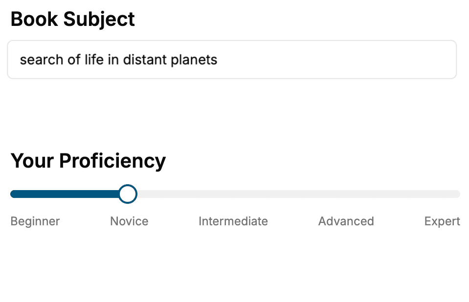
Select the focus of your SCSS book and share your background
- 2. Personalize your book
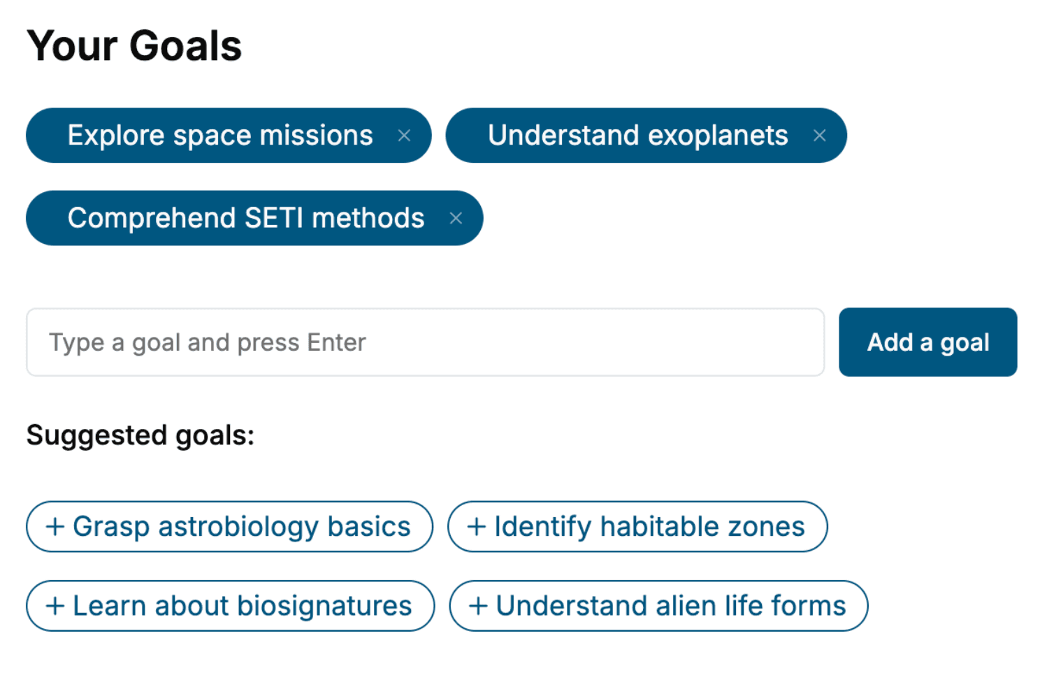
Specify your goals and choose sub-topics to include
- 3. Get your tailored book
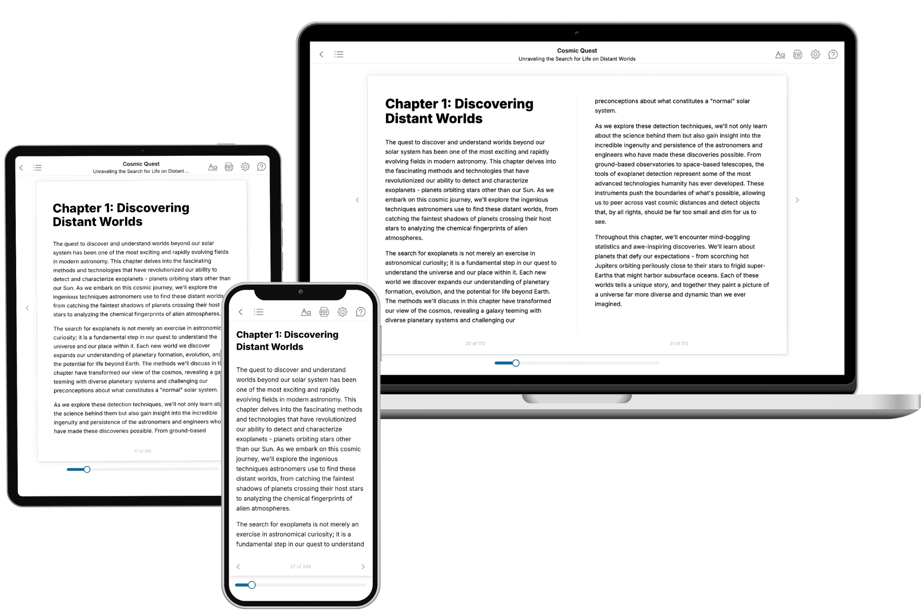
Your book is ready in 10 minutes. Read it online, download as EPUB or PDF, or send to Kindle.
Frequently asked questions
- What is TailoredRead?
TailoredRead creates complete, full-length nonfiction ebooks, written specifically for you. Tell us what you want to learn and why, and TailoredRead writes you a complete ebook on it, with charts, tables, and diagrams throughout. Read it online, on Kindle, or on any e-reader, or download it as a PDF or EPUB. Every book is written fresh the day you order it.
- How is the book tailored to me?
Before anything is written, you answer a few short questions about your goals, your background, and the topics you care about. Your book is then planned around your answers: written at your level, focused on your goals, and covering the topics you chose, instead of the one-size-fits-all book a store sells everyone.
- Will it read like generic AI content?
No. Your book isn't a chat transcript: it's planned chapter by chapter before a single word is written, told in a clear book voice, and explains ideas visually with charts, tables, and diagrams. After writing, every book goes through an editorial pass that polishes chapters so the book reads consistent from start to finish. Judge for yourself: browse thousands of sample books on our Explore Books page.
- How accurate is the content?
Our AI first checks whether your subject needs live research. Niche and fast-moving subjects are researched before writing, and the book plan and chapters are grounded in what it finds. After writing, every book goes through a quality pass that checks its facts and consistency, and researched books list their sources in a Notes section at the back.
- How long is the book?
You choose the length: Comprehensive (250-300 pages), Detailed (150-200 pages), Essential (70-100 pages), or Short (30-50 pages).
- Does the book include visuals?
Yes. Every book includes charts, tables, and diagrams: timelines, checklists, step-by-step guides, decision trees, comparison tables, matrices, and bar charts. A typical book includes dozens of these visual elements.
- Can I read it on Kindle? What formats can I download?
Yes. Every book can be read in our online reader or downloaded as a PDF or EPUB. The EPUB can be opened with Kindle, Apple Books, Kobo, and any e-reader. The Commercial and Author licenses also include an editable Word (DOCX) and Markdown download.
- How much does it cost?
About the price of a regular ebook. The exact price depends on your book's length and complexity, from $2 for the shortest books to $35 for the most comprehensive, and it's shown when you review your book, before you commit to anything. Each book is a one-time purchase, yours to keep, no subscription. Licenses that let you share, teach, or publish your book range from $35.99 to $49.99.
- Can I preview the book before purchasing?
Before you pay, you'll see what your book will cover: the title, a detailed description, the estimated length, and the complete chapter-by-chapter table of contents, so you know what you're getting before you decide. The full text itself is written after you purchase.
- How long does it take to create a book?
About 10 minutes. You can start reading the opening chapters while the rest is still being written.