Seasonal Color Palettes
Master Color Theory and Design with Nature's Timeless Palette System
Many designers struggle with color selection, often choosing colors that clash or feel disconnected from their intended message.
222 pages10 chaptersMar 7, 2026Color Theory
About this book
The problem isn't a lack of color options—it's the absence of a systematic framework for understanding how colors work together. Seasonal color palettes provide exactly that framework, grounded in color theory and proven across decades of design practice. This book teaches you how to identify, understand, and apply seasonal color systems to create designs that feel naturally harmonious and psychologically resonant. You'll discover how the four seasonal archetypes organize colors by undertone and contrast level, learn to recognize which palettes suit different design contexts, and master techniques for combining seasonal colors with other color theory principles. Whether you're designing logos, websites, marketing materials, or illustrations, seasonal color palettes will become your most reliable tool for making confident, strategic color decisions that elevate your work.
Table of contents
- IntroductionWhy Seasonal Color Palettes Matter in Design, The Color Theory Foundation Behind Seasonal Systems, How to Use This BookRead below
- Chapter 1: Color Theory FundamentalsUnderstanding the Color Wheel and Its Principles, Hue, Saturation, and Value: The Three Dimensions of Color, Warm, Cool, and Neutral Undertones Explained
- Chapter 2: The Seasonal Color SystemThe Four Seasons Framework: An Overview, How Undertone and Contrast Define Each Season, The Four Seasonal Archetypes and Their Characteristics
- Chapter 3: Spring PalettesSpring Color Characteristics and Undertones, Applying Spring Palettes in Graphic Design, The Psychology and Mood of Spring Colors
- Chapter 4: Summer PalettesSummer Color Characteristics and Undertones, Applying Summer Palettes in Graphic Design, The Psychology and Mood of Summer Colors
- Chapter 5: Autumn PalettesAutumn Color Characteristics and Undertones, Applying Autumn Palettes in Graphic Design, The Psychology and Mood of Autumn Colors
- Chapter 6: Winter PalettesWinter Color Characteristics and Undertones, Applying Winter Palettes in Graphic Design, The Psychology and Mood of Winter Colors
- Chapter 7: Identifying Your Seasonal PaletteAnalyzing Your Own Undertone Preferences, Determining Your Contrast Level Preference, The Process for Selecting Your Primary Seasonal Palette
- Chapter 8: Seasonal Palettes in Branding and IdentityAligning Seasonal Palettes with Brand Personality, Strategic Color Selection for Logos and Marks, Building Complete Brand Color Systems from Seasonal Foundations
- Chapter 9: Seasonal Palettes in Web and Digital DesignHow Digital Displays Affect Seasonal Color Perception, Maintaining Accessibility While Using Seasonal Palettes, Real-World Examples of Seasonal Palettes in Web Design
- Chapter 10: Advanced Color Combinations and TechniquesBlending Multiple Seasonal Palettes for Unique Effects, Using Complementary Colors Within Seasonal Systems, Manipulating Saturation and Contrast for Design Impact
- ConclusionMastering Seasonal Color Palettes in Your Design Practice, Next Steps for Continued Growth
- Glossary
- Further Reading and Resources
Introduction
Color is one of the most powerful tools in a designer's toolkit, yet it's also one of the most misunderstood. Most designers learn the basics early on: the color wheel, complementary pairs, warm versus cool. But knowing the rules doesn't always translate into confident, consistent color decisions. You've probably experienced that frustrating moment when a palette looks almost right but something feels off, and you can't quite explain why. That gap between knowing color theory and applying it fluently is exactly what this book is designed to close.
Seasonal color palettes offer a practical bridge between abstract color theory and real design decisions. The system organizes colors into four groups, each named after a season, based on two key qualities: undertone and contrast level. These aren't arbitrary categories. They reflect how colors naturally cluster in the world around us, from the warm, golden light of autumn to the crisp, high-contrast clarity of winter. When you understand which colors belong together and why, your design choices become faster, more intentional, and more visually coherent.
This book is written for designers who already have some grounding in color theory and want to go deeper. You don't need to be an expert, but you should be comfortable with concepts like hue, saturation, and value. From that foundation, you'll learn how seasonal systems work, how to identify which palette fits a given design context, and how to apply these principles across branding, web design, print, and beyond. By the end, seasonal color thinking will feel less like a technique you're applying and more like a natural part of how you see and work with color.
Each chapter builds on the last, moving from foundational theory through the four seasonal archetypes and into practical application. Along the way, you'll find concrete examples, real-world scenarios, and actionable frameworks you can use immediately. Whether you're designing a brand identity, building a website, or creating marketing materials, the seasonal color system will give you a reliable structure for making color decisions that feel both intentional and effortless.
Why Seasonal Color Palettes Matter in Design
Color selection is one of the most common sources of frustration in design work. The problem isn't usually a shortage of options. Digital tools give you access to millions of colors, and the internet is full of palette generators and trend reports. The real problem is the absence of a systematic framework for understanding why certain colors work together and others don't. Without that framework, color decisions become guesswork, and guesswork leads to inconsistency.
Seasonal color palettes solve this problem by giving you a structured way to think about color relationships. Instead of choosing colors one at a time and hoping they'll harmonize, you start with a cohesive group of colors that are already designed to work together. Each seasonal palette is built around a consistent undertone and contrast level, which means every color in the group shares a fundamental quality that makes them feel naturally unified.
Consider a practical example. A wellness brand wants to feel calm, natural, and approachable. A designer without a systematic framework might pull together a mix of greens, beiges, and soft blues, only to find the palette feels muddy or disconnected. A designer working with seasonal color principles would recognize that this brand calls for a Summer or Autumn palette, both of which feature muted, low-contrast tones with soft undertones. That single insight narrows the field dramatically and produces a more cohesive result.
Beyond cohesion, seasonal palettes also carry psychological weight. Colors don't just look a certain way; they feel a certain way. Research in color psychology consistently shows that color choices influence how viewers perceive a brand's personality, trustworthiness, and energy level.[1] Seasonal palettes are particularly effective because they tap into associations that are deeply embedded in human experience. Warm, golden tones feel grounding and rich because they echo autumn harvests. Cool, muted tones feel serene because they mirror overcast summer skies. These associations aren't accidental; they're part of what makes the seasonal system so intuitive once you understand it.
Seasonal color thinking also makes you a more efficient designer. When you have a framework, you spend less time second-guessing your choices and more time refining them. You can evaluate a palette quickly by asking whether it's consistent in undertone and contrast, rather than staring at swatches and hoping for inspiration. That efficiency compounds over time, especially when you're working on complex projects with multiple deliverables that all need to feel visually unified.
It's worth noting that seasonal palettes are not a rigid formula. They're a starting point, a lens through which to evaluate and organize color choices. The best designers use them as a foundation and then adapt, combine, and push the boundaries of each palette to suit the specific needs of a project. This book will teach you both the rules and how to break them intelligently.
Key insight: Seasonal color palettes don't limit your creativity. They give you a structured starting point that makes creative decisions faster, more confident, and more consistent across a project.
Finally, seasonal palettes are relevant across every design discipline. They apply equally to logo design, typography pairings, web interfaces, packaging, illustration, and environmental design. Once you internalize the system, you'll find yourself using it constantly, not as a crutch, but as a reliable compass that helps you navigate the enormous complexity of color with clarity and purpose.
The Color Theory Foundation Behind Seasonal Systems
Seasonal color palettes didn't emerge from nowhere. They are grounded in well-established color theory principles that have been studied and refined for centuries. To use the seasonal system effectively, it helps to understand the theoretical scaffolding that supports it. This isn't just academic background; it's practical knowledge that will help you make better decisions when the system doesn't give you a clear-cut answer.
The seasonal system rests on three core color theory concepts: undertone, value, and saturation. Undertone refers to the underlying warmth or coolness of a color. A red can lean warm (toward orange) or cool (toward blue-violet), and that subtle difference determines whether it belongs in a Spring/Autumn palette or a Summer/Winter palette. Value describes how light or dark a color is. Saturation describes how pure or muted a color is. Together, these three dimensions define the character of every color in the seasonal system.
The concept of undertone is particularly central to seasonal color analysis. In traditional color theory, we talk about warm colors (reds, oranges, yellows) and cool colors (blues, greens, purples). But undertone goes deeper than that. Even a color that's nominally "warm," like a dusty rose, can have a cool undertone if it leans toward blue-pink rather than peach-pink. Recognizing these subtle shifts is a skill that develops with practice, and it's one of the most valuable things you'll build through this book.
Contrast level is the other major axis of the seasonal system. In color theory, contrast refers to the degree of difference between colors in a composition. High-contrast palettes pair colors that are very different in value or saturation, creating bold, dynamic visual energy. Low-contrast palettes use colors that are closer together in value and saturation, producing a softer, more harmonious feel. The seasonal system maps these contrast levels directly onto the four archetypes:
- Spring: Warm undertones, medium contrast, clear and bright saturation
- Summer: Cool undertones, low contrast, soft and muted saturation
- Autumn: Warm undertones, medium-low contrast, rich and earthy saturation
- Winter: Cool undertones, high contrast, pure and intense saturation
The seasonal system also draws on the concept of color harmony, which describes the principle that certain color combinations are inherently pleasing to the eye because of their mathematical relationships on the color wheel. Analogous colors (those adjacent on the wheel) tend to feel cohesive and calm. Complementary colors (those opposite on the wheel) create vibrant tension. Seasonal palettes are built around analogous groupings within a consistent undertone range, which is why they feel naturally harmonious even when you're using many colors at once.
It's also worth understanding the historical roots of the seasonal system. The modern version of seasonal color analysis was popularized in the early 1980s, most notably by color consultant Carole Jackson in her influential book Color Me Beautiful.[2] Jackson adapted earlier work by Swiss artist and Bauhaus teacher Johannes Itten, who observed that his students tended to choose colors that harmonized with their own natural coloring. Itten's insight was that color preference isn't random; it's connected to underlying patterns of warmth, coolness, and contrast. The seasonal system formalized those patterns into a teachable framework.
While the seasonal system originated in personal color analysis (helping individuals identify which colors suit their complexion), its principles translate directly and powerfully into graphic design. The same logic that makes a warm, muted palette flattering on an autumn-type person also makes it effective for a brand that wants to feel grounded, artisanal, and authentic. The underlying color theory is identical; only the application context changes.
Understanding this theoretical foundation means you won't just be following rules mechanically. You'll understand why the rules exist, which gives you the flexibility to adapt them intelligently. When a client asks for something that doesn't fit neatly into one seasonal category, you'll have the theoretical tools to create a custom solution that still feels cohesive and intentional. That's the difference between using a system and truly mastering it.
How to Use This Book
This book is structured to take you from foundational understanding through to advanced application, but it's also designed to be a practical reference you'll return to repeatedly. You don't have to read it cover to cover in one sitting. Depending on where you are in your design practice, you might move through it linearly, or you might jump to the chapters most relevant to your current projects. Both approaches work.
Here's a quick overview of how the chapters are organized, so you can navigate with intention:
- Chapters 1 and 2 cover the theoretical foundation. Chapter 1 revisits color theory fundamentals with a focus on the concepts most relevant to seasonal analysis. Chapter 2 introduces the seasonal system itself, explaining how undertone and contrast define each archetype.
- Chapters 3 through 6 go deep on each of the four seasonal palettes. Each chapter covers the characteristics, design applications, and psychological associations of one season. These chapters are rich with specific color examples and practical guidance.
- Chapter 7 helps you identify which seasonal palette aligns with your own design sensibility and preferences, which is useful for developing a consistent personal or studio aesthetic.
- Chapters 8 and 9 move into applied contexts, covering branding and identity design, then web and digital design. These chapters include real-world examples and specific techniques for each context.
- Chapter 10 covers advanced techniques, including how to blend seasonal palettes, use complementary colors within a seasonal framework, and manipulate saturation and contrast for specific effects.
If you're new to seasonal color systems, the recommended path is to read Chapters 1 and 2 first, then work through the four seasonal chapters (3 through 6) in order. This gives you a complete picture of the system before you start applying it. If you already have some familiarity with seasonal color theory, you might skim Chapters 1 and 2 as a refresher and spend more time in the application chapters.
Throughout the book, you'll find several recurring features designed to make the content as practical as possible. Color examples are described in specific, actionable terms, including hex codes and descriptive names, so you can immediately reference them in your design tools. Design scenarios walk you through how a seasonal palette would be applied to a real project type, from a wellness brand identity to a tech startup website. Common mistakes sections highlight the pitfalls that trip up even experienced designers when working with seasonal color.
One important note about how to engage with the color descriptions in this book: color perception is subjective and context-dependent. The same hex value can look warmer or cooler depending on the colors surrounding it, the brightness of your screen, and even the ambient lighting in your workspace. When the book describes a color as "warm" or "muted," treat that as a directional guide rather than an absolute truth. Your own perception, trained through practice, is ultimately the most reliable tool you have.
Practical tip: As you read through each seasonal chapter, open your design software alongside the book. Build a swatch library for each season as you go. By the time you finish Chapter 6, you'll have four complete reference palettes ready to use in your next project.
You'll also notice that this book consistently connects seasonal color principles back to broader color theory concepts. This is intentional. The goal isn't just to teach you a system; it's to deepen your overall color literacy so that you can think flexibly and creatively beyond any single framework. Seasonal palettes are a powerful tool, but they're most powerful when they're part of a larger, well-developed understanding of how color works.
Finally, approach this material with a spirit of experimentation. The best way to internalize seasonal color principles is to apply them, make mistakes, notice what works, and adjust. Every project is an opportunity to test your understanding and refine your instincts. The designers who get the most out of this book won't just read it; they'll use it as a companion to active, ongoing design practice. That's exactly the spirit in which it was written.
Color mastery isn't a destination you arrive at once and stay. It's a practice you deepen continuously, project by project, palette by palette. This book is designed to accelerate that journey significantly, giving you both the conceptual framework and the practical tools to make color one of your greatest strengths as a designer. Let's get started.
This is the end of the free sample. The full book has 10 chapters.
Want this book written for you?
Tell us your goals and background, and get your own version of this book, tailored by AI to you.


Benefits of AI-tailored books
- Read one book, not ten:
- all the Color Theory knowledge you need, gathered into a single book.
- Save days of learning:
- tell us your goals, choose your topics, and the whole book is built around them.
- Learn effortlessly:
- Color Theory book written for your specific background and expertise.
- Understand at a glance:
- includes charts, tables, timelines, checklists, decision trees, and more.
- Stay current:
- written the day you order it, not years ago.
- Trust what you read:
- every book is checked for accuracy, with real research when your subject needs it.
Create your unique book in 3 steps
- 1. Select your focus
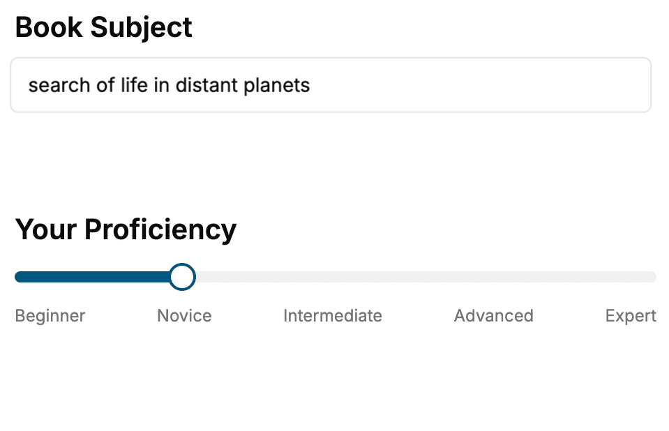
Select the focus of your Color Theory book and share your background
- 2. Personalize your book
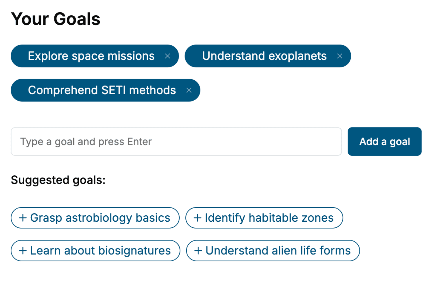
Specify your goals and choose sub-topics to include
- 3. Get your tailored book
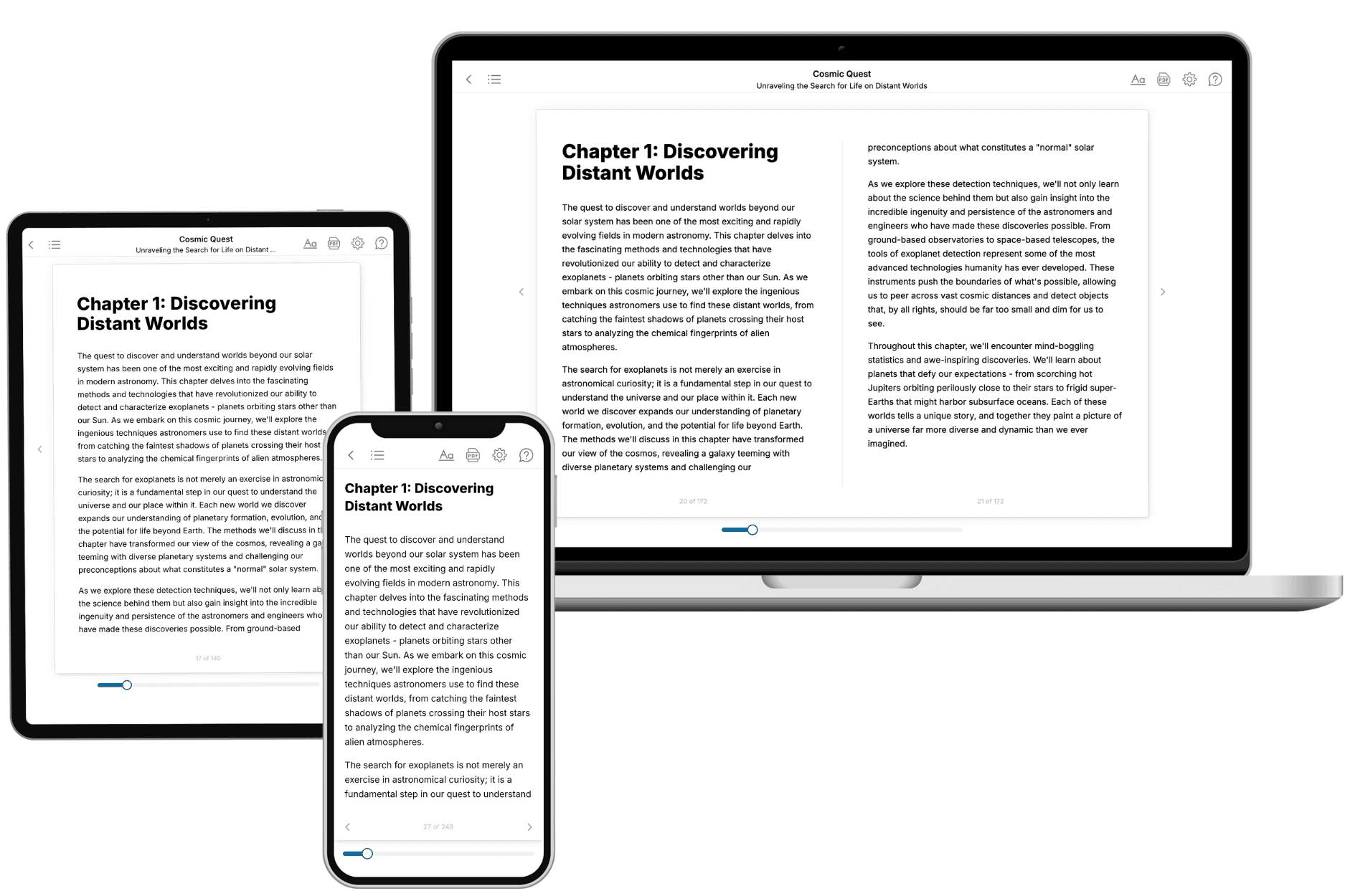
Your book is ready in 10 minutes. Read it online, download as EPUB or PDF, or send to Kindle.
Frequently asked questions
- What is TailoredRead?
TailoredRead creates complete, full-length nonfiction ebooks, written specifically for you. Tell us what you want to learn and why, and TailoredRead writes you a complete ebook on it, with charts, tables, and diagrams throughout. Read it online, on Kindle, or on any e-reader, or download it as a PDF or EPUB. Every book is written fresh the day you order it.
- How is the book tailored to me?
Before anything is written, you answer a few short questions about your goals, your background, and the topics you care about. Your book is then planned around your answers: written at your level, focused on your goals, and covering the topics you chose, instead of the one-size-fits-all book a store sells everyone.
- Will it read like generic AI content?
No. Your book isn't a chat transcript: it's planned chapter by chapter before a single word is written, told in a clear book voice, and explains ideas visually with charts, tables, and diagrams. After writing, every book goes through an editorial pass that polishes chapters so the book reads consistent from start to finish. Judge for yourself: browse thousands of sample books on our Explore Books page.
- How accurate is the content?
Our AI first checks whether your subject needs live research. Niche and fast-moving subjects are researched before writing, and the book plan and chapters are grounded in what it finds. After writing, every book goes through a quality pass that checks its facts and consistency, and researched books list their sources in a Notes section at the back.
- How long is the book?
You choose the length: Comprehensive (250-300 pages), Detailed (150-200 pages), Essential (70-100 pages), or Short (30-50 pages).
- Does the book include visuals?
Yes. Every book includes charts, tables, and diagrams: timelines, checklists, step-by-step guides, decision trees, comparison tables, matrices, and bar charts. A typical book includes dozens of these visual elements.
- Can I read it on Kindle? What formats can I download?
Yes. Every book can be read in our online reader or downloaded as a PDF or EPUB. The EPUB can be opened with Kindle, Apple Books, Kobo, and any e-reader. The Commercial and Author licenses also include an editable Word (DOCX) and Markdown download.
- How much does it cost?
About the price of a regular ebook. The exact price depends on your book's length and complexity, from $2 for the shortest books to $35 for the most comprehensive, and it's shown when you review your book, before you commit to anything. Each book is a one-time purchase, yours to keep, no subscription. Licenses that let you share, teach, or publish your book range from $35.99 to $49.99.
- Can I preview the book before purchasing?
Before you pay, you'll see what your book will cover: the title, a detailed description, the estimated length, and the complete chapter-by-chapter table of contents, so you know what you're getting before you decide. The full text itself is written after you purchase.
- How long does it take to create a book?
About 10 minutes. You can start reading the opening chapters while the rest is still being written.