Seeing Red: Color Theory for Protanomaly
Master Color Harmony, Contrast, and Inclusive Design When Red-Green Color Blindness Shapes Your Vision
Imagine confidently creating game environments and UI designs where every color choice serves both aesthetic and functional purposes—even with protanomaly.
98 pages4 chaptersDec 21, 2025Color TheoryCreated by Jeremiah
About this book
This book bridges the gap between color theory and your lived experience as someone with red-green color blindness, giving you the science, tools, and workflows to design with intention rather than guesswork. You'll explore the neuroscience of cone cell sensitivity, discover why certain colors clash in your vision while harmonizing for others, and learn to validate your palettes using protan-specific testing methods. More importantly, you'll master practical techniques for color contrast, harmony, and mixing that account for your unique perception. Whether you're designing game interfaces, environments, or marketing materials, this guide transforms protanomaly from a constraint into a competitive advantage—helping you create genuinely inclusive designs that work for everyone, not just those with typical color vision. Built on color science and real-world design workflows, this is the resource you've been looking for.
Table of contents
- IntroductionWhy This Book Exists for You, How to Use This Guide, What You'll Master by the EndRead below
- Chapter 1: Understanding Your Color VisionWhat Protanomaly Actually Is, Cone Cell Sensitivity Curves and Your Perception, How Your Vision Differs from Standard Color Vision
- Chapter 2: Color Contrast for ProtanomalyContrast Principles That Work for Protans, Testing and Validating Your Contrast Choices, Common Contrast Mistakes and How to Avoid Them
- Chapter 3: Color Harmony and Palette CreationHarmony Principles for Protan Color Space, Building Inclusive Color Palettes, Protanomaly-Specific Palette Tools and Resources
- Chapter 4: Practical Tools and WorkflowsEssential Protanomaly-Specific Tools, Building an Inclusive Design Workflow, Applying These Techniques in Game Production
- ConclusionMoving Forward as a Protan Designer
Introduction
You've probably experienced that moment of doubt when choosing colors for a game interface or digital artwork. You select what seems like a vibrant red accent against a green background, only to have a colleague point out that the contrast is nearly invisible to them—or worse, you discover after launch that players are struggling to distinguish critical UI elements. This isn't a failure of your design skills or artistic vision. It's the result of working with color theory frameworks built exclusively for typical trichromatic vision, frameworks that don't account for how your cone cells actually process wavelengths of light. The frustration you feel isn't about lacking ability; it's about lacking tools and knowledge specifically calibrated to your perceptual reality.
Protanomaly affects approximately one percent of people assigned male at birth, making it one of the most common forms of color vision deficiency[1]. Yet despite its prevalence, most color theory education treats it as an edge case or accessibility checkbox rather than a legitimate perceptual framework deserving its own design methodology. You've likely encountered generic advice about avoiding red-green combinations or using colorblind-safe palettes, but these surface-level recommendations don't address the underlying question: how do you develop genuine color mastery when your long-wavelength cone cells have reduced sensitivity? How do you move beyond accommodation and into confident, intentional color decision-making that serves both your vision and your audience's needs?
This book exists because you deserve more than workarounds and apologies. Your protanomaly isn't a deficit requiring compensation—it's a specific perceptual configuration with its own logic, strengths, and design opportunities. Understanding the science of your cone cell sensitivity curves, learning contrast principles that actually function within your color space, and building workflows that validate your choices against multiple vision types will transform how you approach every color decision. By the end of this guide, you'll have the theoretical foundation and practical tools to create color palettes that work beautifully for your perception while remaining accessible to the broadest possible audience. More importantly, you'll understand why certain color combinations succeed or fail in your vision, giving you the confidence to make informed choices rather than relying on guesswork or external validation for every hue selection.
Why This Book Exists for You
The game industry and digital art communities have made significant strides in accessibility awareness over the past decade. Colorblind modes appear in major releases, design guidelines mention contrast ratios, and simulation tools let developers preview their work through different vision types. Yet these advances often treat color vision deficiency as something to design around rather than something to design with. If you're a game producer or digital artist with protanomaly, you've likely noticed this gap: plenty of resources explain how to make games accessible to people like you, but almost nothing teaches you how to master color theory as someone with your specific perception. This fundamental disconnect leaves you in an awkward position—simultaneously the target of accessibility efforts and excluded from the expertise needed to implement them effectively.
Traditional color theory education assumes standard trichromatic vision with three cone cell types functioning at typical sensitivity levels. When you learn about complementary colors, you're taught that red and green sit opposite each other on the color wheel and create maximum contrast when paired. But your long-wavelength cone cells have reduced sensitivity to red wavelengths, fundamentally altering how that relationship functions in your perception. The complementary pair that creates vibrant tension for typical vision may appear as a muddy, low-contrast combination to you. This isn't because you're applying the theory incorrectly—it's because the theory itself wasn't built with your cone cell configuration in mind. You need frameworks that start from your perceptual reality rather than treating it as a deviation from an assumed norm.
Consider the practical challenges you face in your daily work. When mixing colors digitally, you might struggle to achieve the exact hue you're visualizing because the relationship between RGB sliders and perceived color doesn't match your expectations. When creating UI elements, you may second-guess whether your contrast choices will read clearly to players, leading to constant external validation requests that slow your workflow. When collaborating with team members who have typical color vision, you might find yourself deferring to their judgment on color decisions even in areas where you have strong design instincts. These challenges compound over time, potentially undermining your confidence and making color work feel like a perpetual obstacle course rather than a creative strength.
This book addresses these issues directly by providing three critical components that existing resources lack:
- Scientific foundation: Detailed explanation of cone cell sensitivity curves, spectral response patterns, and the neurological basis of your color perception, giving you a clear understanding of why you see colors the way you do
- Protan-specific techniques: Color harmony principles, contrast methods, and palette-building strategies specifically calibrated for reduced long-wavelength sensitivity rather than generic colorblind accommodations
- Practical workflows: Step-by-step processes for validating your color choices, integrating simulation tools into your design pipeline, and collaborating effectively with team members who have different vision types
Beyond filling these knowledge gaps, this guide reframes how you think about your protanomaly in professional contexts. Your reduced sensitivity to red wavelengths means you naturally perceive certain color relationships differently than the majority of your audience—but this difference is precisely what makes you valuable as a designer focused on inclusive experiences. You instinctively notice when color contrast relies too heavily on red-green differentiation because those distinctions don't register clearly in your vision. You're more likely to explore alternative contrast strategies using lightness, saturation, or blue-yellow axes because you can't rely on the red-green shortcuts that typical vision takes for granted. These aren't compensatory behaviors; they're design strengths that lead to more robust, accessible solutions.
The game industry increasingly recognizes that accessibility benefits everyone, not just those with specific disabilities. Curb cuts designed for wheelchair users help people with strollers, luggage, and bicycles. Closed captions assist not only deaf viewers but also people in noisy environments or learning new languages. Similarly, color palettes designed with protanomaly in mind tend to have stronger overall contrast, clearer visual hierarchies, and more thoughtful use of multiple visual channels beyond color alone. When you master color theory through your perceptual lens, you don't just create work that accommodates your vision—you create work that's fundamentally more robust and accessible across the full spectrum of human color perception.
This book also exists because you shouldn't have to figure this out alone through trial and error. Many designers with protanomaly develop effective personal strategies over years of practice, learning which color combinations work through accumulated experience rather than systematic understanding. While this experiential knowledge is valuable, it's inefficient and often incomplete. You might discover that certain blue-yellow combinations provide excellent contrast without understanding the underlying cone cell sensitivity reasons why. You might avoid specific hue ranges without realizing that targeted adjustments to saturation or lightness could make them viable. By providing explicit frameworks and scientific explanations, this guide accelerates your learning curve and helps you develop transferable principles rather than just memorized solutions.
Finally, this resource acknowledges that you're not a beginner struggling with basic concepts—you're an intermediate practitioner looking to deepen your expertise. You already understand fundamental color theory principles like hue, saturation, and value. You've worked with color wheels, created palettes, and applied colors in professional contexts. What you need isn't a remedial explanation of color basics but rather an advanced exploration of how those principles function specifically within your perceptual framework. This book meets you at your current knowledge level and builds from there, respecting your existing expertise while filling the specific gaps that standard color theory education leaves unaddressed for designers with protanomaly.
How to Use This Guide
This book is structured to work both as a sequential learning path and as a reference resource you can return to when facing specific color challenges. If you're reading it for the first time, working through the chapters in order will build your understanding progressively, starting with the scientific foundation of your color vision and moving toward practical application in game production and digital art. Each chapter assumes knowledge from previous sections, so concepts introduced early—like cone cell sensitivity curves—become the basis for later discussions of contrast testing and palette validation. However, once you've completed an initial read-through, you can jump directly to relevant sections when you need guidance on particular topics like building accessible UI palettes or troubleshooting contrast issues.
The first chapter establishes the scientific foundation you need to understand every subsequent technique and recommendation. You'll learn exactly what protanomaly means at the physiological level, how your cone cells differ from typical trichromatic vision, and why certain color combinations succeed or fail in your perception. This isn't abstract theory for its own sake—understanding your spectral sensitivity curves directly informs practical decisions about which hues to pair, how to adjust saturation for maximum impact, and where to focus your contrast efforts. If you've ever wondered why a specific red appears brownish to you or why certain greens seem to shift toward yellow, this chapter provides the answers. Take your time with this material; the investment in understanding your perceptual mechanics pays dividends throughout the rest of the book.
Chapters two and three form the practical core of the guide, translating scientific understanding into actionable design techniques. Chapter two focuses specifically on contrast—the single most critical factor in creating functional, accessible designs. You'll learn which contrast methods work reliably for protanomaly, how to test your choices using both digital tools and systematic evaluation methods, and which common contrast mistakes to avoid. Chapter three addresses color harmony and palette creation, showing you how traditional harmony principles like complementary, triadic, and analogous schemes function within your color space. These chapters include numerous examples, step-by-step processes, and specific recommendations you can implement immediately in your current projects.
Chapter four bridges theory and practice by introducing the digital tools and workflows that make protan-specific design efficient and reliable. You'll discover simulation tools that show you how your palettes appear to people with different vision types, validation methods that catch potential accessibility issues before they reach production, and workflow strategies that integrate these checks seamlessly into your existing design process. This chapter is particularly valuable if you work on teams with colleagues who have typical color vision, as it provides concrete methods for collaborative color decision-making that respects both your perceptual reality and your audience's diverse needs.
Throughout the book, you'll encounter several types of specialized content designed to reinforce key concepts and provide quick reference points:
- Blockquotes: Highlight important principles, real-world examples, or critical warnings about common mistakes
- Code examples: Provide specific color values, formulas, or technical specifications you can use directly in your work
- Lists: Break down complex processes into clear, actionable steps or organize related concepts for easy scanning
- Footnotes: Cite scientific research, link to additional resources, or provide technical details for readers who want to explore topics more deeply
As you work through the material, consider keeping a notebook or digital document where you record observations about your own color perception. When you learn about cone cell sensitivity curves, note which specific colors you find most challenging to distinguish. When you explore contrast principles, document which techniques work most reliably in your projects. When you test palette tools, save examples of successful color combinations you can reference in future work. This personal reference library becomes increasingly valuable over time, helping you identify patterns in your perceptual strengths and develop a customized toolkit of reliable strategies. Your protanomaly is unique to you—while you share the general characteristics of reduced long-wavelength sensitivity with other protans, the specific degree and manifestation varies individually.
Don't feel obligated to implement every technique or use every tool mentioned in these pages. The goal is to provide a comprehensive resource covering the full range of protan-specific color theory and practice, but your specific needs depend on your role, projects, and personal working style. A game producer focused primarily on UI design might emphasize contrast validation tools and accessibility testing workflows, while a digital artist creating environmental concept art might focus more on palette harmony and color mixing techniques. Take what serves your immediate needs and bookmark the rest for when your projects evolve or you encounter new challenges.
One particularly effective way to use this guide is to pair reading with active experimentation. After completing a section on contrast principles, open your current project and evaluate your existing color choices against the new frameworks you've learned. After exploring palette-building techniques, create several test palettes and run them through the validation methods described in chapter four. This immediate application reinforces theoretical understanding and helps you develop muscle memory for protan-specific design thinking. You'll also discover which techniques feel most natural to your working style and which require more conscious effort to integrate into your process.
If you work with a team, consider sharing relevant sections with colleagues who have typical color vision. Chapter one's explanation of cone cell sensitivity can help team members understand why you perceive certain color combinations differently, reducing friction in collaborative color decision-making. Chapter four's workflow recommendations provide concrete methods for incorporating protan-specific validation into team processes without creating bottlenecks or requiring constant external validation of your choices. When everyone on the team understands the scientific basis of different color vision types and has access to appropriate testing tools, color discussions become more productive and less dependent on subjective judgments about what "looks right."
What You'll Master by the End
By the time you complete this guide, you'll have developed a comprehensive understanding of color theory specifically calibrated to your protanomaly. This isn't just theoretical knowledge—you'll have practical skills and systematic methods you can apply immediately to improve the accessibility and visual effectiveness of your game designs and digital artwork. Most importantly, you'll have the confidence to make informed color decisions based on scientific understanding rather than guesswork or constant external validation. Your protanomaly will shift from being a source of uncertainty to being a design perspective you understand thoroughly and can leverage strategically.
First and foremost, you'll master the science of your own color perception. You'll understand exactly how your cone cells respond to different wavelengths of light, why your long-wavelength sensitivity reduction affects specific color relationships, and how your brain processes color information differently than typical trichromatic vision. This foundation enables you to predict which color combinations will work well in your perception and which will present challenges. When you encounter a color pairing that seems problematic, you'll be able to identify whether the issue stems from hue confusion, insufficient lightness contrast, or saturation problems—and you'll know which adjustments to make to resolve it. This diagnostic ability transforms color work from frustrating trial-and-error into systematic problem-solving.
You'll develop expertise in contrast techniques that function reliably for protanomaly. Standard contrast advice often focuses heavily on hue differentiation, particularly red-green separation, which doesn't serve your vision well. Instead, you'll learn to leverage lightness contrast, saturation differences, and blue-yellow hue separation—strategies that create robust visual distinction regardless of long-wavelength sensitivity. You'll understand how to calculate and evaluate contrast ratios using methods that account for your perception, and you'll know how to test your designs to ensure they work for both your vision and the full spectrum of color perception types your audience represents. These skills are directly applicable to UI design, environmental art, marketing materials, and any other context where clear visual communication matters.
Your palette-building abilities will expand significantly through understanding how color harmony principles function within protan color space. You'll learn to create:
- Complementary palettes that generate genuine visual tension and contrast in your perception, not just theoretical opposition on a standard color wheel
- Analogous schemes that flow smoothly without creating muddy, indistinct transitions that lack clear boundaries
- Triadic combinations that provide balanced variety while maintaining sufficient contrast between all three hues
- Monochromatic palettes that use lightness and saturation variation to create depth and hierarchy without relying on hue differentiation
You'll gain proficiency with digital tools specifically designed for protanomaly simulation and validation. Rather than relying solely on your own perception or constantly asking colleagues for feedback, you'll be able to systematically test how your color choices appear across different vision types. You'll learn which simulation tools provide the most accurate results, how to interpret their output, and how to integrate them into your workflow without disrupting your creative process. This technical capability gives you independence and confidence—you'll be able to validate your own work and make informed adjustments before sharing designs with your team or shipping to players.
Perhaps most valuably, you'll develop a design philosophy that treats your protanomaly as a strength rather than a limitation. You'll understand how your reduced red-green sensitivity makes you naturally attentive to accessibility issues that designers with typical vision often overlook. You'll recognize situations where your perceptual difference gives you unique insights into color relationships and contrast effectiveness. You'll be able to articulate the value you bring to design teams specifically because of your vision type, not in spite of it. This mindset shift has practical implications—it changes how you approach color decisions, how you collaborate with colleagues, and how you present your work to stakeholders.
Your color mixing skills in digital art will become more precise and intentional. You'll understand why certain RGB or HSL slider adjustments produce unexpected results in your perception and how to compensate for these differences. You'll learn which color spaces and adjustment methods work most intuitively for protanomaly and which require extra attention or validation. When you need to match a specific color or create a particular mood through color grading, you'll have systematic methods for achieving your goals rather than relying on trial-and-error adjustment. This technical precision is especially valuable in production environments where efficiency and consistency matter.
You'll also develop collaborative skills that make working with team members who have different vision types more productive and less frustrating. You'll be able to explain your perceptual differences clearly using scientific terminology rather than vague descriptions. You'll know how to set up validation workflows that catch potential issues early without creating bottlenecks or requiring constant oversight. You'll understand when to trust your own judgment and when to seek input from colleagues with different vision types, making these decisions strategically rather than reflexively. These collaborative capabilities are crucial in game production environments where color decisions often involve multiple stakeholders with different expertise and perspectives.
Finally, you'll have a comprehensive reference resource you can return to throughout your career as you encounter new color challenges or work in different design contexts. The frameworks and principles in this book remain relevant whether you're designing mobile game interfaces, creating concept art for AAA productions, developing marketing materials, or exploring new artistic directions. As your projects evolve and your responsibilities change, you'll find yourself returning to specific chapters for guidance on particular challenges—troubleshooting a contrast issue, building a palette for a new art style, or evaluating a tool you haven't used before. This guide grows with you, supporting your development from intermediate practitioner to advanced expert in protan-specific color theory and practice.
Notes
Introduction
- 1. J. Birch, "Worldwide prevalence of red-green color deficiency," Journal of the Optical Society of America A, 2012
This is the end of the free sample. The full book has 4 chapters.
Want this book written for you?
Tell us your goals and background, and get your own version of this book, tailored by AI to you.


Benefits of AI-tailored books
- Read one book, not ten:
- all the Color Theory knowledge you need, gathered into a single book.
- Save days of learning:
- tell us your goals, choose your topics, and the whole book is built around them.
- Learn effortlessly:
- Color Theory book written for your specific background and expertise.
- Understand at a glance:
- includes charts, tables, timelines, checklists, decision trees, and more.
- Stay current:
- written the day you order it, not years ago.
- Trust what you read:
- every book is checked for accuracy, with real research when your subject needs it.
Create your unique book in 3 steps
- 1. Select your focus
Select the focus of your Color Theory book and share your background
- 2. Personalize your book
Specify your goals and choose sub-topics to include
- 3. Get your tailored book
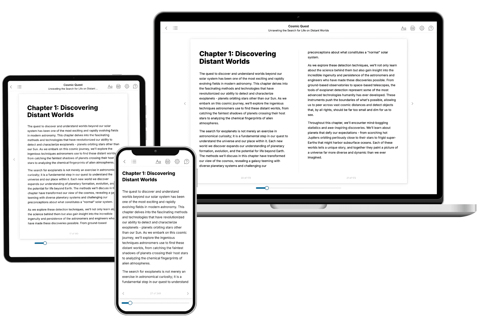
Your book is ready in 10 minutes. Read it online, download as EPUB or PDF, or send to Kindle.

Frequently asked questions
- What is TailoredRead?
TailoredRead creates complete, full-length nonfiction ebooks, written specifically for you. Tell us what you want to learn and why, and TailoredRead writes you a complete ebook on it, with charts, tables, and diagrams throughout. Read it online, on Kindle, or on any e-reader, or download it as a PDF or EPUB. Every book is written fresh the day you order it.
- How is the book tailored to me?
Before anything is written, you answer a few short questions about your goals, your background, and the topics you care about. Your book is then planned around your answers: written at your level, focused on your goals, and covering the topics you chose, instead of the one-size-fits-all book a store sells everyone.
- Will it read like generic AI content?
No. Your book isn't a chat transcript: it's planned chapter by chapter before a single word is written, told in a clear book voice, and explains ideas visually with charts, tables, and diagrams. After writing, every book goes through an editorial pass that polishes chapters so the book reads consistent from start to finish. Judge for yourself: browse thousands of sample books on our Explore Books page.
- How accurate is the content?
Our AI first checks whether your subject needs live research. Niche and fast-moving subjects are researched before writing, and the book plan and chapters are grounded in what it finds. After writing, every book goes through a quality pass that checks its facts and consistency, and researched books list their sources in a Notes section at the back.
- How long is the book?
You choose the length: Comprehensive (250-300 pages), Detailed (150-200 pages), Essential (70-100 pages), or Short (30-50 pages).
- Does the book include visuals?
Yes. Every book includes charts, tables, and diagrams: timelines, checklists, step-by-step guides, decision trees, comparison tables, matrices, and bar charts. A typical book includes dozens of these visual elements.
- Can I read it on Kindle? What formats can I download?
Yes. Every book can be read in our online reader or downloaded as a PDF or EPUB. The EPUB can be opened with Kindle, Apple Books, Kobo, and any e-reader. The Commercial and Author licenses also include an editable Word (DOCX) and Markdown download.
- How much does it cost?
About the price of a regular ebook. The exact price depends on your book's length and complexity, from $2 for the shortest books to $35 for the most comprehensive, and it's shown when you review your book, before you commit to anything. Each book is a one-time purchase, yours to keep, no subscription. Licenses that let you share, teach, or publish your book range from $35.99 to $49.99.
- Can I preview the book before purchasing?
Before you pay, you'll see what your book will cover: the title, a detailed description, the estimated length, and the complete chapter-by-chapter table of contents, so you know what you're getting before you decide. The full text itself is written after you purchase.
- How long does it take to create a book?
About 10 minutes. You can start reading the opening chapters while the rest is still being written.