Styled Components Mastery
Build Beautiful, Maintainable React Applications with CSS-in-JS
Styling React applications shouldn't require juggling multiple CSS files, managing naming conventions, or wrestling with specificity conflicts.
191 pages10 chaptersMar 11, 2026React.js
About this book
Styled-components solves these problems by bringing CSS directly into your JavaScript, but mastering this powerful library requires understanding both its core concepts and real-world implementation patterns. This book guides you from styled-components fundamentals through advanced techniques used in production MERN applications. You'll learn how to write scoped, maintainable styles using template literals, create dynamic components that respond to props and state, build reusable design systems with theme providers, and optimize performance for large-scale applications. Whether you're refactoring an existing project or building new features, you'll discover practical patterns for component styling, global style management, and testing strategies that ensure your styled-components work reliably. By the end, you'll have the confidence and skills to implement styled-components effectively in any React project.
Table of contents
- IntroductionWhy Styled-Components Matter in Modern React, What You'll Learn in This Book, How to Use This Book EffectivelyRead below
- Chapter 1: CSS-in-JS FundamentalsUnderstanding CSS-in-JS and Its Benefits, Styled-Components vs. Other CSS-in-JS Solutions, Installation and Project Setup, Creating Your First Styled Component
- Chapter 2: Template Literals and Tagged TemplatesTemplate Literal Syntax and Basics, How Tagged Template Functions Work, The Styled API Under the Hood, Using Interpolation Expressions in Styles
- Chapter 3: Dynamic Styling with PropsConditional Styling Based on Props, Transient Props and Filtering Attributes, Building Responsive Components with Media Queries, Styling Components Based on Application State
- Chapter 4: Component Composition and InheritanceExtending and Inheriting Styled Components, Composing Styles Across Multiple Components, Using Attribute Selectors and Pseudo-Elements, Nesting and Selector Specificity
- Chapter 5: Global Styles and Theme ManagementImplementing Global Styles and Resets, Setting Up ThemeProvider for Consistent Design, Creating Dynamic Theme Switching (Light/Dark Mode), Using Design Tokens and Theme Variables
- Chapter 6: Building Reusable Design SystemsPrinciples of Scalable Design Systems, Creating a Component Library with Styled-Components, Maintaining Style Consistency Across Projects, Documenting Styled Components and Design Patterns
- Chapter 7: Animations and TransitionsCreating CSS Animations with Keyframes, Implementing Smooth Transitions and Effects, Integrating Animation Libraries (Framer Motion, React Spring), Optimizing Animation Performance
- Chapter 8: Testing Styled ComponentsTesting Strategies for Styled Components, Snapshot Testing and Style Assertions, Integration Testing with React Testing Library, Debugging and Troubleshooting Style Issues
- Chapter 9: Performance OptimizationReducing Bundle Size and Code Splitting, Critical CSS Extraction and Server-Side Rendering, Optimizing Component Render Performance, Production Best Practices and Monitoring
- Chapter 10: Styled-Components in MERN ApplicationsIntegrating Styled-Components in MERN Stack, Server-Side Rendering with Express and Styled-Components, Styling with Redux and Context API, Full-Stack Styling Patterns and Workflows
- ConclusionKey Takeaways and Next Steps, Resources for Continued Learning
Introduction
If you've spent any time building React applications, you've probably run into the same frustrations that most developers face with CSS. You create a class called .button, and three files later, something else accidentally overrides it. You rename a component and forget to update the stylesheet. You inherit a codebase where the CSS file has grown to thousands of lines, and nobody is quite sure what's safe to delete. These aren't signs of bad developers. They're signs of a tooling problem that traditional CSS wasn't designed to solve at the component level.
Styled-components emerged as a direct answer to these problems. Instead of maintaining separate CSS files and hoping your class names don't collide, you write your styles directly inside your JavaScript, scoped automatically to the component they belong to. The result is a development experience that feels more natural, more predictable, and significantly easier to maintain as your application grows. Since its release in 2016, styled-components has become one of the most widely adopted CSS-in-JS libraries in the React ecosystem, with over 40 million weekly downloads on npm as of recent counts.[1]
This book is for intermediate React developers who already understand the basics of components, props, and state, and who want to take their styling approach to a professional level. You don't need to be a CSS expert, though familiarity with standard CSS properties will help. What you do need is a willingness to rethink how styles and components relate to each other. Once that mental shift clicks, styled-components stops feeling like a workaround and starts feeling like the way styling was always supposed to work.
The journey through this book moves from foundational concepts to production-ready patterns. You'll start by understanding why CSS-in-JS exists and how styled-components fits into that landscape. From there, you'll build up through dynamic styling, theme management, design systems, animations, testing, and performance optimization. The final chapters bring everything together in the context of a full MERN stack application, showing how styled-components integrates with the broader architecture of a real-world project. Every chapter is grounded in practical examples, not just theory.
Why Styled-Components Matter in Modern React
React changed how developers think about building user interfaces. Instead of separating concerns by file type (HTML here, CSS there, JavaScript somewhere else), React encouraged thinking in components. A button is a button: its markup, behavior, and logic all live together. But for a long time, the styling half of that equation was left behind. CSS files remained global, flat, and disconnected from the component tree. Styled-components closes that gap by making styles a first-class part of the component itself.
The core problem with global CSS in component-based applications comes down to scope. In a traditional stylesheet, every class name exists in a shared global namespace. When two developers on the same team both write a class called .card, one of them is going to have a bad day. Naming conventions like BEM (Block Element Modifier) were invented to manage this problem, but they require discipline, documentation, and constant enforcement. Styled-components solves it automatically by generating unique class names at runtime, so collisions become structurally impossible.
Consider a real scenario: a team of five developers building a dashboard application. Without scoped styles, a developer adding a new
.headerclass for a widget accidentally overrides the global page header styles. The bug is subtle, only visible on certain screen sizes, and takes two hours to track down. With styled-components, the widget's header styles are scoped to that component. The global header is completely unaffected, and the bug never happens.
Beyond preventing conflicts, styled-components makes dead code elimination dramatically easier. In a traditional setup, deleting a component doesn't automatically remove its CSS. The styles linger in the stylesheet, adding weight to your bundle and confusion to future developers. With styled-components, the styles live inside the component file. Delete the component, and the styles go with it. This tight coupling, which sounds like a limitation, is actually one of the library's greatest strengths.
Dynamic styling is another area where styled-components genuinely outperforms traditional approaches. Imagine a button that needs to look different based on a variant prop: primary, secondary, or danger. With plain CSS, you'd manage multiple class names in JavaScript and apply them conditionally. With styled-components, you write the logic directly in the style definition using props, keeping the visual logic and the component logic in the same place. This makes the code easier to read, easier to test, and easier to modify.
The library also integrates naturally with React's component model in ways that matter for large teams. Styles become part of the component's API. When you look at a styled component, you can immediately see what visual variations it supports, what theme values it consumes, and how it responds to different states. This transparency reduces the cognitive overhead of working in a shared codebase, which is one of the most underrated benefits of the styled-components approach.
It's worth being honest about the tradeoffs, too. Styled-components does add a small runtime overhead compared to static CSS files, because styles are generated and injected at runtime. For most applications, this overhead is negligible and is offset by the developer experience gains. For extremely performance-sensitive applications, there are optimization strategies (covered in Chapter 9) that bring the performance profile much closer to static CSS. Understanding both the benefits and the tradeoffs helps you make informed decisions about when and how to use the library.
The broader CSS-in-JS ecosystem has evolved significantly since styled-components first appeared. Libraries like Emotion, Stitches, and vanilla-extract offer different tradeoffs. But styled-components remains the most widely used option, with the largest community, the most extensive documentation, and the deepest integration with tools like Storybook, Next.js, and Gatsby. Choosing styled-components means choosing a mature, well-supported tool with a proven track record in production applications at scale.
What You'll Learn in This Book
This book is structured as a progressive learning journey. Each chapter builds on the previous one, introducing new concepts while reinforcing the patterns you've already learned. By the time you reach the final chapter, you'll have a complete mental model of how styled-components works, from the JavaScript mechanics that power it to the architectural patterns that make it scale.
The first two chapters establish the foundation. Chapter 1 covers CSS-in-JS fundamentals: what the approach is, why it exists, and how styled-components compares to alternatives like Emotion and CSS Modules. You'll set up your development environment and write your first styled component. Chapter 2 goes deeper into the JavaScript mechanics, specifically template literals and tagged template functions, which are the language features that make styled-components possible. Understanding these mechanics isn't just academic. It helps you write better styles and debug problems more effectively.
Chapters 3 and 4 focus on the dynamic and compositional capabilities that make styled-components genuinely powerful. You'll learn:
- How to write conditional styles based on props and application state
- How to use transient props to pass styling data without polluting the DOM
- How to build responsive components using media queries inside styled-components
- How to extend and inherit styles from existing components
- How to use nested selectors, pseudo-elements, and attribute selectors
Chapters 5 and 6 shift focus to the bigger picture of design systems. You'll implement global styles and CSS resets, set up a ThemeProvider for consistent design tokens, and build a light/dark mode toggle that works across your entire application. Chapter 6 takes those skills further by showing how to build a reusable component library, maintain style consistency across multiple projects, and document your components so that other developers can use them confidently.
Chapter 7 covers animations and transitions, including how to use the keyframes helper from styled-components, how to implement smooth CSS transitions, and how to integrate popular animation libraries like Framer Motion and React Spring alongside your styled components. You'll also learn how to keep animations performant by targeting GPU-composited properties and avoiding layout-triggering styles.
Chapters 8 and 9 address two concerns that often get overlooked until they become urgent: testing and performance. You'll learn snapshot testing strategies, how to assert on specific styles in your tests, and how to use React Testing Library effectively with styled components. The performance chapter covers bundle size reduction, critical CSS extraction, server-side rendering, and the specific render optimizations that matter most in large applications.
Chapter 10 brings everything together in the context of a MERN stack application. You'll see how styled-components integrates with Express for server-side rendering, how it works alongside Redux and the Context API for state-driven styling, and what full-stack styling workflows look like in practice. This chapter is especially valuable if you're building or maintaining applications where the frontend and backend are tightly coupled.
Throughout the book, you'll encounter real code examples, not simplified toy examples. The patterns shown are drawn from the kinds of problems that come up in actual production applications. Where relevant, footnotes point to official documentation, research, and community resources so you can explore topics further on your own.
How to Use This Book Effectively
The most effective way to use this book depends on where you're starting from and what you're trying to accomplish. If you're new to styled-components entirely, reading the chapters in order is strongly recommended. The concepts build on each other in a deliberate sequence, and skipping ahead can leave gaps that make later chapters harder to follow. If you already have some experience with styled-components and are looking to fill specific gaps, the chapter structure makes it easy to jump to the topics most relevant to your current work.
Code along as you read. This is the single most important piece of advice for getting value from a technical book. Reading code is useful, but typing it out yourself, running it, breaking it, and fixing it, is how the concepts actually stick. Every code example in this book is designed to be runnable. Set up a simple React project at the start (Chapter 1 walks you through this) and use it as your sandbox throughout the book.
Here's a suggested setup to get the most out of your practice sessions:
- Create a new React project using Create React App or Vite as your starting point
- Install styled-components and keep the official documentation open in a browser tab
- Create a separate file for each chapter's experiments so you can refer back to earlier work
- After each subchapter, try to recreate the example from memory before looking at the code
- When something doesn't work as expected, use it as a debugging exercise before checking the explanation
Pay particular attention to the sections on props-based styling (Chapter 3) and ThemeProvider (Chapter 5). These two concepts are the foundation of almost every advanced pattern in the book. Developers who struggle with later chapters often find that going back and solidifying their understanding of these two areas resolves most of their confusion. If something in Chapter 6 or 7 feels unclear, ask yourself whether the issue traces back to how props or themes work.
The chapters on testing (Chapter 8) and performance (Chapter 9) are sometimes skipped by developers who are eager to get to the practical application content. Resist that temptation. Testing styled components has specific quirks that can trip you up if you're not prepared for them, and performance issues in styled-components applications often have specific causes that are easy to avoid once you know what to look for. These chapters will save you real debugging time on real projects.
If you're working through this book as part of a team, consider using it as the basis for a study group or code review series. The design system chapters (5 and 6) in particular benefit from group discussion, because design decisions involve tradeoffs that different team members will weigh differently. Talking through those tradeoffs with colleagues will deepen your understanding and help your team arrive at conventions that work for your specific context.
A note on versions: this book is written for styled-components v6, which introduced several changes from v5, including updated TypeScript support, improved performance, and changes to how certain props are handled. If you're working with an older version, most of the concepts still apply, but some syntax details may differ. The official migration guide is a useful reference if you're upgrading an existing project.[2]
Finally, don't treat this book as the last word on styled-components. The library continues to evolve, and the community produces excellent blog posts, conference talks, and open-source examples that complement what you'll learn here. The resources section at the end of the book points to some of the best ongoing learning materials. The goal of this book is to give you a strong enough foundation that you can evaluate new patterns and techniques critically, understand why they work, and decide whether they fit your project's needs.
Styled-components is one of those tools that, once you understand it well, genuinely changes how you think about building UI. The initial learning curve is real but short. The payoff in cleaner code, fewer bugs, and faster development is substantial. The chapters ahead will get you there step by step, with concrete examples and practical patterns at every stage. Let's get started.
This is the end of the free sample. The full book has 10 chapters.
Want this book written for you?
Tell us your goals and background, and get your own version of this book, tailored by AI to you.


Benefits of AI-tailored books
- Read one book, not ten:
- all the React.js knowledge you need, gathered into a single book.
- Save days of learning:
- tell us your goals, choose your topics, and the whole book is built around them.
- Learn effortlessly:
- React.js book written for your specific background and expertise.
- Understand at a glance:
- includes charts, tables, timelines, checklists, decision trees, and more.
- Stay current:
- written the day you order it, not years ago.
- Trust what you read:
- every book is checked for accuracy, with real research when your subject needs it.
Create your unique book in 3 steps
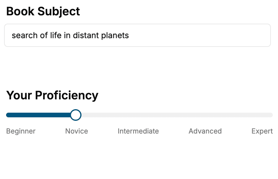
- 1. Select your focus
Select the focus of your React.js book and share your background
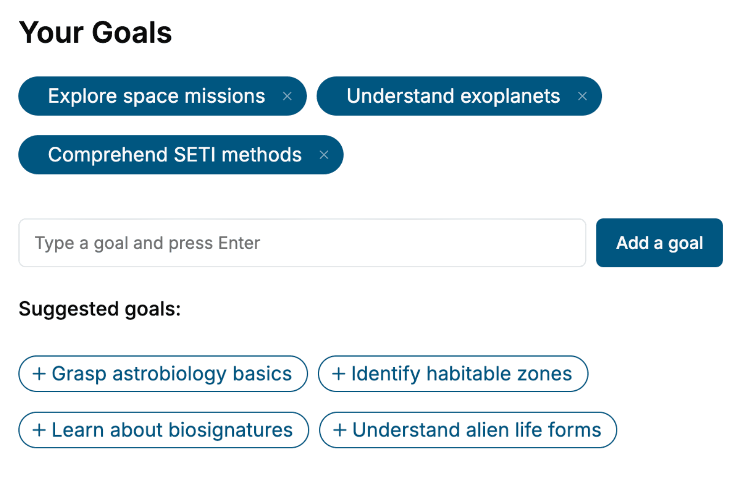
- 2. Personalize your book
Specify your goals and choose sub-topics to include
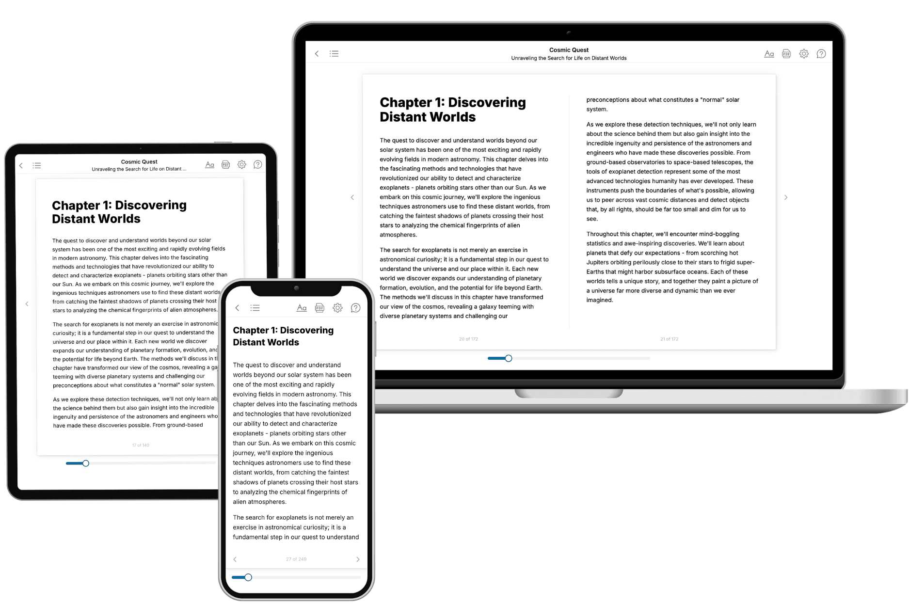
- 3. Get your tailored book
Your book is ready in 10 minutes. Read it online, download as EPUB or PDF, or send to Kindle.
Frequently asked questions
- What is TailoredRead?
TailoredRead creates complete, full-length nonfiction ebooks, written specifically for you. Tell us what you want to learn and why, and TailoredRead writes you a complete ebook on it, with charts, tables, and diagrams throughout. Read it online, on Kindle, or on any e-reader, or download it as a PDF or EPUB. Every book is written fresh the day you order it.
- How is the book tailored to me?
Before anything is written, you answer a few short questions about your goals, your background, and the topics you care about. Your book is then planned around your answers: written at your level, focused on your goals, and covering the topics you chose, instead of the one-size-fits-all book a store sells everyone.
- Will it read like generic AI content?
No. Your book isn't a chat transcript: it's planned chapter by chapter before a single word is written, told in a clear book voice, and explains ideas visually with charts, tables, and diagrams. After writing, every book goes through an editorial pass that polishes chapters so the book reads consistent from start to finish. Judge for yourself: browse thousands of sample books on our Explore Books page.
- How accurate is the content?
Our AI first checks whether your subject needs live research. Niche and fast-moving subjects are researched before writing, and the book plan and chapters are grounded in what it finds. After writing, every book goes through a quality pass that checks its facts and consistency, and researched books list their sources in a Notes section at the back.
- How long is the book?
You choose the length: Comprehensive (250-300 pages), Detailed (150-200 pages), Essential (70-100 pages), or Short (30-50 pages).
- Does the book include visuals?
Yes. Every book includes charts, tables, and diagrams: timelines, checklists, step-by-step guides, decision trees, comparison tables, matrices, and bar charts. A typical book includes dozens of these visual elements.
- Can I read it on Kindle? What formats can I download?
Yes. Every book can be read in our online reader or downloaded as a PDF or EPUB. The EPUB can be opened with Kindle, Apple Books, Kobo, and any e-reader. The Commercial and Author licenses also include an editable Word (DOCX) and Markdown download.
- How much does it cost?
About the price of a regular ebook. The exact price depends on your book's length and complexity, from $2 for the shortest books to $35 for the most comprehensive, and it's shown when you review your book, before you commit to anything. Each book is a one-time purchase, yours to keep, no subscription. Licenses that let you share, teach, or publish your book range from $35.99 to $49.99.
- Can I preview the book before purchasing?
Before you pay, you'll see what your book will cover: the title, a detailed description, the estimated length, and the complete chapter-by-chapter table of contents, so you know what you're getting before you decide. The full text itself is written after you purchase.
- How long does it take to create a book?
About 10 minutes. You can start reading the opening chapters while the rest is still being written.