The Typography Essentials
Master Type Design and Elevate Your Graphic Design Work
What if the difference between a forgettable design and a memorable one comes down to how you use type?
222 pages10 chaptersFeb 14, 2026Typography
About this book
Typography is far more than selecting a pretty font—it's the invisible architecture that guides how people read, feel, and respond to your work. Whether you're designing a website, packaging, poster, or brand identity, the choices you make with type directly impact your message's effectiveness. This book bridges the gap between basic font selection and strategic typography design. You'll discover how to analyze typefaces, build visual hierarchies that work, pair fonts with confidence, and adapt your typography across digital and print mediums. Through practical examples and clear explanations, you'll learn why certain type choices succeed while others fail, and how to apply these principles to elevate every project you create. If you're ready to move beyond guesswork and design with intention, this guide provides the knowledge and frameworks you need.
Table of contents
- IntroductionWhy Typography Matters in Design, What You'll Learn in This Book, How to Use This GuideRead below
- Chapter 1: Typeface FundamentalsThe Anatomy of Type: Understanding Key Elements, Typeface Classifications and Their Characteristics, Serif vs. Sans-Serif: When and Why to Use Each, Display, Script, and Specialty Typefaces
- Chapter 2: Building Visual Hierarchy with TypeCore Principles of Visual Hierarchy, Using Size, Weight, and Contrast Effectively, Color and Emphasis in Typography, Applying Hierarchy to Real Design Projects
- Chapter 3: Spacing, Alignment, and ReadabilityLetter Spacing and Kerning Fundamentals, Line Spacing and Leading for Optimal Readability, Alignment Techniques and Their Impact, Strategic Use of Whitespace
- Chapter 4: The Art of Typeface PairingPrinciples of Effective Typeface Pairing, Contrast vs. Compatibility: Finding the Balance, Proven Pairing Strategies and Combinations, Common Pairing Mistakes and How to Avoid Them
- Chapter 5: Typography for Digital MediumsWeb Typography Basics and Best Practices, Responsive Typography Across Devices, Optimizing for Screen Readability, Implementing Web Fonts Effectively
- Chapter 6: Typography for Print DesignUnique Considerations for Print Media, Font Selection and Rendering in Print, Building Hierarchy and Layout for Print, Production Tips for Professional Print Results
- Chapter 7: Typography in Brand IdentityExpressing Brand Voice Through Typography, Creating Consistent Type Systems, Developing Typography Guidelines for Brands, Case Studies: Typography in Successful Brands
- Chapter 8: Accessibility and Inclusive TypographyUnderstanding Accessibility Standards and Guidelines, Choosing Readable Fonts for All Users, Contrast, Color, and Legibility for Accessibility, Inclusive Design Practices in Typography
- Chapter 9: The History and Context of TypefacesThe Evolution of Typography Through History, Cultural Context and Typeface Associations, Contemporary Typography Trends and Movements
- Chapter 10: Building Your Typography WorkflowIntegrating Typography into Your Design Process, Essential Tools and Resources for Typographers, Testing, Feedback, and Refinement
- ConclusionKey Takeaways and Next Steps, Continuing Your Typography Journey
- Glossary of Typography Terms
- Further Reading and Resources
Introduction
Typography surrounds you every moment of every day. From the moment you check your phone in the morning to the billboard you pass on your commute, from the packaging on your coffee to the presentation slides in your afternoon meeting, type is constantly communicating. Yet despite its omnipresence, typography remains one of the most misunderstood aspects of design. Many designers treat it as an afterthought—a final polish rather than a foundational element. This approach leaves enormous potential untapped. When you understand typography deeply, you gain access to a powerful communication tool that can transform ordinary designs into compelling visual experiences that resonate with audiences and achieve measurable results.
The difference between adequate typography and exceptional typography often determines whether your design succeeds or fails. Consider two identical websites with the same content, layout, and color scheme, but different typographic treatments. One uses carefully selected typefaces with thoughtful hierarchy, appropriate spacing, and strategic emphasis. The other uses default fonts with inconsistent sizing and poor readability. The first site will keep visitors engaged, guide them effortlessly through the content, and establish credibility. The second will frustrate users, obscure important information, and undermine trust. This isn't speculation—research consistently shows that typography directly impacts comprehension, retention, and user behavior[1]. The stakes are real, and the impact is measurable.
This book exists to bridge the gap between basic font selection and strategic typography design. You already understand design fundamentals—composition, color theory, visual balance. Now it's time to develop the same depth of knowledge about type. You'll learn to see typography not as decoration but as architecture, not as styling but as strategy. Through practical frameworks, real-world examples, and actionable techniques, you'll develop the skills to make confident typographic decisions that elevate every project you touch. Whether you're designing a brand identity, a website, a publication, or a poster, the principles you'll learn here will give you a systematic approach to typography that produces consistently professional results.
Why Typography Matters in Design
Typography is the primary vehicle through which written language becomes visual communication. While images capture attention and color evokes emotion, type carries the bulk of your message's informational content. When typography fails, everything fails—no matter how beautiful your imagery or how sophisticated your layout. Poor typography creates friction between your audience and your message. It forces readers to work harder to extract meaning, increases cognitive load, and ultimately causes people to disengage. Conversely, excellent typography is invisible in the best possible way. It guides readers effortlessly through content, emphasizes what matters most, and creates a seamless reading experience that feels natural and intuitive.
The psychological impact of typography extends far beyond simple readability. Different typefaces carry distinct personalities and cultural associations that shape how audiences perceive your message before they even read the words. A law firm using a playful script font undermines its credibility. A children's toy brand using a severe geometric sans-serif feels cold and uninviting. These aren't subjective preferences—they're predictable psychological responses based on learned associations and visual characteristics. Research in typography psychology demonstrates that typeface selection significantly influences perceived trustworthiness, professionalism, creativity, and authority[2]. When you choose a typeface, you're not just selecting letterforms—you're establishing the voice and personality of your entire design.
Typography also serves as the foundation of visual hierarchy, which determines how people navigate and prioritize information in your designs. Without clear hierarchy, viewers don't know where to look first, what's important, or how different pieces of information relate to each other. This creates confusion and frustration. Effective typographic hierarchy uses size, weight, color, spacing, and positioning to create a clear reading order and emphasize key messages. Consider a well-designed newspaper: headlines immediately grab attention, subheadings organize content into digestible sections, body text provides detailed information, and captions connect images to context. This hierarchical structure isn't accidental—it's the result of centuries of typographic refinement designed to facilitate efficient information processing.
In digital environments, typography's importance multiplies. Screen-based reading presents unique challenges that don't exist in print: variable screen sizes, different pixel densities, diverse lighting conditions, and shorter attention spans. Typography must adapt across devices while maintaining consistency and readability. A typeface that works beautifully in a printed brochure might become illegible on a mobile screen. Line lengths that feel comfortable on desktop monitors become exhausting on tablets. These technical considerations aren't optional extras—they're fundamental requirements for effective digital design. Poor digital typography doesn't just look unprofessional; it actively prevents people from accessing your content.
Typography also plays a crucial role in accessibility and inclusive design. Approximately 15% of the global population experiences some form of disability, and many of these disabilities affect how people perceive and process visual information[3]. Typography choices directly impact whether your designs are usable by people with visual impairments, dyslexia, color blindness, or cognitive differences. This isn't just about legal compliance or ethical responsibility—though both matter. It's about reaching the widest possible audience and ensuring your message communicates effectively to everyone. Accessible typography benefits all users, not just those with disabilities. Clear, readable type with appropriate contrast and spacing improves comprehension and reduces eye strain for everyone.
From a business perspective, typography directly impacts conversion rates, engagement metrics, and brand perception. E-commerce sites with poor typography see higher bounce rates and lower sales. Marketing materials with weak typographic hierarchy fail to communicate key value propositions. Brand identities with inconsistent typography appear unprofessional and forgettable. These aren't abstract design concerns—they're measurable business outcomes. Companies that invest in thoughtful typography see tangible returns: increased time on site, higher conversion rates, stronger brand recognition, and improved customer trust. Typography isn't a luxury reserved for high-end design projects; it's a fundamental business tool that affects your bottom line.
Understanding typography also accelerates your design process and improves your creative problem-solving abilities. When you have a deep knowledge of type, you can quickly identify what's not working in a design and implement effective solutions. You spend less time randomly trying different fonts and more time making strategic decisions based on clear principles. You can articulate your design choices to clients and stakeholders with confidence, explaining not just what you did but why it works. This expertise transforms you from someone who makes designs look nice to someone who solves communication problems through strategic visual decisions. That shift in capability and confidence is what separates intermediate designers from advanced practitioners.
What You'll Learn in This Book
This book is structured to build your typography knowledge systematically, starting with foundational concepts and progressing to advanced applications. You'll begin by understanding typeface fundamentals—the anatomy of letterforms, classification systems, and the characteristics that distinguish different type families. This foundation is essential because you can't make informed decisions about typography without understanding what you're actually looking at. You'll learn to identify serifs, ascenders, descenders, x-heights, and other anatomical features that affect how typefaces perform in different contexts. You'll explore the major typeface classifications—serif, sans-serif, script, display, and specialty fonts—and understand when each category is appropriate for your design goals.
Building on this foundation, you'll dive deep into visual hierarchy—the single most important skill in typography. You'll learn the core principles that create clear information architecture: how size establishes importance, how weight creates emphasis, how color directs attention, and how spacing organizes content. More importantly, you'll learn how these elements work together as a system. You'll discover practical frameworks for analyzing existing designs and creating hierarchy in your own work. Through specific examples, you'll see how hierarchy transforms confusing layouts into clear, scannable designs that guide viewers exactly where you want them to go. You'll also learn common hierarchy mistakes and how to avoid them, saving you countless hours of trial and error.
Spacing and alignment receive dedicated attention because they're often overlooked yet critically important. You'll learn the difference between tracking, kerning, and leading, and when to adjust each one. You'll understand how line length affects readability and how to calculate optimal measure for different contexts. You'll explore alignment techniques—left, right, center, and justified—and learn the specific situations where each approach works best. You'll also master the strategic use of whitespace, learning to see empty space not as wasted area but as an active design element that improves clarity and creates visual breathing room. These technical skills might seem mundane, but they're what separate amateur typography from professional work.
Typeface pairing is where typography becomes truly creative, and it's also where many designers struggle. You'll learn proven strategies for combining typefaces effectively, understanding the balance between contrast and compatibility. You'll discover why certain combinations work harmoniously while others clash. You'll explore specific pairing formulas that you can apply immediately:
- Pairing a serif with a sans-serif for classic contrast
- Combining typefaces from the same family for subtle variation
- Using geometric and humanist sans-serifs together for modern sophistication
- Mixing display and text fonts for maximum impact
The book then addresses medium-specific considerations, recognizing that typography must adapt to different contexts. You'll explore digital typography in depth, learning how to optimize type for screens of all sizes. You'll understand responsive typography techniques that maintain readability across devices, from large desktop monitors to small mobile screens. You'll learn about web font implementation, performance considerations, and how to balance aesthetic preferences with technical constraints. For print design, you'll discover the unique considerations that affect font selection, rendering, and production. You'll learn how paper stock, printing methods, and finishing techniques influence typographic decisions, and how to prepare files that ensure your typography reproduces accurately in physical form.
Typography's role in brand identity receives thorough exploration because consistent, strategic type systems are fundamental to strong brands. You'll learn how to express brand personality through typeface selection, how to create flexible type systems that work across all brand touchpoints, and how to develop comprehensive typography guidelines that ensure consistency. You'll examine real-world case studies of brands that use typography effectively, analyzing what makes their typographic systems successful. You'll also learn how to audit existing brand typography, identify inconsistencies, and implement improvements that strengthen brand recognition and perception.
Accessibility and inclusive design are integrated throughout the book, not treated as an afterthought. You'll learn specific accessibility standards and guidelines, including WCAG requirements for contrast ratios and text sizing. You'll discover which typefaces are most readable for users with dyslexia or low vision. You'll understand how to test your typography for accessibility and make adjustments that improve usability for everyone. You'll also explore the broader concept of inclusive design, learning to consider diverse audiences and contexts in your typographic decisions. This knowledge ensures your designs communicate effectively to the widest possible audience while meeting legal and ethical standards.
Finally, you'll develop a practical typography workflow that integrates these skills into your design process. You'll learn when to make typographic decisions, how to test and refine your choices, and which tools and resources will support your work. You'll discover techniques for presenting typography decisions to clients, gathering feedback effectively, and iterating toward optimal solutions. By the end of this book, you'll have not just theoretical knowledge but a systematic approach to typography that you can apply immediately to real projects. You'll be able to analyze any design's typography, identify what's working and what isn't, and implement improvements with confidence and precision.
How to Use This Guide
This book is designed for active learning, not passive reading. While you can certainly read it cover to cover, you'll gain far more by engaging with the material practically. As you read each chapter, have design software open and experiment with the concepts being discussed. When you learn about hierarchy, open an existing project and analyze its typographic structure. When you explore typeface pairing, try different combinations in real layouts. When you study spacing principles, adjust the kerning and leading in your own work and observe the differences. Typography is a visual discipline—you learn it by doing it, not just reading about it. The concepts will solidify much faster when you apply them immediately to actual design challenges.
The book's structure allows for both sequential reading and targeted reference. If you're new to typography or want comprehensive knowledge, start at the beginning and work through each chapter in order. The content builds progressively, with later chapters assuming knowledge from earlier ones. However, if you're facing a specific challenge—struggling with typeface pairing, for example, or needing to improve accessibility—you can jump directly to the relevant chapter. Each chapter is self-contained enough to provide value independently, though you'll occasionally find references to related concepts covered elsewhere. The table of contents and chapter introductions will help you navigate to exactly what you need when you need it.
Pay special attention to the examples throughout the book. Each example is included for a specific reason—to illustrate a principle, demonstrate a technique, or show common mistakes. Don't just glance at examples; study them carefully. Ask yourself why they work or don't work. Try to identify the specific typographic decisions that create the effect being discussed. Better yet, recreate the examples yourself in your design software. This active analysis develops your typographic eye, training you to see subtle differences that dramatically impact effectiveness. Over time, this analytical skill becomes automatic, allowing you to quickly assess typography in any design you encounter.
The book includes various types of practical content designed to support your learning:
- Frameworks and methodologies that give you step-by-step processes for making typographic decisions
- Checklists that help you evaluate your typography systematically
- Before-and-after comparisons that show the impact of specific typographic changes
- Common mistakes sections that help you avoid typical pitfalls
- Case studies that demonstrate how principles apply in real-world projects
- Technical specifications for implementing typography correctly across different mediums
Create a personal typography reference library as you progress through the book. When you encounter a typeface pairing you love, save it with notes about why it works. When you see effective hierarchy in the wild, screenshot it and analyze the specific techniques being used. When you discover a useful tool or resource, add it to your collection. This personal library becomes increasingly valuable over time, giving you a curated set of examples and references tailored to your specific interests and design style. Many professional designers maintain these reference collections throughout their careers, continually adding examples that inspire or inform their work.
Don't expect perfection immediately. Typography mastery develops gradually through repeated practice and experimentation. Your first attempts at applying these principles might feel awkward or forced. That's completely normal. You're developing new skills and training your eye to see things it previously overlooked. Give yourself permission to experiment, make mistakes, and iterate. Try approaches that feel uncomfortable or unfamiliar. Push beyond your default choices and comfort zone. Some experiments will fail, and that's valuable—you learn as much from what doesn't work as from what does. Over time, these conscious, deliberate decisions become intuitive, and you'll find yourself making sophisticated typographic choices almost automatically.
Consider working through the book with a peer or study group. Typography benefits enormously from discussion and critique. What seems obvious to you might be invisible to someone else, and vice versa. Explaining your typographic decisions to others forces you to articulate your reasoning, which deepens your understanding. Receiving feedback on your work helps you see blind spots and consider perspectives you might have missed. If you don't have design colleagues nearby, online communities focused on typography and design can provide similar benefits. Share your work, ask questions, and engage with others who are developing the same skills. This collaborative learning accelerates your progress significantly.
Finally, remember that this book provides principles and frameworks, not rigid rules. Typography is both a technical discipline and a creative practice. The guidelines you'll learn here are based on centuries of typographic tradition, psychological research, and practical experience—they work reliably in most situations. However, design always involves context, and sometimes breaking conventions is exactly the right choice. As you develop expertise, you'll learn when to follow established principles and when to deviate from them intentionally. The key word is intentionally. Break rules when you have a clear reason and understand the trade-offs. Follow principles when they serve your communication goals. This book gives you the knowledge to make those decisions confidently, understanding both the conventions and the reasons behind them.
This is the end of the free sample. The full book has 10 chapters.
Want this book written for you?
Tell us your goals and background, and get your own version of this book, tailored by AI to you.


Benefits of AI-tailored books
- Read one book, not ten:
- all the Typography knowledge you need, gathered into a single book.
- Save days of learning:
- tell us your goals, choose your topics, and the whole book is built around them.
- Learn effortlessly:
- Typography book written for your specific background and expertise.
- Understand at a glance:
- includes charts, tables, timelines, checklists, decision trees, and more.
- Stay current:
- written the day you order it, not years ago.
- Trust what you read:
- every book is checked for accuracy, with real research when your subject needs it.
Create your unique book in 3 steps
- 1. Select your focus
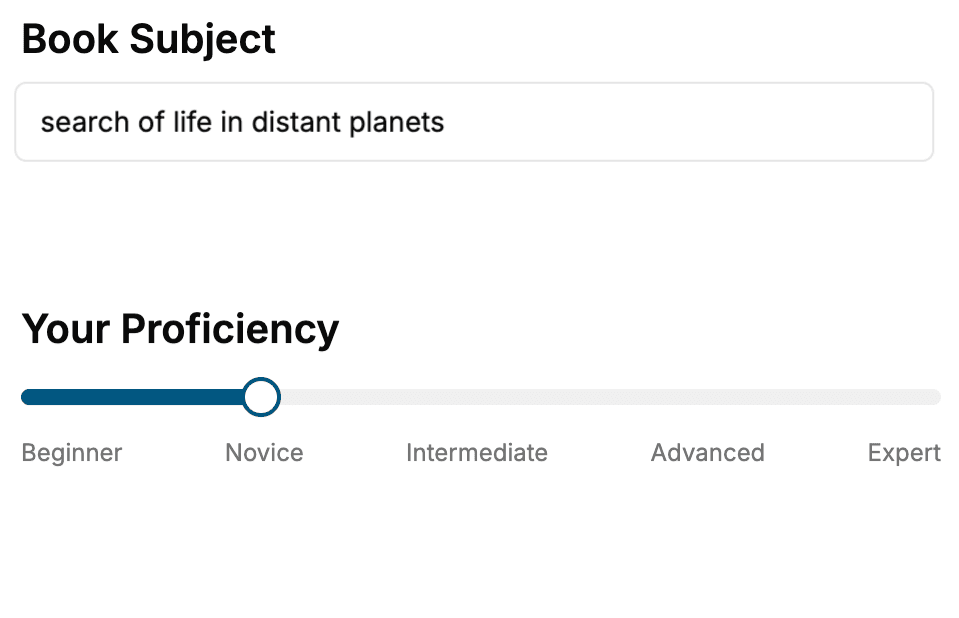
Select the focus of your Typography book and share your background
- 2. Personalize your book
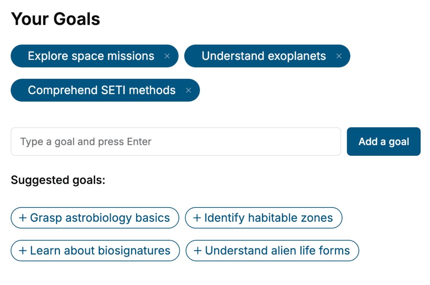
Specify your goals and choose sub-topics to include
- 3. Get your tailored book
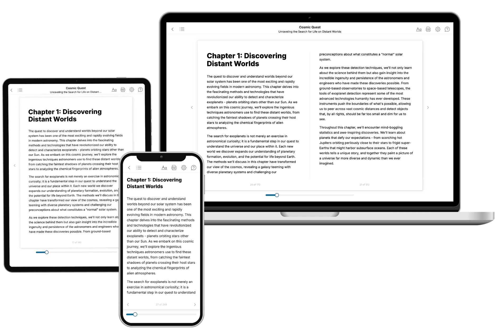
Your book is ready in 10 minutes. Read it online, download as EPUB or PDF, or send to Kindle.
Frequently asked questions
- What is TailoredRead?
TailoredRead creates complete, full-length nonfiction ebooks, written specifically for you. Tell us what you want to learn and why, and TailoredRead writes you a complete ebook on it, with charts, tables, and diagrams throughout. Read it online, on Kindle, or on any e-reader, or download it as a PDF or EPUB. Every book is written fresh the day you order it.
- How is the book tailored to me?
Before anything is written, you answer a few short questions about your goals, your background, and the topics you care about. Your book is then planned around your answers: written at your level, focused on your goals, and covering the topics you chose, instead of the one-size-fits-all book a store sells everyone.
- Will it read like generic AI content?
No. Your book isn't a chat transcript: it's planned chapter by chapter before a single word is written, told in a clear book voice, and explains ideas visually with charts, tables, and diagrams. After writing, every book goes through an editorial pass that polishes chapters so the book reads consistent from start to finish. Judge for yourself: browse thousands of sample books on our Explore Books page.
- How accurate is the content?
Our AI first checks whether your subject needs live research. Niche and fast-moving subjects are researched before writing, and the book plan and chapters are grounded in what it finds. After writing, every book goes through a quality pass that checks its facts and consistency, and researched books list their sources in a Notes section at the back.
- How long is the book?
You choose the length: Comprehensive (250-300 pages), Detailed (150-200 pages), Essential (70-100 pages), or Short (30-50 pages).
- Does the book include visuals?
Yes. Every book includes charts, tables, and diagrams: timelines, checklists, step-by-step guides, decision trees, comparison tables, matrices, and bar charts. A typical book includes dozens of these visual elements.
- Can I read it on Kindle? What formats can I download?
Yes. Every book can be read in our online reader or downloaded as a PDF or EPUB. The EPUB can be opened with Kindle, Apple Books, Kobo, and any e-reader. The Commercial and Author licenses also include an editable Word (DOCX) and Markdown download.
- How much does it cost?
About the price of a regular ebook. The exact price depends on your book's length and complexity, from $2 for the shortest books to $35 for the most comprehensive, and it's shown when you review your book, before you commit to anything. Each book is a one-time purchase, yours to keep, no subscription. Licenses that let you share, teach, or publish your book range from $35.99 to $49.99.
- Can I preview the book before purchasing?
Before you pay, you'll see what your book will cover: the title, a detailed description, the estimated length, and the complete chapter-by-chapter table of contents, so you know what you're getting before you decide. The full text itself is written after you purchase.
- How long does it take to create a book?
About 10 minutes. You can start reading the opening chapters while the rest is still being written.