Visual Hierarchy Mastery
The Complete Guide to Guiding Attention Through Strategic Typography
You'll transform your design work by learning to orchestrate typography as a system rather than treating individual type choices in isolation.
191 pages9 chaptersJun 30, 2026Typography
About this book
This guide reveals how the most effective designers use size, weight, color, spacing, and positioning to create invisible pathways that guide viewers through content naturally and intuitively. You'll discover why some designs feel effortless to read while others create visual chaos, and you'll gain practical frameworks for making hierarchy decisions that serve your specific audience and medium. Through real-world examples, common pitfalls, and actionable techniques, you'll develop the strategic thinking needed to create designs where every typographic choice reinforces your message and respects your viewer's cognitive capacity.
Table of contents
- IntroductionWhy Typographic Hierarchy Matters, What You'll Learn in This Book, How to Use This GuideRead below
- Chapter 1: Foundations of Typographic HierarchyDefining Typographic Hierarchy, How Hierarchy Reduces Cognitive Load, Hierarchy as Function, Not Decoration
- Chapter 2: The Core Tools of HierarchySize and Scale: The Primary Attention Driver, Weight and Contrast: Creating Visual Emphasis, Color as a Hierarchy Signal, Spacing and Proximity: Organizing Information
- Chapter 3: Building Hierarchy SystemsThe Integrated Approach: How Tools Work Together, Establishing a Typographic Scale, Creating Consistent Patterns Across Designs
- Chapter 4: Applying Hierarchy to Real ProjectsAnalyzing Your Content Structure, Mapping Information Importance, Making Strategic Hierarchy Decisions
- Chapter 5: Hierarchy Across Different MediumsTypographic Hierarchy in Print Design, Hierarchy for Web and Digital Interfaces, Adapting Hierarchy for Mobile Screens, Hierarchy in Environmental and Signage Design
- Chapter 6: Avoiding Common Hierarchy MistakesThe Problem with Too Many Font Sizes, Competing Visual Weights and Confusion, Spacing Errors That Break Hierarchy, Color Choices That Undermine Hierarchy
- Chapter 7: Hierarchy and AccessibilityDesigning Hierarchy for Everyone, Contrast, Readability, and Visual Processing, Semantic Structure and Screen Readers
- Chapter 8: Testing and Refining Your HierarchyTesting Hierarchy with Real Users, Understanding How Eyes Move Through Your Design, The Refinement Process
- Chapter 9: Advanced Hierarchy TechniquesCreating Subtle Hierarchy in Minimal Designs, Dynamic Hierarchy and Interactive Elements, When and How to Break Hierarchy Rules
- ConclusionMoving Forward with Hierarchy Thinking
- Further Resources and References
Introduction
Think about the last time you picked up a magazine, opened a website, or glanced at a poster and immediately knew exactly where to look first. You probably didn't stop to analyze why your eyes went there. You just looked, understood, and moved on. That effortless experience didn't happen by accident. Someone made a series of deliberate typographic decisions that quietly guided your attention from the most important information to the least important, in exactly the right order. That invisible architecture is typographic hierarchy, and it is one of the most powerful tools in any designer's toolkit.
Most designers learn about hierarchy early in their training, but learning about it and truly mastering it are two very different things. It's easy to understand the basic idea: make important things bigger, make less important things smaller. But real hierarchy is far more nuanced than that. It involves understanding how human perception works, how different typographic tools interact with each other, and how the medium you're designing for changes everything. When hierarchy is done well, nobody notices it. When it's done poorly, everyone feels it, even if they can't explain why the design feels confusing or exhausting to read.
This book exists because the gap between knowing hierarchy and applying it strategically is wider than most design resources acknowledge. There are plenty of books that explain what typographic hierarchy is. Far fewer explain how to think about it as a system, how to diagnose when it's failing, and how to make confident decisions across different mediums and content types. That's the gap this guide is designed to fill. Whether you're designing a long-form editorial layout, a mobile app interface, a brand identity system, or an environmental wayfinding sign, the principles here will give you a reliable framework for making hierarchy decisions that actually serve your audience.
The approach throughout this book is practical and grounded in real design work. Every concept is connected to concrete examples, common mistakes, and actionable techniques you can apply immediately. The goal isn't to give you a set of rigid rules to follow. It's to build your strategic thinking so that you can evaluate any design situation and make informed choices that reflect both the content's structure and your audience's needs. By the end, hierarchy won't feel like a checklist. It will feel like a natural part of how you see and think about design.
Why Typographic Hierarchy Matters
Every piece of communication you design asks something of the person receiving it. It asks for their time, their attention, and their cognitive effort. In a world where people are constantly bombarded with information, that ask is significant. Typographic hierarchy is the primary tool designers use to honor that ask by making information as easy to process as possible. When hierarchy is strong, viewers can scan a page in seconds and understand its structure before they've read a single word. That's not a small thing. That's the difference between a design that works and one that gets ignored.
Research in cognitive psychology consistently shows that humans are pattern-seeking creatures. When we encounter a visual field, our brains immediately begin sorting elements by perceived importance, grouping related items, and building a mental map of the content.[1] Typographic hierarchy works with this natural tendency rather than against it. When your type sizes, weights, and spacing align with the actual importance of your content, viewers process information faster and with less mental effort. When they don't align, viewers have to work harder to figure out what matters, and many simply won't bother.
Consider two versions of the same news article. In the first version, the headline, subheadline, byline, pull quote, and body text are all set in similar sizes with minimal contrast between them. In the second version, the headline is large and bold, the subheadline is medium weight and slightly smaller, the byline is small and light, and the body text is set at a comfortable reading size with clear spacing. Both versions contain identical words. But the second version communicates its structure instantly, while the first forces the reader to figure out where to start. That difference is entirely the result of typographic hierarchy, and it has a direct impact on whether people actually read the content.
Hierarchy also carries meaning beyond just organization. The visual weight you assign to different pieces of information signals their relative importance to the reader. When a call-to-action button on a website is visually dominant, it communicates that this action matters. When a warning label on a product uses high contrast and large type, it signals urgency. When a brand tagline is set in a delicate, refined typeface at a modest size, it suggests sophistication rather than aggression. These are all hierarchy decisions, and they shape how your audience feels about the content before they've consciously processed a single word.
The stakes are especially high in digital environments, where attention is scarce and competition is fierce. Studies on web reading behavior have consistently found that users scan rather than read, following predictable patterns across a page before deciding whether to engage more deeply.[2] A well-constructed typographic hierarchy works with these scanning patterns, placing the most critical information where eyes naturally land first. A poorly constructed hierarchy fights against those patterns, burying important content in visual noise and losing the reader before they've had a chance to engage.
Beyond communication effectiveness, hierarchy has a direct relationship with accessibility. Clear typographic structure helps people with visual impairments, cognitive differences, and reading challenges navigate content more successfully. It also provides the semantic scaffolding that screen readers and assistive technologies rely on to present content in a meaningful order. Designing strong hierarchy isn't just good design practice. It's a form of respect for the full range of people who will encounter your work. This connection between hierarchy and accessibility runs throughout this book, because the two are genuinely inseparable.
Finally, hierarchy matters because it reflects your credibility as a communicator. Designs with weak or inconsistent hierarchy feel amateurish, even to viewers who couldn't articulate why. Designs with strong, intentional hierarchy feel authoritative and trustworthy. When your typographic choices clearly reflect the structure of your content, you signal to your audience that you understand your material and respect their time. That signal builds trust, and trust is the foundation of effective communication in any medium.
What You'll Learn in This Book
This book is organized to take you from foundational understanding through to advanced application, building your knowledge in a logical sequence while giving you practical tools at every stage. Each chapter addresses a specific dimension of typographic hierarchy, and together they form a complete framework for thinking about and applying hierarchy strategically across any design project.
The first section of the book establishes the conceptual foundation. You'll explore what typographic hierarchy actually is at a functional level, how it connects to the way human brains process visual information, and why it should be understood as a functional tool rather than a decorative one. These foundational chapters are important even if you already have some hierarchy knowledge, because they reframe the concept in a way that makes every subsequent technique more meaningful and easier to apply.
From there, the book moves into the core tools of hierarchy. You'll get a thorough, practical understanding of how each major typographic variable contributes to hierarchy:
- Size and scale, which remain the most immediate and powerful attention drivers in any design
- Weight and contrast, which create emphasis and differentiate levels of importance within a single type size
- Color, which can reinforce or completely undermine hierarchy depending on how it's used
- Spacing and proximity, which organize information into meaningful groups and control the visual rhythm of a layout
Critically, you'll learn how these tools work together as an integrated system rather than as independent variables. One of the most common hierarchy mistakes is adjusting one element without considering how it affects the others. The systems-thinking chapter addresses this directly, giving you a framework for building typographic scales and consistent patterns that hold together across an entire design project.
The practical application chapters are where the conceptual and technical knowledge comes together. You'll learn how to analyze your content structure before making any type decisions, how to map information by importance, and how to translate that mapping into specific hierarchy choices. These chapters include concrete frameworks and step-by-step processes you can apply to your next project immediately.
Because hierarchy doesn't work the same way in every context, the book dedicates significant attention to medium-specific considerations. Print, web, mobile, and environmental design each present unique constraints and opportunities that fundamentally change how hierarchy should be approached. You'll come away with specific strategies for each medium rather than generic advice that doesn't account for real-world differences in viewing distance, screen size, and context.
The later chapters address some of the most valuable but often overlooked aspects of hierarchy work. The common mistakes chapter gives you a diagnostic toolkit for identifying and fixing the hierarchy problems that appear most frequently in real design work. The accessibility chapter makes the case for inclusive hierarchy and gives you practical techniques for designing type systems that work for everyone. The testing and refinement chapter shows you how to evaluate your hierarchy decisions with real users and iterate based on what you learn.
The book closes with advanced techniques for designers who want to push beyond the fundamentals. You'll explore how to create subtle hierarchy in minimal designs where the usual contrast tools are deliberately restrained, how dynamic and interactive elements change hierarchy in digital environments, and how to break hierarchy conventions intentionally and effectively when the creative situation calls for it. By the time you finish, you'll have both the principles and the practical skills to approach any typographic hierarchy challenge with confidence.
How to Use This Guide
This book is designed to be useful in multiple ways depending on where you are in your design practice and what you need right now. If you're working through it for the first time, reading it from beginning to end will give you the most complete and coherent understanding of typographic hierarchy as a system. The chapters build on each other deliberately, and concepts introduced early are expanded and applied in later sections. That sequential reading experience is the most valuable way to engage with the material if you have the time for it.
That said, the book is also structured to work as a reference you return to over time. Each chapter is self-contained enough that you can jump to a specific section when you're facing a particular challenge. If you're about to start a web design project and want to refresh your thinking on digital hierarchy, Chapter 5 is there for you. If you're troubleshooting a layout that feels visually chaotic, Chapter 6 on common mistakes will help you diagnose the problem quickly. The table of contents is detailed enough to help you find what you need without having to search through the whole book.
Throughout the book, you'll encounter several recurring elements designed to make the content more actionable:
- Concrete examples that illustrate each concept in a real design context, showing both what good hierarchy looks like and what common failure modes look like
- Frameworks and checklists that give you structured processes for making hierarchy decisions on actual projects
- Before-and-after scenarios that demonstrate how specific changes to typographic variables affect the overall hierarchy of a design
- Common pitfalls called out explicitly so you can recognize and avoid them in your own work
One of the most effective ways to use this book is to read a chapter and then immediately apply what you've learned to a current or recent project. Hierarchy is a skill that develops through practice, and the concepts here will become much more intuitive once you've worked with them in a real design context. Don't wait until you've finished the whole book to start experimenting. The sooner you start applying the ideas, the faster they'll become part of your natural design thinking.
It's also worth noting what this book assumes about your existing knowledge. It's written for designers and visual communicators who already have a foundational understanding of typography. You should be comfortable with basic type terminology (typeface, font, leading, tracking, kerning) and have some experience making typographic decisions in real projects. If you're completely new to typography, you'll benefit from building that foundation first. But if you've been working with type for a while and want to develop a more strategic, systematic approach to hierarchy, this book is written for you.
The examples and scenarios throughout the book draw from a wide range of design contexts, including editorial design, brand identity, web and app interfaces, packaging, and environmental signage. This breadth is intentional. The principles of typographic hierarchy are universal, but their application varies significantly across contexts. Seeing the same principles applied in different situations will help you develop the flexible, context-sensitive thinking that separates good hierarchy work from great hierarchy work.
Finally, approach this material with a spirit of experimentation rather than rule-following. Typographic hierarchy has principles, not laws. The goal of this book is to give you a deep enough understanding of those principles that you can apply them intelligently, adapt them to unusual situations, and occasionally break them with intention and skill. The best designers don't follow hierarchy rules mechanically. They understand why the rules exist, which gives them the freedom to work with them creatively. That's the kind of understanding this book is designed to build.
The most effective typographic hierarchy is the kind nobody notices. When it works, viewers simply understand your content quickly and easily. The craft is invisible, and that invisibility is the point.
By the time you reach the final chapter, the goal is for hierarchy to feel less like a set of techniques you apply and more like a lens through which you naturally see and evaluate design. That shift in perspective is what separates designers who know about hierarchy from designers who truly master it. Everything in this book is oriented toward helping you make that shift, one concept, one example, and one practical application at a time.
Notes
Introduction
- 1. W. Lidwell and others, Universal Principles of Design, Rockport Publishers, 2010
- 2. J. Nielsen, "F-Shaped Pattern For Reading Web Content," Nielsen Norman Group, 2006
This is the end of the free sample. The full book has 9 chapters.
Want this book written for you?
Tell us your goals and background, and get your own version of this book, tailored by AI to you.


Benefits of AI-tailored books
- Read one book, not ten:
- all the Typography knowledge you need, gathered into a single book.
- Save days of learning:
- tell us your goals, choose your topics, and the whole book is built around them.
- Learn effortlessly:
- Typography book written for your specific background and expertise.
- Understand at a glance:
- includes charts, tables, timelines, checklists, decision trees, and more.
- Stay current:
- written the day you order it, not years ago.
- Trust what you read:
- every book is checked for accuracy, with real research when your subject needs it.
Create your unique book in 3 steps
- 1. Select your focus
Select the focus of your Typography book and share your background
- 2. Personalize your book
Specify your goals and choose sub-topics to include
- 3. Get your tailored book
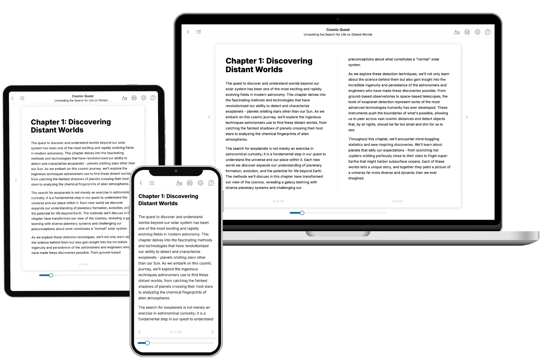
Your book is ready in 10 minutes. Read it online, download as EPUB or PDF, or send to Kindle.
Frequently asked questions
- What is TailoredRead?
TailoredRead creates complete, full-length nonfiction ebooks, written specifically for you. Tell us what you want to learn and why, and TailoredRead writes you a complete ebook on it, with charts, tables, and diagrams throughout. Read it online, on Kindle, or on any e-reader, or download it as a PDF or EPUB. Every book is written fresh the day you order it.
- How is the book tailored to me?
Before anything is written, you answer a few short questions about your goals, your background, and the topics you care about. Your book is then planned around your answers: written at your level, focused on your goals, and covering the topics you chose, instead of the one-size-fits-all book a store sells everyone.
- Will it read like generic AI content?
No. Your book isn't a chat transcript: it's planned chapter by chapter before a single word is written, told in a clear book voice, and explains ideas visually with charts, tables, and diagrams. After writing, every book goes through an editorial pass that polishes chapters so the book reads consistent from start to finish. Judge for yourself: browse thousands of sample books on our Explore Books page.
- How accurate is the content?
Our AI first checks whether your subject needs live research. Niche and fast-moving subjects are researched before writing, and the book plan and chapters are grounded in what it finds. After writing, every book goes through a quality pass that checks its facts and consistency, and researched books list their sources in a Notes section at the back.
- How long is the book?
You choose the length: Comprehensive (250-300 pages), Detailed (150-200 pages), Essential (70-100 pages), or Short (30-50 pages).
- Does the book include visuals?
Yes. Every book includes charts, tables, and diagrams: timelines, checklists, step-by-step guides, decision trees, comparison tables, matrices, and bar charts. A typical book includes dozens of these visual elements.
- Can I read it on Kindle? What formats can I download?
Yes. Every book can be read in our online reader or downloaded as a PDF or EPUB. The EPUB can be opened with Kindle, Apple Books, Kobo, and any e-reader. The Commercial and Author licenses also include an editable Word (DOCX) and Markdown download.
- How much does it cost?
About the price of a regular ebook. The exact price depends on your book's length and complexity, from $2 for the shortest books to $35 for the most comprehensive, and it's shown when you review your book, before you commit to anything. Each book is a one-time purchase, yours to keep, no subscription. Licenses that let you share, teach, or publish your book range from $35.99 to $49.99.
- Can I preview the book before purchasing?
Before you pay, you'll see what your book will cover: the title, a detailed description, the estimated length, and the complete chapter-by-chapter table of contents, so you know what you're getting before you decide. The full text itself is written after you purchase.
- How long does it take to create a book?
About 10 minutes. You can start reading the opening chapters while the rest is still being written.