The Visual Mind
Master Color, Composition, and Perception to Design with Purpose
What if the designs you create could influence how people think and feel before they even consciously register what they're looking at?
207 pages11 chaptersMar 15, 2026Graphic DesignCreated by Roland
About this book
The truth is, visual perception isn't passive—it's an active psychological process shaped by color, contrast, composition, and spatial relationships. This book reveals the science behind why certain designs work while others fall flat, and more importantly, how to apply these principles intentionally. You'll discover how color psychology triggers emotional responses, how visual hierarchy controls attention flow, and how contrast creates emphasis that commands focus. Learn the spatial perception techniques that create depth and clarity, master composition methods that feel balanced and intentional, and understand the eye-tracking patterns that reveal how viewers actually navigate your designs. Whether you're designing digital interfaces, marketing materials, or visual communications, these principles transform you from someone who makes designs to someone who architects experiences. This is practical psychology applied to visual communication—the missing link between intuition and mastery.
Table of contents
- IntroductionWhy Perception Matters in Design, How Your Brain Actually Sees, The Psychology of Visual CommunicationRead below
- Chapter 1: Color Psychology and Emotional ResponseThe Color-Emotion Connection, Cultural Variations in Color Meaning, Applying Color Psychology to Your Designs
- Chapter 2: Chromatic Contrast and Visual ImpactThe Fundamentals of Chromatic Contrast, Advanced Contrast Techniques, Using Contrast to Create Emphasis
- Chapter 3: Visual Hierarchy and Attention FlowCore Principles of Visual Hierarchy, Size, Scale, and Visual Dominance, Implementing Hierarchy in Practice
- Chapter 4: Composition and Balance MethodsSymmetrical, Asymmetrical, and Radial Balance, Understanding Visual Weight Distribution, Composition Frameworks and Grid Systems
- Chapter 5: Emphasis Through Contrast and IsolationTypes of Contrast: Color, Value, Texture, and Form, Isolation and Negative Space Techniques, Strategic Emphasis in Complex Designs
- Chapter 6: Color Harmony Systems and RelationshipsThe Color Wheel and Harmonic Relationships, Complementary, Analogous, and Triadic Schemes, Applying Harmony Systems to Real Projects
- Chapter 7: Spatial Depth and Foreground-Background SeparationDepth Cues and Perspective Techniques, Creating Clear Foreground-Background Relationships, Layering and Creating Visual Depth
- Chapter 8: Proportion, Golden Ratio, and Visual HarmonyUnderstanding the Golden Ratio, Proportion Principles and Visual Harmony, Applying Ratio and Proportion to Layouts
- Chapter 9: Eye Tracking and Attention DirectionNatural Eye Movement Patterns, Techniques for Directing Viewer Attention, Cultural Reading Patterns and Design Implications
- Chapter 10: Texture Perception and Tactile PsychologyThe Psychology of Texture and Material, Creating Texture in Digital and Print Design, Using Texture to Convey Meaning and Emotion
- Chapter 11: Visual Storytelling and Narrative DesignPrinciples of Visual Narrative, Creating Sequence and Visual Flow, Crafting Compelling Visual Stories
- ConclusionIntegrating All Principles into Cohesive Design, Your Path Forward in Visual Design
Introduction
Every design you've ever admired did something to you before you understood why. A poster stopped you mid-stride. A website made you feel calm or urgent. A logo felt trustworthy or cheap within a fraction of a second. None of that happened by accident. Behind every effective visual is a set of psychological and perceptual principles working quietly beneath the surface, shaping how you feel, what you notice, and what you do next. This book is about making those invisible forces visible so you can use them deliberately.
Most designers learn the tools first: software, color pickers, grid systems, typography. Those are important, but they're instruments without a theory of music behind them. You can know every feature in a design application and still produce work that feels flat, confusing, or forgettable. What separates designers who consistently create compelling work from those who struggle isn't talent or taste alone. It's understanding how human perception actually works and designing with that knowledge as a foundation.
This book is built around a single core idea: design is not about what you put on a screen or page, it's about what happens inside the viewer's mind when they encounter it. Color triggers emotional responses before conscious thought kicks in. Composition guides the eye along a path you control. Contrast creates emphasis that commands attention. Proportion creates harmony that feels intuitively right. These aren't abstract concepts. They're measurable, repeatable, and learnable. And once you understand them, you'll never look at a design the same way again.
The chapters ahead move through the major perceptual and psychological systems that govern visual communication. You'll explore color psychology, contrast, visual hierarchy, composition, spatial depth, proportion, eye tracking, texture, and visual storytelling. Each chapter builds on the last, but each also stands on its own as a practical reference. Whether you're designing a mobile app, a brand identity, a marketing campaign, or an editorial layout, the principles here apply across every medium and context.
Before diving into those chapters, this introduction lays the groundwork. It explains why perception matters so much in design, how the brain actually processes visual information, and what psychology has to do with the choices you make as a visual communicator. Think of this as the foundation beneath everything else. The more clearly you understand how seeing works, the more intentional and effective your design decisions become.
Why Perception Matters in Design
Design is often described as problem-solving, and that's accurate. But the problem being solved is almost always a human one. How do you get someone to notice something? How do you make them feel safe enough to trust a brand? How do you guide them through a complex interface without confusion? Every one of those questions is fundamentally about perception. If you don't understand how people perceive visual information, you're solving the wrong problem or solving the right one blindly.
Consider what happens in the first few seconds someone encounters your design. Research in visual cognition suggests that people form initial impressions of a visual stimulus in as little as 50 milliseconds.[1] That's faster than a conscious thought can form. In that tiny window, the brain is already making judgments about trustworthiness, quality, and relevance based entirely on visual signals. Color, layout, contrast, and proportion are all being processed simultaneously, and a verdict is being reached before the viewer has read a single word.
This has enormous practical implications. It means that the emotional tone of your design, the sense of order or chaos, warmth or coldness, energy or calm, is communicated through visual structure alone. A cluttered layout signals unreliability even if the content is excellent. A poorly chosen color palette can undermine a message that the copy works hard to deliver. Perception isn't a secondary concern in design. It's the primary channel through which your design communicates.
Perception also shapes behavior. In user experience design, this is well-documented. Studies on call-to-action buttons, for example, consistently show that color, size, and placement affect click-through rates significantly. A button that contrasts strongly with its background gets clicked more often than one that blends in, regardless of what the button says.[2] That's not a copywriting result. It's a perception result. The visual signal is doing the work.
Beyond individual elements, perception governs how viewers experience a design as a whole. The sequence in which they notice things, the relationships they perceive between elements, the sense of balance or tension they feel, all of this is shaped by perceptual principles that operate consistently across human beings. There are cultural variations, which this book addresses, but the underlying perceptual machinery is largely universal. That universality is what makes these principles so powerful and so worth learning.
Understanding perception also makes you a better collaborator and communicator. When you can explain why a design works in terms of how it affects the viewer's eye and brain, you move beyond subjective taste debates. Instead of saying "this feels off," you can say "the visual weight is unbalanced here, which creates tension that works against the calm tone we're trying to establish." That kind of precision transforms design conversations and makes your decisions defensible, not just intuitive.
A practical example: Imagine two versions of a nonprofit donation page. Version A uses a muted gray background, small text, and a donate button that matches the surrounding color scheme. Version B uses a warm white background, clear typographic hierarchy, and a high-contrast orange button placed in the upper right. Both pages have identical copy. Version B will almost certainly outperform Version A, not because of the words, but because of how perception guides attention and creates urgency. The design is doing the persuasion.
The goal of this book is to give you the vocabulary, frameworks, and practical tools to make those kinds of decisions consciously. Not every design choice needs to be agonized over, but the major ones, the ones that determine whether your design communicates or confuses, should be grounded in an understanding of how perception works. That understanding starts with knowing what's actually happening inside the brain when someone looks at your work.
How Your Brain Actually Sees
Most people think of seeing as a passive process, like a camera recording what's in front of it. But vision is nothing like that. The brain doesn't receive a complete, accurate image of the world. It receives fragmented signals from the eyes and actively constructs a visual experience from those signals, filling in gaps, making assumptions, and prioritizing certain information over other information. Seeing is an act of interpretation, not recording.
The process begins in the retina, where photoreceptor cells called rods and cones convert light into electrical signals. Cones, concentrated in the central area of the retina called the fovea, handle color and fine detail. Rods, spread across the peripheral retina, handle low-light and motion detection. The fovea covers only about two degrees of your visual field, which means sharp, detailed vision is actually quite narrow.[3] Everything outside that small central zone is processed at lower resolution. Your brain compensates by moving your eyes rapidly in small jumps called saccades, stitching together a coherent picture from multiple fixation points.
This has direct design implications. Because detailed vision is limited to a small area at any moment, viewers don't see your entire design at once. They scan it in a sequence of fixations, and what they fixate on first is determined by visual salience: which elements are most visually distinct from their surroundings. High contrast, large size, bright color, and unusual shape all increase salience. This is why understanding visual hierarchy is so critical. You're essentially choreographing a sequence of fixations.
Beyond the mechanics of the eye, the brain applies a set of organizing principles to make sense of visual input. These were first systematically described by Gestalt psychologists in the early twentieth century, and they remain foundational to design theory today. The core Gestalt principles include:
- Proximity: Elements that are close together are perceived as belonging to the same group.
- Similarity: Elements that share visual characteristics (color, shape, size) are perceived as related.
- Continuity: The eye follows lines and curves, preferring smooth paths over abrupt changes.
- Closure: The brain completes incomplete shapes, filling in missing information to perceive a whole.
- Figure-Ground: The brain separates visual scenes into a foreground subject and a background, though this relationship can be ambiguous.
- Common Fate: Elements that move or change together are perceived as a group.
These principles aren't design conventions. They're descriptions of how the brain automatically organizes visual information. When your design works with these principles, it feels intuitive and easy to process. When it works against them, viewers experience confusion or cognitive friction, even if they can't articulate why. A navigation menu where items are spaced inconsistently, for example, violates proximity and makes groupings unclear. The viewer has to work harder to understand the structure, and that extra effort erodes trust and engagement.
Color perception adds another layer of complexity. The brain doesn't perceive color as an absolute property of objects. It perceives color relative to surrounding colors, a phenomenon called simultaneous contrast. The same gray square looks darker on a white background and lighter on a black background. The same orange looks more vibrant next to blue than next to red. This means that color choices can never be evaluated in isolation. Every color in your design is being perceived in relation to every other color around it, and that relationship changes the experience of each individual color.
The brain also processes visual information in two distinct streams, often described as the "what" pathway and the "where" pathway.[4] The "what" pathway (ventral stream) handles object recognition and identity. The "where" pathway (dorsal stream) handles spatial location and movement. Both are active simultaneously when viewing a design, which is why spatial arrangement and object identity are both important. A beautifully designed element placed in the wrong spatial position will still feel wrong, because the brain is processing both what it is and where it is at the same time.
Understanding these mechanisms doesn't require a neuroscience degree. What it requires is a shift in perspective: from thinking about what you're putting into a design to thinking about what the brain will do with it. Every design decision you make is, at its core, a prediction about how a viewer's perceptual system will respond. The more accurate your predictions, the more effective your designs become.
The Psychology of Visual Communication
Perception tells you how the brain processes visual input. Psychology tells you what that processing means for how people feel, think, and behave. Visual communication sits at the intersection of both. When you design something, you're not just arranging pixels or ink. You're creating a psychological experience. The colors, shapes, proportions, and spatial relationships in your design all carry psychological weight, and that weight influences the viewer's emotional state, their level of trust, their sense of urgency, and their willingness to engage.
One of the most well-established areas of visual psychology is the study of color and emotion. Different colors reliably trigger different emotional associations, though these associations are shaped by both biology and culture. Red, for example, is associated with urgency, danger, and passion across many cultures, partly because of its biological salience (blood, fire, ripe fruit) and partly because of learned cultural associations. Blue is widely associated with calm, trust, and reliability, which is why it dominates financial and healthcare branding. These aren't arbitrary conventions. They're patterns that emerge from how the human nervous system responds to color stimuli.[5]
Shape psychology is equally powerful and often underappreciated. Research consistently shows that people associate rounded shapes with softness, safety, and approachability, while angular shapes are associated with energy, tension, and precision. This is why children's brands and healthcare products often use rounded letterforms and soft shapes, while technology and sports brands frequently use sharp angles and geometric forms. The shape language of your design communicates personality and intent before any content is read.
Visual communication also operates through the psychology of attention. Human attention is selective and limited. The brain cannot process everything in a visual field simultaneously, so it prioritizes. Designers who understand this use visual hierarchy to control that prioritization, ensuring that the most important information receives attention first. This is not manipulation in a negative sense. It's guidance. A well-designed hierarchy respects the viewer's cognitive limits and makes their experience easier, not harder.
There's also the psychology of trust and credibility, which is deeply tied to visual quality signals. Studies on web credibility have found that visual design is the most common reason people cite for distrusting a website, outranking concerns about content accuracy.[6] Poor alignment, inconsistent spacing, clashing colors, and low-contrast text all signal carelessness, and carelessness signals untrustworthiness. Conversely, clean layouts, consistent visual language, and thoughtful typography signal professionalism and reliability. The psychology of credibility is largely a visual phenomenon.
Cognitive load is another psychological concept with major design implications. Cognitive load refers to the mental effort required to process information. When a design is visually complex, inconsistent, or poorly organized, it increases cognitive load. Viewers have to work harder to extract meaning, and that effort is experienced as discomfort. High cognitive load reduces comprehension, increases frustration, and drives people away. Reducing cognitive load through clear hierarchy, consistent visual patterns, and strategic use of white space is one of the most impactful things a designer can do.
A real-world example: Apple's product pages are a masterclass in cognitive load management. Each page introduces one idea at a time, uses generous white space to isolate key elements, and employs a clear typographic hierarchy that guides the eye from headline to supporting detail to call to action. The result is a page that feels effortless to navigate, even though it contains substantial information. That effortlessness is engineered through psychological principles, not just aesthetic preference.
The psychology of visual storytelling adds yet another dimension. Humans are narrative creatures. The brain is wired to seek patterns, causality, and story in everything it encounters. When a design has a clear visual flow, a sense of beginning, middle, and end, it satisfies this narrative drive. When it doesn't, the viewer feels disoriented. This is why the sequence in which elements are encountered matters as much as the elements themselves. A design that tells a story, even a simple one, is more engaging and more memorable than one that presents information without a narrative arc.
Finally, there's the psychology of meaning-making through visual metaphor and association. Designers constantly use visual elements to evoke concepts that aren't literally depicted. A photograph of open sky suggests freedom. A tight, dense grid suggests order and precision. Rough, hand-drawn textures suggest authenticity and craft. These associations work because the brain maps visual experiences onto conceptual frameworks built from lived experience. Understanding which visual elements map to which concepts gives you a powerful toolkit for communicating meaning beyond the literal.
Taken together, these psychological dimensions of visual communication explain why design is so much more than decoration. Every visual choice you make is a psychological act. It shapes how viewers feel, what they believe, what they remember, and what they do. The chapters ahead give you the specific tools to make those choices with precision and intention. But the foundation beneath all of it is this: design is psychology made visible, and the more deeply you understand that, the more powerful your work becomes.
Here's a quick summary of the psychological forces at work in every design you create:
- Emotional response: Color, shape, and texture trigger feelings before conscious thought engages.
- Attention and priority: Visual hierarchy controls what viewers notice first, second, and third.
- Trust and credibility: Visual quality signals competence and reliability at a glance.
- Cognitive load: Clarity and organization reduce mental effort and increase engagement.
- Narrative drive: Visual flow satisfies the brain's need for sequence and story.
- Meaning-making: Visual metaphors and associations communicate concepts beyond literal content.
Each of these forces is explored in depth throughout this book. As you move through the chapters, you'll find that they're not separate topics but interconnected systems. Color affects hierarchy. Hierarchy affects cognitive load. Cognitive load affects trust. Trust affects behavior. Understanding how these systems interact is what transforms a competent designer into a truly effective one. That's the journey this book is designed to take you on, and it starts right now.
Notes
Introduction
- 1. G. Lindgaard and others, "Attention web designers," Behaviour & Information Technology, 2006
- 2. Hubspot Research, The Button Color A/B Test: Red Beats Green, HubSpot Blog, 2012
- 3. B. A. Wandell, Foundations of Vision, Sinauer Associates, 1995
- 4. M. A. Goodale and A. D. Milner, "Separate visual pathways for perception and action," Trends in Neurosciences, 1992
- 5. A. J. Elliot and M. A. Maier, "Color psychology: Effects of perceiving color on psychological functioning in humans," Annual Review of Psychology, 2014
- 6. B. J. Fogg and others, "How do users evaluate the credibility of Web sites?," A study with over 2,500 participants. Proceedings of the 2003 Conference on Designing for User Experiences, 2003
This is the end of the free sample. The full book has 11 chapters.
Want this book written for you?
Tell us your goals and background, and get your own version of this book, tailored by AI to you.


Benefits of AI-tailored books
- Read one book, not ten:
- all the Graphic Design knowledge you need, gathered into a single book.
- Save days of learning:
- tell us your goals, choose your topics, and the whole book is built around them.
- Learn effortlessly:
- Graphic Design book written for your specific background and expertise.
- Understand at a glance:
- includes charts, tables, timelines, checklists, decision trees, and more.
- Stay current:
- written the day you order it, not years ago.
- Trust what you read:
- every book is checked for accuracy, with real research when your subject needs it.
Create your unique book in 3 steps
- 1. Select your focus
Select the focus of your Graphic Design book and share your background
- 2. Personalize your book
Specify your goals and choose sub-topics to include
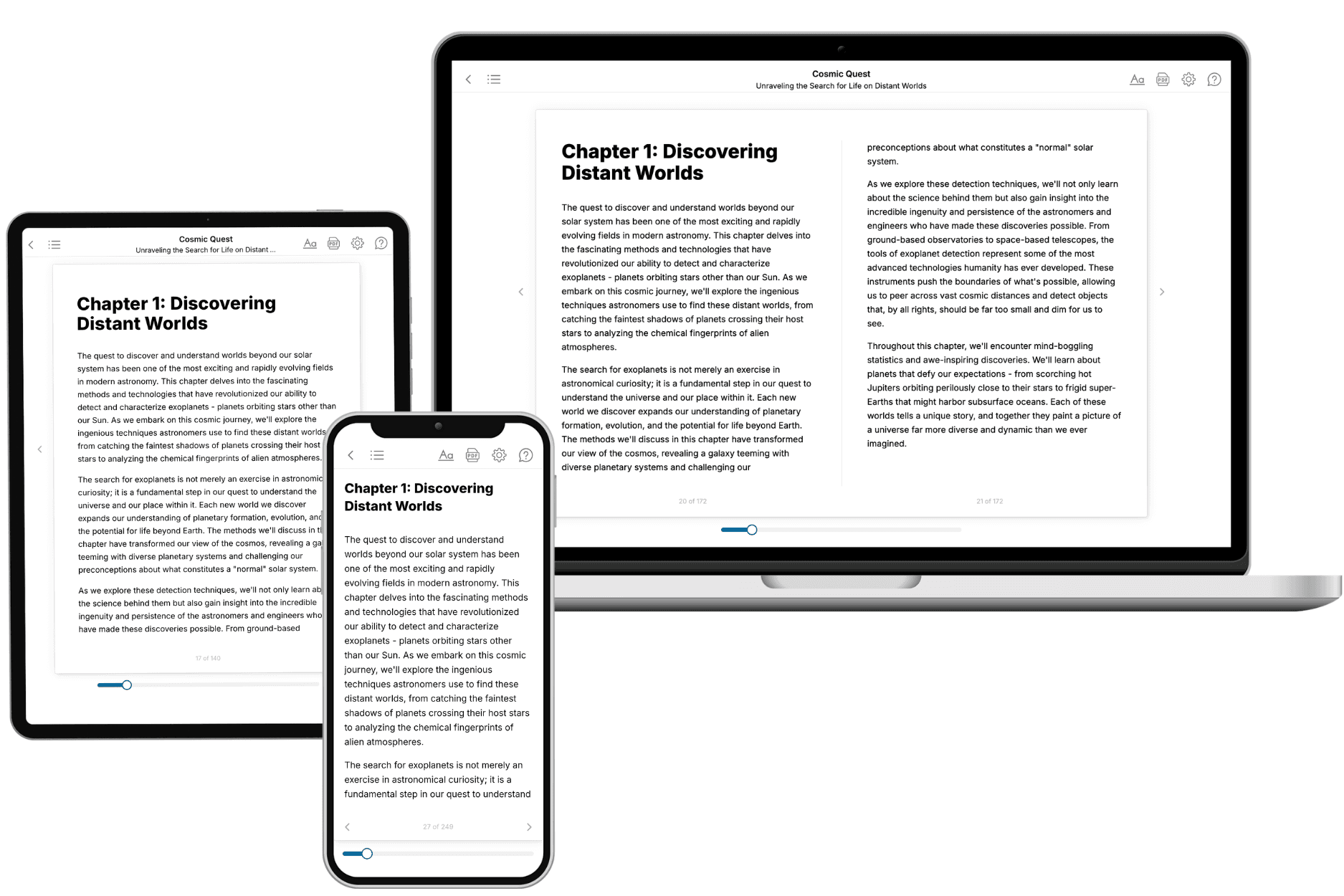
- 3. Get your tailored book
Your book is ready in 10 minutes. Read it online, download as EPUB or PDF, or send to Kindle.
Frequently asked questions
- What is TailoredRead?
TailoredRead creates complete, full-length nonfiction ebooks, written specifically for you. Tell us what you want to learn and why, and TailoredRead writes you a complete ebook on it, with charts, tables, and diagrams throughout. Read it online, on Kindle, or on any e-reader, or download it as a PDF or EPUB. Every book is written fresh the day you order it.
- How is the book tailored to me?
Before anything is written, you answer a few short questions about your goals, your background, and the topics you care about. Your book is then planned around your answers: written at your level, focused on your goals, and covering the topics you chose, instead of the one-size-fits-all book a store sells everyone.
- Will it read like generic AI content?
No. Your book isn't a chat transcript: it's planned chapter by chapter before a single word is written, told in a clear book voice, and explains ideas visually with charts, tables, and diagrams. After writing, every book goes through an editorial pass that polishes chapters so the book reads consistent from start to finish. Judge for yourself: browse thousands of sample books on our Explore Books page.
- How accurate is the content?
Our AI first checks whether your subject needs live research. Niche and fast-moving subjects are researched before writing, and the book plan and chapters are grounded in what it finds. After writing, every book goes through a quality pass that checks its facts and consistency, and researched books list their sources in a Notes section at the back.
- How long is the book?
You choose the length: Comprehensive (250-300 pages), Detailed (150-200 pages), Essential (70-100 pages), or Short (30-50 pages).
- Does the book include visuals?
Yes. Every book includes visual elements such as timelines, checklists, step-by-step guides, decision trees, comparison tables, and matrices, and many include bar charts. A typical book includes dozens of these visual elements.
- Can I read it on Kindle? What formats can I download?
Yes. Every book can be read in our online reader or downloaded as a PDF or EPUB. The EPUB can be opened with Kindle, Apple Books, Kobo, and any e-reader. The Commercial and Author licenses also include an editable Word (DOCX) and Markdown download.
- How much does it cost?
About the price of a regular ebook. The exact price depends on your book's length and complexity, from $2 for the shortest books to $35 for the most comprehensive, and it's shown when you review your book, before you commit to anything. Each book is a one-time purchase, yours to keep, no subscription. Licenses that let you share, teach, or publish your book range from $35.99 to $49.99.
- Can I preview the book before purchasing?
Before you pay, you'll see what your book will cover: the title, a detailed description, the estimated length, and the complete chapter-by-chapter table of contents, so you know what you're getting before you decide. The full text itself is written after you purchase.
- How long does it take to create a book?
About 10 minutes. You can start reading the opening chapters while the rest is still being written.