Visual Storytelling for Impact
Master the Art of Compelling Presentations Through Strategic Visual Design
You're about to discover how strategic visual design transforms ordinary presentations into persuasive experiences that stick with your audience long after you've finished speaking.
207 pages10 chaptersMay 5, 2026Presentation
About this book
This book walks you through the psychology of visual communication, showing you exactly why certain design choices work while others sabotage your message. You'll learn the foundational principles of visual hierarchy, color theory, and typography—not as abstract concepts, but as practical tools you can apply immediately to your next presentation. Whether you're selling a product, pitching an idea, or educating a room full of stakeholders, you'll find actionable frameworks for designing slides that clarify rather than confuse, persuade rather than distract. The book covers real-world scenarios: how to visualize data without overwhelming your audience, how to choose images that reinforce your message, and how to adapt your visuals for different platforms and contexts. By the end, you'll have a complete system for creating presentations that command attention and drive results.
Table of contents
- IntroductionWhy Visuals Matter More Than You Think, The Modern Presentation Landscape, What You'll Learn in This Book, How to Use This Book for Maximum ImpactRead below
- Chapter 1: The Psychology of Visual CommunicationHow Brains Process Visual Information, Cognitive Load and Information Retention, The Science of Visual Persuasion
- Chapter 2: Foundational Design PrinciplesVisual Hierarchy: Guiding the Eye, Balance, Alignment, and Whitespace, Contrast and Emphasis Techniques
- Chapter 3: Color Strategy and PsychologyColor Theory Basics for Presentations, Color Psychology and Emotional Response, Accessible Color Palettes and Contrast
- Chapter 4: Typography That Commands AttentionChoosing Fonts That Reinforce Your Message, Readability, Size, and Visual Hierarchy, Common Typography Mistakes to Avoid
- Chapter 5: Visualizing Data Without OverwhelmingChoosing the Right Chart for Your Data, Simplifying Complex Data, Storytelling With Numbers and Visuals
- Chapter 6: Images, Icons, and Visual ElementsSelecting Images That Reinforce Your Message, Using Icons and Infographics Effectively, Maintaining Visual Consistency Across Slides
- Chapter 7: Designing for Different Presentation ContextsBoardroom and Executive Presentations, Sales Presentations and Pitches, Webinars, Virtual Meetings, and Online Presentations, Conference and Large Audience Presentations
- Chapter 8: Building Your Presentation SystemCreating Brand Guidelines for Consistency, Building Templates for Speed and Consistency, Tools and Software for Professional Design
- Chapter 9: Avoiding Common Presentation PitfallsThe Clutter Trap: When Less Really Is More, Animation and Transitions: Enhancing or Distracting?, Credibility Killers: Design Mistakes That Undermine Authority
- Chapter 10: Accessibility and Inclusive DesignDesigning for Color Blindness and Vision Differences, Font Size, Contrast, and Readability Standards, Inclusive Design Practices for All Audiences
- ConclusionYour Next Steps: From Theory to Practice, Continuous Improvement and Feedback
- Appendix: Quick Reference GuidesPre-Presentation Design Checklist, Recommended Color Palettes by Industry, Tools, Templates, and Resources
Introduction
Think about the last presentation you sat through. Not the one that changed how you thought about something, but the forgettable one. The slides were packed with bullet points. The fonts were inconsistent. The charts were hard to read. The speaker read directly from the screen. You probably checked your phone at least once. Now think about why that happened. It wasn't because the content was bad. It was because the visuals failed to do their job. When design works against a message instead of for it, even the best ideas get lost.
This book exists because that problem is fixable. Visual design in presentations isn't a talent reserved for graphic designers or creative professionals. It's a learnable skill built on clear principles that anyone can apply. The gap between a forgettable presentation and a compelling one usually comes down to a handful of deliberate choices: how information is organized on a slide, which colors signal trust or urgency, how much space is left empty on purpose, and whether the visuals guide the audience's attention or scatter it. These aren't artistic decisions. They're strategic ones.
You're reading this because you already present regularly and you want those presentations to do more. Maybe you've noticed that your slides feel cluttered but you're not sure how to fix them. Maybe you've watched a polished speaker and wondered what made their deck feel so effortless. Maybe you've lost a pitch or failed to move a room and suspected the visuals played a role. Whatever brought you here, the goal is the same: to give you a practical, grounded system for designing presentations that actually work. Not just look good, but work. That means capturing attention, reducing confusion, building credibility, and moving people toward action.
What follows is a structured journey through the principles and practices of visual storytelling. Each chapter builds on the last, moving from the psychology behind why visuals work, through the mechanics of design, and into the real-world contexts where you'll apply everything you've learned. By the time you finish, you'll have a complete toolkit for transforming how you communicate visually, whether you're presenting to three executives in a boardroom or three hundred attendees at a conference.
Why Visuals Matter More Than You Think
Most people treat slides as a support act. The real show, they assume, is the speaker. The slides are just there to give the audience something to look at. This assumption is one of the most common and costly mistakes in professional communication. Visuals aren't decoration. They're a primary channel through which your audience receives, processes, and retains information. When that channel is poorly designed, it doesn't just fail to help. It actively works against you.
The human brain processes visual information roughly 60,000 times faster than text.[1] That's not a small difference. It means that before you've finished your first sentence, your audience has already formed an impression of your slide. They've registered the colors, the layout, the density of information, and whether the whole thing feels trustworthy or chaotic. That first impression shapes how they receive everything that follows. A cluttered slide signals disorganization. A clean, well-structured slide signals competence and clarity.
Research on the "picture superiority effect" consistently shows that people remember images far better than words alone. When information is presented as text only, people recall about 10% of it three days later. Add a relevant image, and that retention rate jumps to around 65%.[2] That's not a marginal improvement. That's the difference between your audience walking away with your key message intact versus walking away with almost nothing. For anyone who presents to drive decisions or change behavior, that gap matters enormously.
Consider a concrete example. A sales team at a mid-sized software company redesigned their pitch deck, replacing text-heavy slides with visual frameworks, simplified data charts, and a consistent color system. Their close rate on initial demos improved by 23% over the following quarter. The product hadn't changed. The pricing hadn't changed. The sales team hadn't changed. The only variable was how the information was presented visually. That kind of result isn't unusual. It reflects a well-documented reality: how you show information shapes how people respond to it.
Visuals also carry emotional weight that words alone struggle to convey. A photograph of a real customer using your product creates a different response than a bullet point describing customer satisfaction. A bold, high-contrast chart showing growth creates a different feeling than a table of numbers. Emotion isn't separate from persuasion. It's central to it. Research in behavioral economics and neuroscience consistently shows that people make decisions emotionally and justify them rationally afterward.[3] Visuals are your fastest path to that emotional layer.
None of this means that content doesn't matter. It absolutely does. But content without effective visual presentation is like a great argument delivered in a monotone whisper. The substance is there, but the delivery undermines it. Strong visuals amplify strong content. They make complex ideas easier to grasp, important points harder to forget, and your overall message more persuasive. That's not a nice-to-have. For anyone who presents professionally, it's essential.
The core principle: Visuals are cognitive tools, not decorative elements. Every design choice you make either helps your audience understand and remember your message, or it gets in the way. There is no neutral ground.
The Modern Presentation Landscape
The way people present has changed dramatically over the past decade, and the pace of that change has accelerated. Not long ago, a presentation meant standing in front of a room with a projector. Today, you might deliver the same content in a boardroom, on a video call, as a shared PDF, or as a recorded walkthrough. Each of those contexts has different visual requirements. A slide designed for a large conference screen often looks completely different when viewed on a laptop during a Zoom call. What works in one setting can fail badly in another.
Remote and hybrid work has made this complexity the norm rather than the exception. According to a 2023 survey by Prezi, 79% of professionals now present in virtual or hybrid environments at least some of the time.[4] That shift has real implications for visual design. On a video call, your slides compete with everything else on your audience's screen. Notifications, email, other browser tabs. The visual bar for capturing and holding attention is higher than it's ever been. Slides that might have been passable in a conference room become invisible noise in a virtual setting.
At the same time, audiences have become more visually sophisticated. Years of exposure to high-quality design in apps, websites, social media, and streaming content have raised expectations. People may not be able to articulate exactly why a slide looks unprofessional, but they feel it immediately. Misaligned text, clashing colors, inconsistent fonts, and low-resolution images all register as signals of low effort or low competence, even when the underlying content is strong. The visual standard your audience holds you to is shaped by everything they see every day, not just other presentations.
The tools available for creating presentations have also expanded significantly. Beyond PowerPoint and Keynote, professionals now use Canva, Google Slides, Figma, Beautiful.ai, and a growing range of AI-assisted design platforms. These tools have lowered the barrier to creating visually polished slides. But access to better tools doesn't automatically produce better design. Without understanding the principles behind effective visual communication, even the most sophisticated software produces cluttered, confusing slides. Tools amplify your decisions. They don't make the decisions for you.
There's also a growing recognition that presentations are often consumed without the presenter present. Slide decks get forwarded, shared in Slack channels, posted to internal wikis, and reviewed asynchronously. When your slides have to stand alone without your voice to guide them, the visual design carries even more weight. Every slide needs to communicate clearly on its own. That requires a different kind of intentionality than designing slides purely as speaker notes projected on a screen.
Understanding this landscape matters because it shapes every design decision you'll make. The context in which your presentation will be delivered should influence your font sizes, your color choices, your use of animation, and how much information you put on each slide. One of the most important skills you'll develop through this book is the ability to design with context in mind, not just content. A great presentation isn't just well-designed in the abstract. It's well-designed for the specific situation in which it will be experienced.
Here's a quick overview of how context shapes design requirements across common presentation formats:
- Boardroom or executive meeting: Small audience, close viewing distance, high stakes. Prioritize clarity, data credibility, and a polished, minimal aesthetic.
- Sales pitch or client presentation: Emotional connection matters as much as logic. Visuals should build trust and tell a story before presenting data.
- Webinar or virtual meeting: Slides viewed on small screens with many distractions. Use high contrast, larger text, and strong visual anchors to maintain attention.
- Conference or large audience: Slides viewed from a distance on a large screen. Simplify aggressively. One idea per slide. Large, bold visuals.
- Asynchronous or shared deck: No presenter voice to guide interpretation. Each slide must communicate independently with clear labels and context.
What You'll Learn in This Book
This book is organized as a progressive system. Each chapter introduces a layer of visual storytelling, building toward a complete, practical framework you can apply to any presentation in any context. The goal isn't to turn you into a graphic designer. It's to give you enough design literacy to make intentional, effective choices every time you open a slide editor. That's a different and more achievable goal, and it's the one that will actually move the needle on your results.
The first section of the book covers the psychological and cognitive foundations of visual communication. You'll learn how the brain processes visual information, why certain design choices reduce cognitive load while others increase it, and how visuals influence persuasion at a level that goes beyond conscious reasoning. This isn't theory for its own sake. Understanding why something works makes it much easier to apply correctly and adapt when circumstances change.
From there, the book moves into the core design principles that govern effective slide design. These include:
- Visual hierarchy: How to organize information so the most important elements get noticed first and the viewer's eye moves through the slide in the right order.
- Balance, alignment, and whitespace: Why empty space is one of your most powerful design tools and how to use it intentionally.
- Contrast and emphasis: How to make key points stand out without creating visual chaos.
- Color strategy: How to choose and use color to reinforce your message, signal credibility, and guide emotional response.
- Typography: How font choices, sizes, and spacing affect readability, tone, and authority.
The middle section of the book tackles some of the most common and challenging presentation tasks. You'll learn how to visualize data in ways that clarify rather than overwhelm, how to select and use images and icons effectively, and how to maintain visual consistency across an entire deck. These are the areas where most presentations fall apart, and they're also the areas where relatively small improvements produce the biggest visible results.
The later chapters address context and systems. You'll learn how to adapt your visual approach for different presentation environments, from boardrooms to virtual meetings to large conference stages. You'll also learn how to build a personal presentation system, including brand guidelines, reusable templates, and a toolkit of go-to design resources. This is where the individual skills you've developed get organized into a repeatable process that saves time and produces consistent quality.
The book closes with a chapter on accessibility and inclusive design. This isn't an afterthought. Designing for accessibility, including adequate contrast ratios, readable font sizes, and color-blind-friendly palettes, makes your presentations better for everyone. It also signals a level of professionalism and care that audiences notice, even if they can't name exactly what they're responding to. Inclusive design is good design.
Throughout every chapter, you'll find concrete examples, practical frameworks, and specific actions you can take immediately. The goal is always to move from understanding to application as quickly as possible. By the end of the book, you'll have a complete system for creating presentations that are not just visually polished, but strategically designed to achieve the outcomes you're aiming for.
How to Use This Book for Maximum Impact
There are two ways to read this book, and both are valid depending on where you are right now. If you're building your visual design skills from the ground up, reading it cover to cover in order will give you the strongest foundation. Each chapter builds on the concepts introduced before it, and the progression from psychology to principles to application to systems is intentional. You'll get the most out of the later chapters if you've worked through the earlier ones first.
If you're already comfortable with the basics and have a specific challenge you're trying to solve, you can use the book as a reference. Each chapter is designed to stand on its own as a practical guide to its topic. If you're struggling with data visualization, go straight to Chapter 5. If you're preparing for a virtual presentation and want to optimize your slides for that format, Chapter 7 covers exactly that. The table of contents and the subchapter structure are designed to make it easy to find what you need quickly.
Regardless of how you read it, the most important thing is to apply what you learn as you go. Reading about visual hierarchy is useful. Redesigning one of your existing slides using visual hierarchy principles is transformative. After each chapter, take one concrete action. That might mean:
- Auditing an existing presentation for the specific issue the chapter covered
- Redesigning one slide using the principles you just learned
- Applying a new framework to a presentation you're currently building
- Sharing a concept with a colleague and discussing how it applies to your team's work
The book also includes checklists, frameworks, and reference guides in the appendix. These are designed to be used actively, not just read once and forgotten. The pre-presentation design checklist, for example, is something you can run through every time you finalize a deck. Print it out, save it to your desktop, or add it to your project management tool. The value of a checklist isn't in reading it. It's in using it consistently until the habits it represents become automatic.
One practical suggestion: keep a presentation you're currently working on open while you read. The best way to internalize design principles is to apply them to real content in real time. When you read about color contrast in Chapter 3, immediately check the contrast ratios in your current deck. When you read about font hierarchy in Chapter 4, look at your slide titles and body text and ask whether the hierarchy is clear. This kind of active reading accelerates learning significantly compared to passive reading followed by delayed application.
It's also worth noting what this book is not. It's not a software tutorial. The principles covered here apply across PowerPoint, Keynote, Google Slides, Canva, and any other presentation tool you use. Specific software features are mentioned where relevant, but the focus is always on the underlying design decision, not the button you click to implement it. If you need help with a specific tool's interface, the documentation and tutorial resources for that tool are the right place to look. This book gives you the thinking. The tools give you the execution.
Finally, approach this material with a willingness to challenge habits you've built up over years of presenting. Many of the most common presentation practices, including dense bullet points, decorative clip art, and animation-heavy transitions, are deeply ingrained precisely because they feel productive. Filling a slide with text feels thorough. Adding transitions feels dynamic. Part of what this book will do is help you see why those instincts often work against you, and replace them with habits that actually serve your audience and your goals. That shift in perspective is the real foundation of everything that follows.
A note on mindset: The best presenters aren't the ones with the most design talent. They're the ones who think most carefully about their audience's experience. Every design decision in this book comes back to one question: does this help my audience understand, remember, and act on my message? Keep that question in front of you, and you'll make better choices every time.
You're about to develop a skill that will make every presentation you give more effective. That's not a small thing. Presentations are where ideas get funded, strategies get approved, products get sold, and careers get built. The ability to communicate visually with clarity and intention is one of the highest-leverage skills a professional can develop. Let's get started.
This is the end of the free sample. The full book has 10 chapters.
Want this book written for you?
Tell us your goals and background, and get your own version of this book, tailored by AI to you.


Benefits of AI-tailored books
- Read one book, not ten:
- all the Presentation knowledge you need, gathered into a single book.
- Save days of learning:
- tell us your goals, choose your topics, and the whole book is built around them.
- Learn effortlessly:
- Presentation book written for your specific background and expertise.
- Understand at a glance:
- includes charts, tables, timelines, checklists, decision trees, and more.
- Stay current:
- written the day you order it, not years ago.
- Trust what you read:
- every book is checked for accuracy, with real research when your subject needs it.
Create your unique book in 3 steps
- 1. Select your focus
Select the focus of your Presentation book and share your background
- 2. Personalize your book
Specify your goals and choose sub-topics to include
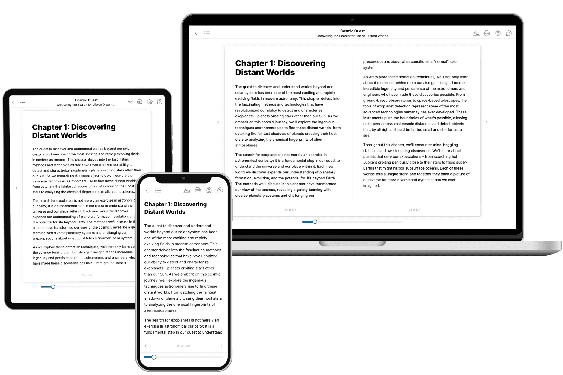
- 3. Get your tailored book
Your book is ready in 10 minutes. Read it online, download as EPUB or PDF, or send to Kindle.
Frequently asked questions
- What is TailoredRead?
TailoredRead creates complete, full-length nonfiction ebooks, written specifically for you. Tell us what you want to learn and why, and TailoredRead writes you a complete ebook on it, with charts, tables, and diagrams throughout. Read it online, on Kindle, or on any e-reader, or download it as a PDF or EPUB. Every book is written fresh the day you order it.
- How is the book tailored to me?
Before anything is written, you answer a few short questions about your goals, your background, and the topics you care about. Your book is then planned around your answers: written at your level, focused on your goals, and covering the topics you chose, instead of the one-size-fits-all book a store sells everyone.
- Will it read like generic AI content?
No. Your book isn't a chat transcript: it's planned chapter by chapter before a single word is written, told in a clear book voice, and explains ideas visually with charts, tables, and diagrams. After writing, every book goes through an editorial pass that polishes chapters so the book reads consistent from start to finish. Judge for yourself: browse thousands of sample books on our Explore Books page.
- How accurate is the content?
Our AI first checks whether your subject needs live research. Niche and fast-moving subjects are researched before writing, and the book plan and chapters are grounded in what it finds. After writing, every book goes through a quality pass that checks its facts and consistency, and researched books list their sources in a Notes section at the back.
- How long is the book?
You choose the length: Comprehensive (250-300 pages), Detailed (150-200 pages), Essential (70-100 pages), or Short (30-50 pages).
- Does the book include visuals?
Yes. Every book includes charts, tables, and diagrams: timelines, checklists, step-by-step guides, decision trees, comparison tables, matrices, and bar charts. A typical book includes dozens of these visual elements.
- Can I read it on Kindle? What formats can I download?
Yes. Every book can be read in our online reader or downloaded as a PDF or EPUB. The EPUB can be opened with Kindle, Apple Books, Kobo, and any e-reader. The Commercial and Author licenses also include an editable Word (DOCX) and Markdown download.
- How much does it cost?
About the price of a regular ebook. The exact price depends on your book's length and complexity, from $2 for the shortest books to $35 for the most comprehensive, and it's shown when you review your book, before you commit to anything. Each book is a one-time purchase, yours to keep, no subscription. Licenses that let you share, teach, or publish your book range from $35.99 to $49.99.
- Can I preview the book before purchasing?
Before you pay, you'll see what your book will cover: the title, a detailed description, the estimated length, and the complete chapter-by-chapter table of contents, so you know what you're getting before you decide. The full text itself is written after you purchase.
- How long does it take to create a book?
About 10 minutes. You can start reading the opening chapters while the rest is still being written.