Zaha Hadid Architecture Coloring Book
Explore Parametric Design and Fluid Forms Through Creative Expression
What if the buildings around you could flow like water, curve like wind, and defy every expectation of what architecture should be?
238 pages12 chaptersEnglishOct 21, 2025Architecture
About this book
Zaha Hadid proved this vision possible, creating structures that seem to move and breathe. This coloring book offers you an intimate exploration of her revolutionary designs, from the sweeping curves of the Heydar Aliyev Center to the dynamic angles of the Guangzhou Opera House. As you color each carefully curated illustration, you'll discover the principles behind parametric design, understand how fluid forms challenge conventional construction, and appreciate the relationship between structure and space. Each page combines detailed architectural drawings with insights into Hadid's design philosophy, allowing you to engage both creatively and intellectually. Whether you're an architecture student, design professional, or simply captivated by extraordinary buildings, this book provides a unique pathway to understanding one of the most influential architects of our time. Through the meditative act of coloring, you'll internalize the rhythms, proportions, and spatial relationships that define Hadid's unmistakable architectural language.
Table of contents
- IntroductionAbout This Coloring Book, How to Use This Book, Coloring Techniques for Architectural FormsRead below
- Chapter 1: The Visionary Behind the FormsBreaking Architectural Boundaries, Design Philosophy and Influences, Legacy and Global Impact
- Chapter 2: Understanding Parametric DesignWhat Is Parametric Architecture, Computational Tools and Digital Design, When Form Follows Algorithm, The Structural Logic of Curves
- Chapter 3: Fluid Geometry and Organic FormsDrawing Inspiration from Nature, Curves, Flows, and Movement, Geological and Topographical Influences, Creating Dynamic Surfaces
- Chapter 4: Cultural and Civic LandmarksHeydar Aliyev Center: Flowing Continuity, Guangzhou Opera House: Twin Pebbles, MAXXI Museum: Intersecting Paths
- Chapter 5: Space, Light, and MovementBlurring Interior and Exterior, Light and Shadow in Curved Spaces, Circulation and Spatial Flow, Human Scale in Monumental Forms
- Chapter 6: Transportation and InfrastructureAirport Terminals: Gateways in Motion, Train Stations and Transit Hubs, Bridges and Urban Connections
- Chapter 7: Towers and Vertical StructuresTwisting and Rotating Forms, Achieving Fluidity in Height, Structural Innovation in Tall Buildings
- Chapter 8: Color in Hadid's ArchitectureMaterial and Color Palette, The Power of White and Purity, Bold Accents and Contrasts, Strategies for Coloring Parametric Forms
- Chapter 9: From Vision to Built RealityEngineering Challenges and Solutions, Material Innovation and Fabrication, Advanced Construction Technologies
- Chapter 10: Architecture in Urban ContextResponding to Site and Context, Urban Integration and Public Space, Landscape and Architecture as One
- Chapter 11: Smaller Scale Works and InteriorsPavilions and Temporary Installations, Interior Design and Furniture, Product Design and Objects
- Chapter 12: Developing Your Architectural EyeObserving and Analyzing Forms, Sketching Architectural Concepts, Creating Your Personal Interpretation
- ConclusionContinuing Your Architectural Exploration, Final Reflections on Form and Creativity
- Further Reading and Resources
Introduction
Architecture has the power to transform how we experience space, movement, and possibility. For centuries, buildings followed predictable patterns: straight lines, right angles, and rigid geometries that reflected the limitations of traditional construction methods. Then Zaha Hadid arrived and changed everything. Her buildings flow like rivers, curve like wind-sculpted dunes, and challenge every assumption about what architecture can be. This coloring book invites you into her revolutionary world, where form breaks free from convention and structures seem to defy gravity itself. Through the act of coloring, you'll develop an intimate understanding of her design principles, spatial relationships, and the mathematical elegance underlying seemingly impossible forms.
The pages ahead contain carefully selected illustrations representing Hadid's most significant works and design concepts. Each drawing has been crafted to reveal the underlying geometry, spatial flow, and structural logic that make her architecture so distinctive. As you apply color to these forms, you'll engage with them in ways that passive observation cannot achieve. Your hand will trace the sweeping curves, follow the dynamic angles, and navigate the complex intersections that define parametric design. This tactile engagement creates a deeper connection with architectural principles than simply reading about them or viewing photographs. You'll begin to internalize the rhythms and proportions that characterize Hadid's unmistakable visual language.
This book serves multiple purposes simultaneously. It functions as an introduction to parametric architecture for those new to the concept, a creative exploration for design enthusiasts, and a meditative practice for anyone seeking a mindful engagement with extraordinary forms. Whether you're an architecture student analyzing spatial relationships, a professional designer seeking inspiration, or simply someone captivated by beautiful buildings, these pages offer something valuable. The combination of visual engagement through coloring and intellectual understanding through accompanying text creates a unique learning experience. You'll discover that coloring isn't merely a relaxing activity but a powerful tool for understanding three-dimensional space, structural systems, and design philosophy.
Zaha Hadid's work represents more than aesthetic innovation. Her buildings embody a fundamental shift in how architecture relates to technology, nature, and human experience. The computational tools that made her visions possible emerged during her career, allowing her to realize forms that previous generations could only imagine. Her designs respond to site conditions, program requirements, and cultural contexts while maintaining a distinctive formal language. Understanding this balance between artistic vision and practical constraints reveals the true genius of her approach. Through coloring and studying these works, you'll appreciate how radical innovation can still create functional, inhabitable spaces that serve their communities.
About This Coloring Book
This coloring book differs fundamentally from typical architectural coloring books that simply reproduce building facades. Each illustration has been specifically designed to reveal the underlying principles of parametric design and fluid geometry. The drawings emphasize spatial relationships, structural systems, and the dynamic qualities that make Hadid's architecture so compelling. You'll find cross-sections that expose interior volumes, axonometric views that clarify three-dimensional relationships, and detail studies that highlight how curves transition into structural elements. These aren't simplified sketches but carefully considered representations that balance coloring accessibility with architectural accuracy.
The book's organization follows a logical progression from foundational concepts to specific projects and design applications. Early chapters establish the theoretical framework of parametric design and Hadid's design philosophy. Middle chapters explore major building types and iconic projects, examining how her principles manifest in different contexts and scales. Later chapters address practical considerations like color application, construction technology, and urban integration. This structure allows you to build understanding progressively, with each chapter reinforcing and expanding concepts introduced earlier. You can work through the book sequentially or jump to projects that particularly interest you, as each section stands independently while contributing to the larger narrative.
Accompanying each illustration, you'll find contextual information that enriches your coloring experience. These texts explain the project's background, design intentions, structural innovations, and cultural significance. They highlight specific features to notice as you color, drawing your attention to crucial details that might otherwise go unobserved. The information provided balances technical architectural knowledge with accessible explanations that don't require specialized training. You'll learn terminology naturally through context rather than through dense definitions. This approach ensures that the book serves both educational and creative purposes without overwhelming you with jargon or oversimplifying complex ideas.
The illustrations vary in complexity to accommodate different skill levels and time commitments. Some pages feature bold, sweeping forms with large areas suitable for quick coloring sessions. Others present intricate details and complex geometries that reward patient, careful work. This variety ensures that you'll find appropriate challenges regardless of your experience with coloring or architectural drawing. The more complex illustrations often reveal their full beauty gradually, with patterns and relationships emerging as you work through different sections. This discovery process mirrors how Hadid's buildings reveal themselves to visitors who move through and around them, with new perspectives constantly appearing.
Special attention has been given to line weight and detail density in the illustrations. Thicker lines define major structural elements and primary forms, while finer lines indicate secondary details, surface patterns, and spatial depth. This hierarchy helps you understand which elements are fundamental to the design and which provide refinement and texture. As you color, you can choose to emphasize these hierarchies through your color choices or create alternative readings by highlighting different aspects. The illustrations provide a framework for interpretation rather than dictating a single correct approach. Your creative decisions become part of the design exploration process.
The book includes both completed buildings and conceptual projects, offering insight into Hadid's full creative range. Realized projects demonstrate how her visions translate into physical structures that people inhabit and use daily. Unbuilt designs reveal more experimental thinking, showing directions she explored that pushed even further beyond conventional limits. Both categories provide valuable learning opportunities. Completed buildings show how engineering constraints and practical requirements shape final forms, while conceptual projects illustrate pure design thinking unconstrained by immediate buildability. Together, they present a comprehensive picture of her architectural philosophy and creative process.
Throughout the book, you'll encounter recurring themes and formal strategies that characterize Hadid's approach. Notice how she creates continuity between different building elements, blurring distinctions between walls, floors, and ceilings. Observe how exterior forms respond to interior spatial requirements, with the building envelope expressing internal functions. Pay attention to how she uses repetition and variation, creating rhythm through similar elements that subtly transform across a composition. These patterns become more apparent as you work through multiple illustrations, helping you develop an intuitive understanding of her design language. Recognition of these strategies enhances your appreciation of both individual projects and her overall body of work.
How to Use This Book
Begin by familiarizing yourself with the overall structure and content before diving into coloring. Page through the entire book, noting which projects and concepts most intrigue you. Read the introductory text for chapters that catch your attention, getting a sense of the themes and ideas explored. This preliminary survey helps you understand how different sections relate and allows you to plan your approach. Some people prefer working sequentially, building knowledge progressively. Others jump to projects that excite them most, returning to foundational chapters as questions arise. Both approaches work well, so choose what matches your learning style and creative preferences.
Before coloring each illustration, read the accompanying text carefully. Understanding the project's context, design intentions, and key features will inform your color choices and help you appreciate what you're creating. The text often highlights specific elements worth noticing, such as structural innovations, spatial relationships, or formal strategies. As you read, examine the illustration to locate these features, tracing lines with your finger to understand how forms connect and flow. This preliminary study takes only a few minutes but significantly enhances your engagement with the drawing. You'll color more thoughtfully when you understand what the lines represent and how different elements relate.
Consider your coloring materials carefully, as different media produce distinct effects on architectural forms. The illustrations in this book work well with various tools:
- Colored pencils offer precise control and allow subtle gradations, ideal for showing depth and shadow on curved surfaces
- Markers provide bold, even color that emphasizes the graphic quality of architectural forms and creates strong contrasts
- Gel pens work well for adding fine details, highlights, and accents over base colors applied with other media
- Watercolor pencils combine pencil control with watercolor effects, useful for creating atmospheric backgrounds and soft transitions
- Fine-tip pens can add additional line work, patterns, or textures to enhance surface qualities
Develop a systematic approach to coloring complex illustrations. Start by identifying major zones or elements in the composition, deciding on a color scheme that creates clear distinctions between different parts. Many people find it helpful to color background elements first, then move to foreground features, building depth through layering. Others prefer completing one section entirely before moving to adjacent areas. For parametric forms with continuous flowing surfaces, consider how color can emphasize or de-emphasize the curves. Gradations that follow the form's direction enhance the sense of movement, while contrasting colors at transitions can clarify where one surface ends and another begins.
Use color strategically to enhance your understanding of three-dimensional form. Lighter values typically suggest surfaces facing toward light sources, while darker values indicate areas in shadow or receding into space. On curved surfaces, gradual transitions from light to dark help convey the form's roundness and depth. Sharp value contrasts work well at edges where planes meet at angles, emphasizing the geometry's crispness. Don't feel obligated to create realistic lighting effects if other approaches interest you more. Flat, graphic color schemes can be equally valid, emphasizing pattern and composition over volumetric illusion. Your choices should serve your learning goals and aesthetic preferences.
Take breaks during complex illustrations to step back and assess your progress. Viewing your work from a distance reveals overall composition and color relationships that aren't apparent when working up close. These pauses also prevent eye strain and maintain your focus. During breaks, you might read ahead to upcoming projects, review concepts from earlier chapters, or simply rest your eyes and hands. Coloring should be enjoyable rather than exhausting. If you find yourself rushing or becoming frustrated, set the book aside and return when you feel refreshed. The meditative benefits of coloring emerge when you work at a comfortable pace without pressure.
Consider keeping a separate notebook for observations, questions, and ideas that arise while coloring. You might sketch your own variations on Hadid's forms, note features you want to research further, or record thoughts about how her principles could apply to other contexts. This supplementary documentation transforms the coloring book into a more comprehensive learning tool. Your notes create a personal record of your architectural education, capturing insights that might otherwise be forgotten. Over time, reviewing these observations reveals how your understanding has deepened and evolved. The combination of visual engagement through coloring and written reflection through note-taking creates a powerful learning experience.
Don't worry about making mistakes or achieving perfection. These illustrations serve as learning tools rather than precious artworks requiring flawless execution. If you choose a color that doesn't work as intended, consider it an experiment that teaches you something about color relationships or spatial perception. You can often incorporate unexpected results into your overall scheme, adjusting subsequent choices to harmonize with what you've already done. Some of the most interesting colored illustrations emerge from happy accidents and spontaneous decisions. The goal is engagement and understanding, not creating museum-quality renderings. Your colored pages document your learning journey, with each one representing a moment of creative exploration and architectural discovery.
Coloring Techniques for Architectural Forms
Architectural illustration requires specific techniques that differ from coloring organic subjects like plants or animals. Buildings consist of distinct surfaces, edges, and materials, each with characteristic visual properties. Understanding how to represent these qualities through color enhances both the visual appeal of your work and your comprehension of architectural form. The techniques described here apply specifically to parametric architecture's curved surfaces and complex geometries, though they're useful for any architectural subject. Mastering these approaches allows you to create compelling illustrations that communicate spatial depth, material quality, and structural logic.
Creating convincing curved surfaces requires careful attention to value gradation. Unlike flat planes that can be colored uniformly, curves must show continuous transition from light to dark to convey their three-dimensional form. The technique involves gradually increasing pressure or layering additional color as you move from the lightest area toward the darkest. For colored pencils, this means multiple light passes, building intensity slowly rather than pressing hard immediately. Start with very light pressure across the entire surface, then add subsequent layers only to areas that should appear darker. This gradual approach prevents harsh transitions and maintains the smooth quality essential to representing flowing forms. The lightest area, called the highlight, typically remains close to the paper's original color, while the darkest area, the core shadow, receives the most color application.
Edge treatment significantly affects how viewers perceive spatial relationships between architectural elements. Sharp, clean edges suggest crisp intersections between planes meeting at definite angles. Soft, blended edges indicate gradual transitions or surfaces that curve away from view. In Hadid's architecture, you'll encounter both types, often within the same project. To create sharp edges with colored pencils, color right up to the line without crossing it, maintaining consistent pressure for even color density. For markers, use the tip carefully along edges, working away from the line to prevent bleeding. Soft edges require blending techniques: overlap colors slightly, use lighter pressure near the edge, or employ a colorless blender pencil to soften transitions. The contrast between sharp and soft edges creates visual hierarchy and guides the viewer's eye through the composition.
Representing different materials requires distinct coloring approaches that suggest their physical properties. Consider these strategies for common architectural materials:
- Glass and reflective surfaces: Leave areas white or very light to suggest reflections and transparency, use sharp value contrasts, add small bright highlights
- Concrete and stone: Use subtle texture through varied pencil strokes, incorporate slight color variations to suggest natural material inconsistency, avoid perfectly smooth application
- Metal panels: Create smooth, even color with sharp highlights and reflections, use cool colors like grays and blues, show environmental reflections through color shifts
- White or light-colored surfaces: Use very pale warm or cool grays rather than leaving white, add subtle shadows to define form, let paper white serve as highlights
Shadow application requires understanding both the form casting the shadow and the surface receiving it. Form shadows appear on the object itself, in areas turned away from the light source. These shadows follow the surface's contours, curving with cylindrical forms or creating distinct shapes on angular surfaces. Cast shadows are thrown by one object onto another, with their shape determined by the light angle and the receiving surface's geometry. In architectural illustration, cast shadows help establish spatial relationships, showing how elements project forward or recede. For parametric architecture's complex curves, shadows often create intricate patterns that reveal the form's three-dimensional complexity. Study how shadows behave on curved surfaces in photographs of Hadid's buildings to inform your coloring decisions.
Color temperature affects spatial perception and emotional response to architectural forms. Warm colors (reds, oranges, yellows) appear to advance toward the viewer, while cool colors (blues, greens, purples) seem to recede. This principle helps create depth in architectural illustrations. Consider using warmer values for foreground elements and cooler values for background areas, even within a limited color palette. Temperature shifts can also suggest different materials or functional zones within a building. Hadid often used white and light colors in her buildings, which you might interpret through warm or cool grays depending on the lighting conditions you want to suggest. A warm gray suggests sunlight and warmth, while cool gray evokes overcast conditions or artificial lighting.
Directional strokes enhance the sense of movement inherent in Hadid's flowing forms. Rather than coloring in random directions, align your strokes with the form's primary direction. On surfaces that sweep horizontally, use horizontal strokes. On vertical elements, stroke vertically. For curved surfaces, follow the curve's direction, allowing your hand to trace the form's movement. This technique, called cross-contour or form-following stroke direction, reinforces the three-dimensional quality of the form. It requires more attention than random strokes but produces significantly more convincing results. The technique works particularly well with colored pencils, where individual strokes remain visible, but the principle applies to any medium.
Atmospheric perspective helps establish depth in illustrations showing buildings in context or multiple elements at varying distances. This technique involves reducing contrast, detail, and color intensity for elements farther from the viewer. Distant buildings appear lighter, bluer, and less distinct than foreground elements. In architectural coloring, you might apply this by using lighter pressure, fewer layers, or more diluted colors for background areas. The effect creates a sense of space and air between elements, preventing the flat, compressed appearance that results when all elements receive equal treatment. Even in illustrations focusing on a single building, atmospheric perspective can distinguish between the nearest surfaces and those farther away, enhancing three-dimensional perception.
Pattern and texture application requires restraint and strategic placement. While adding texture to every surface might seem appealing, it often creates visual chaos that obscures the underlying form. Instead, use texture selectively to differentiate materials, create focal points, or suggest surface qualities. A building might have smooth glass curtain walls, textured concrete panels, and patterned metal screens, each requiring different treatment. Apply the most detailed texture to foreground elements or areas you want to emphasize. Background areas can be suggested more simply, with texture implied rather than fully rendered. This selective approach maintains visual clarity while adding interest and material specificity. Remember that in parametric architecture, the form itself provides visual interest, so texture should enhance rather than compete with the primary geometry.
Experiment with unconventional color schemes to explore different interpretations of the architecture. While realistic colors based on actual materials provide one valid approach, abstract or expressive color choices can reveal aspects of the design that realistic rendering might obscure. A monochromatic scheme using values of a single color emphasizes form over material. Complementary colors create vibrant contrasts that highlight spatial relationships. Analogous colors produce harmonious, unified compositions. Consider what each project might express through color: energy and dynamism might suggest bright, saturated hues, while contemplative spaces might call for muted, subtle tones. Your color choices become an interpretation of the architecture's character and emotional qualities, adding your personal response to Hadid's formal vision.
Finally, develop your observational skills by studying photographs of Hadid's buildings and other parametric architecture. Notice how light behaves on curved surfaces, how shadows reveal form, and how materials reflect their surroundings. Observe which areas appear lightest and darkest, and how gradual or abrupt the transitions are. This visual research informs your coloring decisions, helping you create more convincing representations. You might keep a collection of reference images for different lighting conditions, materials, and formal types. As you color, refer to these images when uncertain about how to handle a particular situation. Over time, you'll internalize these observations, making informed decisions intuitively without constant reference checking. This combination of hands-on practice through coloring and careful observation of real buildings accelerates your understanding of architectural form and representation.
This is the end of the free sample. The full book has 12 chapters.
Want this book written for you?
Tell us your goals and background, and get your own version of this book, tailored by AI to you.


Benefits of AI-tailored books
- Read one book, not ten:
- all the Architecture knowledge you need, gathered into a single book.
- Save days of learning:
- tell us your goals, choose your topics, and the whole book is built around them.
- Learn effortlessly:
- Architecture book written for your specific background and expertise.
- Understand at a glance:
- includes charts, tables, timelines, checklists, decision trees, and more.
- Stay current:
- written the day you order it, not years ago.
- Trust what you read:
- every book is checked for accuracy, with real research when your subject needs it.
Create your unique book in 3 steps
- 1. Select your focus
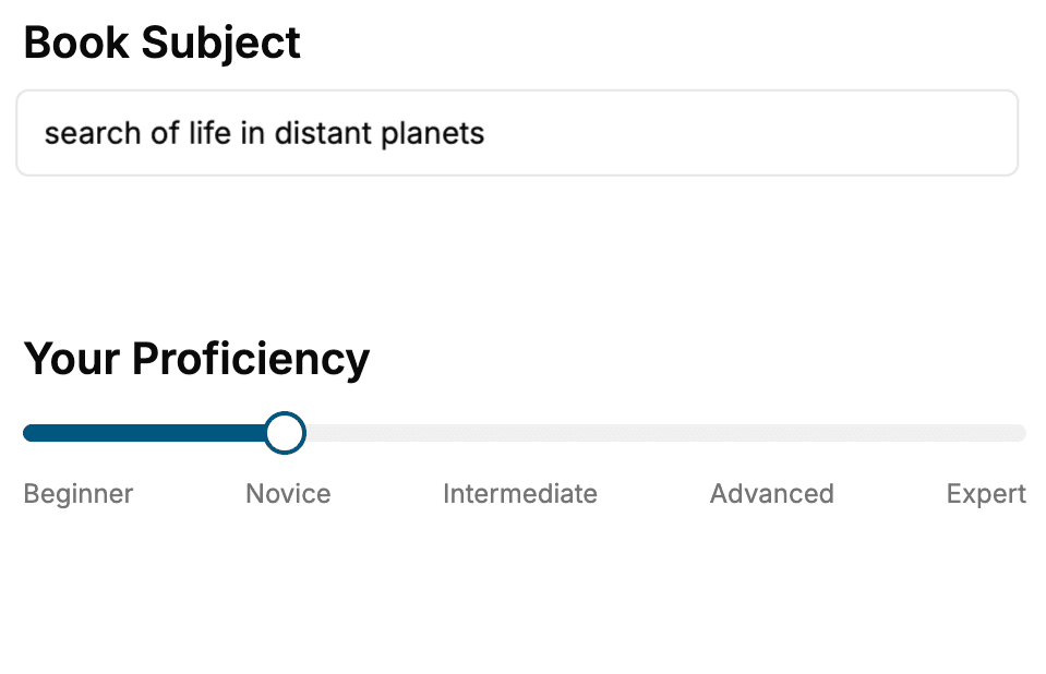
Select the focus of your Architecture book and share your background
- 2. Personalize your book
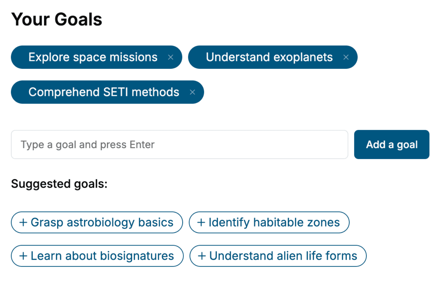
Specify your goals and choose sub-topics to include
- 3. Get your tailored book
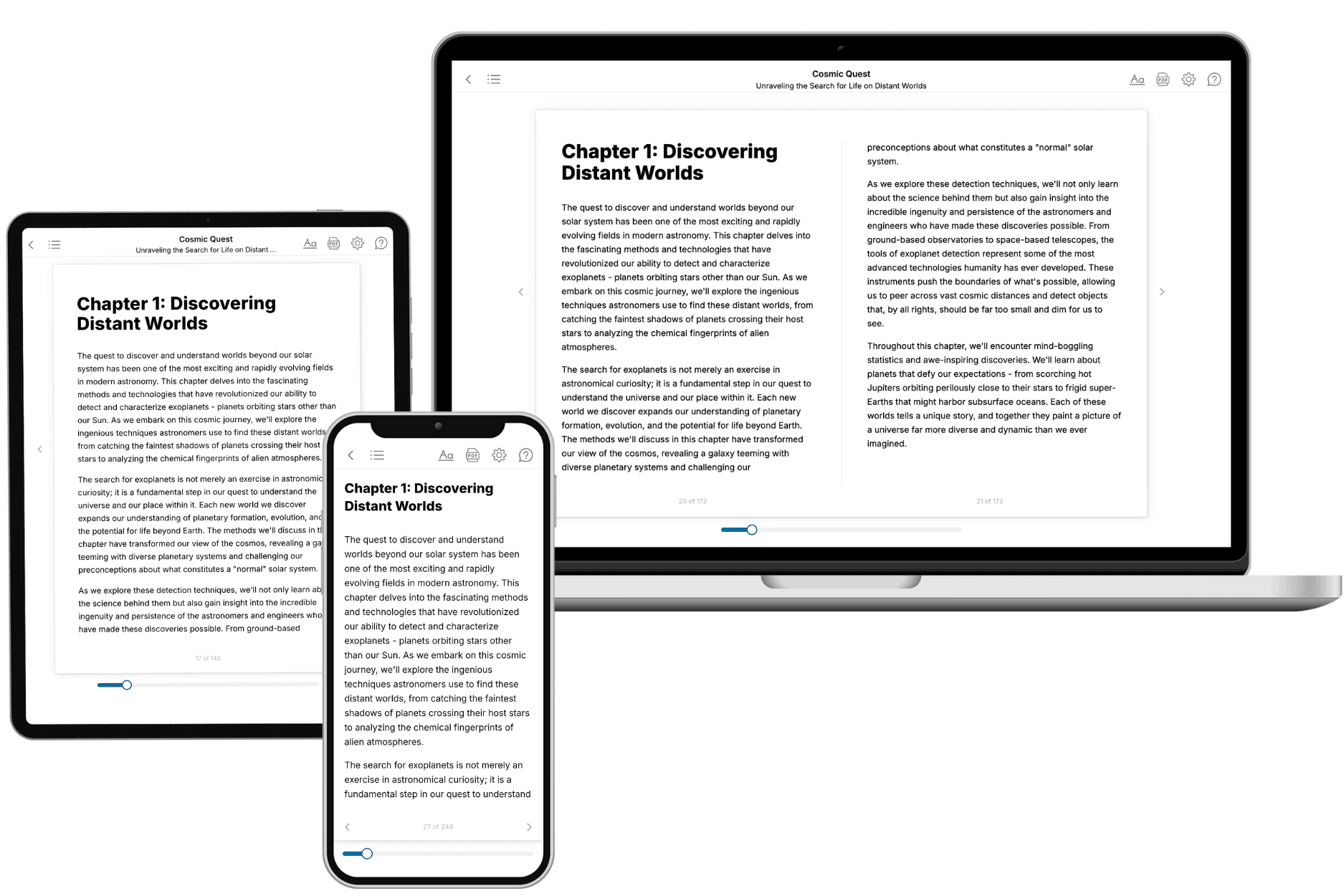
Your book is ready in 10 minutes. Read it online, download as EPUB or PDF, or send to Kindle.
Frequently asked questions
- What is TailoredRead?
TailoredRead creates complete, full-length nonfiction ebooks, written specifically for you. Tell us what you want to learn and why, and TailoredRead writes you a complete ebook on it, with charts, tables, and diagrams throughout. Read it online, on Kindle, or on any e-reader, or download it as a PDF or EPUB. Every book is written fresh the day you order it.
- How is the book tailored to me?
Before anything is written, you answer a few short questions about your goals, your background, and the topics you care about. Your book is then planned around your answers: written at your level, focused on your goals, and covering the topics you chose, instead of the one-size-fits-all book a store sells everyone.
- Will it read like generic AI content?
No. Your book isn't a chat transcript: it's planned chapter by chapter before a single word is written, told in a clear book voice, and explains ideas visually with charts, tables, and diagrams. After writing, every book goes through an editorial pass that polishes chapters so the book reads consistent from start to finish. Judge for yourself: browse thousands of sample books on our Explore Books page.
- How accurate is the content?
Our AI first checks whether your subject needs live research. Niche and fast-moving subjects are researched before writing, and the book plan and chapters are grounded in what it finds. After writing, every book goes through a quality pass that checks its facts and consistency, and researched books list their sources in a Notes section at the back.
- How long is the book?
You choose the length: Comprehensive (250-300 pages), Detailed (150-200 pages), Essential (70-100 pages), or Short (30-50 pages).
- Does the book include visuals?
Yes. Every book includes charts, tables, and diagrams: timelines, checklists, step-by-step guides, decision trees, comparison tables, matrices, and bar charts. A typical book includes dozens of these visual elements.
- Can I read it on Kindle? What formats can I download?
Yes. Every book can be read in our online reader or downloaded as a PDF or EPUB. The EPUB can be opened with Kindle, Apple Books, Kobo, and any e-reader. The Commercial and Author licenses also include an editable Word (DOCX) and Markdown download.
- How much does it cost?
About the price of a regular ebook. The exact price depends on your book's length and complexity, from $2 for the shortest books to $35 for the most comprehensive, and it's shown when you review your book, before you commit to anything. Each book is a one-time purchase, yours to keep, no subscription. Licenses that let you share, teach, or publish your book range from $35.99 to $49.99.
- Can I preview the book before purchasing?
Before you pay, you'll see what your book will cover: the title, a detailed description, the estimated length, and the complete chapter-by-chapter table of contents, so you know what you're getting before you decide. The full text itself is written after you purchase.
- How long does it take to create a book?
About 10 minutes. You can start reading the opening chapters while the rest is still being written.