Mastering Flex Responsive Design
Crafting Adaptive Apache Flex Applications for Modern Devices
Imagine creating Apache Flex applications that seamlessly adapt to any screen size, providing an optimal user experience across desktops, tablets, and smartphones.
300 pages16 chaptersMar 4, 2025Web Development
About this book
With "Mastering Flex Responsive Design," you'll turn this vision into reality. This comprehensive guide takes you on a deep dive into the world of responsive design within the Apache Flex framework. You'll learn how to leverage Flex's powerful features to create fluid layouts, scalable components, and dynamic user interfaces that respond intelligently to different devices and screen orientations. From mastering fluid grids and flexible images to implementing adaptive navigation patterns, this book covers all aspects of responsive design in Flex. You'll discover how to use media queries, create resolution-independent graphics, and optimize performance for various devices. Real-world examples and hands-on projects will solidify your understanding, allowing you to apply these concepts to your own Flex applications with confidence. By the end of this journey, you'll possess the skills to create stunning, responsive Flex applications that stand out in today's multi-device landscape. Get ready to elevate your Flex development skills and deliver exceptional user experiences across all platforms.
Table of contents
- IntroductionThe Importance of Responsive Design in Flex, Book Overview and How to Use It, Prerequisites and Setup, Core Principles of Responsive DesignRead below
- Chapter 1: Flex Basics for Responsive DesignOverview of the Flex Framework, MXML and ActionScript Fundamentals, Understanding the Flex Component Lifecycle, Flex Layout Containers and Their Properties
- Chapter 2: Responsive Design Concepts in FlexImplementing Fluid Grids, Working with Flexible Images, Using Media Queries in Flex, Understanding Viewport and Meta Tags
- Chapter 3: Flex Layout Techniques for ResponsivenessCreating Percentage-Based Layouts, Mastering the Flex Box Model, Dynamic Layout Adjustment Techniques, Implementing Responsive Grid Systems
- Chapter 4: Building Responsive Flex ComponentsDesigning Scalable UI Controls, Creating Adaptive Forms, Implementing Responsive Data Grids, Building Flexible Charts and Graphs
- Chapter 5: Responsive Navigation PatternsDesigning Adaptive Menus, Implementing Collapsible Navigation, Using Off-Canvas Navigation Patterns, Responsive Breadcrumbs and Wayfinding
- Chapter 6: Handling Images in Responsive Flex DesignImage Scaling Techniques, Creating Resolution-Independent Graphics, Implementing Lazy Loading for Images, Working with Responsive Background Images
- Chapter 7: Advanced Media Queries in FlexUnderstanding Media Query Syntax, Developing a Breakpoint Strategy, Applying Orientation-Specific Styles, Device-Specific Optimizations
- Chapter 8: Performance Optimization for Responsive FlexCode Optimization Techniques, Efficient Asset Management, Memory Management in Responsive Applications, Improving Rendering Performance
- Chapter 9: Responsive Typography in FlexImplementing Scalable Fonts, Dynamic Text Sizing Techniques, Controlling Line Length for Readability, Font Loading Strategies for Performance
- Chapter 10: Designing for Touch InteractionsCreating Touch-Friendly UI Controls, Implementing Gesture Recognition, Providing Appropriate Touch Feedback, Supporting Multi-Touch Interactions
- Chapter 11: Responsive Animations and TransitionsCreating Performance-Friendly Animations, Implementing Adaptive Transitions, Using State-Based Animations, Optimizing Animations for Different Devices
- Chapter 12: Testing and Debugging Responsive Flex ApplicationsStrategies for Cross-Device Testing, Using Debugging Tools for Responsive Design, Performance Profiling Techniques, Implementing Automated Testing for Responsiveness
- Chapter 13: Accessibility in Responsive Flex DesignUnderstanding WCAG Guidelines for Flex, Implementing Keyboard Navigation, Ensuring Screen Reader Compatibility, Managing Color Contrast in Responsive Designs
- Chapter 14: Common Responsive Design Patterns in FlexImplementing the Column Drop Pattern, Using the Mostly Fluid Pattern, Applying the Layout Shifter Pattern, Mastering the Tiny Tweaks Pattern
- Chapter 15: Real-World Case StudiesBuilding a Responsive E-commerce Application, Creating a Flexible Data Dashboard, Designing a Responsive Media Player, Implementing a Responsive Social Network Interface
- Chapter 16: Future Trends in Responsive Flex DesignEmerging Technologies and Their Impact, AI and Machine Learning in Responsive Design, Responsive Design for IoT Integration, Future-Proofing Your Flex Applications
- ConclusionKey Takeaways, Next Steps in Your Responsive Flex Journey
- AppendixAdditional Resources and Tools, Glossary of Responsive Design Terms
Introduction
Welcome to "Mastering Flex Responsive Design: Crafting Adaptive Apache Flex Applications for Modern Devices." This comprehensive guide is designed to elevate your skills in creating responsive and adaptive Apache Flex applications that seamlessly function across a wide array of devices and screen sizes. As the digital landscape continues to evolve, with users accessing applications on everything from large desktop monitors to compact smartphones, the ability to design flexible and responsive interfaces has become not just a luxury, but a necessity. This book will equip you with the knowledge and techniques to meet this challenge head-on, ensuring that your Flex applications provide an optimal user experience regardless of the device they're viewed on.
Throughout this book, you'll delve deep into the world of responsive design within the Apache Flex framework. You'll discover how to harness Flex's powerful features to create fluid layouts, develop scalable components, and build dynamic user interfaces that intelligently adapt to different devices and screen orientations. From mastering fluid grids and flexible images to implementing adaptive navigation patterns, this guide covers all aspects of responsive design in Flex. You'll learn how to use media queries effectively, create resolution-independent graphics, and optimize performance for various devices. Real-world examples and hands-on projects will solidify your understanding, allowing you to apply these concepts to your own Flex applications with confidence.
By the time you reach the conclusion of this book, you'll possess a robust skill set that enables you to create stunning, responsive Flex applications that stand out in today's multi-device landscape. Whether you're working on a new project or looking to update existing applications, the principles and techniques covered in this guide will help you deliver exceptional user experiences across all platforms. So, let's embark on this journey to master Flex responsive design and transform the way you approach application development.
The Importance of Responsive Design in Flex
In today's digital ecosystem, responsive design has transitioned from being a mere trend to an absolute necessity. The proliferation of devices with varying screen sizes and resolutions has fundamentally altered the way users interact with applications. This shift has made it imperative for developers to create applications that can adapt seamlessly to different viewing environments. When it comes to Apache Flex applications, implementing responsive design principles is not just about aesthetics; it's about ensuring functionality, usability, and accessibility across a diverse range of devices.
Responsive design in Flex applications offers numerous benefits that directly impact user experience and business outcomes. Firstly, it ensures consistency in user experience across devices. Whether a user accesses your application on a desktop computer, a tablet, or a smartphone, they should be able to interact with it efficiently and intuitively. This consistency builds trust and familiarity, which are crucial factors in user retention. Secondly, responsive design improves accessibility. By adapting to different screen sizes and orientations, your application becomes more accessible to a wider audience, including those with visual impairments or motor disabilities who may rely on specific devices or assistive technologies.
From a business perspective, responsive design can lead to significant cost savings. Instead of developing and maintaining separate versions of your application for different devices, a responsive approach allows you to create a single, flexible application that works across all platforms. This not only reduces development and maintenance costs but also streamlines updates and feature rollouts. Moreover, responsive design can positively impact your application's search engine optimization (SEO) performance. Search engines like Google favor mobile-friendly, responsive websites and applications, potentially boosting your visibility in search results.
In the context of Apache Flex, embracing responsive design principles opens up new possibilities for creating rich, interactive applications that work flawlessly across devices. Flex's component-based architecture and powerful layout capabilities provide a solid foundation for implementing responsive design strategies. By leveraging these features in combination with responsive design techniques, you can create applications that not only look great but also provide an optimal user experience regardless of the device being used.
Furthermore, responsive design in Flex applications contributes to future-proofing your work. As new devices with different screen sizes and resolutions continue to enter the market, a responsive application can adapt without requiring a complete overhaul. This adaptability ensures that your application remains relevant and functional in the face of evolving technology trends. It also allows you to focus on enhancing features and functionality rather than constantly reworking your application to fit new device specifications.
Lastly, implementing responsive design in Flex applications can lead to improved performance across devices. By optimizing content delivery and adjusting functionality based on device capabilities, you can ensure that your application runs smoothly on both high-end devices and those with limited resources. This performance optimization is crucial for maintaining user engagement and preventing frustration due to slow load times or unresponsive interfaces.
As we delve deeper into the techniques and strategies for implementing responsive design in Flex applications throughout this book, keep in mind the overarching importance of this approach. The skills you'll develop will not only enhance your current projects but will also position you at the forefront of modern application development, ready to tackle the challenges of an ever-evolving digital landscape.
Book Overview and How to Use It
"Mastering Flex Responsive Design" is structured to provide a comprehensive and practical approach to implementing responsive design principles in Apache Flex applications. The book is organized into logical sections that build upon each other, taking you from the fundamentals of responsive design in Flex to advanced techniques and real-world applications. This overview will help you understand the book's structure and how to make the most of its content as you progress through your learning journey.
The book begins with an introduction to the core concepts of responsive design and their relevance to Flex applications. This foundational knowledge sets the stage for the more detailed explorations that follow. From there, you'll dive into the basics of Flex development, ensuring that you have a solid understanding of the framework's capabilities and how they relate to responsive design. These early chapters are crucial for establishing a common ground, regardless of your current level of experience with Flex.
As you progress, you'll encounter chapters dedicated to specific aspects of responsive design in Flex. These include fluid layouts, flexible components, media queries, and adaptive styling. Each chapter is designed to provide in-depth knowledge on its topic, complete with practical examples and code snippets that you can apply to your own projects. The book also covers advanced topics such as performance optimization, handling responsive images and graphics, and implementing adaptive navigation patterns.
To make the most of this book, it's recommended that you follow the chapters in order, as each builds upon the knowledge and skills developed in the previous sections. However, if you're already familiar with certain aspects of Flex or responsive design, you can use the table of contents to jump to specific topics of interest. Each chapter is self-contained enough to provide value on its own, while still fitting into the larger narrative of the book.
Throughout the book, you'll find practical exercises and real-world examples that illustrate the concepts being discussed. These hands-on components are crucial for reinforcing your learning and helping you apply the techniques to your own projects. It's highly recommended that you work through these exercises as you encounter them, experimenting with the code and adapting it to your own needs. This active learning approach will help solidify your understanding and build your confidence in implementing responsive design in Flex.
The book also includes case studies and real-world scenarios that demonstrate how the principles and techniques you've learned can be applied to actual projects. These sections provide valuable insights into the decision-making process behind responsive design implementations and offer inspiration for your own work. Pay close attention to these examples, as they often reveal nuances and best practices that can elevate your own development skills.
As you work through the book, don't hesitate to revisit earlier chapters or jump ahead to explore topics that particularly interest you. The book is designed to be a comprehensive resource that you can return to as needed, whether you're looking to refresh your memory on a specific technique or seeking inspiration for a new project. The appendix at the end of the book provides additional resources and a glossary of terms, which can be valuable references as you continue your journey in responsive Flex design.
Remember, the key to mastering responsive design in Flex is practice and experimentation. Use this book as a guide, but don't be afraid to explore beyond its pages. Try out different approaches, push the boundaries of what you've learned, and adapt the techniques to fit your unique projects and challenges. By actively engaging with the material and applying it to real-world scenarios, you'll develop a deep understanding of responsive design principles and how to implement them effectively in Flex applications.
Lastly, keep in mind that responsive design is an evolving field. While this book provides a solid foundation and up-to-date techniques, it's important to stay informed about new developments in both Flex and responsive design. Use the knowledge gained from this book as a springboard for further learning and exploration in the field.
Prerequisites and Setup
Before diving into the intricacies of responsive design in Apache Flex, it's essential to ensure that you have the necessary foundation and tools to make the most of this book. While "Mastering Flex Responsive Design" is designed to be accessible to developers with varying levels of experience, having a basic understanding of certain concepts and technologies will greatly enhance your learning experience. This section outlines the prerequisites for following along with the book and guides you through the setup process to prepare your development environment.
First and foremost, a fundamental understanding of web technologies is crucial. You should be comfortable with HTML, CSS, and JavaScript, as these form the backbone of web development and are closely related to many concepts in Flex development. Familiarity with object-oriented programming principles is also beneficial, as Flex heavily relies on these concepts. If you're new to these areas or feel you need a refresher, consider spending some time reviewing these topics before proceeding with the more advanced content in this book.
When it comes to Flex-specific knowledge, having some experience with the framework will be advantageous. However, the book does include a chapter on Flex basics, which will help bring you up to speed if you're new to the framework or need a quick review. Familiarity with ActionScript 3.0, the programming language used in Flex, is also important. If you're comfortable with Java or similar object-oriented languages, you'll find ActionScript relatively easy to pick up.
To follow along with the examples and exercises in this book, you'll need to set up your development environment. Here's a step-by-step guide to getting started:
- Install the Apache Flex SDK: Visit the official Apache Flex website (flex.apache.org) and download the latest version of the Flex SDK. Follow the installation instructions provided on the site for your specific operating system.
- Choose an Integrated Development Environment (IDE): While you can develop Flex applications using a simple text editor, an IDE can significantly enhance your productivity. Popular choices include Adobe Flash Builder, IntelliJ IDEA with the Flex plugin, or the free and open-source FlashDevelop. Install your chosen IDE and configure it to work with the Flex SDK you installed in step 1.
- Set up a local server: Many examples in this book will require a local server to run properly. You can use options like Apache HTTP Server, XAMPP, or even the built-in PHP server if you have PHP installed on your system.
- Install a modern web browser: Ensure you have the latest version of browsers like Google Chrome, Mozilla Firefox, or Microsoft Edge installed. These will be crucial for testing and debugging your responsive Flex applications.
- Set up version control: While not strictly necessary, using a version control system like Git is highly recommended. It will help you manage your code and track changes as you work through the examples in the book.
Once you have your development environment set up, it's a good idea to test it by creating a simple Flex application. This will help ensure that everything is configured correctly and that you're ready to start working with the more complex examples in the book. Here's a basic test you can run:
		<?xml version="1.0" encoding="utf-8"?>
		<s:Application xmlns:fx="http://ns.adobe.com/mxml/2009"
					   xmlns:s="library://ns.adobe.com/flex/spark"
					   xmlns:mx="library://ns.adobe.com/flex/mx">
			<s:Label text="Hello, Responsive Flex!" fontSize="24"/>
		</s:Application>
As you progress through the book, you may need to install additional libraries or tools. These will be mentioned in the relevant chapters, along with instructions on how to integrate them into your development environment. Keep in mind that the field of web development moves quickly, so it's always a good idea to check for the latest versions of tools and libraries as you work through the book.
Lastly, remember that learning responsive design in Flex is an iterative process. Don't be discouraged if you encounter challenges along the way. Experimentation and problem-solving are key parts of the learning process. Take advantage of online resources, community forums, and the official Apache Flex documentation to supplement your learning and troubleshoot any issues you may encounter.
With your development environment set up and a basic understanding of the prerequisites, you're now ready to embark on your journey to mastering responsive design in Apache Flex. The following chapters will build upon this foundation, introducing you to advanced concepts and techniques that will transform the way you approach Flex application development.
Core Principles of Responsive Design
Responsive design is built upon a set of core principles that guide developers in creating flexible, adaptive layouts that work across a wide range of devices and screen sizes. Understanding these principles is crucial for effectively implementing responsive design in Apache Flex applications. This section will explore the fundamental concepts that form the foundation of responsive design, providing you with a solid framework to build upon as you progress through the book.
The first and perhaps most crucial principle of responsive design is fluid grids. Unlike traditional fixed-width layouts, fluid grids use relative units (such as percentages) instead of absolute units (like pixels) to define the width of layout elements. This approach allows the layout to expand or contract based on the available screen space. In the context of Flex, this means utilizing percentage-based widths and heights for containers and components, enabling them to resize proportionally as the viewport changes.
Closely related to fluid grids is the concept of flexible images and media. In a responsive design, images and other media elements should also adapt to the changing layout. This is typically achieved by setting maximum widths on these elements and allowing them to scale down proportionally when the container size decreases. Flex provides various techniques for handling flexible images, including using the Image control with percentage-based dimensions and implementing custom logic for image scaling and cropping.
Another cornerstone of responsive design is the use of media queries. Media queries allow you to apply different styles or even alter the layout based on characteristics of the device, such as its width, height, or orientation. While traditional CSS media queries are not directly applicable in Flex, similar functionality can be achieved through ActionScript code that detects screen properties and adjusts the application's layout accordingly. This principle enables you to create truly adaptive interfaces that optimize the user experience for different devices.
The concept of progressive enhancement is also fundamental to responsive design. This approach involves starting with a basic, functional version of your application that works on all devices, and then progressively adding more complex features and interactions for devices with greater capabilities. In Flex, this might involve creating a simple layout that works well on small screens, then enhancing it with additional components and functionality for larger displays or more powerful devices.
Responsive design also emphasizes the importance of content prioritization. As screen sizes decrease, it becomes crucial to focus on the most important content and functionality. This principle often leads to the implementation of techniques like off-canvas navigation, collapsible sections, or even completely different layouts for mobile devices. In your Flex applications, this might involve dynamically showing or hiding components based on available space, or reorganizing the layout to emphasize key features on smaller screens.
Performance optimization is another critical aspect of responsive design. Responsive applications need to load quickly and perform well across a variety of devices, including those with limited processing power or slower network connections. This principle encompasses techniques such as lazy loading of assets, efficient use of graphics and animations, and optimizing the application's overall structure to minimize resource usage.
Lastly, the principle of device-agnostic design encourages creating interfaces that are not tied to specific devices or screen sizes. Instead of designing for particular breakpoints (e.g., smartphone, tablet, desktop), the focus is on creating flexible layouts that adapt smoothly across a continuous spectrum of screen sizes. In Flex, this involves creating components and layouts that can gracefully adjust to any container size, rather than relying on fixed breakpoints.
As you work through the examples and techniques in this book, you'll see how these core principles of responsive design are applied in the context of Apache Flex development. Each principle will be explored in greater depth, with practical demonstrations of how to implement them in your Flex applications. By internalizing these concepts and learning to apply them effectively, you'll be well-equipped to create Flex applications that provide an optimal user experience across the diverse landscape of modern devices.
Remember that while these principles provide a solid foundation for responsive design, their application often requires creativity and problem-solving. As you gain experience, you'll develop an intuition for how to best apply these principles in different scenarios, balancing the needs of your application with the constraints and opportunities presented by various devices and screen sizes.
In the following chapters, we'll delve deeper into each of these principles, exploring specific techniques and best practices for implementing them in Flex. You'll learn how to create fluid layouts, work with flexible components, implement adaptive styling, and optimize performance for responsive Flex applications. By the end of this journey, you'll have a comprehensive understanding of how to apply these core principles to create truly responsive and adaptive Flex applications.
This is the end of the free sample. The full book has 16 chapters.
Want this book written for you?
Tell us your goals and background, and get your own version of this book, tailored by AI to you.


Benefits of AI-tailored books
- Read one book, not ten:
- all the Web Development knowledge you need, gathered into a single book.
- Save days of learning:
- tell us your goals, choose your topics, and the whole book is built around them.
- Learn effortlessly:
- Web Development book written for your specific background and expertise.
- Understand at a glance:
- includes charts, tables, timelines, checklists, decision trees, and more.
- Stay current:
- written the day you order it, not years ago.
- Trust what you read:
- every book is checked for accuracy, with real research when your subject needs it.
Create your unique book in 3 steps
- 1. Select your focus
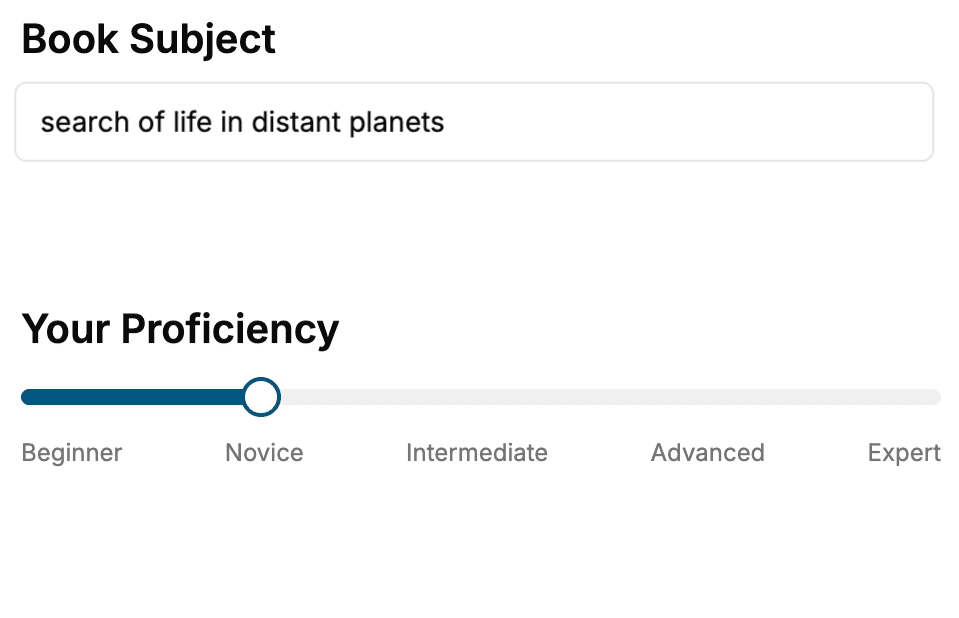
Select the focus of your Web Development book and share your background
- 2. Personalize your book
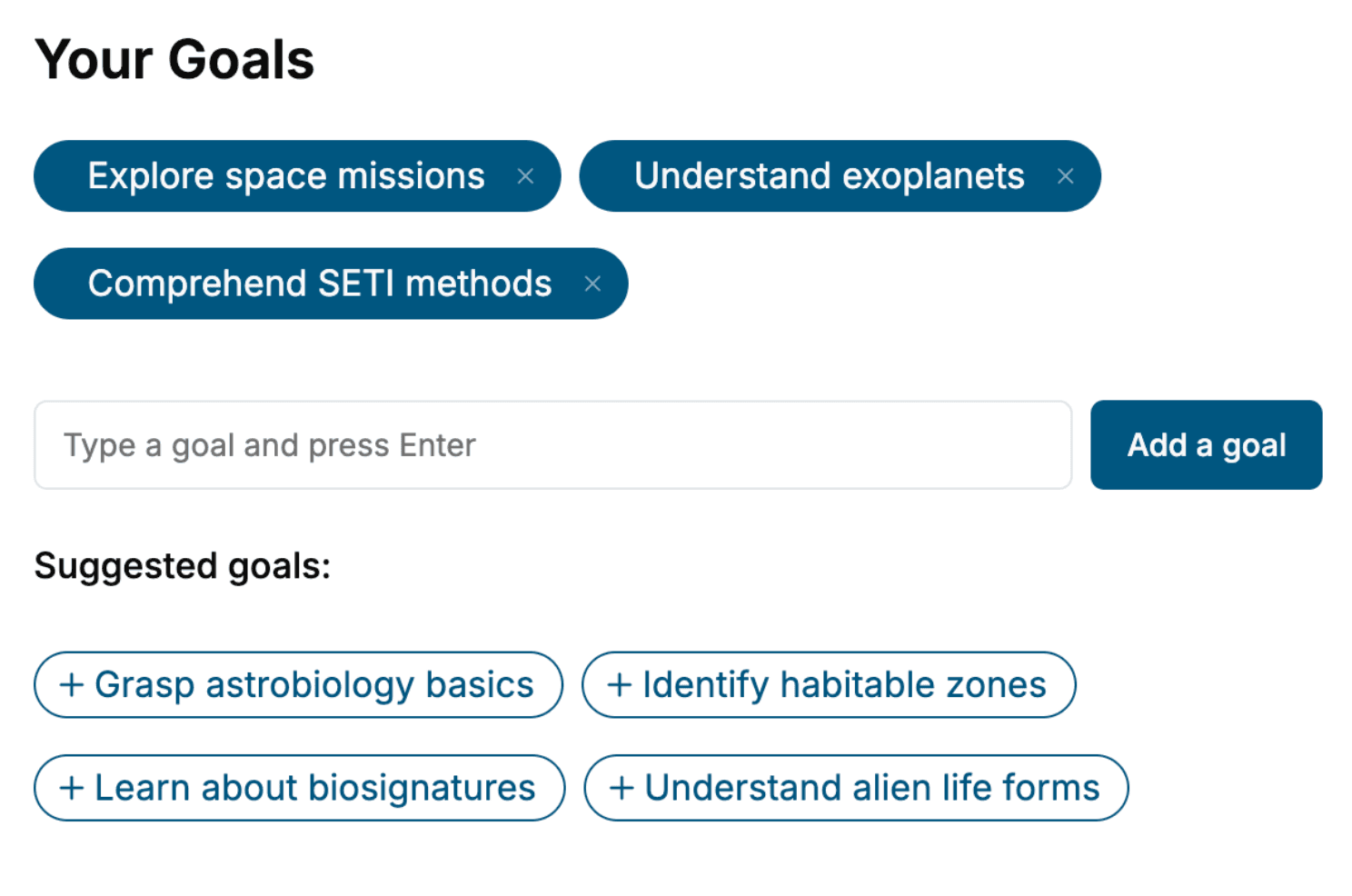
Specify your goals and choose sub-topics to include
- 3. Get your tailored book
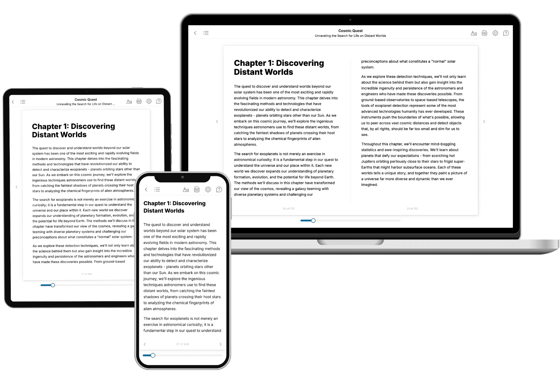
Your book is ready in 10 minutes. Read it online, download as EPUB or PDF, or send to Kindle.
Frequently asked questions
- What is TailoredRead?
TailoredRead creates complete, full-length nonfiction ebooks, written specifically for you. Tell us what you want to learn and why, and TailoredRead writes you a complete ebook on it, with charts, tables, and diagrams throughout. Read it online, on Kindle, or on any e-reader, or download it as a PDF or EPUB. Every book is written fresh the day you order it.
- How is the book tailored to me?
Before anything is written, you answer a few short questions about your goals, your background, and the topics you care about. Your book is then planned around your answers: written at your level, focused on your goals, and covering the topics you chose, instead of the one-size-fits-all book a store sells everyone.
- Will it read like generic AI content?
No. Your book isn't a chat transcript: it's planned chapter by chapter before a single word is written, told in a clear book voice, and explains ideas visually with charts, tables, and diagrams. After writing, every book goes through an editorial pass that polishes chapters so the book reads consistent from start to finish. Judge for yourself: browse thousands of sample books on our Explore Books page.
- How accurate is the content?
Our AI first checks whether your subject needs live research. Niche and fast-moving subjects are researched before writing, and the book plan and chapters are grounded in what it finds. After writing, every book goes through a quality pass that checks its facts and consistency, and researched books list their sources in a Notes section at the back.
- How long is the book?
You choose the length: Comprehensive (250-300 pages), Detailed (150-200 pages), Essential (70-100 pages), or Short (30-50 pages).
- Does the book include visuals?
Yes. Every book includes charts, tables, and diagrams: timelines, checklists, step-by-step guides, decision trees, comparison tables, matrices, and bar charts. A typical book includes dozens of these visual elements.
- Can I read it on Kindle? What formats can I download?
Yes. Every book can be read in our online reader or downloaded as a PDF or EPUB. The EPUB can be opened with Kindle, Apple Books, Kobo, and any e-reader. The Commercial and Author licenses also include an editable Word (DOCX) and Markdown download.
- How much does it cost?
About the price of a regular ebook. The exact price depends on your book's length and complexity, from $2 for the shortest books to $35 for the most comprehensive, and it's shown when you review your book, before you commit to anything. Each book is a one-time purchase, yours to keep, no subscription. Licenses that let you share, teach, or publish your book range from $35.99 to $49.99.
- Can I preview the book before purchasing?
Before you pay, you'll see what your book will cover: the title, a detailed description, the estimated length, and the complete chapter-by-chapter table of contents, so you know what you're getting before you decide. The full text itself is written after you purchase.
- How long does it take to create a book?
About 10 minutes. You can start reading the opening chapters while the rest is still being written.